# Badge
A small inline label for status, counts or metadata.
Badge is an open-source component from suiss/ui for React, React Native, SwiftUI and Jetpack Compose. The @esuiss/ui CLI copies its source into your project, so you own the code.
Source: https://suiss.app/ui/docs/components/badge
**React**
**Example**
```tsx
import { Badge } from "@/components/ui/badge"
export default function BadgeDemo() {
return Badge
}
```
`Badge` is a single element that renders a `span` by default and can render as another element, such as a link. Badges can hold text and an icon on either side.
Use the `render` prop to render the badge as another element: `render={}`.
Use a badge to tag content with a short status or category. For actions, use Button instead.
## Installation
### CLI
```bash title="Terminal"
npx shadcn@latest add @esuiss/badge
```
Works in any project with a `components.json`. See [Installation](https://suiss.app/ui/docs/installation#add-components) for the one-line registry setup. Or use the [suiss/ui CLI](https://suiss.app/ui/docs/cli):
```bash title="Terminal"
npx @esuiss/ui@latest add badge
```
### Manual
1. Install the dependencies and add the [`cn` helper](https://suiss.app/ui/docs/installation#the-cn-helper):
```bash title="Terminal"
npm install @base-ui/react class-variance-authority
```
2. Copy the source into `components/ui/badge.tsx`:
```tsx title="components/ui/badge.tsx"
import { mergeProps } from "@base-ui/react/merge-props"
import { useRender } from "@base-ui/react/use-render"
import { cva, type VariantProps } from "class-variance-authority"
import { cn } from "@/lib/utils"
const badgeVariants = cva(
"focus-visible:border-ring aria-invalid:border-destructive h-5 gap-1 rounded-full border border-transparent text-xs font-semibold transition-colors focus-visible:ring-3 focus-visible:ring-ring/50 inline-flex w-fit shrink-0 items-center justify-center overflow-hidden whitespace-nowrap [&>svg]:pointer-events-none group/badge [&>svg]:size-3!",
{
variants: {
variant: {
default: "text-primary [a]:hover:underline",
secondary: "text-muted-foreground [a]:hover:underline",
destructive: "text-destructive focus-visible:ring-destructive/20 dark:focus-visible:ring-destructive/40 [a]:hover:underline",
outline: "border-border px-2 text-foreground has-data-[icon=inline-end]:pe-1.5 has-data-[icon=inline-start]:ps-1.5 [a]:hover:bg-accent [a]:hover:text-accent-foreground",
ghost: "px-2 has-data-[icon=inline-end]:pe-1.5 has-data-[icon=inline-start]:ps-1.5 [a]:hover:bg-accent [a]:hover:text-muted-foreground",
link: "text-primary hover:underline",
},
},
defaultVariants: {
variant: "default",
},
}
)
function Badge({
className,
variant = "default",
render,
...props
}: useRender.ComponentProps<"span"> & VariantProps) {
return useRender({
defaultTagName: "span",
props: mergeProps<"span">(
{
className: cn(badgeVariants({ variant }), className),
},
props
),
render,
state: {
slot: "badge",
variant,
},
})
}
export { Badge }
```
3. Update the import paths to match your project.
## Usage
```tsx
import { Badge } from "@/components/ui/badge"
```
```tsx
Badge
```
Mark icons with `data-icon="inline-start"` or `data-icon="inline-end"` so the `outline` and `ghost` variants tighten their padding on that side. Icons are sized to `size-3`.
Pass `render` with an anchor element, for example an `a` with an `href`, to make the badge a link. Linked badges get hover styles that depend on the variant.
To use a custom color, override the text color with a `className` such as `text-green-600 dark:text-green-400`.
## Examples
### Variants
Shows the `default`, `secondary`, `destructive`, `outline`, `ghost` and `link` variants.
**Example**
```tsx
import { Badge } from "@/components/ui/badge"
export default function BadgeVariants() {
return (
Default
Secondary
Destructive
Outline
Ghost
Link
)
}
```
### With icon
Places icons before and after the label with `data-icon`.
**Example**
```tsx
import { ArrowUpRightIcon, CheckCircleIcon } from "@phosphor-icons/react"
import { Badge } from "@/components/ui/badge"
export default function BadgeWithIcon() {
return (
)
}
```
### As link
Renders the badge as a link.
**Example**
```tsx
import { Badge } from "@/components/ui/badge"
export default function BadgeAsLink() {
return }>Documentation
}
```
### Custom color
Overrides the text color with utility classes.
**Example**
```tsx
import { Badge } from "@/components/ui/badge"
export default function BadgeCustomColor() {
return (
New
Available
)
}
```
## API Reference
### Badge
The inline label element.
| Prop | Type | Default | Description |
| --- | --- | --- | --- |
| `variant` | `"default" \| "secondary" \| "destructive" \| "outline" \| "ghost" \| "link"` | `"default"` | Visual style. `default`, `secondary`, `destructive` and `link` are text-only; `outline` adds a border and `ghost` adds horizontal padding. |
Also accepts the props of `useRender.ComponentProps<"span">`.
## Accessibility
- A badge is static text by default and is not focusable.
- When rendered as a link, it shows a focus ring on keyboard focus.
- `aria-invalid` adds a `border-destructive` border.
## Notes
- Styling hook: `data-slot="badge"`, plus `data-variant` from the render state.
- The `destructive` variant also tints the focus ring with `ring-destructive/20` (`ring-destructive/40` in dark mode).
- Badges are a fixed `h-5` with fully rounded corners and do not wrap text.
**React Native, SwiftUI, Jetpack Compose**

```tsx
import { View } from "react-native"
import { Badge } from "@/components/ui/badge"
import { Text } from "@/components/ui/text"
export function BadgeExample() {
return (
Badge
)
}
```
```swift
import EsuissUI
import SwiftUI
struct BadgeExample: View {
var body: some View {
Badge("Badge")
}
}
```
```kotlin
import androidx.compose.foundation.layout.Row
import androidx.compose.runtime.Composable
import com.esuiss.ui.components.Badge
@Composable
fun BadgeDefault() {
Row {
Badge("Badge")
}
}
```
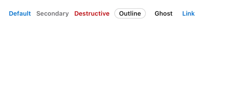
`Badge` is a compact pill `View` that passes a small, bold text style and a 12-point icon size to its children. Six variants are available. `default`, `secondary`, `destructive` and `link` show colored text with no background, while `outline` adds a hairline border and `ghost` adds horizontal padding.
Use `default` for highlighted labels, `secondary` for neutral metadata, `destructive` for errors and `outline` when the badge needs a visible edge.
## Installation
**React Native**
```bash title="Terminal"
npx shadcn@latest add @esuiss-rn/badge
```
See [Installation](https://suiss.app/ui/docs/installation) for the `components.json` setup. Or use the [suiss/ui CLI](https://suiss.app/ui/docs/cli):
```bash title="Terminal"
npx @esuiss/ui@latest add badge
```
**SwiftUI**
```bash title="Terminal"
npx @esuiss/ui@latest add badge --platform swift
```
**Jetpack Compose**
```bash title="Terminal"
npx @esuiss/ui@latest add badge --platform kotlin
```
The CLI also adds what it builds on: [Icon](https://suiss.app/ui/docs/components/icon), [Text](https://suiss.app/ui/docs/components/text).
### Manual
**React Native**
**Uniwind**
1. Install the dependencies:
```bash title="Terminal"
npx expo install class-variance-authority cn
```
2. Add the pieces it builds on: [Icon](https://suiss.app/ui/docs/components/icon), [Text](https://suiss.app/ui/docs/components/text), and the primitives `components/primitives/types.tsx`, `components/primitives/use-render.tsx`.
3. Copy the source into `components/ui/badge.tsx`:
```tsx title="uniwind/components/ui/badge.tsx"
import { cva, type VariantProps } from "class-variance-authority"
import { cn } from "cn"
import { View } from "react-native"
import type { RenderProp } from "@/components/primitives/types"
import { useRender } from "@/components/primitives/use-render"
import { IconClassContext } from "@/components/ui/icon"
import { TextClassContext } from "@/components/ui/text"
const badgeVariants = cva(
"h-5 shrink-0 flex-row items-center justify-center gap-1 self-start overflow-hidden rounded-badge border border-transparent",
{
variants: {
variant: {
default: "",
secondary: "",
destructive: "",
outline: "border-border px-2",
ghost: "px-2",
link: "",
},
},
defaultVariants: {
variant: "default",
},
}
)
const badgeTextVariants = cva("text-xs font-semibold", {
variants: {
variant: {
default: "text-primary",
secondary: "text-muted-foreground",
destructive: "text-destructive",
outline: "text-foreground",
ghost: "text-foreground",
link: "text-primary",
},
},
defaultVariants: {
variant: "default",
},
})
type BadgeProps = React.ComponentProps &
React.RefAttributes> & {
render?: RenderProp, Record>
} & VariantProps
function Badge({ className, variant, render, ...props }: BadgeProps) {
const element = useRender({
defaultComponent: View,
render,
props: [{ className: cn(badgeVariants({ variant }), className) }, props],
})
return (
{element}
)
}
export type { BadgeProps }
export { Badge, badgeTextVariants, badgeVariants }
```
4. Update the import paths to match your project.
**NativeWind**
1. Install the dependencies:
```bash title="Terminal"
npx expo install class-variance-authority cn
```
2. Add the pieces it builds on: [Icon](https://suiss.app/ui/docs/components/icon), [Text](https://suiss.app/ui/docs/components/text), and the primitives `components/primitives/types.tsx`, `components/primitives/use-render.tsx`.
3. Copy the source into `components/ui/badge.tsx`:
```tsx title="nativewind/components/ui/badge.tsx"
import { cva, type VariantProps } from "class-variance-authority"
import { cn } from "cn"
import { View } from "react-native"
import type { RenderProp } from "@/components/primitives/types"
import { useRender } from "@/components/primitives/use-render"
import { IconClassContext } from "@/components/ui/icon"
import { TextClassContext } from "@/components/ui/text"
const badgeVariants = cva(
"h-5 shrink-0 flex-row items-center justify-center gap-1 self-start overflow-hidden rounded-badge border border-transparent",
{
variants: {
variant: {
default: "",
secondary: "",
destructive: "",
outline: "border-border px-2",
ghost: "px-2",
link: "",
},
},
defaultVariants: {
variant: "default",
},
}
)
const badgeTextVariants = cva("text-xs font-semibold", {
variants: {
variant: {
default: "text-primary",
secondary: "text-muted-foreground",
destructive: "text-destructive",
outline: "text-foreground",
ghost: "text-foreground",
link: "text-primary",
},
},
defaultVariants: {
variant: "default",
},
})
type BadgeProps = React.ComponentProps &
React.RefAttributes> & {
render?: RenderProp, Record>
} & VariantProps
function Badge({ className, variant, render, ...props }: BadgeProps) {
const element = useRender({
defaultComponent: View,
render,
props: [{ className: cn(badgeVariants({ variant }), className) }, props],
})
return (
{element}
)
}
export type { BadgeProps }
export { Badge, badgeTextVariants, badgeVariants }
```
4. Update the import paths to match your project.
**StyleSheet**
1. Add the pieces it builds on: [Icon](https://suiss.app/ui/docs/components/icon), [Text](https://suiss.app/ui/docs/components/text), and the primitives `components/primitives/types.tsx`, `components/primitives/use-render.tsx`.
2. Copy the source into `components/ui/badge.tsx`:
```tsx title="stylesheet/components/ui/badge.tsx"
import { StyleSheet, type TextStyle, View, type ViewStyle } from "react-native"
import type { RenderProp } from "@/components/primitives/types"
import { useRender } from "@/components/primitives/use-render"
import { IconSizeContext } from "@/components/ui/icon"
import { TextStyleContext } from "@/components/ui/text"
import {
fontSize,
metrics,
type ThemeColors,
useTheme,
} from "@/components/ui/theme"
type BadgeVariant =
| "default"
| "secondary"
| "destructive"
| "outline"
| "ghost"
| "link"
const styles = StyleSheet.create({
root: {
height: 20,
flexShrink: 0,
flexDirection: "row",
alignItems: "center",
justifyContent: "center",
gap: 4,
alignSelf: "flex-start",
overflow: "hidden",
borderRadius: metrics.radius.badge,
borderWidth: 1,
borderColor: "transparent",
},
padded: { paddingHorizontal: 8 },
})
function badgeStyle(variant: BadgeVariant, colors: ThemeColors): ViewStyle {
switch (variant) {
case "outline":
return { ...styles.padded, borderColor: colors.border }
case "ghost":
return styles.padded
default:
return {}
}
}
function badgeTextStyle(variant: BadgeVariant, colors: ThemeColors): TextStyle {
let color = colors.primary
if (variant === "secondary") color = colors.mutedForeground
else if (variant === "destructive") color = colors.destructive
else if (variant === "outline" || variant === "ghost")
color = colors.foreground
return { ...fontSize.xs, fontWeight: "600", color }
}
type BadgeProps = React.ComponentProps &
React.RefAttributes> & {
render?: RenderProp, Record>
variant?: BadgeVariant
}
function Badge({ style, variant = "default", render, ...props }: BadgeProps) {
const { colors } = useTheme()
const element = useRender({
defaultComponent: View,
render,
props: [
{ style: [styles.root, badgeStyle(variant, colors), style] },
props,
],
})
return (
{element}
)
}
export type { BadgeProps, BadgeVariant }
export { Badge, badgeStyle, badgeTextStyle }
```
3. Update the import paths to match your project.
**SwiftUI**
1. Target iOS 17 or later.
2. Copy the theme files every view uses:
- `swift/Theme/Theme.swift`: [source](https://github.com/e-suiss/ui/blob/main/packages/mobile/swiftui/Sources/EsuissUI/Theme/Theme.swift)
- `swift/Theme/Tokens.swift`: [source](https://github.com/e-suiss/ui/blob/main/packages/mobile/swiftui/Sources/EsuissUI/Theme/Tokens.swift)
3. Copy the source and every file it uses:
```swift title="swift/Components/Badge.swift"
import SwiftUI
public struct Badge: View {
public enum Variant: CaseIterable, Sendable {
case `default`, secondary, destructive, outline, ghost, link
}
let variant: Variant
let label: Label
public init(_ variant: Variant = .default, @ViewBuilder label: () -> Label) {
self.variant = variant
self.label = label()
}
public var body: some View {
label
.labelStyle(ButtonLabelStyle(spacing: 4, iconSize: 12))
.scaledFont(TextStyle.xs, weight: .semibold)
.lineLimit(1)
.foregroundStyle(foreground)
.padding(.horizontal, padded ? 8 : 0)
.frame(height: 20)
.overlay {
if variant == .outline {
RoundedRectangle(cornerRadius: Metrics.Radius.badge, style: .continuous).strokeBorder(EsuissColor.border)
}
}
.clipShape(RoundedRectangle(cornerRadius: Metrics.Radius.badge, style: .continuous))
}
private var padded: Bool {
variant == .outline || variant == .ghost
}
private var foreground: Color {
switch variant {
case .default, .link: EsuissColor.primary
case .secondary: EsuissColor.mutedForeground
case .destructive: EsuissColor.destructive
case .outline, .ghost: EsuissColor.foreground
}
}
}
extension Badge where Label == Text {
public init(_ title: LocalizedStringKey, variant: Variant = .default) {
self.init(variant) { Text(title) }
}
}
```
- `swift/Components/Button.swift`: see [Button](https://suiss.app/ui/docs/components/button.md)
- `swift/Components/ButtonGroup.swift`: see [Button Group](https://suiss.app/ui/docs/components/button-group.md)
- `swift/Components/TextVariant.swift`: [source](https://github.com/e-suiss/ui/blob/main/packages/mobile/swiftui/Sources/EsuissUI/Components/TextVariant.swift)
4. Add the files to your app target.
**Jetpack Compose**
1. Set `minSdk` to 24 or higher and add the dependencies:
```kotlin title="build.gradle.kts"
implementation(platform("androidx.compose:compose-bom:2026.09.00"))
implementation("androidx.compose.foundation:foundation")
implementation("androidx.compose.ui:ui")
```
2. Copy the theme files every view uses:
- `kotlin/theme/Theme.kt`: [source](https://github.com/e-suiss/ui/blob/main/packages/mobile/kotlin/ui/src/main/kotlin/com/esuiss/ui/theme/Theme.kt)
- `kotlin/theme/Tokens.kt`: [source](https://github.com/e-suiss/ui/blob/main/packages/mobile/kotlin/ui/src/main/kotlin/com/esuiss/ui/theme/Tokens.kt)
3. Copy the source and every file it uses:
```kt title="kotlin/components/Badge.kt"
package com.esuiss.ui.components
import androidx.compose.foundation.border
import androidx.compose.foundation.layout.Arrangement
import androidx.compose.foundation.layout.Row
import androidx.compose.foundation.layout.RowScope
import androidx.compose.foundation.layout.height
import androidx.compose.foundation.layout.padding
import androidx.compose.foundation.shape.RoundedCornerShape
import androidx.compose.foundation.text.BasicText
import androidx.compose.runtime.Composable
import androidx.compose.runtime.CompositionLocalProvider
import androidx.compose.ui.Alignment
import androidx.compose.ui.Modifier
import androidx.compose.ui.draw.clip
import androidx.compose.ui.text.font.FontWeight
import androidx.compose.ui.unit.dp
import com.esuiss.ui.theme.EsuissTheme
import com.esuiss.ui.theme.Metrics
import com.esuiss.ui.theme.Typography
enum class BadgeVariant { Default, Secondary, Destructive, Outline, Ghost, Link }
@Composable
fun Badge(
modifier: Modifier = Modifier,
variant: BadgeVariant = BadgeVariant.Default,
content: @Composable RowScope.() -> Unit,
) {
val colors = EsuissTheme.colors
val foreground = when (variant) {
BadgeVariant.Default, BadgeVariant.Link -> colors.primary
BadgeVariant.Secondary -> colors.mutedForeground
BadgeVariant.Destructive -> colors.destructive
BadgeVariant.Outline, BadgeVariant.Ghost -> colors.foreground
}
val padded = variant == BadgeVariant.Outline || variant == BadgeVariant.Ghost
Row(
modifier = modifier
.height(20.dp)
.clip(RoundedCornerShape(Metrics.Radius.badge))
.then(if (variant == BadgeVariant.Outline) Modifier.border(1.dp, colors.border, RoundedCornerShape(Metrics.Radius.badge)) else Modifier)
.padding(horizontal = if (padded) 8.dp else 0.dp),
horizontalArrangement = Arrangement.spacedBy(4.dp, Alignment.CenterHorizontally),
verticalAlignment = Alignment.CenterVertically,
) {
CompositionLocalProvider(
LocalContentStyle provides Typography.xs.copy(color = foreground, fontWeight = FontWeight.SemiBold),
LocalContentColor provides foreground,
LocalIconSize provides 12.dp,
) {
content()
}
}
}
@Composable
fun Badge(
text: String,
modifier: Modifier = Modifier,
variant: BadgeVariant = BadgeVariant.Default,
) {
Badge(modifier, variant) {
BasicText(text, style = LocalContentStyle.current, maxLines = 1)
}
}
```
- `kotlin/components/Content.kt`: [source](https://github.com/e-suiss/ui/blob/main/packages/mobile/kotlin/ui/src/main/kotlin/com/esuiss/ui/components/Content.kt)
4. Update the `com.esuiss.ui` package names to match your project.
## Usage
```tsx
import { Badge } from "@/components/ui/badge"
```
```tsx
Badge
```
Put the label in a `Text` and icons in an `Icon`. Use `render` to render the badge as a different component, such as a `Pressable`, while keeping its styles.
`badgeVariants` and `badgeTextVariants` are also exported if you need the classes on another element.
## Examples
### Variants
All six variants side by side.
```tsx
import { View } from "react-native"
import { Badge } from "@/components/ui/badge"
import { Text } from "@/components/ui/text"
export function BadgeVariantsExample() {
return (
Default
Secondary
Destructive
Outline
Ghost
Link
)
}
```
```swift
import EsuissUI
import SwiftUI
struct BadgeVariantsExample: View {
var body: some View {
FlowRow(spacing: 8) {
Badge("Default")
Badge("Secondary", variant: .secondary)
Badge("Destructive", variant: .destructive)
Badge("Outline", variant: .outline)
Badge("Ghost", variant: .ghost)
Badge("Link", variant: .link)
}
}
}
```
```kotlin
import androidx.compose.foundation.layout.Arrangement
import androidx.compose.foundation.layout.FlowRow
import androidx.compose.runtime.Composable
import androidx.compose.ui.unit.dp
import com.esuiss.ui.components.Badge
import com.esuiss.ui.components.BadgeVariant
@Composable
fun BadgeVariants() {
FlowRow(horizontalArrangement = Arrangement.spacedBy(8.dp), verticalArrangement = Arrangement.spacedBy(8.dp)) {
Badge("Default")
Badge("Secondary", variant = BadgeVariant.Secondary)
Badge("Destructive", variant = BadgeVariant.Destructive)
Badge("Outline", variant = BadgeVariant.Outline)
Badge("Ghost", variant = BadgeVariant.Ghost)
Badge("Link", variant = BadgeVariant.Link)
}
}
```
### With icon
Badges with a leading icon.

```tsx
import { SealCheckIcon, StarIcon } from "phosphor-react-native"
import { View } from "react-native"
import { Badge } from "@/components/ui/badge"
import { Icon } from "@/components/ui/icon"
import { Text } from "@/components/ui/text"
export function BadgeWithIconExample() {
return (
Verified
Featured
8
)
}
```
```swift
import EsuissUI
import PhosphorSwift
import SwiftUI
struct BadgeWithIconExample: View {
var body: some View {
FlowRow(spacing: 8) {
Badge(.secondary) {
Label {
Text("Verified")
} icon: {
Ph.sealCheck.regular
}
}
Badge(.outline) {
Label {
Text("Featured")
} icon: {
Ph.star.regular
}
}
Badge("8", variant: .outline)
}
}
}
```
```kotlin
import androidx.compose.foundation.layout.Arrangement
import androidx.compose.foundation.layout.FlowRow
import androidx.compose.foundation.layout.widthIn
import androidx.compose.runtime.Composable
import androidx.compose.ui.Modifier
import androidx.compose.ui.unit.dp
import com.adamglin.PhosphorIcons
import com.adamglin.phosphoricons.Regular
import com.adamglin.phosphoricons.regular.SealCheck
import com.adamglin.phosphoricons.regular.Star
import com.esuiss.ui.components.Badge
import com.esuiss.ui.components.BadgeVariant
import com.esuiss.ui.components.Icon
import com.esuiss.ui.components.Text
@Composable
fun BadgeWithIcon() {
FlowRow(horizontalArrangement = Arrangement.spacedBy(8.dp), verticalArrangement = Arrangement.spacedBy(8.dp)) {
Badge(variant = BadgeVariant.Secondary) {
Icon(PhosphorIcons.Regular.SealCheck, contentDescription = null)
Text("Verified")
}
Badge(variant = BadgeVariant.Outline) {
Icon(PhosphorIcons.Regular.Star, contentDescription = null)
Text("Featured")
}
Badge(Modifier.widthIn(min = 20.dp), variant = BadgeVariant.Outline) {
Text("8")
}
}
}
```
## API Reference
### Badge
| Prop | Type | Default | Description |
| --- | --- | --- | --- |
| `variant` | `"default" \| "secondary" \| "destructive" \| "outline" \| "ghost" \| "link"` | `"default"` | Visual style. |
| `render` | `RenderProp` | - | Renders the badge as another element. |
Also accepts the props of `BadgeProps`.
## Accessibility
- The badge adds no role; it is read as plain text.
- If you render it as a pressable element, give that element a role and label.
## Notes
- Text colors come from `text-primary`, `text-muted-foreground`, `text-destructive` and `text-foreground`; light and dark follow the system appearance.