suiss/ui · Pattern
Action Bar
A row of menus that renders as a menubar on desktop and a single More actions sheet on mobile.
Action Bar is an open-source pattern from suiss/ui for React, React Native, SwiftUI and Jetpack Compose. The @esuiss/ui CLI copies its source into your project, so you own the code.
ActionBar groups several ActionBarMenus, each with a ActionBarTrigger and ActionBarContent. On desktop it renders a Menubar: each menu is a MenubarMenu, and hovering another trigger while a menu is open switches menus.
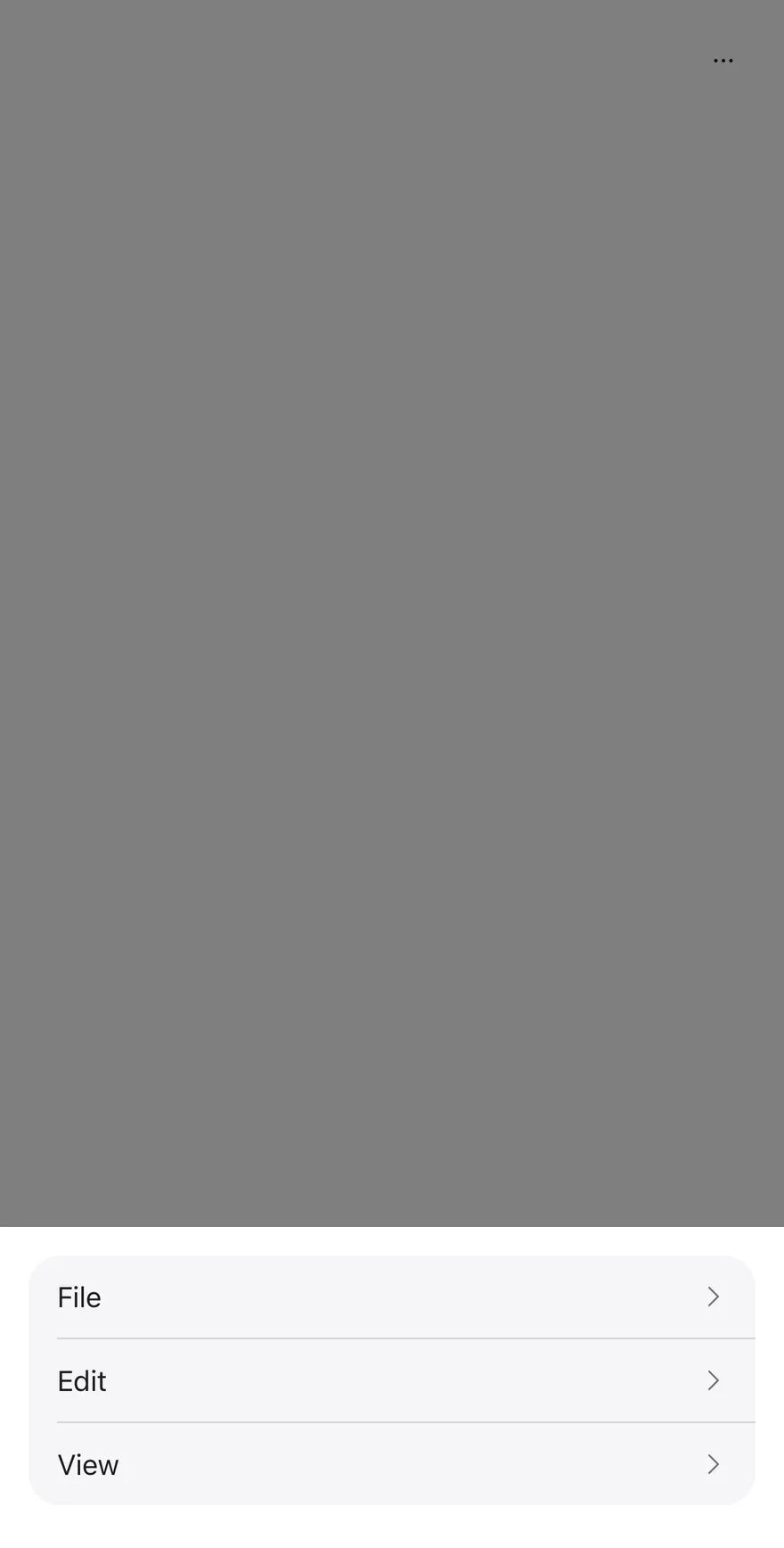
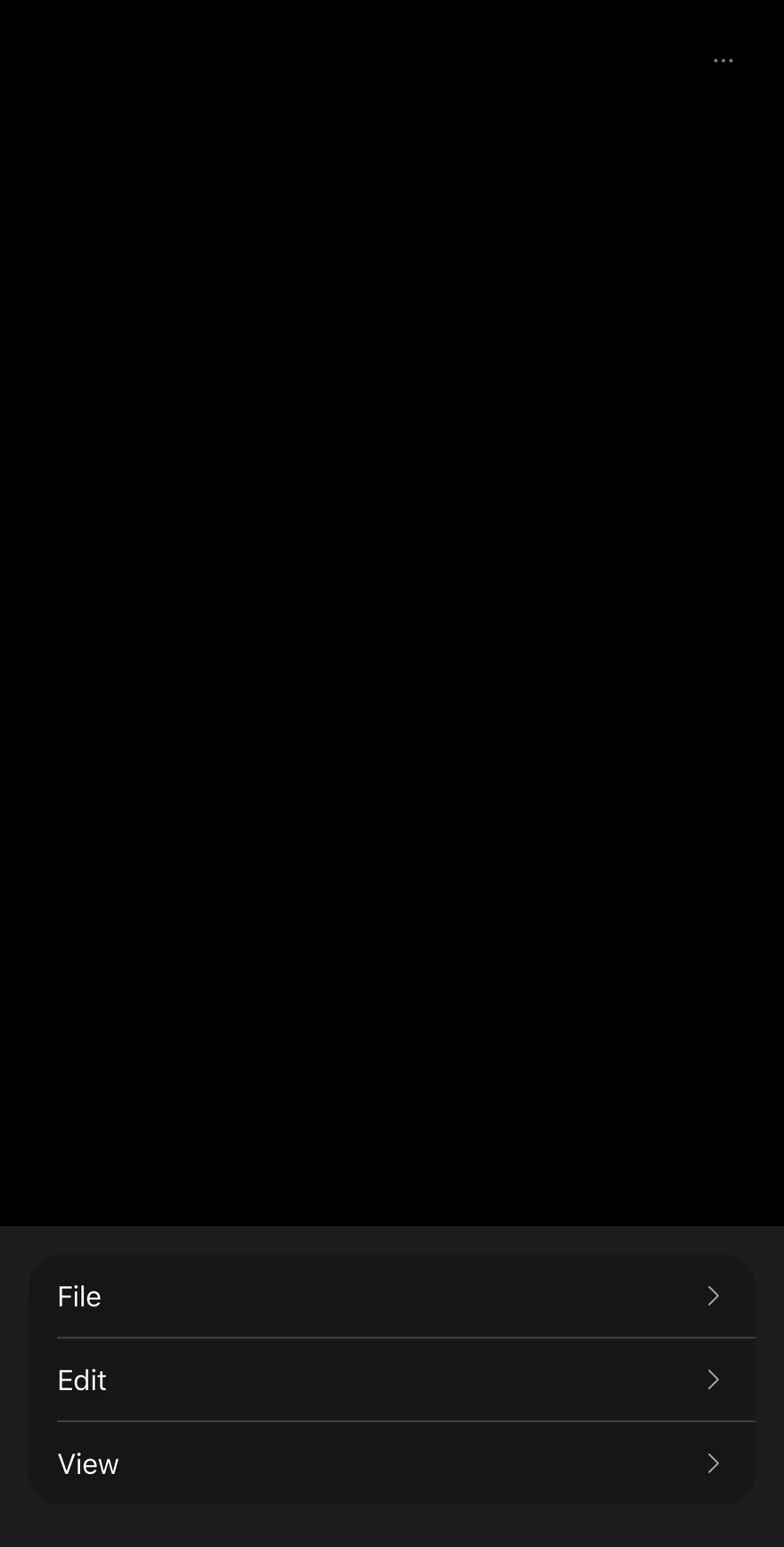
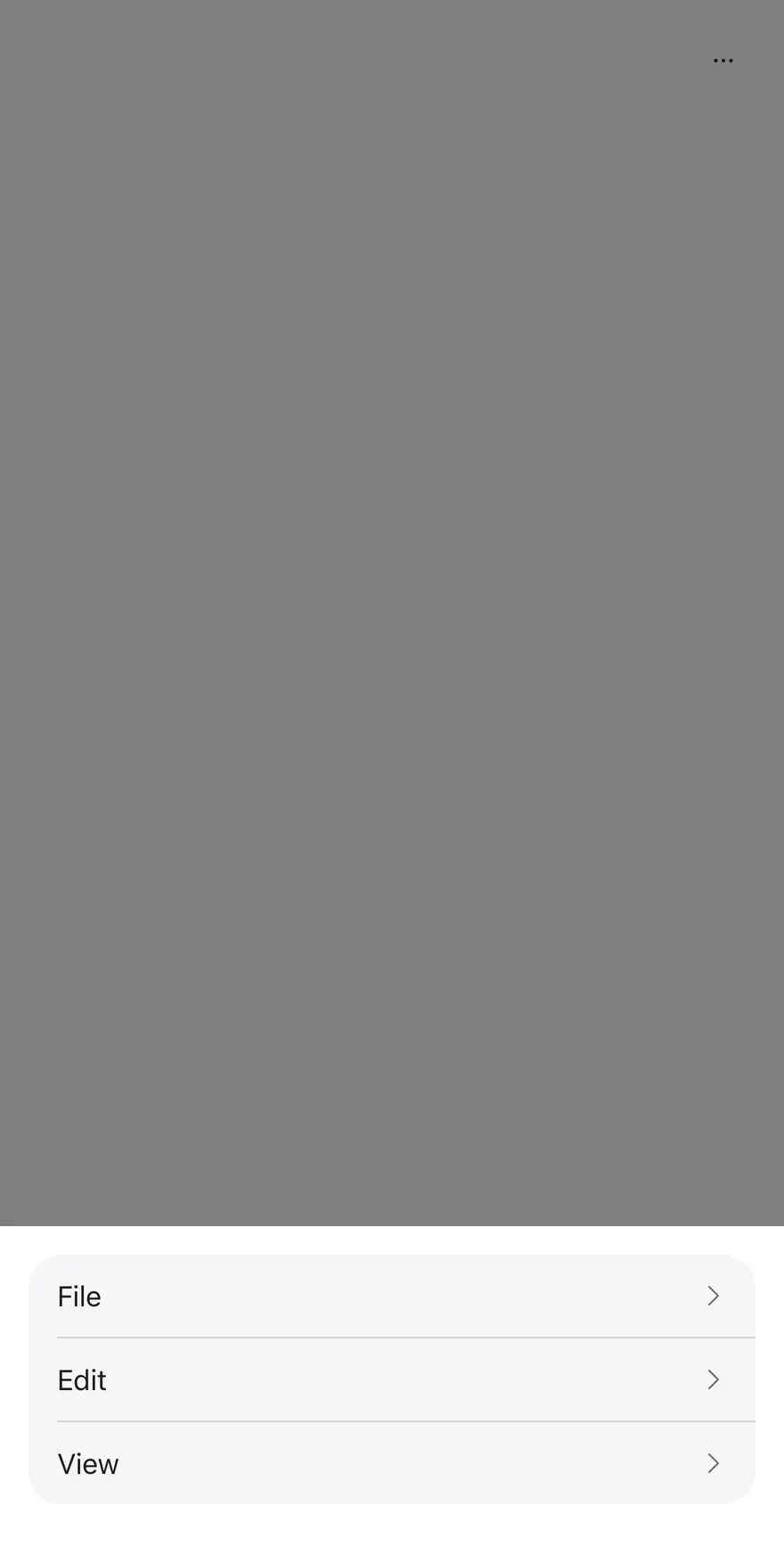
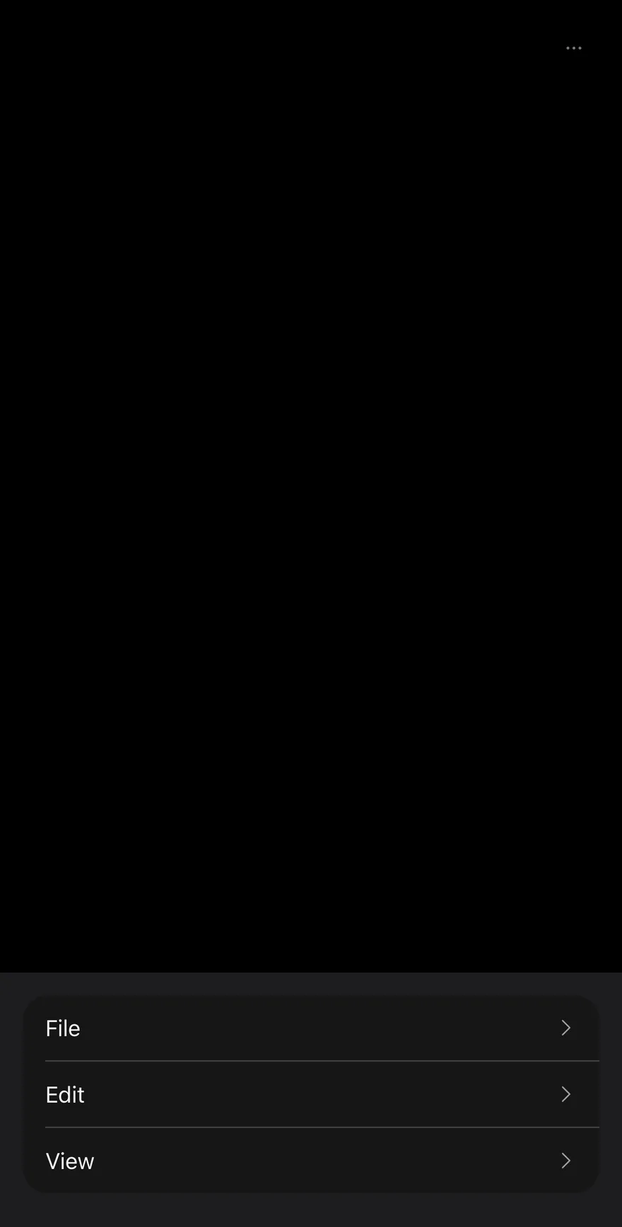
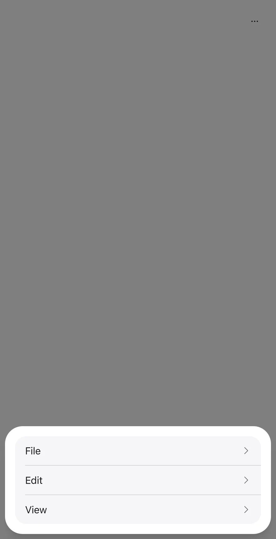
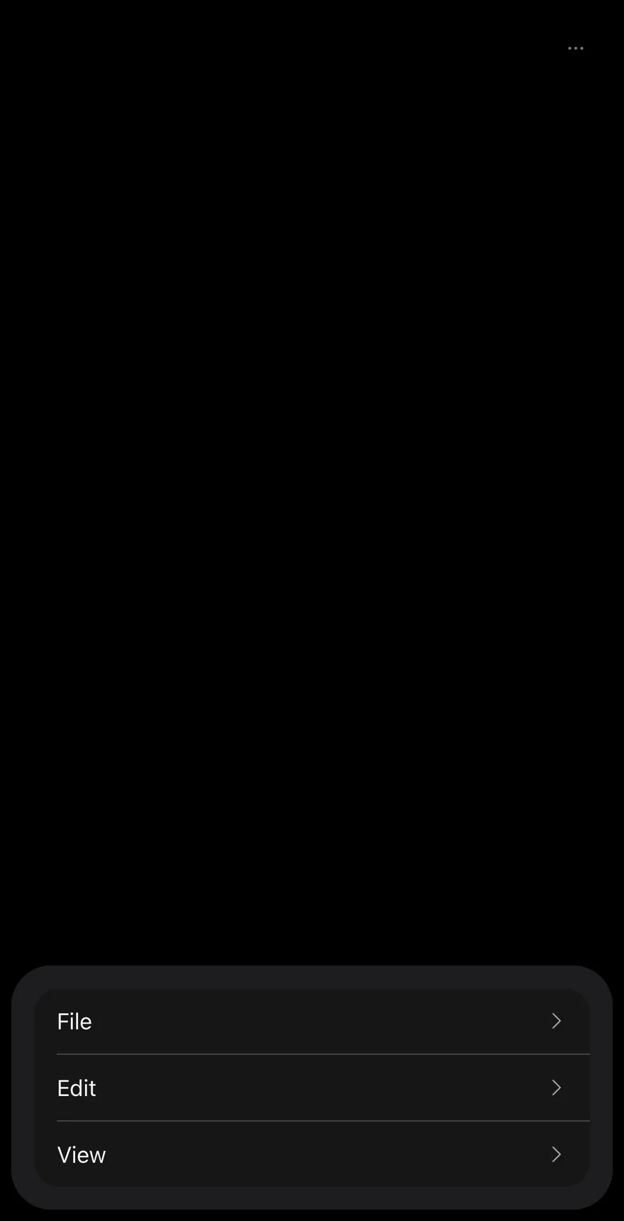
Below the 48rem breakpoint (useIsMobile), the bar collapses into a ghost icon Button that opens a Drawer. The drawer lists every menu's trigger as a row; choosing a row closes the drawer and opens that menu's items in an AlertSheet, with a Cancel button appended. Use it for toolbar-style command groups, such as File, Edit and View, that need to fit on small screens.
Installation
CLI
Works in any project with a components.json. See Installation for the one-line registry setup. Or use the suiss/ui CLI:
Manual
- Install the dependencies and add the
cnhelper:
-
Add the pieces it builds on: Alert Sheet, Button, Drawer, Menubar,
use-mobile. -
Copy the source into
components/patterns/action-bar.tsx:
- Update the import paths to match your project.
Usage
Each child of ActionBar should be an ActionBarMenu containing one ActionBarTrigger and one ActionBarContent; the bar uses the child index to pair the mobile row with its sheet. open, defaultOpen and onOpenChange on ActionBar control the mobile More actions drawer only; on desktop they have no effect. ActionBarMenu accepts its own open, defaultOpen and onOpenChange for an individual menu, which apply on desktop and to the mobile sheet. Use ActionBarShortcut with mod to prefix the platform modifier key.
Examples
With icons
Places an icon before each item in the Edit menu, including a destructive Delete item.
By default
Opens the File menu on first render using defaultOpen on the bar and the menu.
Not dismissible
Sets dismissible to false so mobile sheets close only through an action or Cancel.
Custom labels
Renames the mobile More actions button and the sheet's Cancel button with moreLabel and cancelLabel.
Floating
Detaches the mobile More actions drawer from the screen edges with floating.
API Reference
ActionBar
The root that renders a Menubar on desktop and a More actions button with a Drawer on mobile.
| Prop | Type | Default | Description |
|---|---|---|---|
open | boolean | - | Controls whether the mobile More actions drawer is open. |
defaultOpen | boolean | false | Whether the mobile More actions drawer starts open when uncontrolled. |
onOpenChange | (open: boolean) => void | - | Called when the mobile More actions drawer opens or closes. |
dismissible | boolean | true | When true, mobile sheets close on an outside press; when false, they use an alert dialog that closes only through an action or Cancel. |
floating | boolean | - | Insets the mobile drawer from the screen edges with fully rounded corners. |
moreLabel | string | "More actions" | Accessible label of the mobile More actions button and title of its drawer. |
cancelLabel | string | "Cancel" | Text of the Cancel button appended to each mobile sheet. |
Also accepts the props of React.ComponentProps<"div">.
ActionBarMenu
One menu in the bar; a MenubarMenu on desktop and an AlertSheet on mobile.
| Prop | Type | Default | Description |
|---|---|---|---|
onOpenChange | (open: boolean) => void | - | Called when this menu opens or closes. |
children | React.ReactNode | - | The menu's ActionBarTrigger and ActionBarContent. |
Also accepts the props of React.ComponentProps<typeof MenubarMenu>.
ActionBarTrigger
The menu's button; a menubar trigger on desktop and a drawer row with a chevron on mobile.
Also accepts the props of React.ButtonHTMLAttributes<HTMLButtonElement>.
ActionBarContent
The menu's items; a MenubarContent popup on desktop and an AlertSheetContent with a Cancel button on mobile.
Also accepts the props of React.HTMLAttributes<HTMLElement>, React.ComponentProps<typeof MenubarContent>.
ActionBarLabel
A non-interactive heading; a menu label on desktop and the sheet title on mobile.
Also accepts the props of React.HTMLAttributes<HTMLElement>.
ActionBarItem
An actionable entry; a MenubarItem on desktop and an AlertSheetAction on mobile.
| Prop | Type | Default | Description |
|---|---|---|---|
variant | "default" | "destructive" | - | Use destructive to style the item as a destructive action. |
disabled | boolean | - | Prevents the item from being chosen. |
Also accepts the props of React.HTMLAttributes<HTMLElement>.
On the aria base, respond to the item with onAction.
ActionBarSeparator
A divider between item groups, rendered on desktop only.
Also accepts the props of React.HTMLAttributes<HTMLElement>.
ActionBarShortcut
A keyboard shortcut hint aligned to the end of an item, rendered on desktop only.
Also accepts the props of React.ComponentProps<typeof MenubarShortcut>.
Accessibility
- On desktop the bar has the
menubarrole and each trigger and item has themenuitemrole. - Disabled items expose
aria-disabled="true". Escapecloses an open menu and returns focus to its trigger.- On mobile the More actions button is labelled by
moreLabel, and each drawer row hasaria-haspopup="dialog".
Notes
Parts carry data-slot values such as action-bar, action-bar-menu, action-bar-trigger, action-bar-content, action-bar-item, action-bar-more, action-bar-label, action-bar-separator and action-bar-shortcut. ActionBarSeparator and ActionBarShortcut render nothing on mobile.
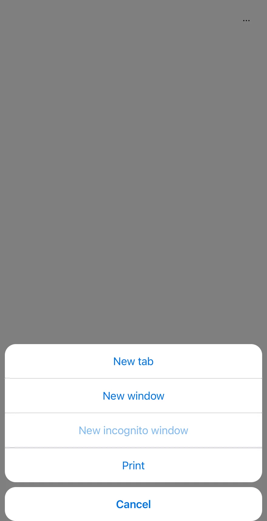
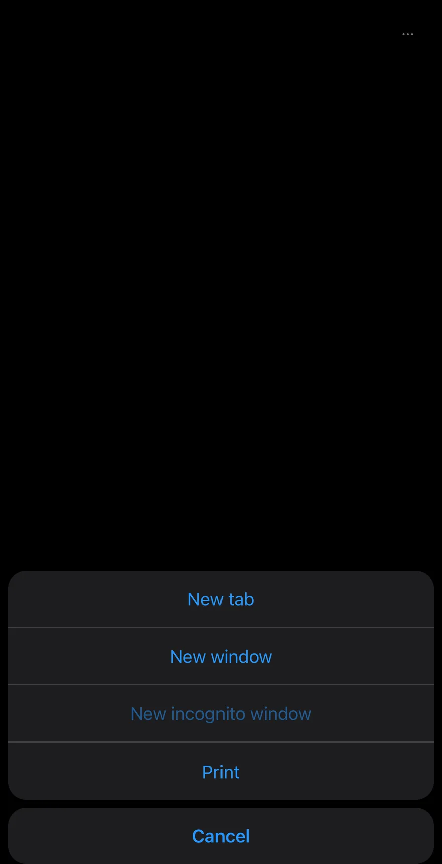
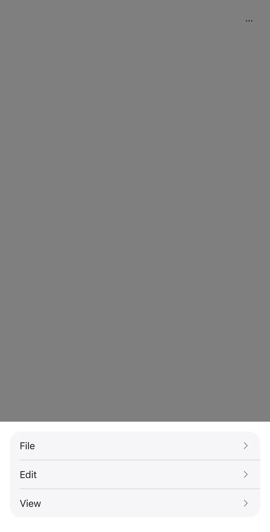
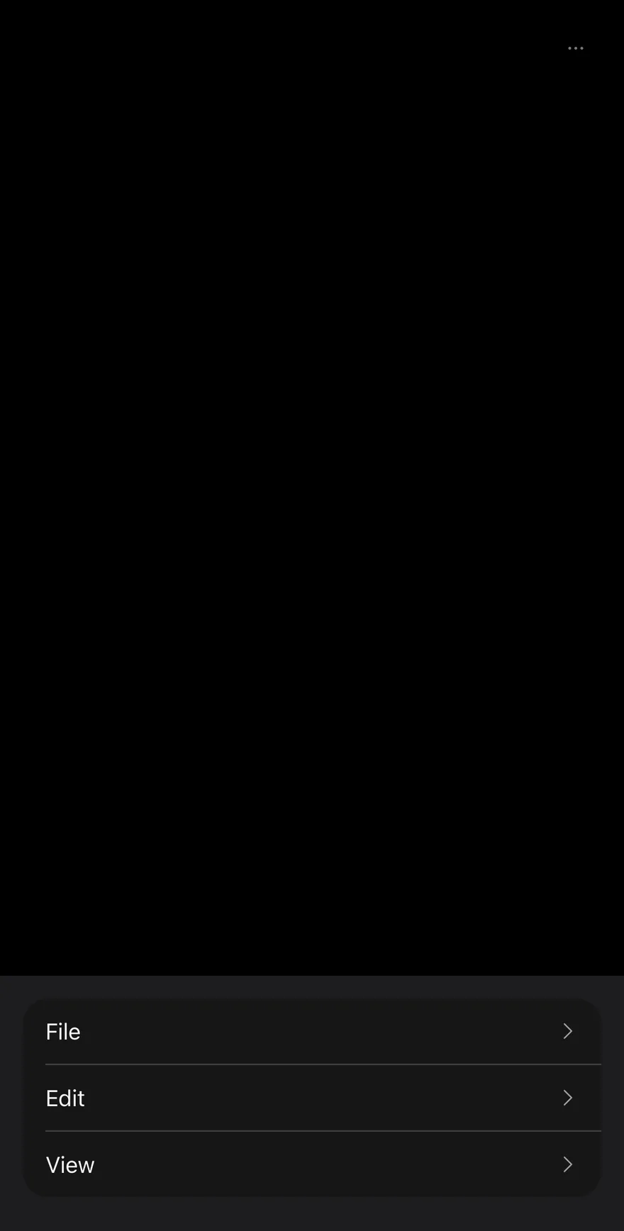
ActionBar groups several ActionBarMenus, such as File, Edit and View, behind one ghost icon Button. Pressing it opens a Drawer that lists each menu's trigger as a row with a chevron.
Choosing a row closes the drawer and opens that menu's items in an AlertSheet, with a Cancel button appended. Use it for toolbar-style command groups that need to fit on a phone screen.
Installation
The CLI also adds what it builds on: Alert Sheet, Button, Drawer, Icon, Text.
Manual
- Install the dependencies:
-
Add the pieces it builds on: Alert Sheet, Button, Drawer, Icon, Text.
-
Copy the source into
components/patterns/action-bar.tsx:
- Update the import paths to match your project.
- Install the dependencies:
-
Add the pieces it builds on: Alert Sheet, Button, Drawer, Icon, Text.
-
Copy the source into
components/patterns/action-bar.tsx:
- Update the import paths to match your project.
- Install the dependencies:
-
Add the pieces it builds on: Alert Sheet, Button, Drawer, Icon, Text.
-
Copy the source into
components/patterns/action-bar.tsx:
- Update the import paths to match your project.
-
Target iOS 17 or later.
-
Add the Swift package to your app:
- Copy the theme files every view uses:
- Copy the source and every file it uses:
- Add the files to your app target.
- Set
minSdkto 24 or higher and add the dependencies:
- Copy the theme files every view uses:
- Copy the source and every file it uses:
- Update the
com.esuiss.uipackage names to match your project.
Usage
Each child of ActionBar should be an ActionBarMenu containing one ActionBarTrigger and one ActionBarContent. The bar renders every child twice, once as a drawer row and once as a sheet, and pairs them by child index.
open, defaultOpen and onOpenChange on ActionBar control the drawer. ActionBarMenu takes its own open, defaultOpen and onOpenChange for its sheet. A string child of ActionBarTrigger is wrapped in Text.
Examples
Default
Overflow
Opens the More actions drawer on first render.
With icons
Places an icon before each item in the Edit menu.
Not dismissible
Sets dismissible to false, so sheets close only through an action or Cancel.
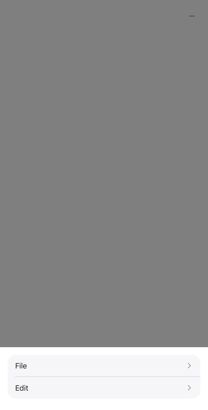
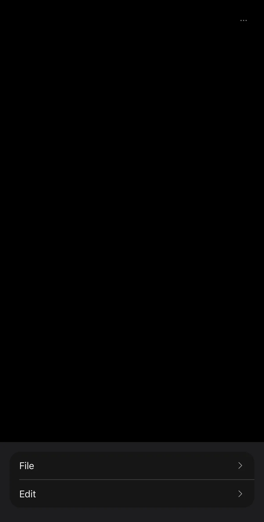
Custom labels
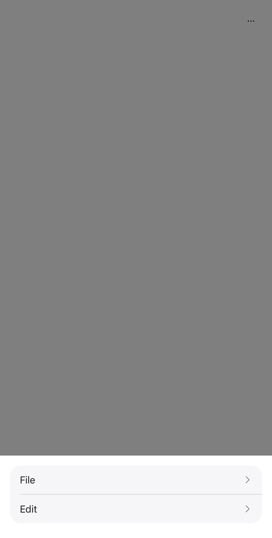
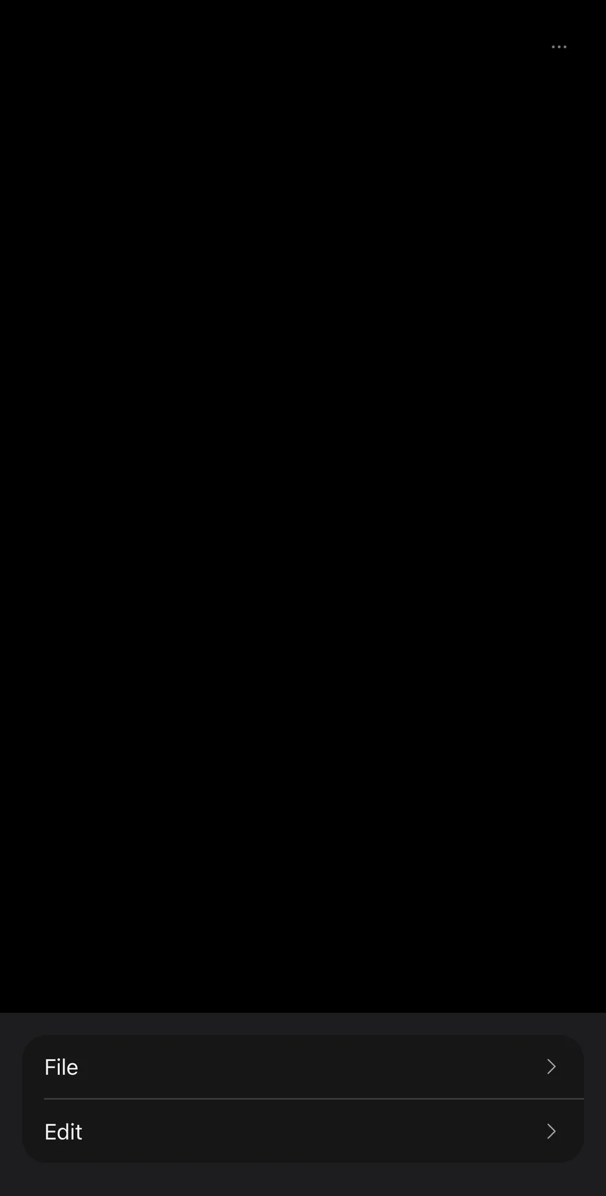
Renames the More actions button and the Cancel button with moreLabel and cancelLabel.
Floating
Detaches the drawer from the screen edges with floating.
API Reference
ActionBar
The root that renders the More actions button, its drawer and each menu's sheet.
| Prop | Type | Default | Description |
|---|---|---|---|
open | boolean | - | Controls whether the More actions drawer is open. |
defaultOpen | boolean | false | Whether the drawer starts open when uncontrolled. |
onOpenChange | (open: boolean) => void | - | Called when the drawer opens or closes. |
dismissible | boolean | true | When false, sheets ignore outside presses and close only through an action or Cancel. Defaults to true. |
floating | boolean | - | Insets the drawer from the screen edges. |
moreLabel | string | "More actions" | Accessibility label of the More actions button and drawer. Defaults to More actions. |
cancelLabel | string | "Cancel" | Text of the Cancel button in each sheet. Defaults to Cancel. |
Also accepts the props of ViewProps.
ActionBarMenu
One menu; a row in the drawer and an AlertSheet for its items.
| Prop | Type | Default | Description |
|---|---|---|---|
open | boolean | - | Controls whether this menu's sheet is open. |
defaultOpen | boolean | - | Opens this menu's sheet on first render. |
onOpenChange | (open: boolean) => void | - | Called when this menu's sheet opens or closes. |
children | React.ReactNode | - |
ActionBarTrigger
The drawer row that opens the menu's sheet, with a trailing chevron.
| Prop | Type | Default | Description |
|---|---|---|---|
children | React.ReactNode | - |
Also accepts the props of React.ComponentProps<typeof Pressable>.
ActionBarContent
The menu's items in an AlertSheetContent, followed by a Cancel button.
Also accepts the props of React.ComponentProps<typeof AlertSheetContent>.
ActionBarLabel
A title shown at the top of the sheet.
Also accepts the props of React.ComponentProps<typeof AlertSheetTitle>.
ActionBarItem
An actionable entry, rendered as an AlertSheetAction.
Also accepts the props of React.ComponentProps<typeof AlertSheetAction>.
ActionBarSeparator
Kept for API parity; renders nothing.
| Prop | Type | Default | Description |
|---|---|---|---|
className | string | - |
Accessibility
- The More actions button and the drawer are labelled by
moreLabel. - Each drawer row has the
buttonrole and exposes its disabled state. - The chevron flips in right-to-left layouts.
Notes
- Rows sit on
bg-mutedwithborder-borderdividers; disabled rows useopacity-50. - Without
floating, the drawer's top corners are square.