suiss/ui · Pattern
Preview
A link preview that shows a hover card on desktop and a drawer on mobile.
Preview is an open-source pattern from suiss/ui for React, React Native, SwiftUI and Jetpack Compose. The @esuiss/ui CLI copies its source into your project, so you own the code.
Preview reveals extra information about a link, such as a profile or page summary, without navigating. On desktop it renders a suiss/ui HoverCard that opens when the trigger is hovered or focused. On mobile (below 48rem, via useIsMobile), where hover is not available, it renders a Drawer with a swipe handle that opens when the trigger is tapped. The drawer floats inset from the screen edges by default.
Use it for supplementary content that people can skip. Keep essential information and actions out of the preview, because the hover card opens only on hover or focus.
Installation
CLI
Works in any project with a components.json. See Installation for the one-line registry setup. Or use the suiss/ui CLI:
Manual
-
Add the
cnhelper. -
Add the pieces it builds on: Drawer, Hover Card,
use-mobile. -
Copy the source into
components/patterns/preview.tsx:
- Update the import paths to match your project.
Usage
- Place
PreviewTriggerandPreviewContentinsidePreview. The parts throw when used outside it. - Open state is uncontrolled by default; use
defaultOpen, oropenwithonOpenChangeto control it. - On desktop the trigger is a link that uses
href; on mobile it is a button that opens the drawer, so the link target is not followed. align,alignOffset,sideandsideOffsetposition the desktop card.showCloseButtonandcloseLabelapply only to the mobile drawer.
Examples
With close button
Adds a close button to the mobile drawer with showCloseButton.
With close label
Uses a Done text button for the mobile close button through closeLabel.
Attached
Sets floating to false so the mobile drawer sits on the screen edges.
API Reference
Preview
The root that chooses HoverCard or Drawer and holds the open state.
| Prop | Type | Default | Description |
|---|---|---|---|
onOpenChange | (open: boolean) => void | - | Called with the new open state when the preview opens or closes. |
floating | boolean | true | Insets the mobile drawer from the screen edges. Has no effect on desktop. |
Also accepts the props of React.ComponentProps<typeof HoverCard>.
PreviewTrigger
The link-styled element that opens the preview.
| Prop | Type | Default | Description |
|---|---|---|---|
href | string | - | The link destination on desktop. Ignored on mobile. |
Also accepts the props of React.HTMLAttributes<HTMLElement>.
PreviewContent
The card or drawer that holds the preview.
| Prop | Type | Default | Description |
|---|---|---|---|
showCloseButton | boolean | - | Shows a close button in the mobile drawer. |
closeLabel | string | - | Text for the mobile close button in place of the icon. |
Also accepts the props of React.HTMLAttributes<HTMLElement>, React.ComponentProps<typeof HoverCardContent>.
Accessibility
- On desktop the trigger is a link; the card opens on hover and on keyboard focus, and closes when the pointer leaves.
- On mobile the trigger is a button that opens the drawer.
- The trigger shows a focus ring when focused with the keyboard.
Notes
Styling hooks: data-slot="preview", preview-trigger and preview-content. On mobile, className on PreviewContent applies to an inner padded wrapper, which adds end padding to clear the close button when it is shown.
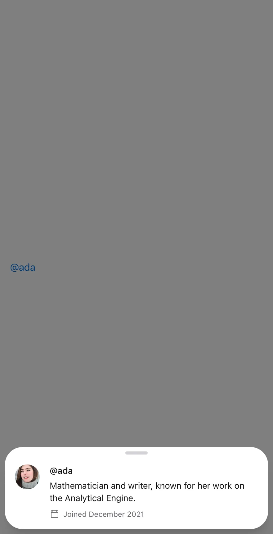

PreviewTrigger renders inline in the primary color and fades when pressed. It opens a Drawer that floats above the screen edges by default and has a swipe handle.
Use it to show a summary of a person, place or item from a mention or link without leaving the screen.
Installation
The CLI also adds what it builds on: Drawer, Text.
Manual
-
Target iOS 17 or later.
-
Add the Swift package to your app:
- Copy the theme files every view uses:
- Copy the source and every file it uses:
- Add the files to your app target.
- Set
minSdkto 24 or higher and add the dependencies:
- Copy the theme files every view uses:
- Copy the source and every file it uses:
- Update the
com.esuiss.uipackage names to match your project.
Usage
Put a PreviewTrigger and a PreviewContent inside Preview. A string or number child of the trigger is wrapped in Text.
The preview can be uncontrolled or controlled with open, defaultOpen and onOpenChange. PreviewContent pads its children and adds end padding when a close button is shown, so content does not sit under it.
Examples
Default


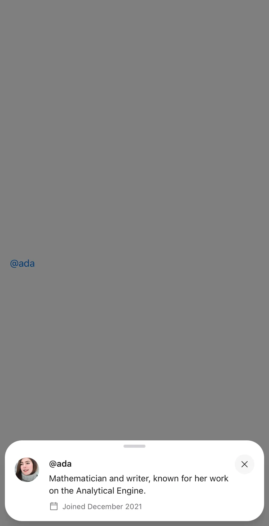
With close button
Shows a close button with showCloseButton.

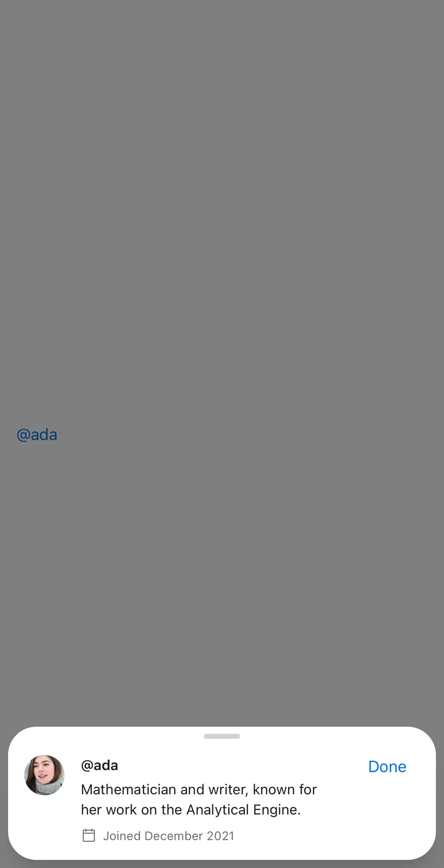
With close label
Labels the close button Done with closeLabel.

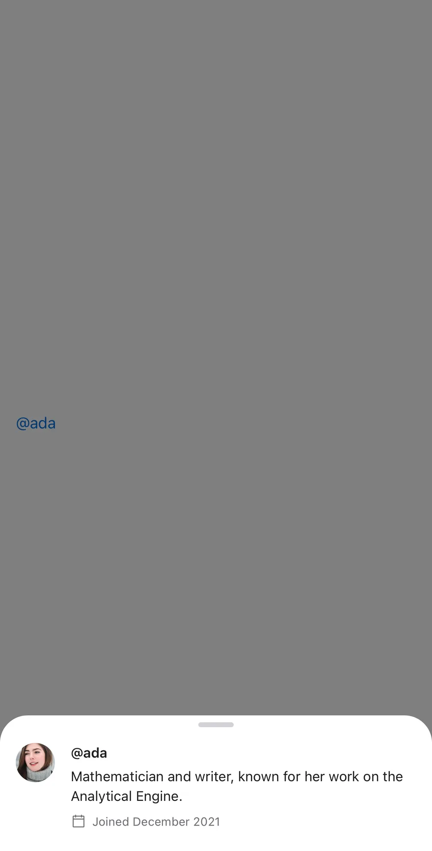
Attached
Sets floating to false so the drawer sits on the screen edges.

API Reference
Preview
The root drawer, floating by default.
| Prop | Type | Default | Description |
|---|---|---|---|
open | boolean | - | Controls whether the preview is open. |
defaultOpen | boolean | - | Whether the preview starts open when uncontrolled. |
onOpenChange | (open: boolean) => void | - | Called when the preview opens or closes. |
floating | boolean | true | Insets the drawer from the screen edges. Defaults to true. |
children | React.ReactNode | - |
PreviewTrigger
The link-styled element that opens the preview.
Also accepts the props of React.ComponentProps<typeof DrawerTrigger>.
PreviewContent
The drawer content with padding for the preview.
| Prop | Type | Default | Description |
|---|---|---|---|
className | string | - |
Also accepts the props of React.ComponentProps<typeof DrawerContent>.
Accessibility
- Give
PreviewContentanaccessibilityLabelthat names what is previewed.
Notes
- The trigger uses the
text-primarycolor.