suiss/ui · Pattern
Search Picker
A searchable single-choice picker that renders a Combobox on desktop and a search drawer on mobile.
Search Picker is an open-source pattern from suiss/ui for React, React Native, SwiftUI and Jetpack Compose. The @esuiss/ui CLI copies its source into your project, so you own the code.
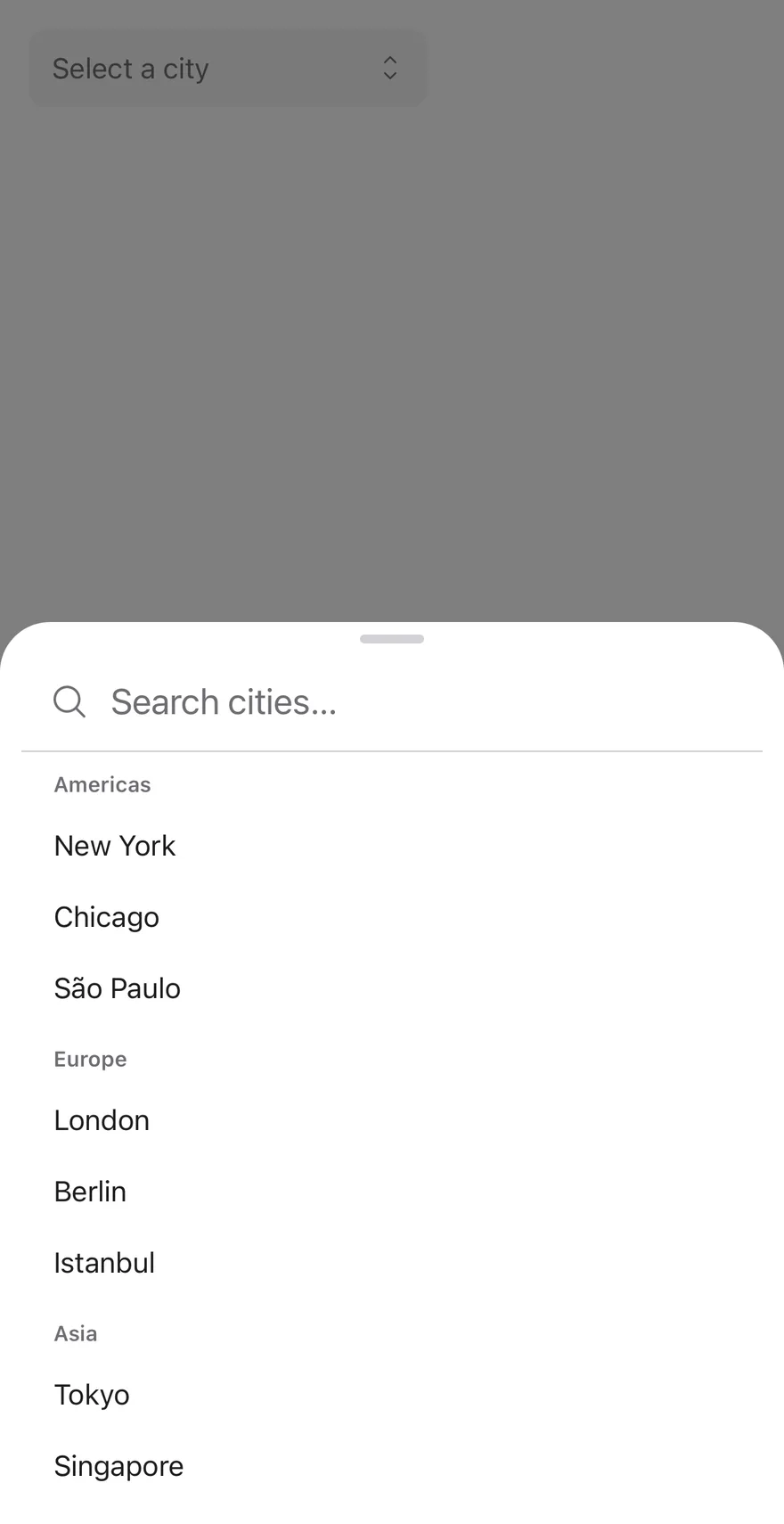
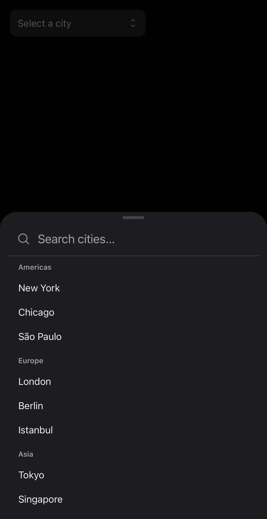
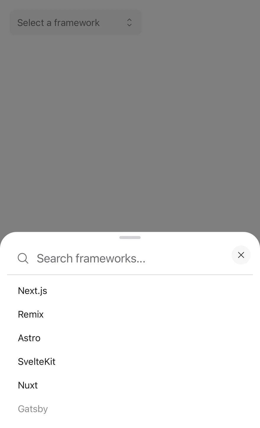
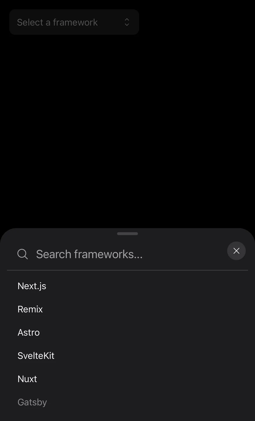
SearchPicker lets the user find and choose one item from a long list. On desktop it renders a suiss/ui Combobox: the field itself is the search input, and the list filters as the user types. On mobile (below 48rem, via useIsMobile) it renders a field-style button that shows the selected label. Tapping it opens a Drawer with a swipe handle and a Command menu whose search input receives focus. Choosing an item closes the drawer.
Items are passed as data. When any item has a group, items are listed under group headings in both presentations. Use it for countries, cities, users and other lists too long to scan; for short lists, use Picker.
Installation
CLI
Works in any project with a components.json. See Installation for the one-line registry setup. Or use the suiss/ui CLI:
Manual
- Install the dependencies and add the
cnhelper:
-
Add the pieces it builds on: Combobox, Command, Drawer,
use-mobile. -
Copy the source into
components/patterns/search-picker.tsx:
- Update the import paths to match your project.
Usage
- Each item in
itemshas avalue, alabel, and an optionalgroupanddisabledflag. TheSearchPickerItemtype is exported. - The value is uncontrolled by default; use
defaultValue, orvaluewithonValueChangeto control it. The value isnullwhen nothing is selected. searchPlaceholder,title,floating,showCloseButtonandcloseLabelaffect only the mobile drawer. On desktop the field showsplaceholder.- Mobile search matches against each item's label.
Examples
With value
Starts with a selected item through defaultValue.
Grouped
Lists cities under group headings and filters across groups.
With title
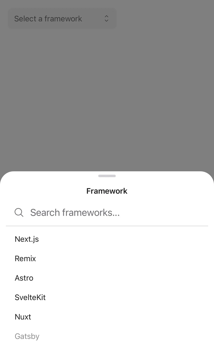
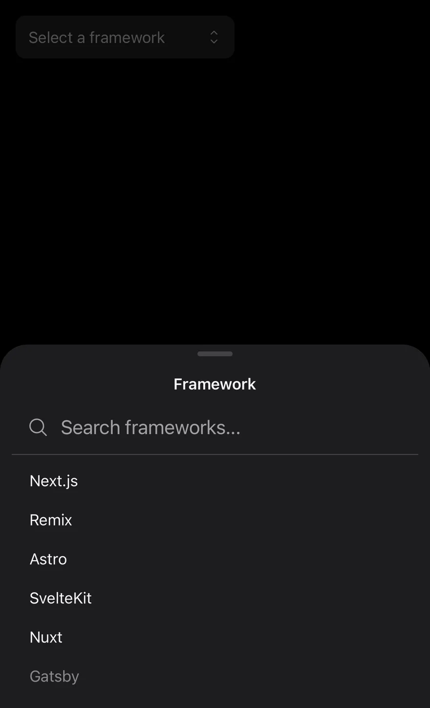
Shows a visible title at the top of the mobile drawer.
With close button
Adds a close button to the mobile drawer.
With close label
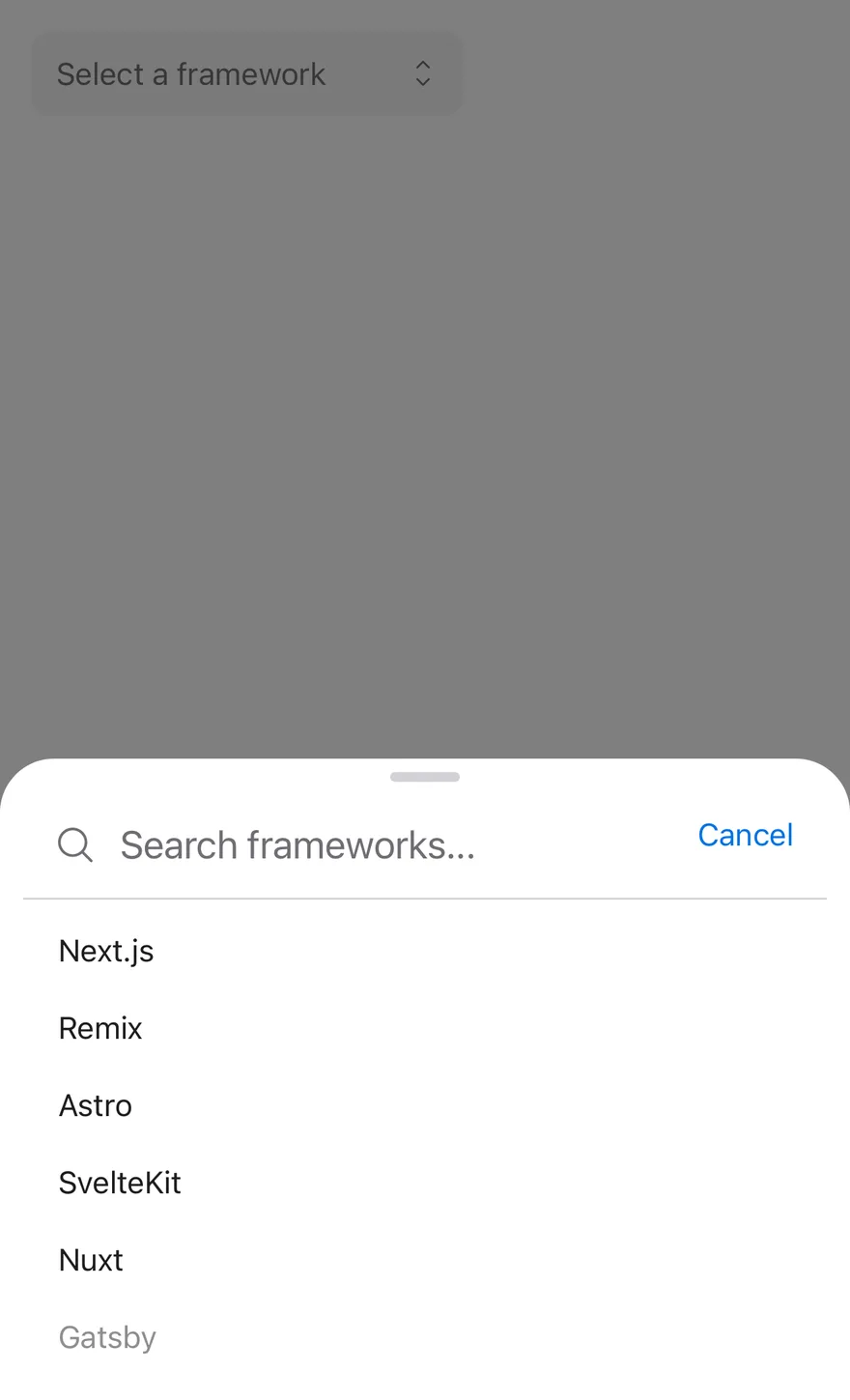
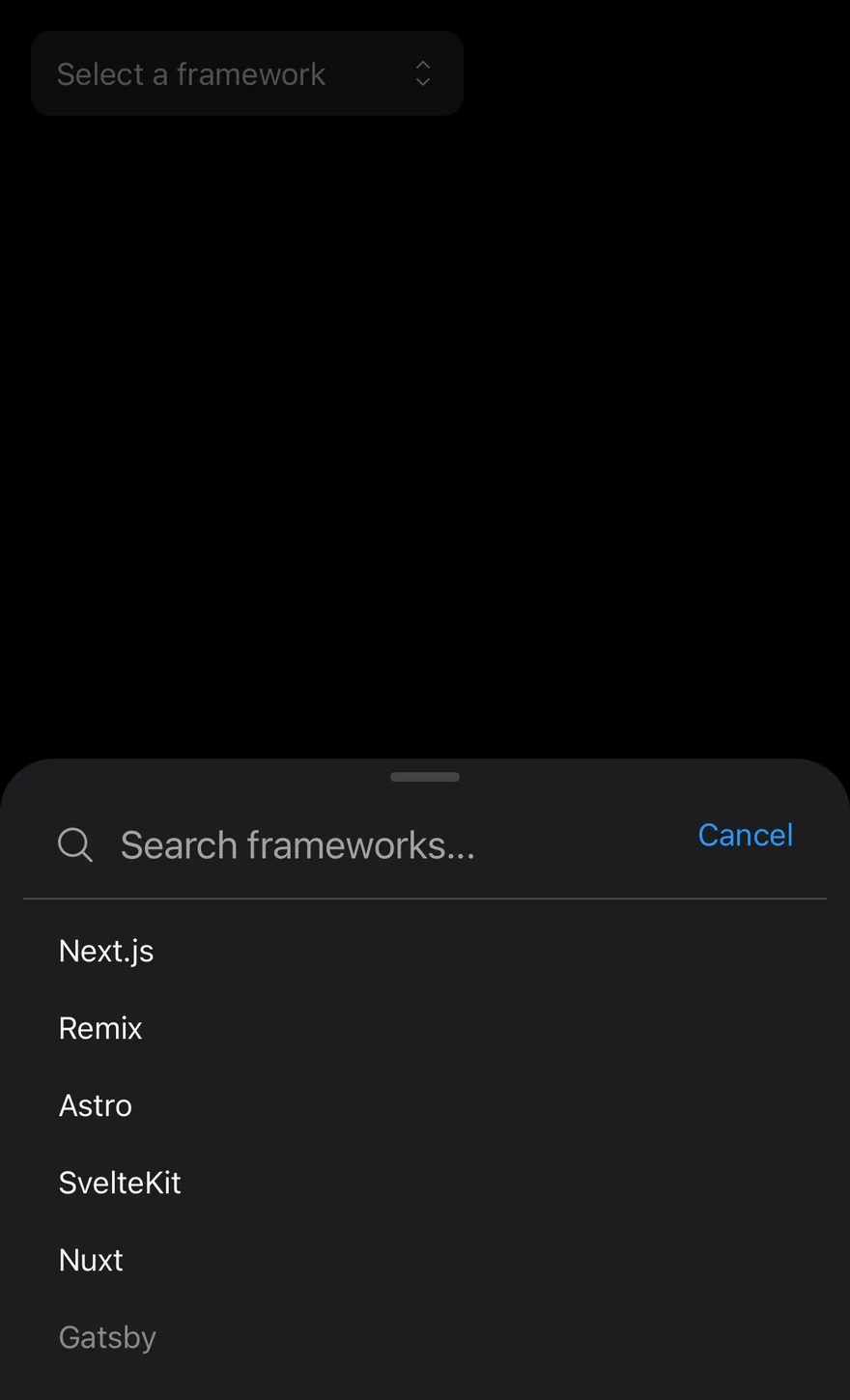
Uses a Cancel text button for the mobile close button.
Disabled
Disables the field.
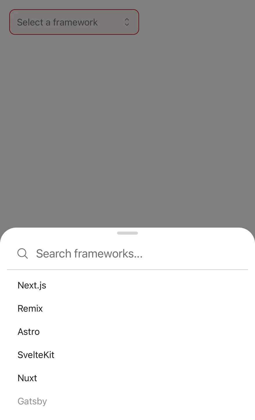
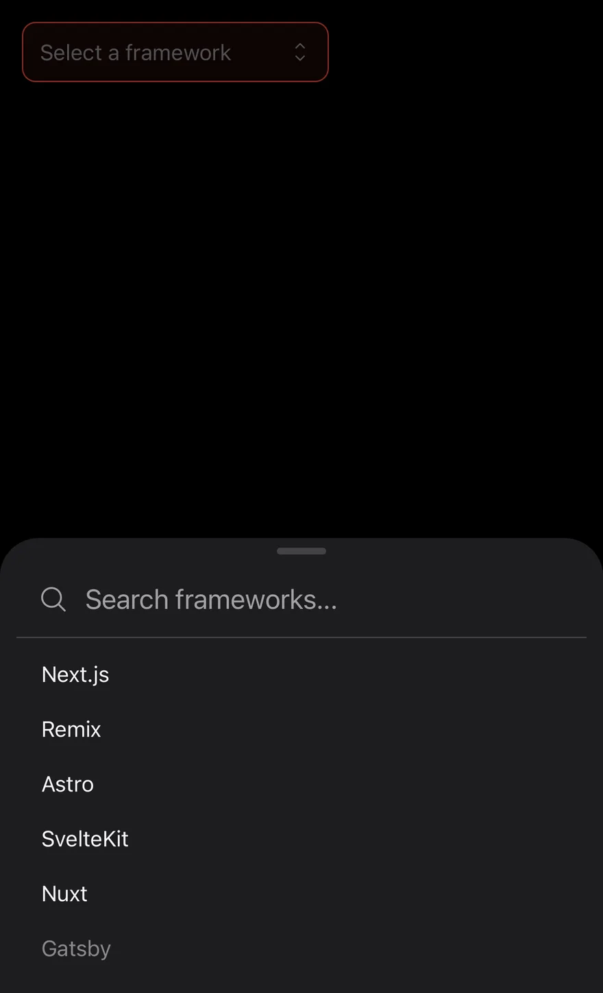
Invalid
Shows the invalid style through aria-invalid.
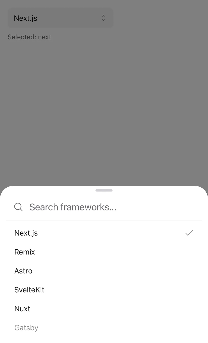
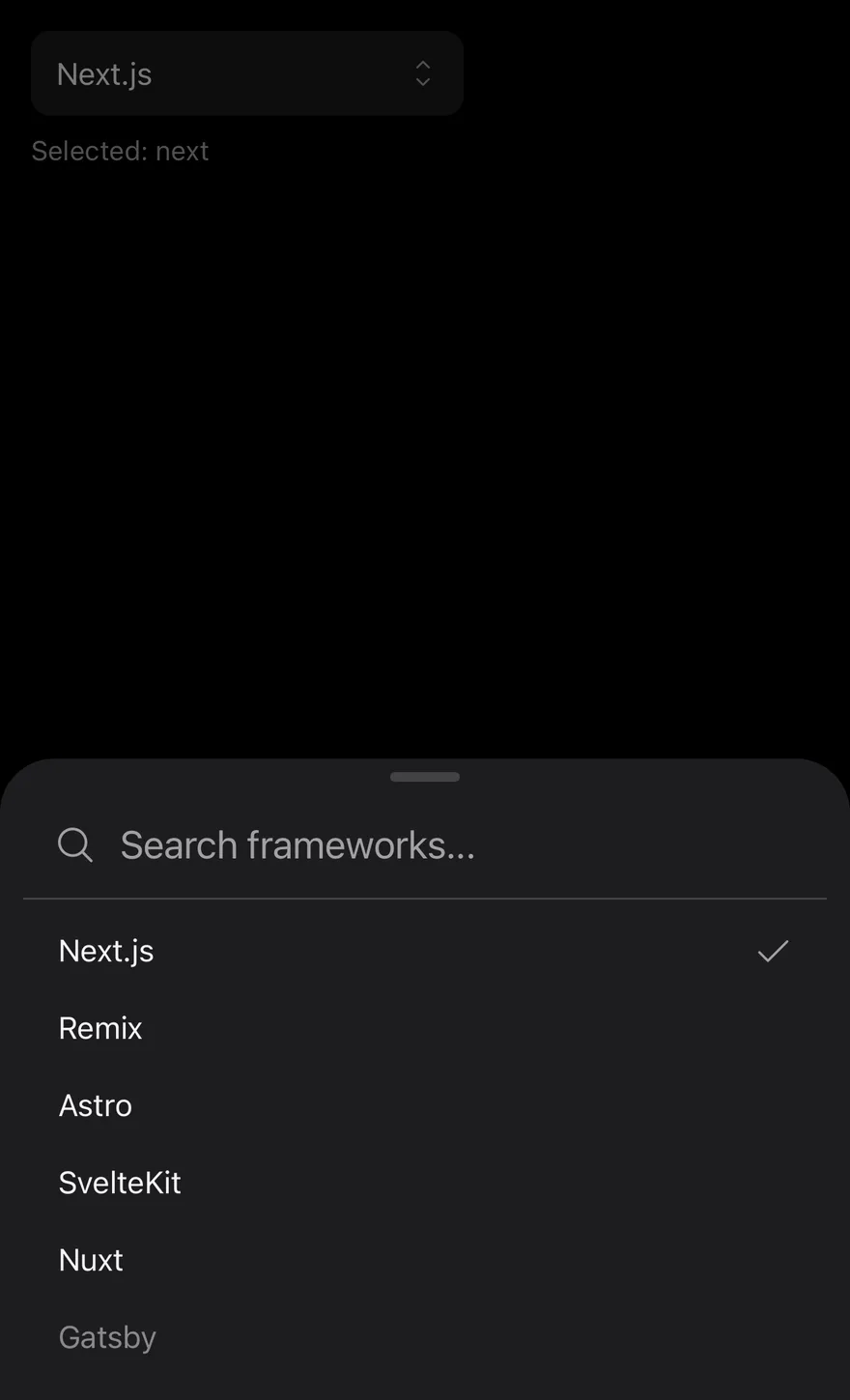
Controlled
Owns the value in state with value and onValueChange.
Floating
Insets the mobile drawer from the screen edges.
API Reference
SearchPicker
The complete searchable picker, rendered from the items array.
| Prop | Type | Default | Description |
|---|---|---|---|
items | SearchPickerItem[] | Required | The items to choose from, each with a value, label, and optional group and disabled. |
value | string | null | - | The selected value when controlled, or null for no selection. |
defaultValue | string | null | - | The initially selected value when uncontrolled. |
onValueChange | (value: string | null) => void | - | Called with the new value, or null, when the selection changes. |
placeholder | string | - | Text shown when nothing is selected. |
searchPlaceholder | string | "Search..." | Placeholder of the search input in the mobile drawer. |
emptyText | string | "No results found." | Text shown when no item matches the search. |
title | string | - | A visible heading for the mobile drawer. When omitted, the drawer title is visually hidden and falls back to placeholder or aria-label. |
disabled | boolean | - | Disables the field. |
floating | boolean | - | Insets the mobile drawer from the screen edges. |
showCloseButton | boolean | false | Shows a close button in the mobile drawer. |
closeLabel | string | - | Text for the mobile close button in place of the icon. |
id | string | - | The ID of the input on desktop or the trigger button on mobile. |
className | string | - | Classes applied to the input on desktop or the trigger button on mobile. |
aria-invalid | boolean | - | Marks the field as invalid and applies the error style. |
aria-label | string | - | The accessible name of the field. |
aria-describedby | string | - | The ID of an element that describes the field. |
Accessibility
- On desktop the field has the
comboboxrole and controls alistbox. The selected option hasaria-selected, disabled options havearia-disabled, and groups are exposed asgroupelements named by their heading. - Escape closes the desktop list.
- On mobile, the drawer is titled by
title,placeholderoraria-label, and focus moves to the search input when it opens.
Notes
Styling hooks: data-slot="search-picker", search-picker-trigger (mobile) and search-picker-content. The mobile trigger has data-placeholder while nothing is selected, and the selected command item has data-checked.
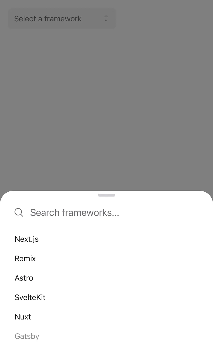
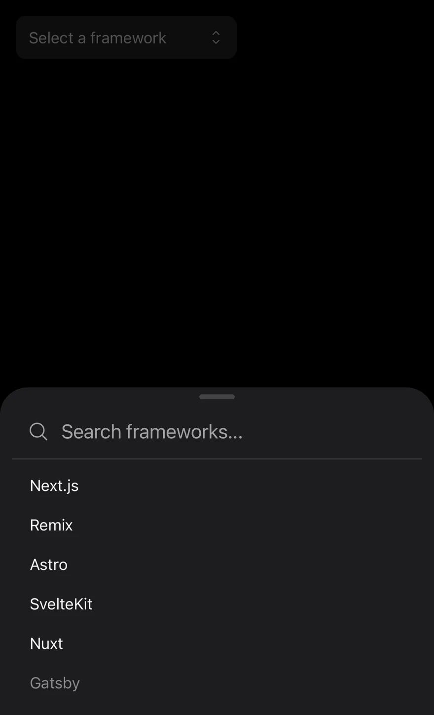
SearchPicker renders a field-style DrawerTrigger with the selected label and an up-down caret. Pressing it opens a Drawer with a search input and a scrollable list of options.
Typing filters options by label, case-insensitively. Options with a group are shown under a group heading. Choosing an option selects it, closes the drawer and clears the search. Use it when the list is too long to scan, such as countries, cities or frameworks.
Installation
The CLI also adds what it builds on: Drawer, Icon, Text.
Manual
-
Target iOS 17 or later.
-
Add the Swift package to your app:
- Copy the theme files every view uses:
- Copy the source and every file it uses:
- Add the files to your app target.
- Set
minSdkto 24 or higher and add the dependencies:
- Copy the theme files every view uses:
- Copy the source and every file it uses:
- Update the
com.esuiss.uipackage names to match your project.
Usage
Pass items as an array of { value, label, group?, disabled? }. The SearchPickerItem type is exported.
Use it uncontrolled with defaultValue, or controlled with value and onValueChange; the value is a string or null. emptyText shows when nothing matches.
Examples
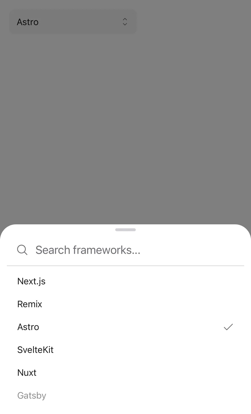
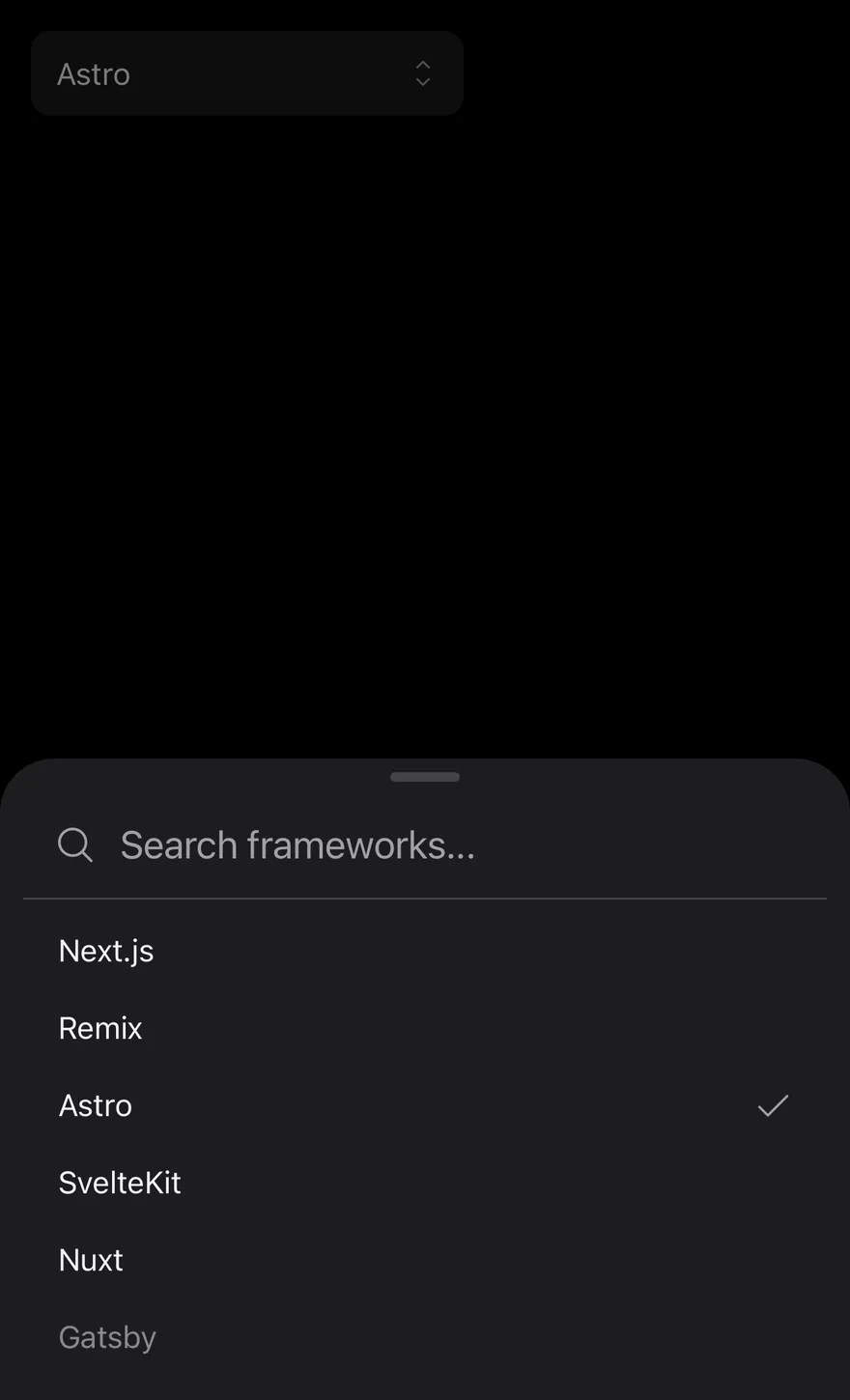
With value
Starts with a preset selection via defaultValue.
Grouped
Cities grouped by country, with custom placeholders.
With title
Adds a heading to the drawer with title.
With close button
Shows a close button in the drawer.
With close label
Labels the close button Cancel with closeLabel.
Disabled
A disabled field that cannot open the drawer.


Invalid
Shows the error border and tint with invalid.
Controlled
Holds the value in state and prints the selection below.
Floating
Detaches the drawer from the screen edges.


API Reference
SearchPicker
| Prop | Type | Default | Description |
|---|---|---|---|
items | SearchPickerItem[] | Required | The options, each with value, label and optional group and disabled. |
value | string | null | - | The selected value when controlled, or null. |
defaultValue | string | null | - | The initial value when uncontrolled. |
onValueChange | (value: string | null) => void | - | Called with the chosen value. |
placeholder | string | - | Text shown in the field when nothing is selected. |
searchPlaceholder | string | "Search..." | Placeholder and label of the search input. Defaults to Search.... |
emptyText | string | "No results found." | Text shown when no option matches. Defaults to No results found.. |
title | string | - | Heading shown at the top of the drawer. |
disabled | boolean | - | Prevents opening and dims the field. |
floating | boolean | - | Insets the drawer from the screen edges. |
showCloseButton | boolean | false | Shows a close button in the drawer. Defaults to false. |
closeLabel | string | - | Label of the close button. |
invalid | boolean | - | Applies the error border and background. |
className | string | - | |
accessibilityLabel | string | - | Label for the field. |
accessibilityLabelledBy | string | - | Links the field to a visible label. |
Accessibility
- Each option is a button that exposes
selectedanddisabledstates. - Each group has the
grouprole and is labelled by its name. - The search input is labelled by
searchPlaceholder. - Without a
title, the drawer is labelled by the placeholder oraccessibilityLabel.
Notes
- The list stays between 40% and 60% of the window height, and taps work while the keyboard is open.
- The field uses
bg-secondary,border-destructivewith abg-destructivetint when invalid, andopacity-50when disabled; the tint is stronger in dark mode. - The search input disables autocorrect and autocapitalization.