suiss/ui · Pattern
Context Actions
Actions for an element that open as a context menu on right click, or an action sheet on long press on mobile.
Context Actions is an open-source pattern from suiss/ui for React, React Native, SwiftUI and Jetpack Compose. The @esuiss/ui CLI copies its source into your project, so you own the code.
ContextActions attaches a set of actions to an area of the page. On desktop it renders a ContextMenu that opens at the pointer on right click. Below the 48rem breakpoint it renders an AlertSheet instead, opened by a 500 ms long press on touch, by the context menu event, or by the ContextMenu key or Shift+F10; the sheet groups the items in a card and appends a Cancel button.
Use it for secondary actions on content such as photos, files or list rows, where actions should stay out of the way until requested.
Installation
CLI
Works in any project with a components.json. See Installation for the one-line registry setup. Or use the suiss/ui CLI:
Manual
- Install the dependencies and add the
cnhelper:
-
Add the pieces it builds on: Alert Sheet, Context Menu,
use-mobile. -
Copy the source into
components/patterns/context-actions.tsx:
- Update the import paths to match your project.
Usage
Wrap the target area in ContextActionsTrigger and list the actions in ContextActionsContent. The open state is internal; use onOpenChange to react to it. A long press is cancelled if the finger moves more than 10 pixels, so scrolling over the trigger does not open the sheet.
Examples
With icons
Places an icon before every action, including a destructive Delete item.
Not dismissible
Sets dismissible to false so the mobile sheet closes only through an action or Cancel.
API Reference
ContextActions
The root that renders a ContextMenu on desktop and an AlertSheet on mobile.
| Prop | Type | Default | Description |
|---|---|---|---|
onOpenChange | (open: boolean) => void | - | Called when the menu or sheet opens or closes. |
dismissible | boolean | true | When true, the mobile sheet closes on an outside press; when false, it uses an alert dialog that closes only through an action or Cancel. |
Also accepts the props of React.ComponentProps<typeof ContextMenu>.
ContextActionsTrigger
The area that opens the actions on right click, or on long press and keyboard on mobile.
Also accepts the props of React.HTMLAttributes<HTMLElement>.
ContextActionsContent
The popup holding the actions; on mobile it adds a Cancel button below them.
| Prop | Type | Default | Description |
|---|---|---|---|
cancelLabel | string | "Cancel" | Text of the Cancel button shown below the actions on mobile. |
Also accepts the props of React.HTMLAttributes<HTMLElement>.
ContextActionsLabel
A non-interactive heading; a menu label on desktop and the sheet title on mobile.
Also accepts the props of React.HTMLAttributes<HTMLElement>.
ContextActionsItem
An actionable entry that closes the actions when chosen.
| Prop | Type | Default | Description |
|---|---|---|---|
variant | "default" | "destructive" | - | Use destructive to style the item as a destructive action. |
disabled | boolean | - | Prevents the item from being chosen. |
Also accepts the props of React.HTMLAttributes<HTMLElement>.
On the aria base, respond to the item with onAction.
ContextActionsSeparator
A divider between groups of items, rendered on desktop only.
Also accepts the props of React.HTMLAttributes<HTMLElement>.
Accessibility
- On desktop the popup has the
menurole and receives focus when opened; arrow keys move betweenmenuitems andEnterruns the focused one. Escapecloses the menu.- On mobile the trigger has
role="button",tabIndex={0}andaria-haspopup="dialog", and opens with theContextMenukey orShift+F10.
Notes
Parts carry data-slot values context-actions, context-actions-trigger, context-actions-content, context-actions-label, context-actions-item and context-actions-separator. On mobile the trigger disables text selection and the iOS touch callout so a long press does not select text.
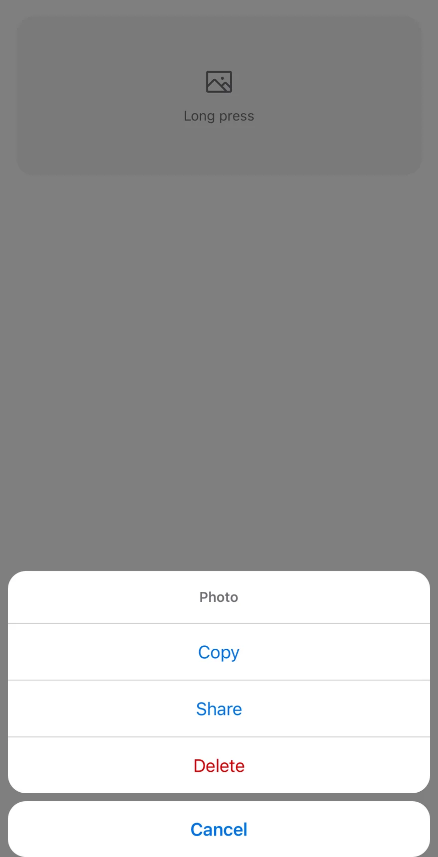
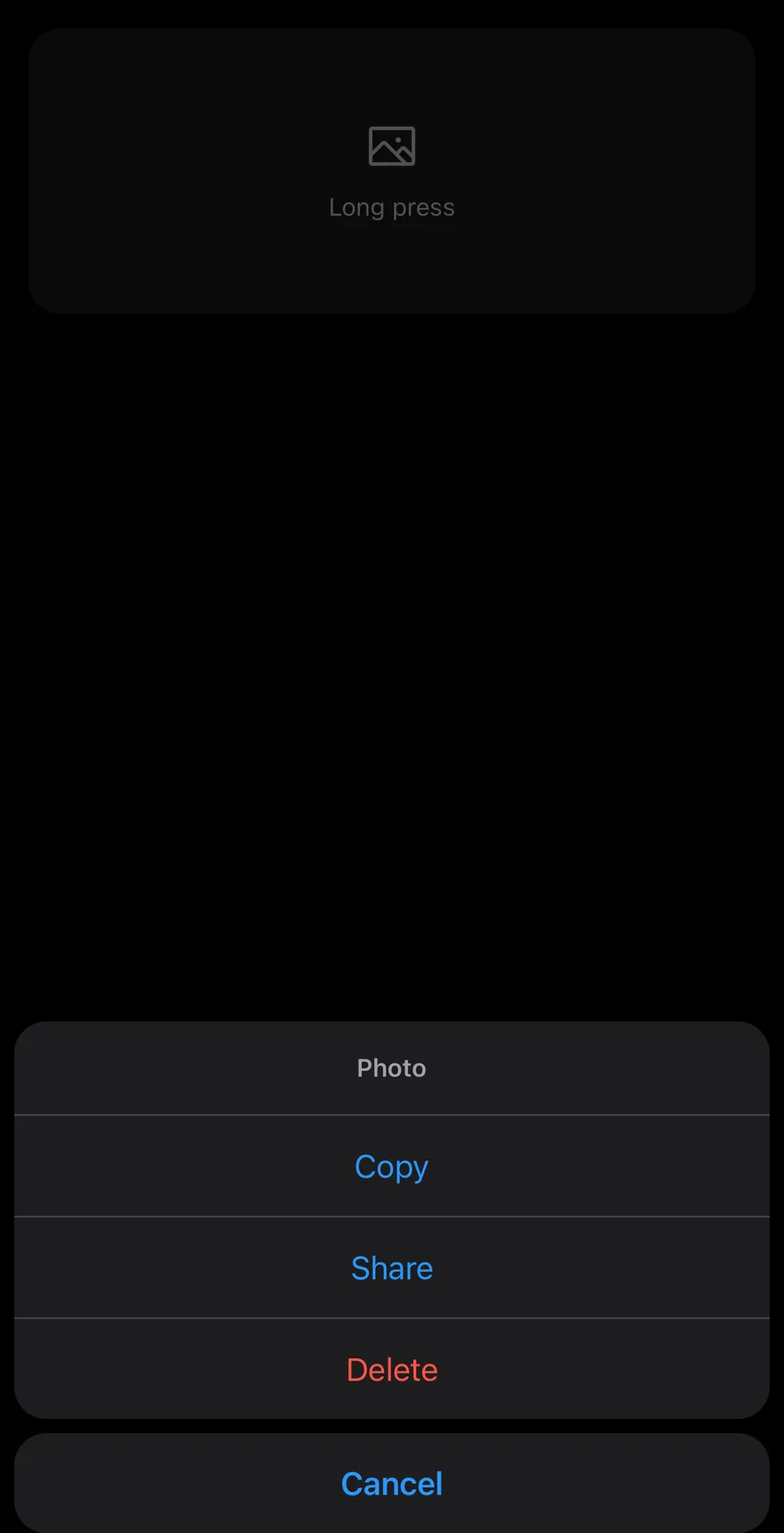
ContextActions turns any content into a long-press target. Holding ContextActionsTrigger for 500 ms opens an AlertSheet with the actions grouped in one block and a separate Cancel button below.
Use it for secondary actions on photos, messages or list rows that should not take up space on screen.
Installation
The CLI also adds what it builds on: Alert Sheet.
Manual
-
Add the pieces it builds on: Alert Sheet.
-
Copy the source into
components/patterns/context-actions.tsx:
- Update the import paths to match your project.
-
Add the pieces it builds on: Alert Sheet.
-
Copy the source into
components/patterns/context-actions.tsx:
- Update the import paths to match your project.
-
Add the pieces it builds on: Alert Sheet.
-
Copy the source into
components/patterns/context-actions.tsx:
- Update the import paths to match your project.
-
Target iOS 17 or later.
-
Add the Swift package to your app:
- Copy the theme files every view uses:
- Copy the source and every file it uses:
- Add the files to your app target.
- Set
minSdkto 24 or higher and add the dependencies:
- Copy the theme files every view uses:
- Copy the source and every file it uses:
- Update the
com.esuiss.uipackage names to match your project.
Usage
Wrap the target in ContextActionsTrigger and list ContextActionsItems in ContextActionsContent. Add a ContextActionsLabel first to show a title.
The open state is managed internally; use onOpenChange to react to it. ContextActionsTrigger accepts every Pressable prop, so onPress still works for a normal tap, and your own onLongPress runs before the sheet opens. Change the hold time with delayLongPress.
Examples
Inline
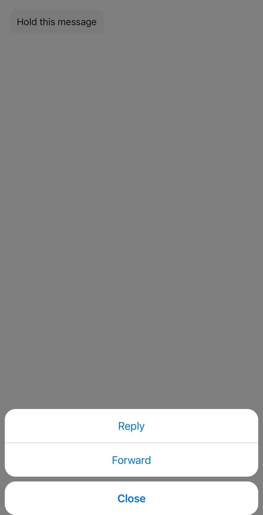
A small message bubble as the trigger, with a custom cancelLabel.

API Reference
ContextActions
The root that owns the open state.
| Prop | Type | Default | Description |
|---|---|---|---|
onOpenChange | (open: boolean) => void | - | Called when the sheet opens or closes. |
dismissible | boolean | true | When false, the sheet ignores outside presses. Defaults to true. |
children | React.ReactNode | - |
ContextActionsTrigger
A Pressable that opens the sheet on long press.
Also accepts the props of React.ComponentProps<typeof Pressable>.
ContextActionsContent
The sheet with the grouped items and a Cancel button.
| Prop | Type | Default | Description |
|---|---|---|---|
cancelLabel | string | "Cancel" | Text of the Cancel button. Defaults to Cancel. |
Also accepts the props of React.ComponentProps<typeof AlertSheetContent>.
ContextActionsLabel
A title shown at the top of the group.
Also accepts the props of React.ComponentProps<typeof AlertSheetTitle>.
ContextActionsItem
An actionable entry, rendered as an AlertSheetAction.
Also accepts the props of React.ComponentProps<typeof AlertSheetAction>.
ContextActionsSeparator
Kept for API parity; renders nothing.
| Prop | Type | Default | Description |
|---|---|---|---|
className | string | - |
Accessibility
- The trigger has the hint "Long press for actions".
- It adds
longpressandshowActions("Show actions") accessibility actions, so screen reader users can open the sheet without holding. - Your own
accessibilityActionsandonAccessibilityActionare kept.
Notes
- Item text uses
text-primary, ortext-destructivefor thedestructivevariant. - On iOS the sheet renders in a full-window overlay so it appears above native screens.