suiss/ui · Interaction
Card Stack
A deck of cards the user swipes left or right one at a time, with buttons, undo and an empty state.
Card Stack is an open-source interaction from suiss/ui for React Native, SwiftUI and Jetpack Compose. The @esuiss/ui CLI copies its source into your project, so you own the code.
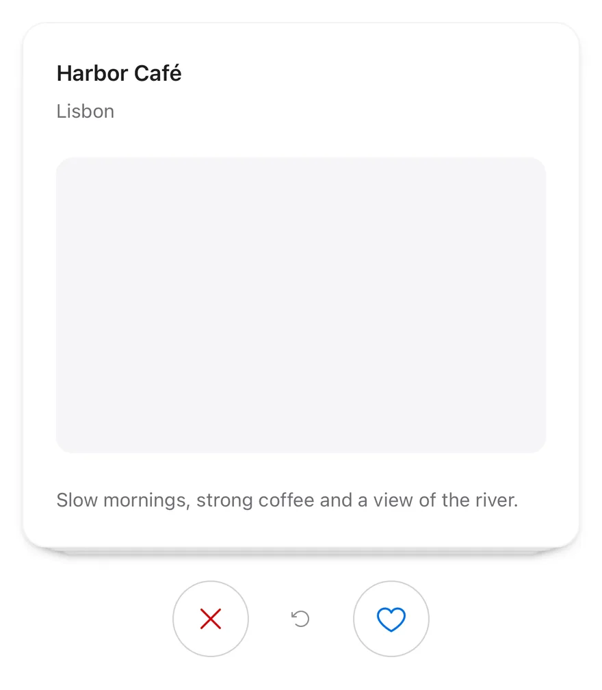
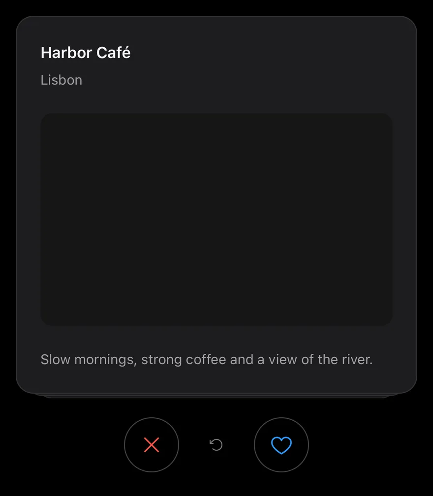
CardStack shows the top card of data with up to visibleCount cards stacked behind it, each slightly smaller and lower. Dragging the top card sideways moves and tilts it, while the cards behind grow into place.
Releasing past threshold, or flicking faster than 800 points per second, flies the card off in that direction and shows the next one; otherwise it springs back. Use it for one-at-a-time decisions such as keep or skip.
Installation
The CLI also adds what it builds on: Button, Icon, Text. On React Native it also adds the animated view components/ui/animated-view.tsx.
Manual
- Install the dependencies:
-
Add the pieces it builds on: Button, Icon, Text, and the primitives
components/primitives/haptics.tsx, and the animated viewcomponents/ui/animated-view.tsxfrom the next step. -
Copy the animated view into
components/ui/animated-view.tsx:
- Copy the source into
components/interactions/card-stack.tsx:
- Update the import paths to match your project.
- Install the dependencies:
-
Add the pieces it builds on: Button, Icon, Text, and the primitives
components/primitives/haptics.tsx, and the animated viewcomponents/ui/animated-view.tsxfrom the next step. -
Copy the animated view into
components/ui/animated-view.tsx:
- Copy the source into
components/interactions/card-stack.tsx:
- Update the import paths to match your project.
- Install the dependencies:
-
Add the pieces it builds on: Button, Icon, Text, and the primitives
components/primitives/haptics.tsx, and the animated viewcomponents/ui/animated-view.tsxfrom the next step. -
Copy the animated view into
components/ui/animated-view.tsx:
- Copy the source into
components/interactions/card-stack.tsx:
- Update the import paths to match your project.
-
Target iOS 17 or later.
-
Add the Swift package to your app:
- Copy the theme files every view uses:
- Copy the source and every file it uses:
- Add the files to your app target.
- Set
minSdkto 24 or higher and add the dependencies:
- Copy the theme files every view uses:
- Copy the source and every file it uses:
- Update the
com.esuiss.uipackage names to match your project.
Usage
Pass data and renderItem, and handle onSwipe(direction, item, index). Add children below the deck: CardStackActions with CardStackSwipeButtons and a CardStackUndo, and a CardStackEmpty shown once every card is swiped.
Undo brings back the last card from the side it left and calls onUndo. useCardStack exposes index, count, remaining, canUndo, swipe and undo for custom controls. The CardStackDirection type is exported.
Examples
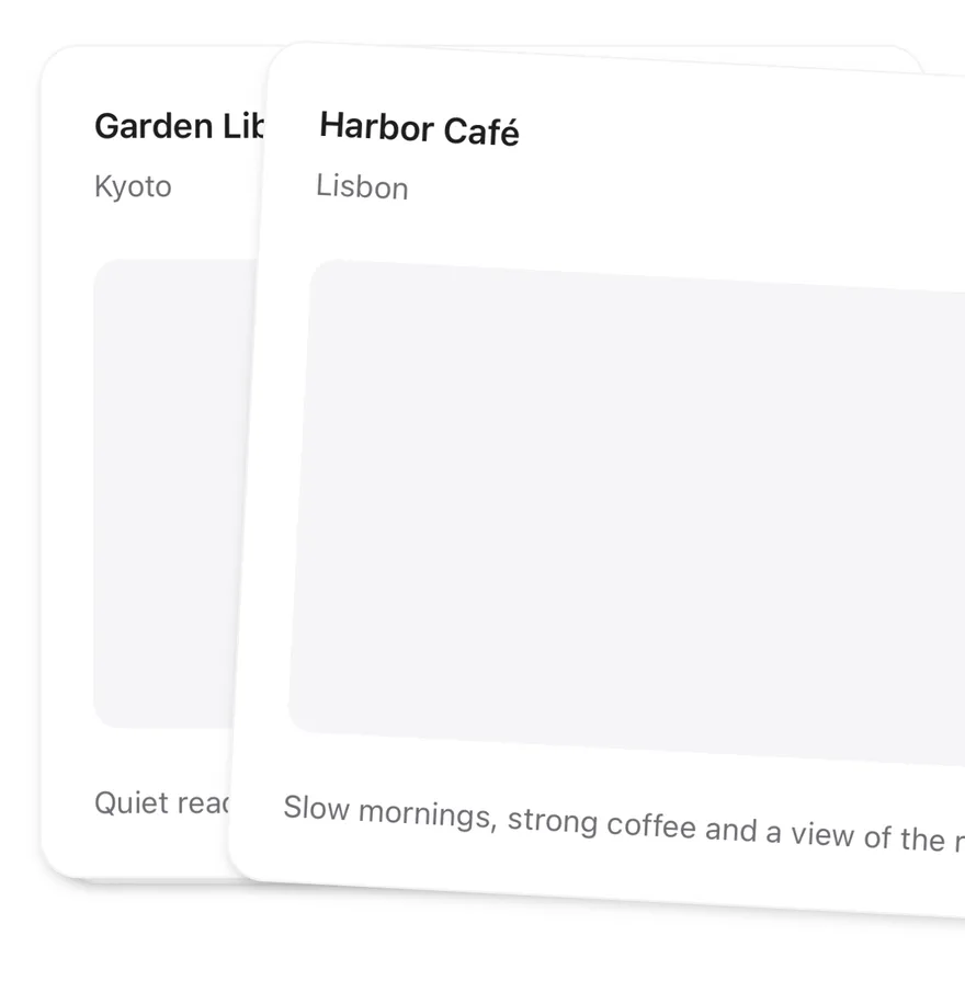
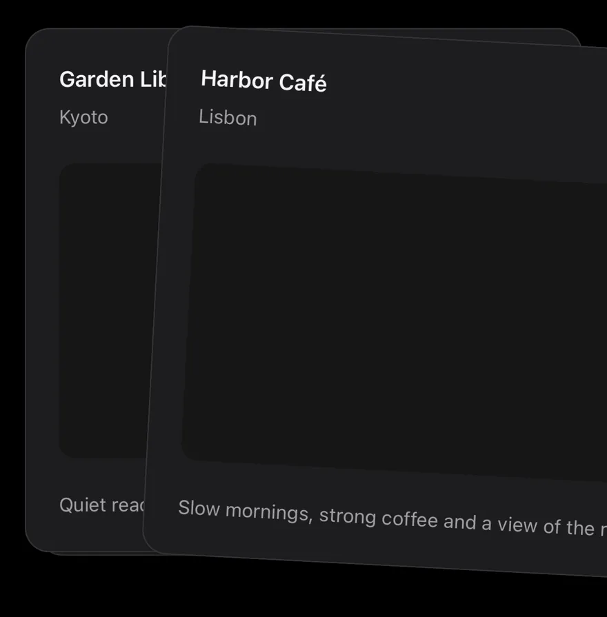
Mid swipe
A static frame of the top card dragged to the right.
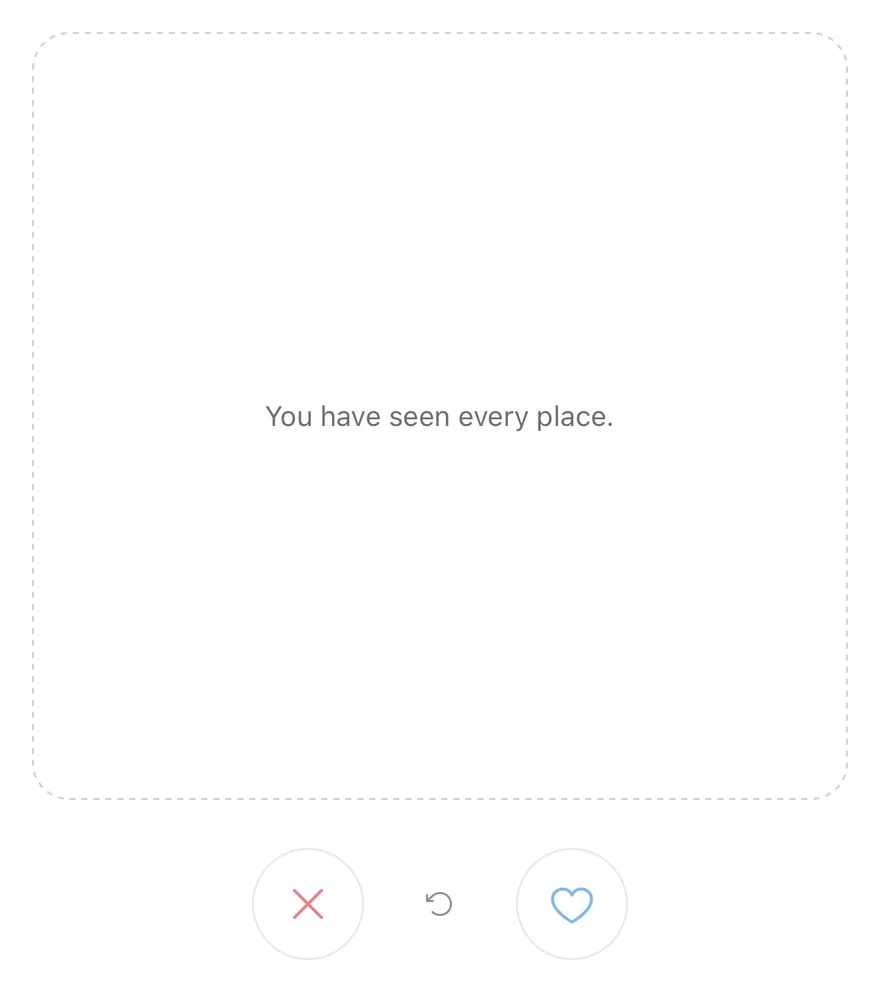
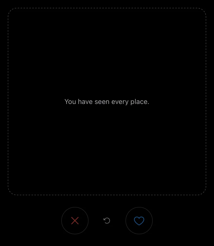
Empty
An empty deck showing CardStackEmpty.
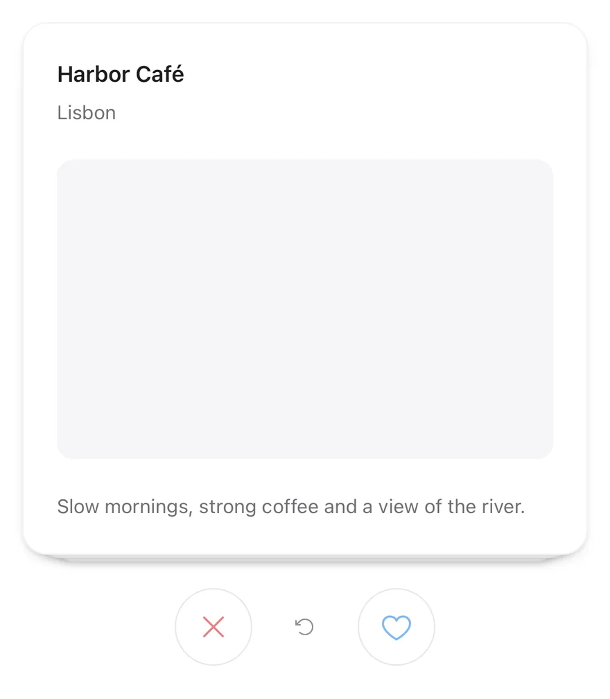
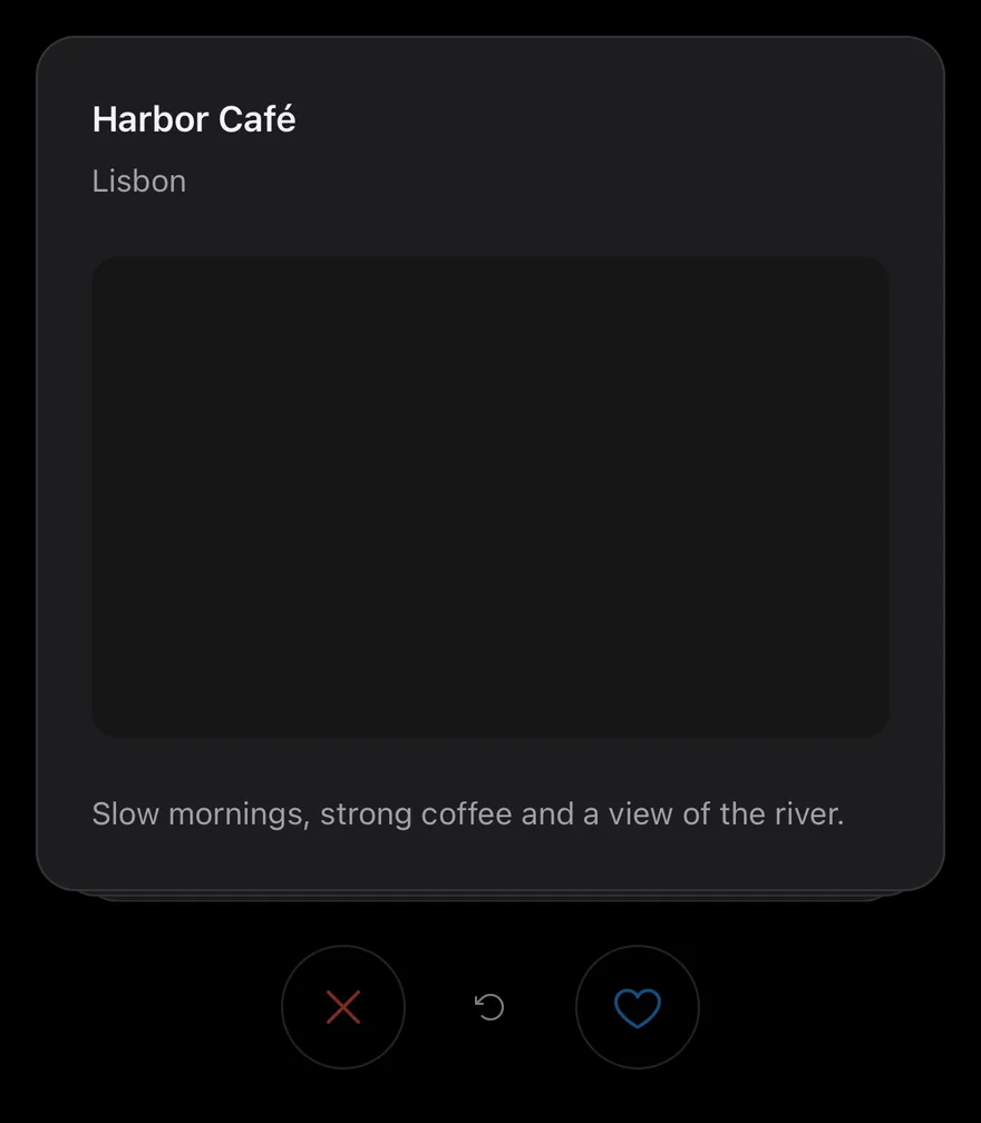
Disabled
Turns off swiping and the buttons with disabled.
API Reference
CardStack
The root that renders the deck and handles the drag gesture.
| Prop | Type | Default | Description |
|---|---|---|---|
data | readonly T[] | Required | The items to show as cards. |
renderItem | (item: T, index: number) => React.ReactNode | Required | Renders one card from the item and its index. |
keyExtractor | (item: T, index: number) => string | - | Returns a key for a card. Defaults to its position. |
onSwipe | (direction: CardStackDirection, item: T, index: number) => void | - | Called with the direction, item and index after a card leaves. |
onUndo | (item: T, index: number) => void | - | Called with the item and index after undo. |
threshold | number | 120 | Drag distance that commits a swipe. Defaults to 120. |
visibleCount | number | 3 | Cards stacked behind the top card. Defaults to 3. |
disabled | boolean | false | Turns off the gesture and the swipe buttons. |
itemAccessibilityLabel | (item: T, index: number) => string | - | Returns the label for the top card. |
deckClassName | string | - | Classes for the deck area, which is h-96 by default. |
Also accepts the props of ViewProps.
CardStackEmpty
A dashed placeholder shown when no cards remain.
Also accepts the props of ViewProps, React.RefAttributes<View>.
CardStackActions
A centered row for the buttons.
Also accepts the props of ViewProps, React.RefAttributes<View>.
CardStackSwipeButton
A round button that swipes the top card left or right.
| Prop | Type | Default | Description |
|---|---|---|---|
direction | CardStackDirection | Required | left shows an X icon, right shows a heart icon. |
Also accepts the props of React.ComponentProps<typeof Button>.
CardStackUndo
A button that restores the last swiped card.
Also accepts the props of React.ComponentProps<typeof Button>.
Accessibility
- The top card has
Swipe leftandSwipe rightaccessibility actions. - Cards behind the top card are hidden from screen readers.
- Swipe buttons are labelled
Swipe leftandSwipe right, and undo is labelledUndo, unless you passaccessibilityLabel.
Notes
- A medium impact haptic plays when a card is swiped by gesture, button or accessibility action, if the app provides an adapter through
HapticsProvider. - Fly-out and spring animations respect the system reduce motion setting.
- The left button icon uses
text-destructive; the right usestext-primary.