suiss/ui · Interaction
Undo Bar
A floating bar that offers to undo the last action for a few seconds before committing it.
Undo Bar is an open-source interaction from suiss/ui for React, React Native, SwiftUI and Jetpack Compose. The @esuiss/ui CLI copies its source into your project, so you own the code.
UndoBarProvider renders a floating bar at the bottom of the screen and provides useUndoBar. Calling show displays a title and an Undo button with a countdown ring. Pressing Undo, or Ctrl+Z or Cmd+Z outside text fields, runs onUndo; when the timer runs out, the bar closes and runs onCommit. Showing a new entry commits the previous one first.
The countdown pauses while the pointer hovers the bar, while it has focus, and while the page is hidden. The Undo button is a suiss/ui Button. Use it to make destructive actions, such as deleting from a list, immediate but reversible.
Installation
CLI
Works in any project with a components.json. See Installation for the one-line registry setup. Or use the suiss/ui CLI:
Manual
-
Add the
cnhelper. -
Add the pieces it builds on: Button.
-
Copy the source into
components/interactions/undo-bar.tsx:
- Update the import paths to match your project.
Usage
- Wrap the app or screen in
UndoBarProviderand callshow({ title, actionLabel, onUndo, onCommit })fromuseUndoBarafter performing the action. - Apply the change optimistically, restore it in
onUndo, and finalize it inonCommit. actionLabeldefaults toUndo.useUndoBaralso returnsundoanddismissto settle the current entry from code.- It pairs well with
SwipeActions, including full swipes.
Examples
Longer timeout
A timeout of 10 seconds keeps the bar on screen longer before committing.
With swipe actions
Notes deleted from swipe actions, including a full swipe, can be restored from the bar.
API Reference
UndoBarProvider
Provides useUndoBar and renders the floating undo bar.
| Prop | Type | Default | Description |
|---|---|---|---|
timeout | number | 5000 | Milliseconds the bar stays visible before committing. |
className | string | - | Classes for the fixed region that positions the bar. |
children | React.ReactNode | - | The content that can show undo entries. |
Accessibility
- The bar sits in a polite live region, so its title is announced when it appears.
- The bar has
role="group"and is labelled by its title. Ctrl+ZorCmd+Ztriggers undo while the bar is visible, except when focus is in an editable field.- The countdown pauses while the bar has keyboard focus, giving people time to reach the button.
Notes
- Parts use
data-slotvaluesundo-bar-region,undo-bar,undo-bar-title, andundo-bar-action. The bar setsdata-pausedwhile the countdown is paused anddata-closedwhile closing. - The bar is fixed to the bottom of the viewport above the safe-area inset.
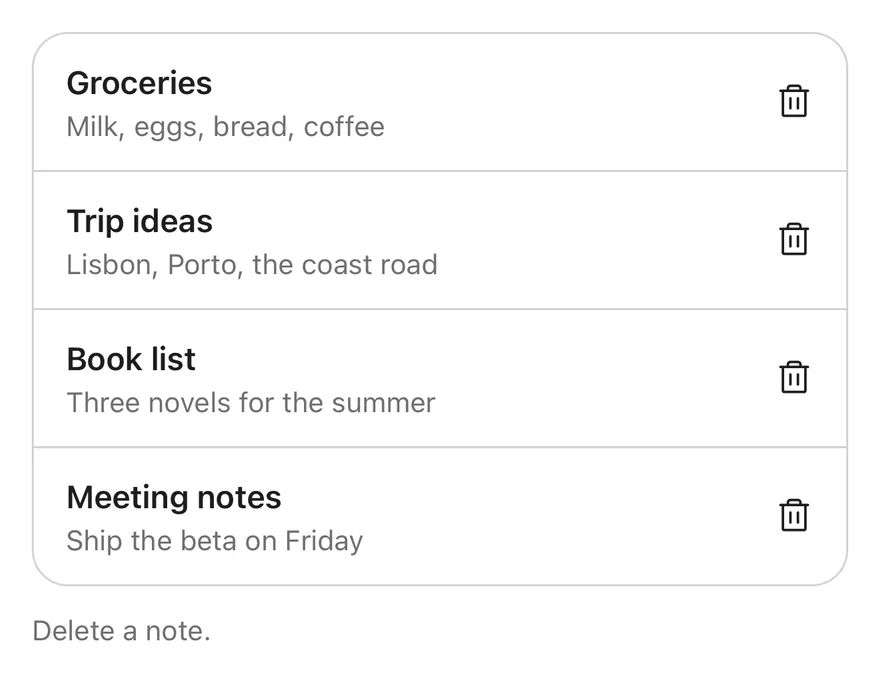
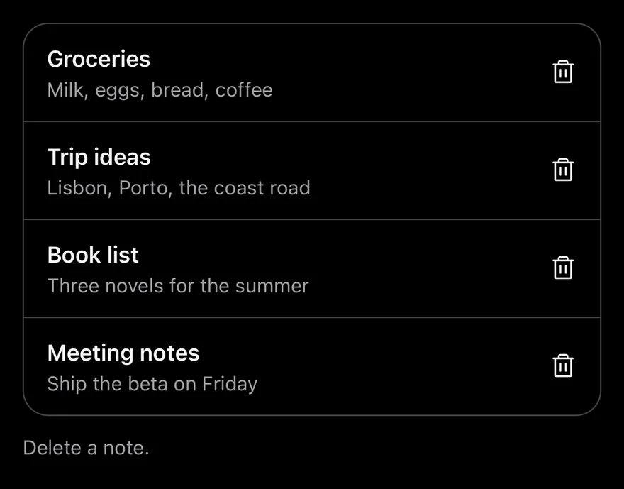
UndoBarProvider shows a pill-shaped bar above the bottom safe area when show is called from useUndoBar. It holds a message, a countdown ring and an Undo button, and slides up into view.
If the user presses Undo, onUndo runs. If the countdown runs out, onCommit runs. Only one bar shows at a time: calling show again commits the previous action first. The countdown pauses while the app is in the background and resumes with the time left. Use it after deleting, archiving or moving items.
Installation
The CLI also adds what it builds on: Button, Text. On React Native it also adds the animated view components/ui/animated-view.tsx.
Manual
- Install the dependencies:
-
Add the pieces it builds on: Button, Text, and the primitives
components/primitives/portal.tsx, and the animated viewcomponents/ui/animated-view.tsxfrom the next step. -
Copy the animated view into
components/ui/animated-view.tsx:
- Copy the source into
components/interactions/undo-bar.tsx:
- Update the import paths to match your project.
- Install the dependencies:
-
Add the pieces it builds on: Button, Text, and the primitives
components/primitives/portal.tsx, and the animated viewcomponents/ui/animated-view.tsxfrom the next step. -
Copy the animated view into
components/ui/animated-view.tsx:
- Copy the source into
components/interactions/undo-bar.tsx:
- Update the import paths to match your project.
- Install the dependencies:
-
Add the pieces it builds on: Button, Text, and the primitives
components/primitives/portal.tsx, and the animated viewcomponents/ui/animated-view.tsxfrom the next step. -
Copy the animated view into
components/ui/animated-view.tsx:
- Copy the source into
components/interactions/undo-bar.tsx:
- Update the import paths to match your project.
-
Target iOS 17 or later.
-
Add the Swift package to your app:
- Copy the theme files every view uses:
- Copy the source and every file it uses:
- Add the files to your app target.
- Set
minSdkto 24 or higher and add the dependencies:
- Copy the theme files every view uses:
- Copy the source and every file it uses:
- Update the
com.esuiss.uipackage names to match your project.
Usage
Wrap the screen or app in UndoBarProvider. After removing an item from the UI, call show({ title, onUndo, onCommit?, actionLabel? }): restore the item in onUndo, and do the permanent work, such as a server delete, in onCommit.
useUndoBar also returns undo, which runs the current undo, and dismiss, which commits and hides the bar.
Examples
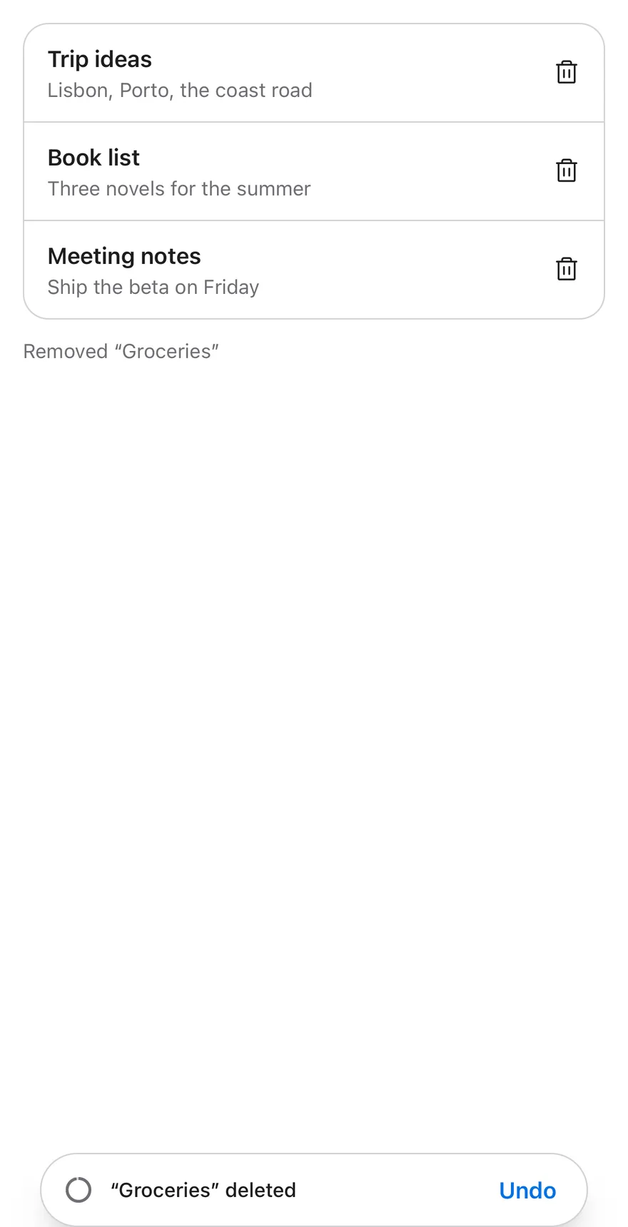
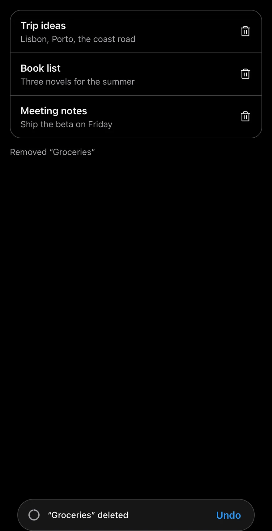
Showing
The bar shown right after deleting a note, with a long timeout.
Longer timeout
Uses a 10 second timeout.
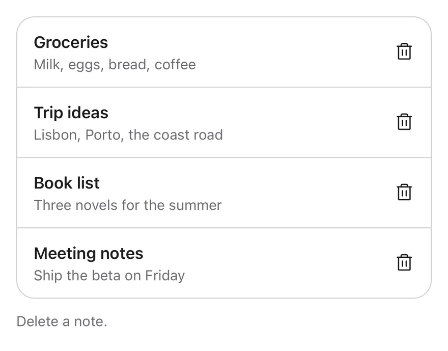
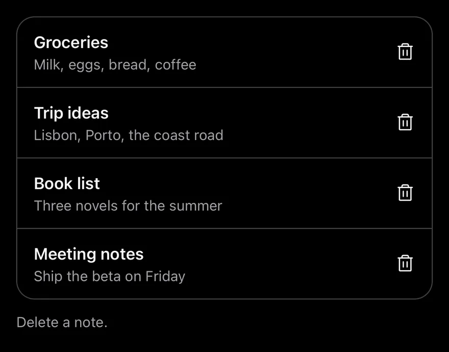
With swipe actions
Shows the bar after a swipe-to-delete in a list with swipe actions.
API Reference
UndoBarProvider
Holds the current undo entry and renders the bar in a portal.
| Prop | Type | Default | Description |
|---|---|---|---|
timeout | number | 5000 | Countdown length in milliseconds. Defaults to 5000. |
className | string | - | Classes for the bar. |
portalHost | string | - | Name of a portal host to render into. |
children | React.ReactNode | - |
Accessibility
- A string title is announced when the bar appears.
- The bar has the
grouprole and is a polite live region. - The countdown ring is hidden from screen readers.
Notes
- The bar is up to 384 points wide and centered; it uses
bg-popover, orbg-mutedin dark mode, with aborder-borderoutline. - The ring drains linearly and runs counterclockwise in right-to-left layouts.
- Slide animations respect the system reduce motion setting; the countdown always runs.