suiss/ui · Interaction
Stepper
A numeric field with minus and plus buttons that step the value, accelerating while held.
Stepper is an open-source interaction from suiss/ui for React, React Native, SwiftUI and Jetpack Compose. The @esuiss/ui CLI copies its source into your project, so you own the code.
Stepper recreates the iOS stepper on top of a number field primitive. It pairs an editable StepperInput with a segmented StepperGroup of StepperDecrement and StepperIncrement buttons. Each press changes the value by step; holding a button repeats the change after a short delay and speeds up over time. Each button disables itself when the value reaches min or max.
Use it for small, bounded quantities such as copies, servings, or scale, where people usually adjust a value by a few steps.
Installation
CLI
Works in any project with a components.json. See Installation for the one-line registry setup. Or use the suiss/ui CLI:
Manual
- Install the dependencies and add the
cnhelper:
- Copy the source into
components/interactions/stepper.tsx:
- Update the import paths to match your project.
Usage
- Compose
StepperInputand aStepperGroupcontainingStepperDecrement,StepperSeparator, andStepperIncrementinsideStepper. - The value is uncontrolled by default; pass
valueandonValueChangeto control it. - Other number field props, such as
min,max,disabled, andformat, pass through to the root. - The buttons render minus and plus icons by default; pass children to replace them.
Examples
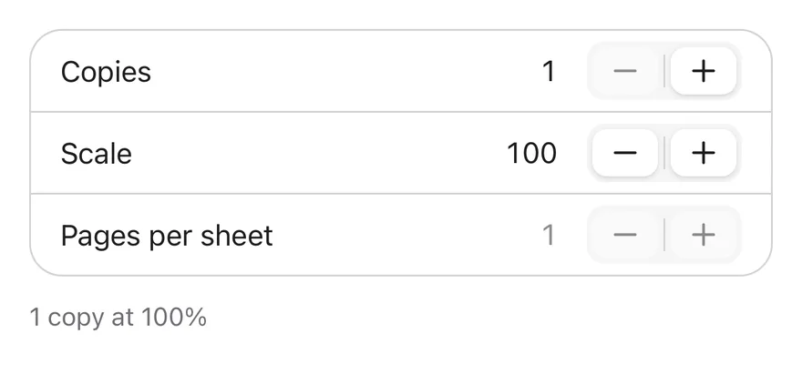
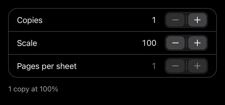
A print settings list with labelled steppers, a percent format with a step of 5, and a disabled row.
API Reference
Stepper
The Number Field root that holds the value and its limits.
| Prop | Type | Default | Description |
|---|---|---|---|
step | number | 1 | The amount each press adds or subtracts. |
value | number | - | The current value, for controlled use. |
defaultValue | number | 0 | The initial value when uncontrolled. |
onValueChange | (value: number) => void | - | Called with the new value when it changes. |
Also accepts the props of the primitive part it wraps.
StepperInput
The editable text field that shows the value.
Also accepts the props of the primitive part it wraps.
StepperGroup
The segmented container for the decrement and increment buttons.
Also accepts the props of React.ComponentProps<"div">.
StepperDecrement
The button that decreases the value by one step.
Also accepts the props of React.ComponentProps<"button">.
StepperIncrement
The button that increases the value by one step.
Also accepts the props of React.ComponentProps<"button">.
StepperSeparator
A thin divider between the two buttons.
Also accepts the props of React.ComponentProps<"span">.
Accessibility
- Label
StepperInputwitharia-labeloraria-labelledby. - The arrow keys step the value from the input, as provided by the number field primitive.
- The buttons are labelled
DecreaseandIncrease, and are disabled at the limits or when the stepper is disabled. StepperGrouphasrole="group", andStepperSeparatorisaria-hidden.
Notes
- Parts use
data-slotvaluesstepper,stepper-input,stepper-group,stepper-decrement,stepper-increment, andstepper-separator. - Values are rounded to the precision of
step, so decimal steps do not accumulate floating-point errors. - The buttons suppress the long-press context menu so holding them on touch devices keeps stepping.
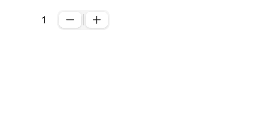

Stepper is a number field laid out as a right-aligned value followed by a field holding minus and plus buttons, inset from its edges. Each step snaps to step and stays within min and max, and a button that can go no further is shown as disabled.
Pressing and holding a button steps once, then repeats every 60 ms after 400 ms. The value can also be typed. Use it for quantities, copies or percentages in settings rows.
Installation
The CLI also adds what it builds on: Icon.
Manual
- Install the dependencies:
-
Add the pieces it builds on: Icon, and the primitives
components/primitives/number-field.tsx,components/primitives/use-render.tsx. -
Copy the source into
components/interactions/stepper.tsx:
- Update the import paths to match your project.
- Install the dependencies:
-
Add the pieces it builds on: Icon, and the primitives
components/primitives/number-field.tsx,components/primitives/use-render.tsx. -
Copy the source into
components/interactions/stepper.tsx:
- Update the import paths to match your project.
- Install the dependencies:
-
Add the pieces it builds on: Icon, and the primitives
components/primitives/number-field.tsx,components/primitives/use-render.tsx. -
Copy the source into
components/interactions/stepper.tsx:
- Update the import paths to match your project.
-
Target iOS 17 or later.
-
Add the Swift package to your app:
- Copy the theme files every view uses:
- Copy the source and every file it uses:
- Add the files to your app target.
- Set
minSdkto 24 or higher and add the dependencies:
- Copy the theme files every view uses:
- Copy the source and every file it uses:
- Update the
com.esuiss.uipackage names to match your project.
Usage
Compose StepperInput and a StepperGroup containing StepperDecrement, StepperSeparator and StepperIncrement inside Stepper.
Use it uncontrolled with defaultValue (0 by default) or controlled with value and onValueChange. Clearing the field never reports null; the change is cancelled instead. min, max, step, format (Intl.NumberFormatOptions), locale and disabled are passed to the number field.
Examples
A print settings list with copies, a percentage scale stepping by 5, and a disabled row.
API Reference
Stepper
The root that holds the value and limits.
| Prop | Type | Default | Description |
|---|---|---|---|
value | number | - | The current value when controlled. |
defaultValue | number | 0 | The initial value when uncontrolled. Defaults to 0. |
onValueChange | ( value: number, eventDetails: NumberFieldPrimitive.ChangeEventDetails ) => void | - | Called with the new number and change details. |
Also accepts the props of React.ComponentProps<typeof NumberFieldPrimitive.Root>.
StepperInput
The editable, right-aligned value.
Also accepts the props of React.ComponentProps<typeof NumberFieldPrimitive.Input>.
StepperGroup
The rounded field that holds the buttons.
Also accepts the props of React.ComponentProps<typeof NumberFieldPrimitive.Group>.
StepperDecrement
The minus button.
Also accepts the props of React.ComponentProps<typeof NumberFieldPrimitive.Decrement>.
StepperIncrement
The plus button.
Also accepts the props of React.ComponentProps<typeof NumberFieldPrimitive.Increment>.
StepperSeparator
A thin divider between the buttons.
Also accepts the props of ViewProps.
Accessibility
- The minus and plus buttons have the
buttonrole. - Label the value with
accessibilityLabeloraccessibilityLabelledByonStepperInput. - The separator is hidden from screen readers.
Notes
- A selection haptic plays on each step, if the app provides an adapter through
HapticsProvider. - The group uses
bg-secondary. Buttons usebg-cardwith a small shadow (bg-borderin dark mode) andopacity-80when pressed; a disabled button or one at its limit usesopacity-50. - Disabled text uses
opacity-50.