suiss/ui · Interaction
Tip
A dismissible feature tip shown inline or as a popover, remembered once dismissed and sequenced in groups.
Tip is an open-source interaction from suiss/ui for React, React Native, SwiftUI and Jetpack Compose. The @esuiss/ui CLI copies its source into your project, so you own the code.
Tip recreates TipKit-style feature tips. Each tip has an id; once dismissed, the id is stored in localStorage and the tip no longer appears. Show a tip inline with TipCard, which expands into the layout, or attach it to a control with TipAnchor and TipPopover, which uses a non-modal popover with an arrow. Using the anchored control also dismisses its tip.
Wrap several tips in TipGroup to show them one at a time, in the order they mount; when one is dismissed, the next appears. Use tips sparingly to point out features people might otherwise miss.
Installation
CLI
Works in any project with a components.json. See Installation for the one-line registry setup. Or use the suiss/ui CLI:
Manual
- Install the dependencies and add the
cnhelper:
- Copy the source into
components/interactions/tip.tsx:
- Update the import paths to match your project.
Usage
- Give every
Tipa stable, uniqueid. Place either aTipCard, or aTipAnchorwith aTipPopover, inside it. - Build the content with
TipIcon,TipContent,TipTitle,TipDescription, andTipClose. TipPopoveracceptsside,align, andsideOffsetfor positioning, defaulting tobottom,center, and10.- Call
resetTipswith a list of ids to clear their dismissed state, for example from a Show tips again control.
API Reference
TipGroup
Shows the tips inside it one at a time, in order.
| Prop | Type | Default | Description |
|---|---|---|---|
children | React.ReactNode | - | The tips to show in sequence. |
Tip
Holds a single tip's visibility and dismissed state.
| Prop | Type | Default | Description |
|---|---|---|---|
id | string | Required | The unique key used to remember that the tip was dismissed. |
delay | number | 0 | Milliseconds to wait before showing the tip. |
onDismiss | () => void | - | Called when the tip is dismissed. |
children | React.ReactNode | - | The card or anchored popover for the tip. |
TipCard
An inline card that expands into the layout while the tip is visible.
Also accepts the props of React.ComponentProps<"div">.
TipAnchor
Wraps the control that a popover tip points to.
Also accepts the props of React.ComponentProps<"span">.
TipPopover
A popover with an arrow, positioned against TipAnchor.
Also accepts the props of the primitive parts it wraps.
TipIcon
The leading icon of the tip.
Also accepts the props of React.ComponentProps<"span">.
TipContent
The container for the title and description.
Also accepts the props of React.ComponentProps<"div">.
TipTitle
The tip's title.
Also accepts the props of React.ComponentProps<"p">.
TipDescription
The tip's supporting text.
Also accepts the props of React.ComponentProps<"p">.
TipClose
The button that dismisses the tip.
Also accepts the props of React.ComponentProps<"button">.
Accessibility
TipCardrenders withrole="note".TipPopoveris labelled byTipTitleand described byTipDescription. It does not move focus when it opens or closes, and pressingEscapeor outside dismisses it.TipCloseis labelledDismiss tip.TipIconisaria-hidden.
Notes
- Dismissed tips are stored under
tip:followed by the id inlocalStorage. When storage is unavailable, tips still dismiss for the current session. - Parts use
data-slotvaluestip-card-frame,tip-card,tip-anchor,tip-popover,tip-icon,tip-content,tip-title,tip-description, andtip-close.
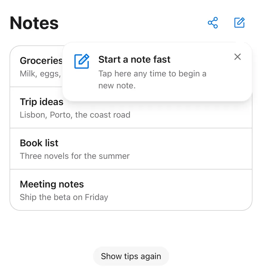
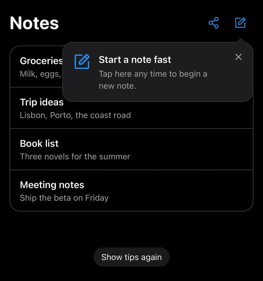
Tip shows a hint until the user dismisses it, then records the dismissal under its id so it does not return. It renders either as a TipCard placed in the layout, or as a TipPopover with an arrow pointing at a TipAnchor. Touching the anchor also dismisses the tip.
TipGroup shows several tips one at a time in the order they mount, moving to the next when one is dismissed. Use tips to introduce a feature or gesture the user may not discover.
Installation
The CLI also adds what it builds on: Icon, Text. On React Native it also adds the animated view components/ui/animated-view.tsx.
Manual
- Install the dependencies:
-
Add the pieces it builds on: Icon, Text, and the primitives
components/primitives/popover.tsx,components/primitives/types.tsx,components/primitives/use-render.tsx, and the animated viewcomponents/ui/animated-view.tsxfrom the next step. -
Copy the animated view into
components/ui/animated-view.tsx:
- Copy the source into
components/interactions/tip.tsx:
- Update the import paths to match your project.
- Install the dependencies:
-
Add the pieces it builds on: Icon, Text, and the primitives
components/primitives/popover.tsx,components/primitives/types.tsx,components/primitives/use-render.tsx, and the animated viewcomponents/ui/animated-view.tsxfrom the next step. -
Copy the animated view into
components/ui/animated-view.tsx:
- Copy the source into
components/interactions/tip.tsx:
- Update the import paths to match your project.
- Install the dependencies:
-
Add the pieces it builds on: Icon, Text, and the primitives
components/primitives/popover.tsx,components/primitives/types.tsx,components/primitives/use-render.tsx, and the animated viewcomponents/ui/animated-view.tsxfrom the next step. -
Copy the animated view into
components/ui/animated-view.tsx:
- Copy the source into
components/interactions/tip.tsx:
- Update the import paths to match your project.
-
Target iOS 17 or later.
-
Add the Swift package to your app:
- Copy the theme files every view uses:
- Copy the source and every file it uses:
- Add the files to your app target.
- Set
minSdkto 24 or higher and add the dependencies:
- Copy the theme files every view uses:
- Copy the source and every file it uses:
- Update the
com.esuiss.uipackage names to match your project.
Usage
Give each Tip a stable id. Compose TipIcon, TipContent with TipTitle and TipDescription, and TipClose inside a TipCard or TipPopover. For a popover, wrap the target in TipAnchor inside the same Tip.
By default dismissals are kept in memory and reset when the app restarts. To persist them, pass a storage adapter to TipGroup with getItem and setItem, sync or async, such as one backed by your app's key-value store. Keys are prefixed with tip:. resetTips(ids, storage) clears dismissals, and useTip returns visible and dismiss. The TipStorage type is exported.
Examples
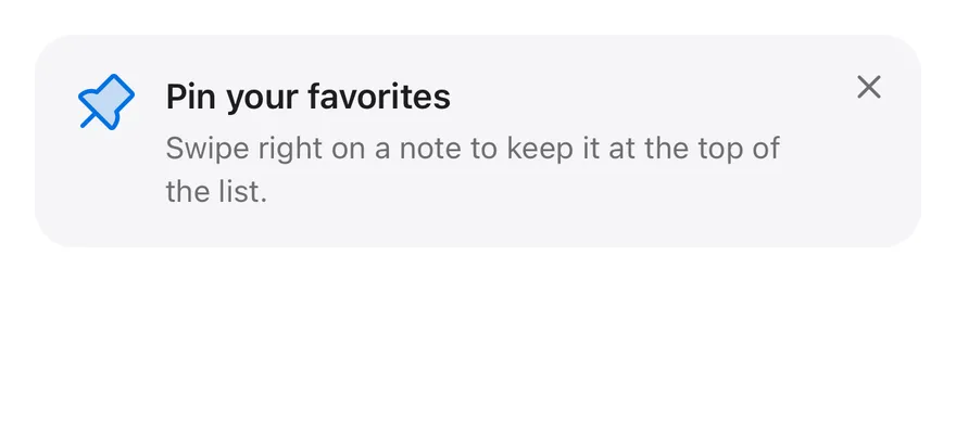
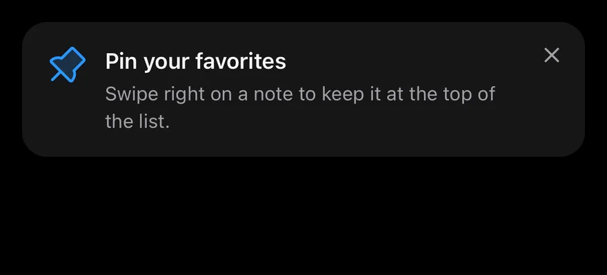
Card
An inline card tip with an icon, title, description and close button.
API Reference
TipGroup
Shows its tips one at a time and supplies the storage.
| Prop | Type | Default | Description |
|---|---|---|---|
storage | TipStorage | memoryStorage | Adapter with getItem and setItem for remembering dismissals. Defaults to in-memory storage. |
children | React.ReactNode | - |
Tip
One hint, identified by id.
| Prop | Type | Default | Description |
|---|---|---|---|
id | string | Required | Stable key used to remember the dismissal. |
delay | number | 0 | Milliseconds to wait before showing. Defaults to 0. |
onDismiss | () => void | - | Called when the tip is dismissed. |
children | React.ReactNode | - |
TipCard
Renders the tip inline as a card.
Also accepts the props of ViewProps.
TipAnchor
The element the popover points at.
Also accepts the props of ViewProps.
TipPopover
Renders the tip as a popover next to the anchor.
| Prop | Type | Default | Description |
|---|---|---|---|
side | Side | "bottom" | Side of the anchor to show on. Defaults to bottom. |
align | Align | "center" | Alignment against the anchor. Defaults to center. |
sideOffset | number | 10 | Gap from the anchor. Defaults to 10. |
portalHost | string | - | Name of a portal host to render into. |
Also accepts the props of React.ComponentProps<typeof PopoverPrimitive.Popup>.
TipIcon
A decorative icon slot.
Also accepts the props of ViewProps.
TipContent
Holds the title and description.
Also accepts the props of ViewProps.
TipTitle
The tip's heading.
Also accepts the props of React.ComponentProps<typeof Text>.
TipDescription
The tip's supporting text.
Also accepts the props of React.ComponentProps<typeof Text>.
TipClose
A button that dismisses the tip.
Also accepts the props of React.ComponentProps<typeof Pressable>.
Accessibility
TipCardhas thenoterole.TipPopoveris non-modal, does not move focus, and is labelled byTipTitle.TipCloseis labelledDismiss tip.- The icon is hidden from screen readers.
Notes
- Cards use
bg-muted; popovers usebg-popoverwith a border that is stronger in dark mode, and are up to 320 points wide. - Animations respect the system reduce motion setting.
- On iOS the popover renders in a full-window overlay so it appears above native screens.