suiss/ui · Interaction
Top Banner
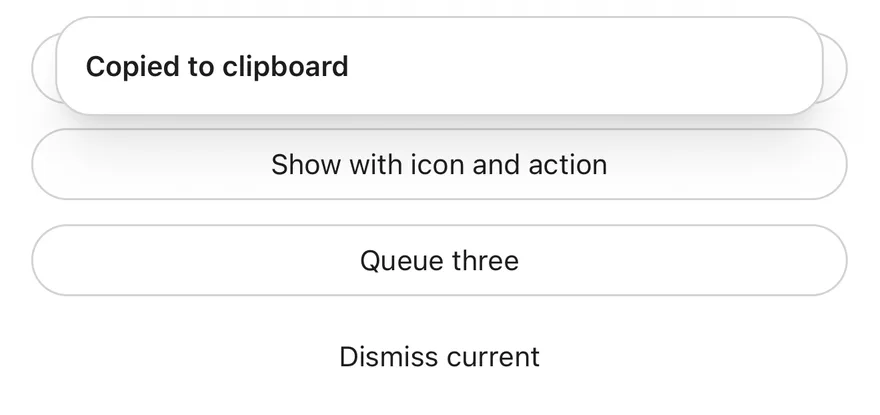
Short banners that slide in from the top of the screen, queue one at a time and can be swiped up to dismiss.
Top Banner is an open-source interaction from suiss/ui for React Native, SwiftUI and Jetpack Compose. The @esuiss/ui CLI copies its source into your project, so you own the code.
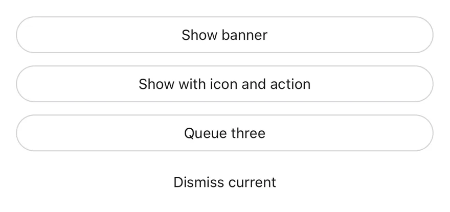
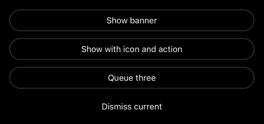
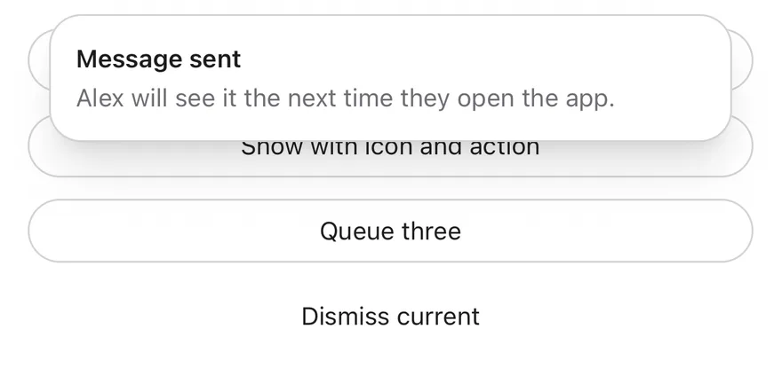
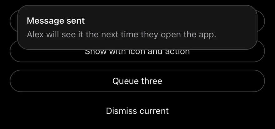
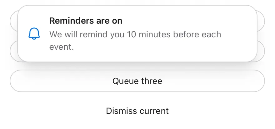
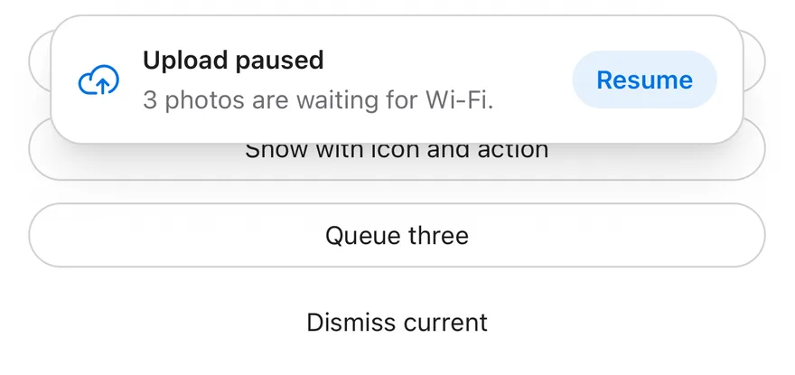
TopBannerProvider shows banners requested with show from useTopBanner. Each banner slides down below the top safe area with a title, an optional description, icon and action button, and hides after 4 seconds by default.
Banners queue and appear one at a time, with a short pause between them. Swiping a banner up past a small distance, or flicking it up, dismisses it; dragging pauses the timer. Use it for brief confirmations and status updates, such as a copied link or a restored connection.
Installation
The CLI also adds what it builds on: Button, Icon, Text. On React Native it also adds the animated view components/ui/animated-view.tsx.
Manual
- Install the dependencies:
-
Add the pieces it builds on: Button, Icon, Text, and the primitives
components/primitives/portal.tsx, and the animated viewcomponents/ui/animated-view.tsxfrom the next step. -
Copy the animated view into
components/ui/animated-view.tsx:
- Copy the source into
components/interactions/top-banner.tsx:
- Update the import paths to match your project.
- Install the dependencies:
-
Add the pieces it builds on: Button, Icon, Text, and the primitives
components/primitives/portal.tsx, and the animated viewcomponents/ui/animated-view.tsxfrom the next step. -
Copy the animated view into
components/ui/animated-view.tsx:
- Copy the source into
components/interactions/top-banner.tsx:
- Update the import paths to match your project.
- Install the dependencies:
-
Add the pieces it builds on: Button, Icon, Text, and the primitives
components/primitives/portal.tsx, and the animated viewcomponents/ui/animated-view.tsxfrom the next step. -
Copy the animated view into
components/ui/animated-view.tsx:
- Copy the source into
components/interactions/top-banner.tsx:
- Update the import paths to match your project.
-
Target iOS 17 or later.
-
Add the Swift package to your app:
- Copy the theme files every view uses:
- Copy the source and every file it uses:
- Add the files to your app target.
- Set
minSdkto 24 or higher and add the dependencies:
- Copy the theme files every view uses:
- Copy the source and every file it uses:
- Update the
com.esuiss.uipackage names to match your project.
Usage
Wrap the app in TopBannerProvider, then call show({ title, description?, icon?, action?, timeout? }) from useTopBanner. show returns an id that you can pass to dismiss; calling dismiss() with no id dismisses the current banner.
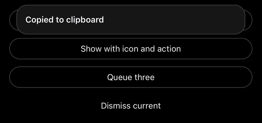
icon is a Phosphor icon component. action is { label, onPress }; pressing it runs onPress and dismisses the banner. Pass a timeout of 0 or Infinity to keep a banner until dismissed.
Examples
Showing
A banner with a title and description, shown on mount.
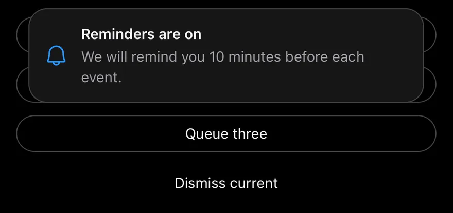
With icon
A banner with a leading icon.
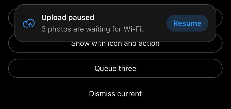
With action
A banner with an action button.
Title only
A banner with only a title.
API Reference
TopBannerProvider
Holds the banner queue and renders the current banner in a portal.
| Prop | Type | Default | Description |
|---|---|---|---|
timeout | number | 4000 | Default time in milliseconds before a banner hides. Defaults to 4000. |
className | string | - | Classes for the banner card. |
portalHost | string | - | Name of a portal host to render into. |
children | React.ReactNode | - |
Accessibility
- The banner has the
alertrole and is a polite live region. - A string title is announced when the banner appears.
- The banner has a
dismissaccessibility action.
Notes
- Banners are up to 384 points wide and centered.
- The card uses
bg-card, orbg-mutedin dark mode, with aborder-borderoutline; the icon usestext-primary. - Slide animations respect the system reduce motion setting.