suiss/ui · Interaction
Search Reveal
A scrolling list with a search field tucked above it that appears when the user scrolls up.
Search Reveal is an open-source interaction from suiss/ui for React, React Native, SwiftUI and Jetpack Compose. The @esuiss/ui CLI copies its source into your project, so you own the code.
SearchReveal recreates the iOS pattern where a search field hides above a list. The container starts scrolled so the field is just out of view; scrolling up reveals it and fades it in. When scrolling stops partway, the container settles to fully shown or fully hidden, and it stays revealed while the field holds a query. Focusing the field scrolls it into view.
SearchRevealField is a controlled search input with a magnifying glass and a clear button. Use the pattern for lists such as notes, messages, or contacts where search should be available without taking up space.
Installation
CLI
Works in any project with a components.json. See Installation for the one-line registry setup. Or use the suiss/ui CLI:
Manual
- Install the dependencies and add the
cnhelper:
- Copy the source into
components/interactions/search-reveal.tsx:
- Update the import paths to match your project.
Usage
- Place
SearchRevealFieldfirst andSearchRevealContentafter it insideSearchReveal, and give the container a bounded height. - The field is controlled: pass
valueand update it inonValueChange. Filter the content from that value. SearchRevealContentfills at least the container's height, so the field can hide even when the list is short.placeholderdefaults toSearchand also labels the input.
Examples
Short list
A short list still hides the field above it and reveals it on focus.
API Reference
SearchReveal
The scroll container that hides, reveals, and snaps the search field.
Also accepts the props of React.ComponentProps<"div">.
SearchRevealField
The search input with a clear button.
| Prop | Type | Default | Description |
|---|---|---|---|
value | string | Required | The current query. |
onValueChange | (value: string) => void | Required | Called with the new query when the user types or clears the field. |
Also accepts the props of React.ComponentProps<"input">.
SearchRevealContent
The scrolling content below the field.
Also accepts the props of React.ComponentProps<"div">.
Accessibility
- The input has
type="search"and is labelled by its placeholder througharia-label. - The clear button is labelled
Clear searchand returns focus to the input. - Focusing the field, including with the keyboard, scrolls it into view.
Notes
- Parts use
data-slotvaluessearch-reveal,search-reveal-field,search-reveal-input, andsearch-reveal-content. - The
--search-revealcustom property runs from0to1as the field is revealed and drives its opacity.
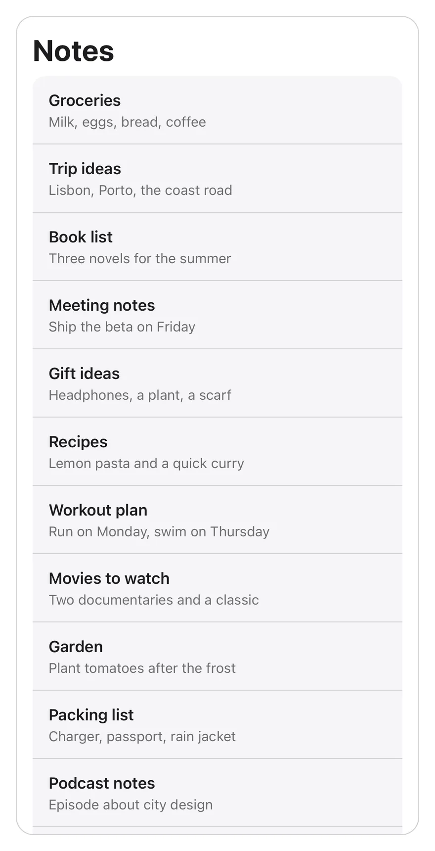
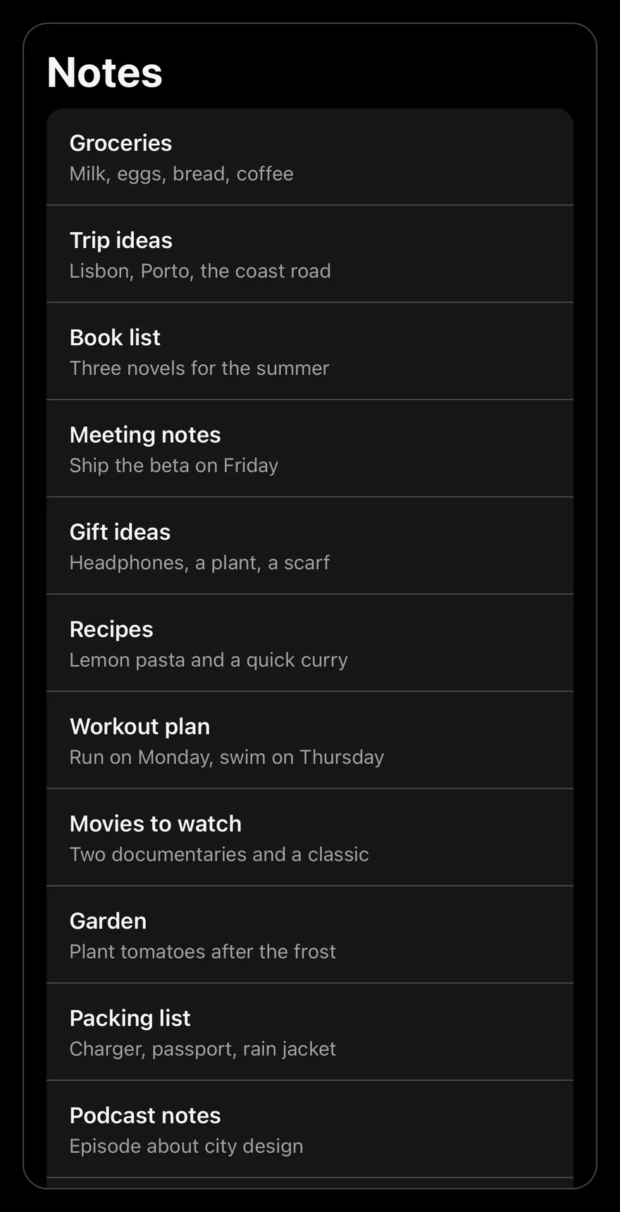
SearchReveal is a scroll view that starts scrolled just past its SearchRevealField, so the list shows first and the field is out of view. Pulling down reveals the field, which fades in as it appears, and the scroll snaps either fully open or fully hidden.
Focusing the field scrolls it into view. While there is a query, snapping is turned off so the field stays visible. Use it for notes, mail or settings lists where search should be close but not take space.
Installation
The CLI also adds what it builds on: Icon.
Manual
- Install the dependencies:
-
Add the pieces it builds on: Icon.
-
Copy the source into
components/interactions/search-reveal.tsx:
- Update the import paths to match your project.
- Install the dependencies:
-
Add the pieces it builds on: Icon.
-
Copy the source into
components/interactions/search-reveal.tsx:
- Update the import paths to match your project.
- Install the dependencies:
-
Add the pieces it builds on: Icon.
-
Copy the source into
components/interactions/search-reveal.tsx:
- Update the import paths to match your project.
-
Target iOS 17 or later.
-
Add the Swift package to your app:
- Copy the theme files every view uses:
- Copy the source and every file it uses:
- Add the files to your app target.
- Set
minSdkto 24 or higher and add the dependencies:
- Copy the theme files every view uses:
- Copy the source and every file it uses:
- Update the
com.esuiss.uipackage names to match your project.
Usage
Put a SearchRevealField first, then the list inside a SearchRevealContent, all inside SearchReveal. The field is controlled: pass value and update it in onValueChange, then filter your list with it.
SearchRevealContent is at least as tall as the scroll view, so the field can be hidden even when the list is short. Other ScrollView props, except onScroll, pass through to SearchReveal, and other TextInput props pass through to the field.
Examples
Short list
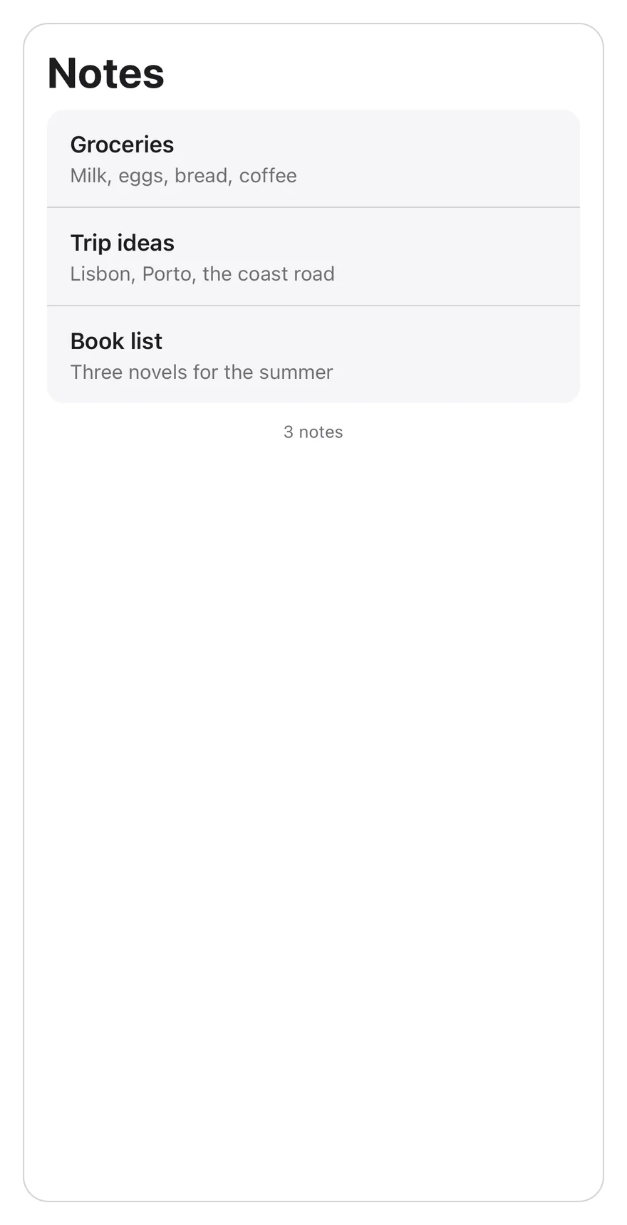
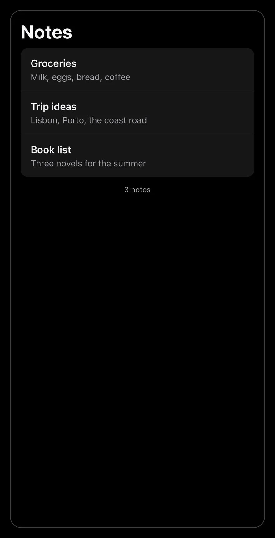
A three-item list that still hides the field.
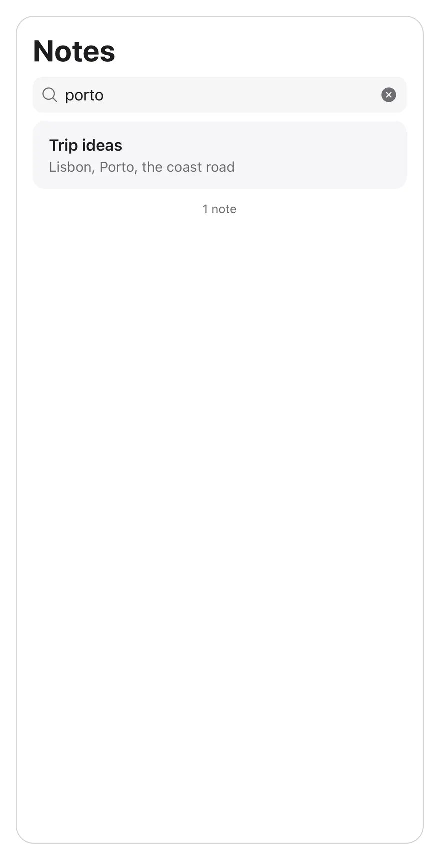
With query
Starts with a query, so the field is visible and the list is filtered.

API Reference
SearchReveal
The scroll view that hides and reveals the field.
Also accepts the props of ScrollViewProps.
SearchRevealField
The search input with a clear button.
| Prop | Type | Default | Description |
|---|---|---|---|
value | string | Required | The current query. |
onValueChange | (value: string) => void | Required | Called with the new query. |
Also accepts the props of React.ComponentProps<typeof TextInput>.
SearchRevealContent
The list area, at least one screen tall.
Also accepts the props of ViewProps.
Accessibility
- The input has the
searchboxrole and is labelled byplaceholder. - The clear button is labelled
Clear searchand returns focus to the input.
Notes
- The field uses
bg-secondarywithmuted-foregroundplaceholder and icons. - Autocorrect and autocapitalization are off, and the return key reads
search. - Taps on the list work while the keyboard is open.