suiss/ui · Interaction
Image Viewer
A full-screen photo viewer with swipe paging, pinch and double-tap zoom, and swipe down to close.
Image Viewer is an open-source interaction from suiss/ui for React Native, SwiftUI and Jetpack Compose. The @esuiss/ui CLI copies its source into your project, so you own the code.


ImageViewer opens a set of images full screen on a black background, starting at the pressed thumbnail. A counter such as 2 of 5 and a close button sit at the top, below the safe area.
Swipe sideways to page between images, with resistance at the first and last image. Pinch to zoom between 1x and 4x around the fingers, double-tap to zoom to 2.5x at the tapped point or back to 1x, and drag to pan while zoomed. Swiping up or down far enough closes the viewer, and a single tap toggles the controls.
Installation
The CLI also adds what it builds on: Icon, Text. On React Native it also adds the animated view components/ui/animated-view.tsx.
Manual
- Install the dependencies:
-
Add the pieces it builds on: Icon, Text, and the primitives
components/primitives/image-viewer.tsx,components/primitives/use-render.tsx, and the animated viewcomponents/ui/animated-view.tsxfrom the next step. -
Copy the animated view into
components/ui/animated-view.tsx:
- Copy the source into
components/interactions/image-viewer.tsx:
- Update the import paths to match your project.
- Install the dependencies:
-
Add the pieces it builds on: Icon, Text, and the primitives
components/primitives/image-viewer.tsx,components/primitives/use-render.tsx, and the animated viewcomponents/ui/animated-view.tsxfrom the next step. -
Copy the animated view into
components/ui/animated-view.tsx:
- Copy the source into
components/interactions/image-viewer.tsx:
- Update the import paths to match your project.
- Install the dependencies:
-
Add the pieces it builds on: Icon, Text, and the primitives
components/primitives/image-viewer.tsx,components/primitives/use-render.tsx, and the animated viewcomponents/ui/animated-view.tsxfrom the next step. -
Copy the animated view into
components/ui/animated-view.tsx:
- Copy the source into
components/interactions/image-viewer.tsx:
- Update the import paths to match your project.
-
Target iOS 17 or later.
-
Add the Swift package to your app:
- Copy the theme files every view uses:
- Copy the source and every file it uses:
- Add the files to your app target.
- Set
minSdkto 24 or higher and add the dependencies:
- Copy the theme files every view uses:
- Copy the source and every file it uses:
- Update the
com.esuiss.uipackage names to match your project.
Usage
Pass images to ImageViewer, wrap each thumbnail in an ImageViewerTrigger with its index, and render one ImageViewerContent. Give each image an accessibilityLabel. The ImageViewerImage type is exported.
Open state and the current image can be uncontrolled with defaultOpen and defaultIndex, or controlled with open, onOpenChange, index and onIndexChange. useImageViewer returns open, index, count and images.
Examples
Default
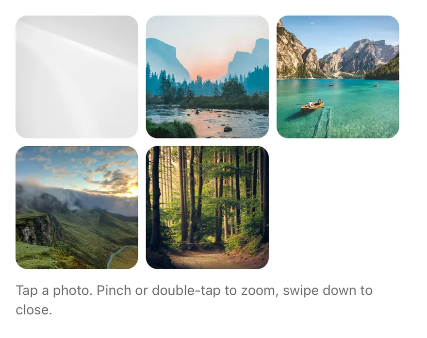
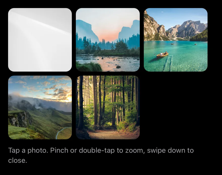
API Reference
ImageViewer
The root that holds the images, open state and current index.
| Prop | Type | Default | Description |
|---|---|---|---|
onOpenChange | (open: boolean) => void | - | Called when the viewer opens or closes. |
onIndexChange | (index: number) => void | - | Called with the new index after paging. |
Also accepts the props of React.ComponentProps<typeof ImageViewerPrimitive.Root>.
ImageViewerTrigger
A pressable thumbnail that opens the viewer at its index.
Also accepts the props of React.ComponentProps<typeof ImageViewerPrimitive.Trigger>.
ImageViewerContent
The full-screen viewer with the pages, counter and close button.
| Prop | Type | Default | Description |
|---|---|---|---|
portalHost | string | - | Name of a portal host to render into. |
closeLabel | string | "Close" | Accessibility label of the close button. Defaults to Close. |
indexLabel | (index: number, count: number) => string | defaultIndexLabel | Formats the counter from the index and count. Defaults to n of count. |
className | string | - |
Accessibility
- The viewer is modal for screen readers, and the escape gesture closes it.
- The current page is
adjustable: swiping up or down with a screen reader moves between images. It is labelled by the image'saccessibilityLabel, orImage n, with the counter as its value. - Triggers have the
buttonrole and expose theirexpandedstate.
Notes
- The viewer fades in and out, and paging and zoom animations respect the system reduce motion setting.
- Colors use the
bg-blackandtext-whitetokens, so the viewer stays dark in light mode. - On iOS the viewer renders in a full-window overlay so it appears above native screens.