suiss/ui · Interaction
Island
A floating pill at the top of the screen that shows live activities and brief notifications, like the Dynamic Island.
Island is an open-source interaction from suiss/ui for React, React Native, SwiftUI and Jetpack Compose. The @esuiss/ui CLI copies its source into your project, so you own the code.
Island renders a dark pill fixed to the top of the viewport, below the safe-area inset. It morphs between four views: hidden, compact, expanded, and notice. The pill measures the active part and animates its width, height, and corner radius with a spring curve, so content changes feel continuous.
A live activity is an IslandCompact and IslandExpanded pair rendered inside Island. Mounting an IslandCompact shows the pill; tapping it expands to the details. Notifications come from the notify function returned by useIsland; a notice temporarily takes over the pill and then returns to the activity, or hides the pill when no activity is mounted. Use it for ongoing, glanceable status such as downloads, timers, or calls.
Installation
CLI
Works in any project with a components.json. See Installation for the one-line registry setup. Or use the suiss/ui CLI:
Manual
-
Add the
cnhelper. -
Copy the source into
components/interactions/island.tsx:
- Update the import paths to match your project.
Usage
- Wrap the app, or the part of it that posts notifications, in
IslandProvider.Island,IslandCompact,IslandExpanded, anduseIslandthrow outside of it. - Render a single
Island. MountIslandCompactandIslandExpandedas its children only while an activity is running; unmounting the compact part hides the pill and collapses it. - Call
notify({ icon, title, description, duration })fromuseIslandto show a notice. It replaces any current notice and dismisses itself afterdurationmilliseconds (4000 by default). Calldismissto remove it early. useIslandalso exposesview,expanded, andsetExpandedfor custom controls.
Examples
Live activity
A download runs as a live activity, with a progress ring in the compact pill and details plus a cancel button when expanded.
Activity with notifications
A notification temporarily replaces a running live activity, which returns once the notice is dismissed.
API Reference
IslandProvider
Holds the island state and provides notify, dismiss, and the expanded state to everything inside it.
| Prop | Type | Default | Description |
|---|---|---|---|
children | React.ReactNode | - | The content that can render the island and post notifications. |
Island
The fixed pill that sizes itself to the active view and renders the built-in notice.
Also accepts the props of React.ComponentProps<"div">.
IslandCompact
The button shown in the collapsed pill; tapping it expands the island.
Also accepts the props of React.ComponentProps<"button">.
IslandExpanded
The detailed view shown when the island is expanded.
Also accepts the props of React.ComponentProps<"div">.
IslandRing
A small circular progress ring for the compact pill.
| Prop | Type | Default | Description |
|---|---|---|---|
value | number | Required | Progress from 0 to 1; values outside the range are clamped. |
Also accepts the props of React.ComponentProps<"svg">.
Accessibility
IslandCompactis a button witharia-expandedreflecting the expanded state; give it anaria-labelthat describes the activity.- Expanding moves focus to the first enabled button, link, or input inside
IslandExpanded, which hasrole="group"and isinertwhile not shown. Escapeor a pointer press outside collapses the expanded view. AfterEscape, focus returns to the compact button if it was inside the island.- Notices render as a button that dismisses on press, and their title and description are announced through a polite live region.
- Inactive parts are removed from the tab order.
IslandRingisaria-hidden.
Notes
- The root exposes
data-slot="island"anddata-viewwith the current view. Parts usedata-slotvaluesisland-compact,island-expanded,island-notice, andisland-ring, and carrydata-activewhile shown. - Animations are disabled under
prefers-reduced-motion.
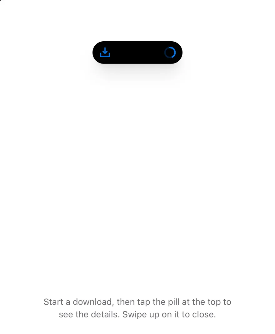
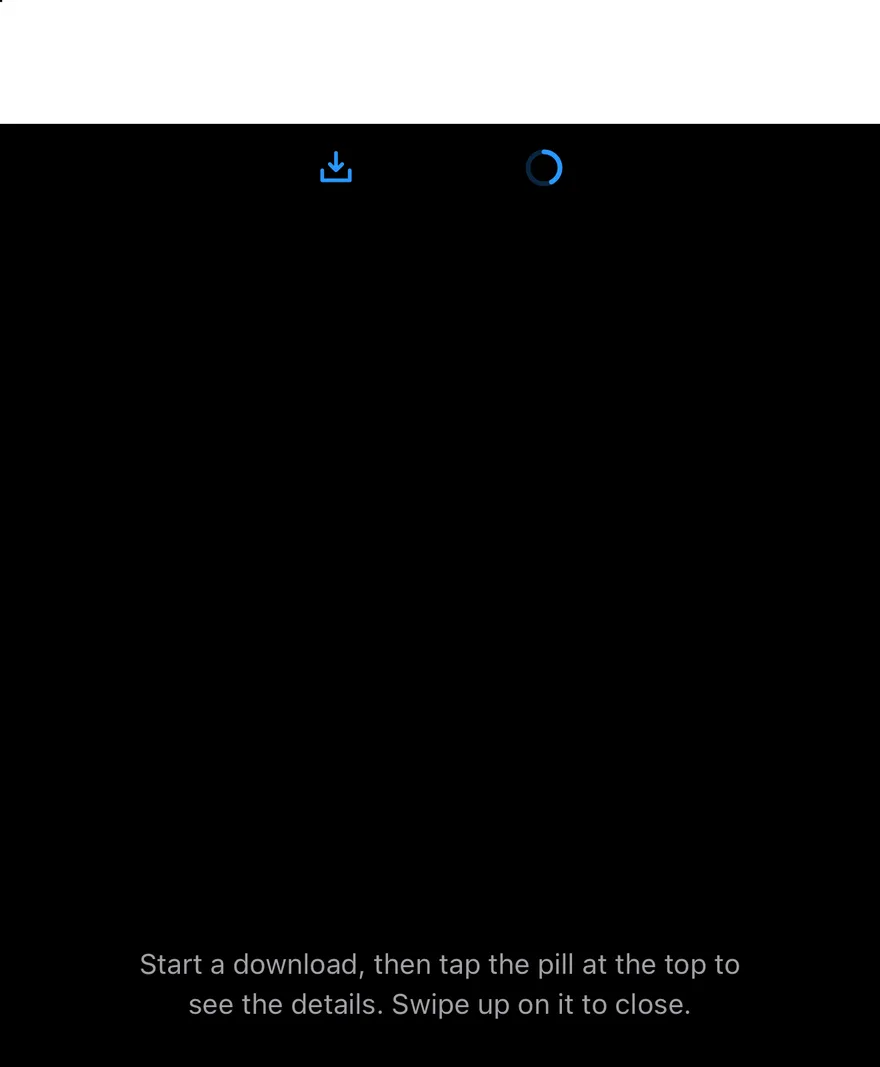
Island floats below the top safe area and morphs between views: hidden, compact, minimal, expanded and notice. Its width, height and corner radius spring to the measured size of the active view, and views cross-fade as it changes.
Content is passed through slots. compactLeading and compactTrailing sit at the two ends of the compact pill, minimal is a single small circle, and IslandExpandedRegion children fill the expanded view. The island appears while it has compact or minimal content and hides when it has none. Pressing it expands; pressing outside, swiping up or the Android back button collapses it. notify shows a notice that replaces the current view and dismisses itself after 4 seconds, on press or on swipe up. Use it for ongoing activity such as a download, timer or call.
Installation
The CLI also adds what it builds on: Icon, Text. On React Native it also adds the animated view components/ui/animated-view.tsx.
Manual
- Install the dependencies:
-
Add the pieces it builds on: Icon, Text, and the primitives
components/primitives/hooks.tsx,components/primitives/portal.tsx, and the animated viewcomponents/ui/animated-view.tsxfrom the next step. -
Copy the animated view into
components/ui/animated-view.tsx:
- Copy the source into
components/interactions/island.tsx:
- Update the import paths to match your project.
- Install the dependencies:
-
Add the pieces it builds on: Icon, Text, and the primitives
components/primitives/hooks.tsx,components/primitives/portal.tsx, and the animated viewcomponents/ui/animated-view.tsxfrom the next step. -
Copy the animated view into
components/ui/animated-view.tsx:
- Copy the source into
components/interactions/island.tsx:
- Update the import paths to match your project.
- Install the dependencies:
-
Add the pieces it builds on: Icon, Text, and the primitives
components/primitives/hooks.tsx,components/primitives/portal.tsx, and the animated viewcomponents/ui/animated-view.tsxfrom the next step. -
Copy the animated view into
components/ui/animated-view.tsx:
- Copy the source into
components/interactions/island.tsx:
- Update the import paths to match your project.
-
Target iOS 17 or later.
-
Copy the theme files every view uses:
- Copy the source:
- Add the files to your app target.
- Set
minSdkto 24 or higher and add the dependencies:
- Copy the theme files every view uses:
- Copy the source and every file it uses:
- Update the
com.esuiss.uipackage names to match your project.
Usage
Wrap the app in IslandProvider and render one Island. Pass compactLeading, compactTrailing and minimal only while there is activity to show, and add IslandExpandedRegions as children with a region of leading, trailing, center or bottom. Leading, center and trailing form a top row; bottom regions stack below it at full width. If only one of the compact and minimal slots is given, the island uses it for both views.
useIsland returns view, notice, expand, collapse, minimize, notify and dismiss. A notice is { icon?, title, description?, duration? }; pass a duration of 0 or Infinity to keep it until dismissed. Dragging the island pauses the notice timer. Use IslandRing for circular progress. The IslandNotice, IslandRegion and IslandView types are exported.
Examples
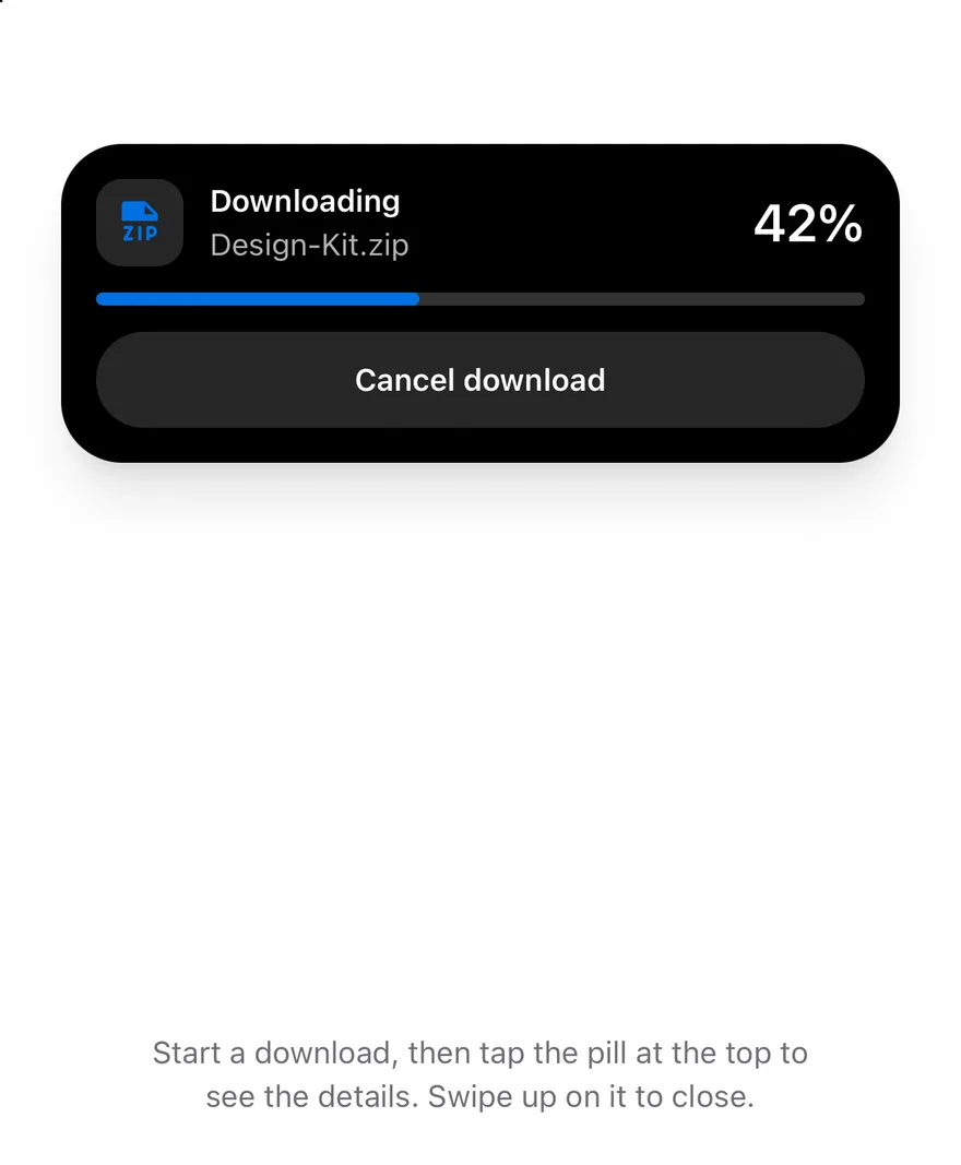
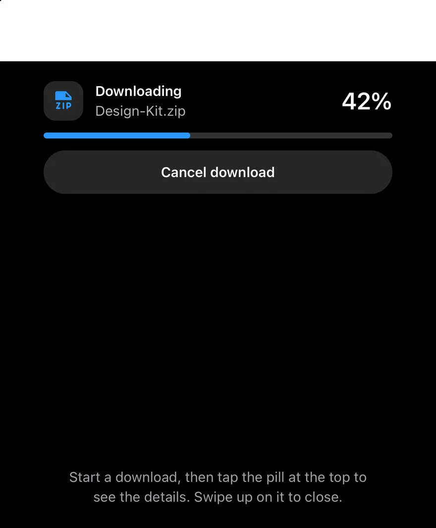
Expanded
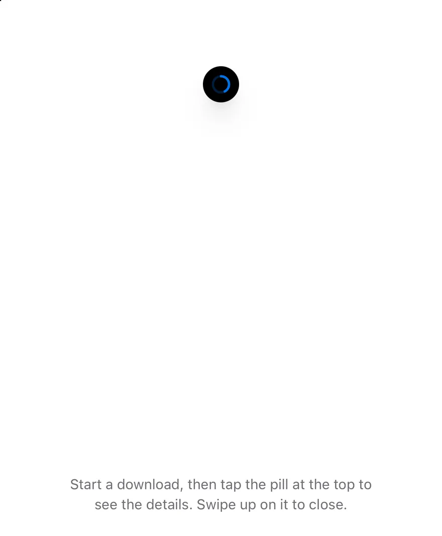
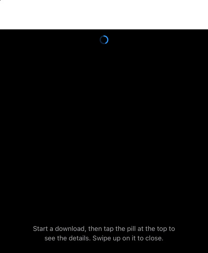
Starts with the island expanded to show download details.
Minimal
Starts in the minimal view with only the progress ring.
Notice
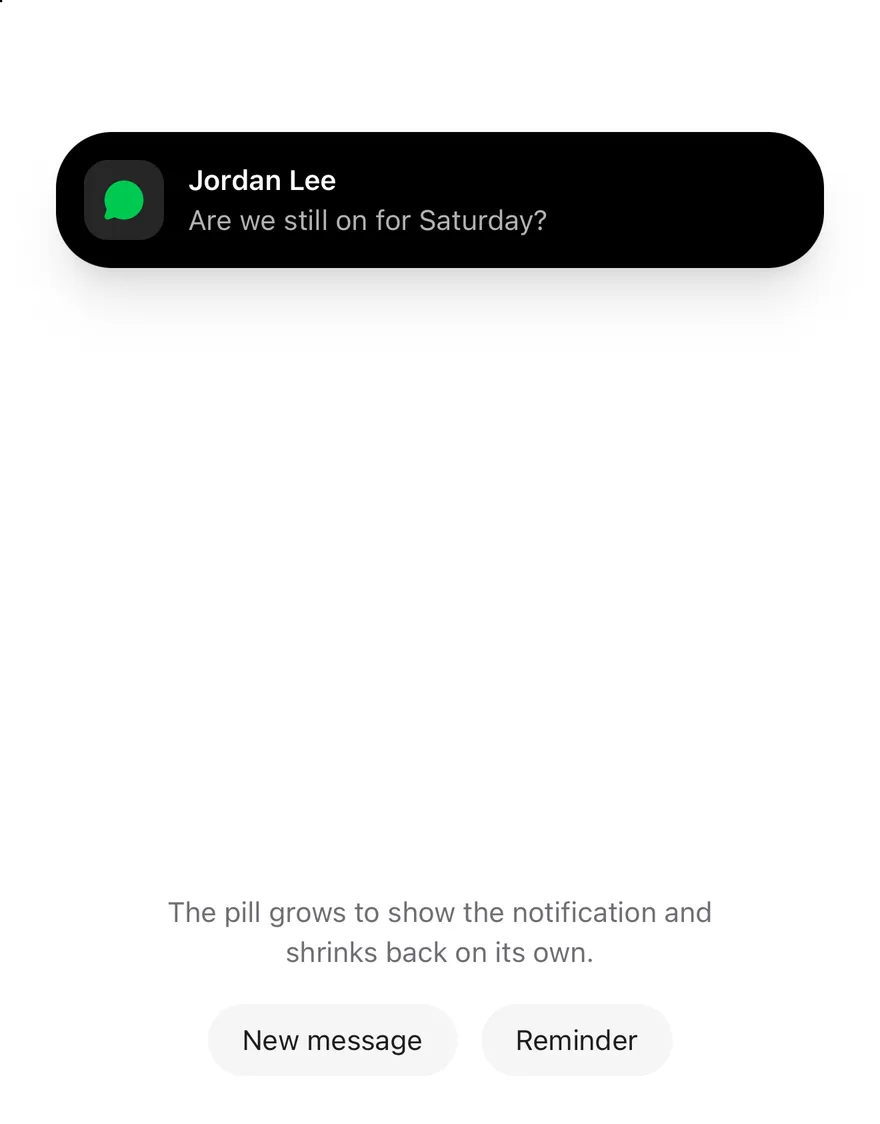
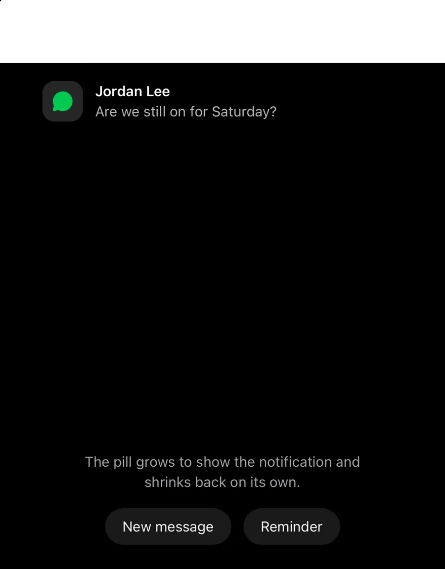
Shows a notice on mount.
Live activity
A download that starts on press, with buttons that minimize the island and send notices over it.
API Reference
IslandProvider
Holds the island mode, the notice and the notice timer.
| Prop | Type | Default | Description |
|---|---|---|---|
children | React.ReactNode | - |
IslandExpandedRegion
A region of the expanded view.
| Prop | Type | Default | Description |
|---|---|---|---|
region | "leading" | "trailing" | "center" | "bottom" | Required | Where the content sits in the expanded view. |
Also accepts the props of IslandExpandedRegionProps.
Island
The floating pill, rendered in a portal, with slots for the compact and minimal views.
| Prop | Type | Default | Description |
|---|---|---|---|
className | string | - | |
compactLeading | React.ReactNode | - | Content at the start of the compact pill. |
compactTrailing | React.ReactNode | - | Content at the end of the compact pill. |
minimal | React.ReactNode | - | Content of the minimal view. |
portalHost | string | - | Name of a portal host to render into. |
Also accepts the props of React.ComponentProps<typeof View>.
IslandRing
A small circular progress ring.
| Prop | Type | Default | Description |
|---|---|---|---|
value | number | Required | Progress from 0 to 1. |
className | string | - |
Accessibility
- Notices are announced with their title and description when they are text.
- The compact and minimal views are buttons that expose
expandedand haveactivateandexpandactions. - The expanded view has the
grouprole, acollapseaction and closes on the escape gesture. - The notice is a button with
activateanddismissactions. - Inactive views and the progress ring are hidden from screen readers.
Notes
- The island uses
bg-blackwithtext-white. - Expanded and notice views are up to 384 points wide.
- Size and fade animations respect the system reduce motion setting.