suiss/ui
  • Docs
  • Components
  • Patterns
  • Interactions
  • Charts
  • Blocks
  • AI
GitHubCreate
DocsComponentsPatternsInteractionsChartsBlocksAICreate
Interactions15
  • Overview
  • Card Stack
  • Image Viewer
  • Island
  • OTP Autofill
  • Preview Menu
  • Pull to Refresh
  • Reorder List
  • Search Reveal
  • Section Index
  • Selection List
  • Stepper
  • Swipe Actions
  • Tip
  • Top Banner
  • Undo Bar

suiss/ui · Interaction

Selection List

A list with an edit mode for selecting multiple rows and acting on them from a floating toolbar.

Selection List is an open-source interaction from suiss/ui for React, React Native, SwiftUI and Jetpack Compose. The @esuiss/ui CLI copies its source into your project, so you own the code.

import { CaretRightIcon } from "@phosphor-icons/react"
import * as React from "react"
import {
  SelectionList,
  SelectionListBar,
  SelectionListCount,
  SelectionListItem,
  SelectionListTrigger,
  useSelectionList,
} from "@/components/interactions/selection-list"
import { Button } from "@/components/ui/button"

const initialNotes = [
  { id: "groceries", title: "Groceries", preview: "Milk, eggs, bread, coffee" },
  { id: "trip", title: "Trip ideas", preview: "Lisbon, Porto, the coast road" },
  { id: "books", title: "Book list", preview: "Three novels for the summer" },

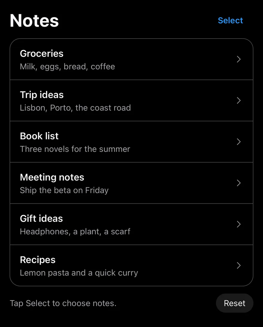
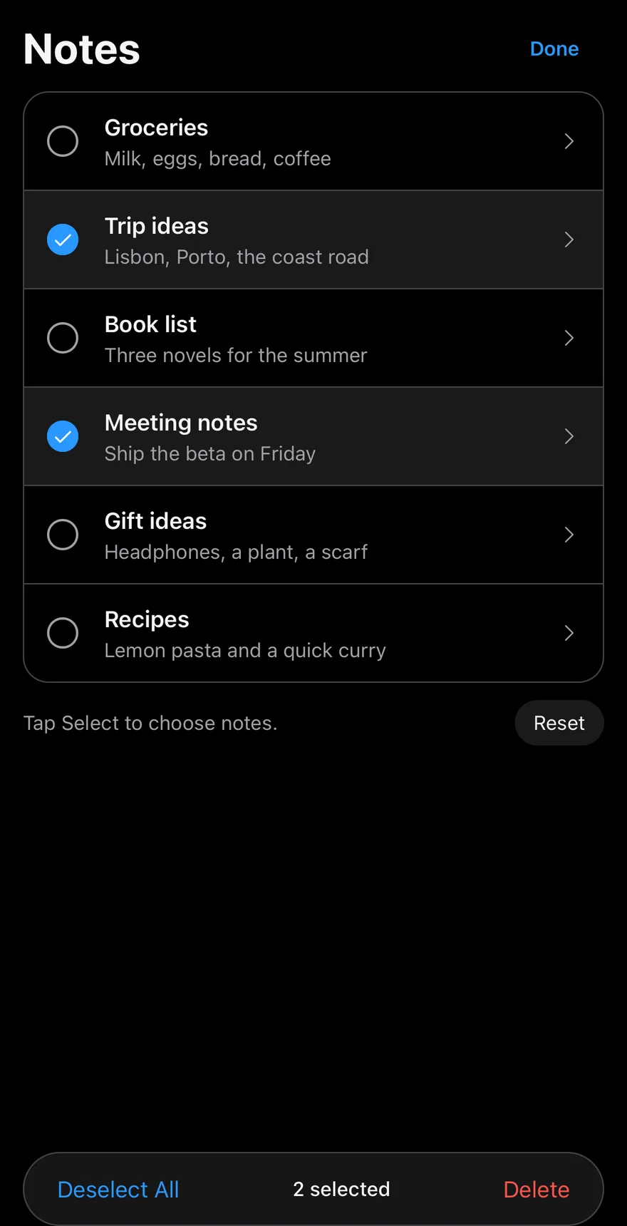
SelectionList recreates the iOS Select mode for lists. Pressing SelectionListTrigger switches into editing: each SelectionListItem slides in a round checkmark indicator and becomes a checkbox, and SelectionListBar rises from the bottom of the screen as a floating toolbar. The row content is made inert while editing, so taps toggle selection instead of opening the row. Leaving editing clears the selection.

The trigger is a suiss/ui Button that reads Select or Done by default, and SelectionListCount shows how many rows are selected. Use it for lists where people manage several items at once, such as deleting notes or archiving mail.

Installation

CLI

$ pnpm dlx shadcn@latest add @esuiss/selection-list

Works in any project with a components.json. See Installation for the one-line registry setup. Or use the suiss/ui CLI:

$ pnpm dlx @esuiss/ui@latest add interactions selection-list

Manual

  1. Install the dependencies and add the cn helper:
$ pnpm add @phosphor-icons/react
  1. Add the pieces it builds on: Button.

  2. Copy the source into components/interactions/selection-list.tsx:

components/interactions/selection-list.tsx
"use client"

import { CheckIcon } from "@phosphor-icons/react"
import * as React from "react"
import { Button } from "@/components/ui/button"
import { cn } from "@/lib/utils"

type SelectionListContextProps = {
  editing: boolean
  setEditing: (editing: boolean) => void
  selected: string[]
  setSelected: (selected: string[]) => void
  toggle: (value: string, range: boolean) => void
  selectAll: () => void
  clear: () => void
}
  1. Update the import paths to match your project.

Usage

import { SelectionList, SelectionListTrigger, SelectionListItem, SelectionListBar, SelectionListCount } from "@/components/interactions/selection-list"
<NotesExample />
  • Place SelectionListTrigger, the SelectionListItem rows, and SelectionListBar inside SelectionList. Put your own action buttons and SelectionListCount inside the bar.
  • Editing and selection are each uncontrolled by default. Pass editing and onEditingChange, or value and onValueChange, to control them.
  • useSelectionList returns editing, setEditing, selected, setSelected, selectAll, and clear for building actions such as Select All or Delete.
  • Shift-clicking a row, or pressing Shift with Enter or Space, selects the range from the previously toggled row.
  • Escape leaves editing.

Examples

Icon actions

A controlled selection drives icon-only toolbar actions that stay disabled until a row is picked.

import {
  ArchiveIcon,
  CaretRightIcon,
  FolderSimpleIcon,
  TrashIcon,
} from "@phosphor-icons/react"
import * as React from "react"
import {
  SelectionList,
  SelectionListBar,
  SelectionListCount,
  SelectionListItem,
  SelectionListTrigger,
} from "@/components/interactions/selection-list"
import { Button } from "@/components/ui/button"

API Reference

01

SelectionList

The root that holds the editing state and the selected values.

PropTypeDefaultDescription
editingboolean-Whether the list is in editing mode, for controlled use.
defaultEditingbooleanfalseWhether the list starts in editing mode when uncontrolled.
onEditingChange(editing: boolean) => void-Called when editing mode turns on or off.
valuestring[]-The selected row values, for controlled use.
defaultValuestring[][]The rows selected initially when uncontrolled.
onValueChange(value: string[]) => void-Called with the new array of selected values.

Also accepts the props of React.ComponentProps<"div">.

02

SelectionListTrigger

The button that enters and leaves editing.

Also accepts the props of React.ComponentProps<typeof Button>.

03

SelectionListItem

A row that becomes a selectable checkbox while editing.

PropTypeDefaultDescription
valuestringRequiredThe unique value that identifies the row in the selection.

Also accepts the props of React.ComponentProps<"div">.

04

SelectionListBar

The floating toolbar shown while editing.

Also accepts the props of React.ComponentProps<"div">.

05

SelectionListCount

A live label with the number of selected rows.

Also accepts the props of React.ComponentProps<"span">.

Accessibility

  • SelectionListTrigger sets aria-pressed while editing.
  • In editing mode, each row has role="checkbox" with aria-checked, is focusable, and toggles with Enter or Space. Its accessible name comes from the row's text unless you set aria-label.
  • SelectionListBar has role="toolbar" and is inert while not editing; give it an aria-label.
  • SelectionListCount is a polite live region, so selection changes are announced.

Notes

  • The root sets data-editing while editing, available to children as the group/selection-list Tailwind group. Rows expose data-value and data-checked.
  • Parts use data-slot values selection-list, selection-list-trigger, selection-list-item, selection-list-indicator, selection-list-item-content, selection-list-bar, and selection-list-count.
  • The bar is fixed to the bottom of the viewport, so leave room below the list for it.
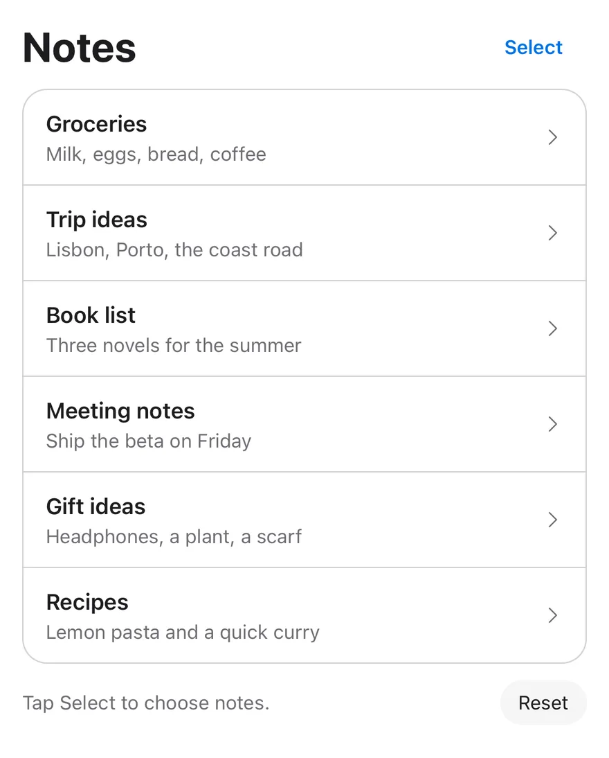
iOS
Selection List on iOS in light modeSelection List on iOS in dark mode
import { CaretRightIcon } from "phosphor-react-native"
import * as React from "react"
import { Pressable, View } from "react-native"
import { SelectionList, SelectionListBar, SelectionListCount, SelectionListItem, SelectionListTrigger, useSelectionList } from "@/components/interactions/selection-list"
import { Button } from "@/components/ui/button"
import { Icon } from "@/components/ui/icon"
import { Text } from "@/components/ui/text"

const initialNotes = [
  { id: "groceries", title: "Groceries", preview: "Milk, eggs, bread, coffee" },
  { id: "trip", title: "Trip ideas", preview: "Lisbon, Porto, the coast road" },
  { id: "books", title: "Book list", preview: "Three novels for the summer" },
  { id: "meeting", title: "Meeting notes", preview: "Ship the beta on Friday" },
  { id: "gifts", title: "Gift ideas", preview: "Headphones, a plant, a scarf" },
  { id: "recipes", title: "Recipes", preview: "Lemon pasta and a quick curry" },
]
import EsuissUI
import PhosphorSwift
import SwiftUI

struct SelectionListNote: Identifiable {
  let id: String
  let title: String
  let preview: String
}

let selectionListInitialNotes = [
  SelectionListNote(id: "groceries", title: "Groceries", preview: "Milk, eggs, bread, coffee"),
  SelectionListNote(id: "trip", title: "Trip ideas", preview: "Lisbon, Porto, the coast road"),
  SelectionListNote(id: "books", title: "Book list", preview: "Three novels for the summer"),
  SelectionListNote(id: "meeting", title: "Meeting notes", preview: "Ship the beta on Friday"),
  SelectionListNote(id: "gifts", title: "Gift ideas", preview: "Headphones, a plant, a scarf"),
import androidx.compose.foundation.background
import androidx.compose.foundation.border
import androidx.compose.foundation.layout.Arrangement
import androidx.compose.foundation.layout.Box
import androidx.compose.foundation.layout.Column
import androidx.compose.foundation.layout.Row
import androidx.compose.foundation.layout.fillMaxWidth
import androidx.compose.foundation.layout.height
import androidx.compose.foundation.layout.padding
import androidx.compose.foundation.shape.RoundedCornerShape
import androidx.compose.runtime.Composable
import androidx.compose.runtime.getValue
import androidx.compose.runtime.mutableStateOf
import androidx.compose.runtime.remember
import androidx.compose.runtime.saveable.rememberSaveable
import androidx.compose.runtime.setValue

SelectionList switches a list between normal and editing modes. In editing mode each SelectionListItem slides in a check circle at its start, the whole row toggles on press, and selected rows are highlighted.

SelectionListBar floats above the bottom safe area while editing, sliding up into view, for actions such as delete or move. Leaving editing mode clears the selection. On Android the hardware back button also leaves it. Use it for mail, notes or photo lists that need bulk actions.

Installation

$ pnpm dlx shadcn@latest add @esuiss-rn/selection-list

See Installation for the components.json setup. Or use the suiss/ui CLI:

$ pnpm dlx @esuiss/ui@latest add selection-list
$ pnpm dlx @esuiss/ui@latest add selection-list --platform swift
$ pnpm dlx @esuiss/ui@latest add selection-list --platform kotlin

The CLI also adds what it builds on: Button, Icon, Text. On React Native it also adds the animated view components/ui/animated-view.tsx.

Manual

  1. Install the dependencies:
npx expo install cn phosphor-react-native react-native-reanimated react-native-safe-area-context react-native-svg react-native-worklets
  1. Add the pieces it builds on: Button, Icon, Text, and the primitives components/primitives/hooks.tsx, components/primitives/portal.tsx, and the animated view components/ui/animated-view.tsx from the next step.

  2. Copy the animated view into components/ui/animated-view.tsx:

uniwind/components/ui/animated-view.tsx
import { Pressable } from "react-native"
import Animated from "react-native-reanimated"

const AnimatedPressable = Animated.createAnimatedComponent(Pressable)

type AnimatedViewProps =
  | (React.ComponentProps<typeof Animated.View> &
      React.RefAttributes<React.ComponentRef<typeof Animated.View>> & {
        as?: "View"
      })
  | (React.ComponentProps<typeof AnimatedPressable> &
      React.RefAttributes<React.ComponentRef<typeof AnimatedPressable>> & {
        as: "Pressable"
      })

function AnimatedView(props: AnimatedViewProps) {
  1. Copy the source into components/interactions/selection-list.tsx:
uniwind/components/interactions/selection-list.tsx
import { cn } from "cn"
import { CheckIcon } from "phosphor-react-native"
import * as React from "react"
import { Pressable, View, type ViewProps } from "react-native"
import {
  Easing,
  Keyframe,
  ReduceMotion,
  useAnimatedStyle,
  withTiming,
} from "react-native-reanimated"
import { useSafeAreaInsets } from "react-native-safe-area-context"
import { useBackHandler } from "@/components/primitives/hooks"
import { Portal } from "@/components/primitives/portal"
import { AnimatedView } from "@/components/ui/animated-view"
import { Button } from "@/components/ui/button"
  1. Update the import paths to match your project.
  1. Install the dependencies:
npx expo install cn phosphor-react-native react-native-reanimated react-native-safe-area-context react-native-svg react-native-worklets
  1. Add the pieces it builds on: Button, Icon, Text, and the primitives components/primitives/hooks.tsx, components/primitives/portal.tsx, and the animated view components/ui/animated-view.tsx from the next step.

  2. Copy the animated view into components/ui/animated-view.tsx:

nativewind/components/ui/animated-view.tsx
import { Pressable } from "react-native"
import Animated from "react-native-reanimated"

const AnimatedPressable = Animated.createAnimatedComponent(Pressable)

type AnimatedViewProps =
  | (React.ComponentProps<typeof Animated.View> &
      React.RefAttributes<React.ComponentRef<typeof Animated.View>> & {
        as?: "View"
      })
  | (React.ComponentProps<typeof AnimatedPressable> &
      React.RefAttributes<React.ComponentRef<typeof AnimatedPressable>> & {
        as: "Pressable"
      })

function AnimatedView(props: AnimatedViewProps) {
  1. Copy the source into components/interactions/selection-list.tsx:
nativewind/components/interactions/selection-list.tsx
import { cn } from "cn"
import { CheckIcon } from "phosphor-react-native"
import * as React from "react"
import { Pressable, View, type ViewProps } from "react-native"
import {
  Easing,
  Keyframe,
  ReduceMotion,
  useAnimatedStyle,
  withTiming,
} from "react-native-reanimated"
import { useSafeAreaInsets } from "react-native-safe-area-context"
import { useBackHandler } from "@/components/primitives/hooks"
import { Portal } from "@/components/primitives/portal"
import { AnimatedView } from "@/components/ui/animated-view"
import { Button } from "@/components/ui/button"
  1. Update the import paths to match your project.
  1. Install the dependencies:
npx expo install phosphor-react-native react-native-reanimated react-native-safe-area-context react-native-svg react-native-worklets
  1. Add the pieces it builds on: Button, Icon, Text, and the primitives components/primitives/hooks.tsx, components/primitives/portal.tsx, and the animated view components/ui/animated-view.tsx from the next step.

  2. Copy the animated view into components/ui/animated-view.tsx:

stylesheet/components/ui/animated-view.tsx
import { Pressable } from "react-native"
import Animated from "react-native-reanimated"

const AnimatedPressable = Animated.createAnimatedComponent(Pressable)

type AnimatedViewProps =
  | (React.ComponentProps<typeof Animated.View> &
      React.RefAttributes<React.ComponentRef<typeof Animated.View>> & {
        as?: "View"
      })
  | (React.ComponentProps<typeof AnimatedPressable> &
      React.RefAttributes<React.ComponentRef<typeof AnimatedPressable>> & {
        as: "Pressable"
      })

function AnimatedView(props: AnimatedViewProps) {
  1. Copy the source into components/interactions/selection-list.tsx:
stylesheet/components/interactions/selection-list.tsx
import { CheckIcon } from "phosphor-react-native"
import * as React from "react"
import { Pressable, StyleSheet, View, type ViewProps } from "react-native"
import {
  Easing,
  Keyframe,
  ReduceMotion,
  useAnimatedStyle,
  withTiming,
} from "react-native-reanimated"
import { useSafeAreaInsets } from "react-native-safe-area-context"
import { useBackHandler } from "@/components/primitives/hooks"
import { Portal } from "@/components/primitives/portal"
import { AnimatedView } from "@/components/ui/animated-view"
import { Button } from "@/components/ui/button"
import { Icon } from "@/components/ui/icon"
  1. Update the import paths to match your project.
  1. Target iOS 17 or later.

  2. Add the Swift package to your app:

Package.swift
.package(url: "https://github.com/phosphor-icons/swift", from: "2.1.0")
  1. Copy the theme files every view uses:
swift/Theme/Theme.swift
import CoreText
import SwiftUI
import UIKit

struct RGBA: Sendable {
  let red: CGFloat
  let green: CGFloat
  let blue: CGFloat
  let alpha: CGFloat

  init(_ hex: UInt32, _ alpha: CGFloat = 1) {
    red = CGFloat((hex >> 16) & 0xFF) / 255
    green = CGFloat((hex >> 8) & 0xFF) / 255
    blue = CGFloat(hex & 0xFF) / 255
    self.alpha = alpha
  }
swift/Theme/Tokens.swift
import SwiftUI

public enum EsuissColor {
  public static let background = Color.adaptive(light: .init(0xFFFFFF), dark: .init(0x000000))
  public static let foreground = Color.adaptive(light: .init(0x1D1D1F), dark: .init(0xF5F5F7))
  public static let card = Color.adaptive(light: .init(0xFFFFFF), dark: .init(0x1D1D1F))
  public static let cardForeground = Color.adaptive(light: .init(0x1D1D1F), dark: .init(0xF5F5F7))
  public static let popover = Color.adaptive(light: .init(0xFFFFFF), dark: .init(0x1D1D1F))
  public static let popoverForeground = Color.adaptive(light: .init(0x1D1D1F), dark: .init(0xF5F5F7))
  public static let primary = Color.adaptive(light: .init(0x0071E3), dark: .init(0x2997FF))
  public static let primaryForeground = Color.adaptive(light: .init(0xFFFFFF), dark: .init(0xFFFFFF))
  public static let secondary = Color.adaptive(light: .init(0x000000, 0.04), dark: .init(0xFFFFFF, 0.1))
  public static let secondaryForeground = Color.adaptive(light: .init(0x1D1D1F), dark: .init(0xF5F5F7))
  public static let muted = Color.adaptive(light: .init(0xF5F5F7), dark: .init(0x161617))
  public static let mutedForeground = Color.adaptive(light: .init(0x6E6E73), dark: .init(0xA1A1A6))
  public static let accent = Color.adaptive(light: .init(0x000000, 0.06), dark: .init(0xFFFFFF, 0.1))
  1. Copy the source and every file it uses:
swift/Interactions/SelectionList.swift
import PhosphorSwift
import SwiftUI

struct SelectionModel<Value: Hashable> {
  var editing = false
  var selected: Set<Value> = []
  var order: [Value] = []

  mutating func toggle(_ value: Value) {
    if selected.contains(value) {
      selected.remove(value)
    } else {
      selected.insert(value)
    }
  }
swift/Components/Button.swift
import SwiftUI

public struct VariantButtonStyle: ButtonStyle {
  public enum Variant: CaseIterable, Sendable {
    case `default`, outline, secondary, tinted, ghost, plain, destructive, link
  }

  public enum Size: CaseIterable, Sendable {
    case `default`, xs, sm, lg, xl, icon, iconXs, iconSm, iconLg, iconXl

    var height: CGFloat {
      switch self {
      case .xs, .iconXs: Metrics.Height.buttonXs
      case .sm, .iconSm: Metrics.Height.buttonSm
      case .default, .icon: Metrics.Height.button
      case .lg, .iconLg: Metrics.Height.buttonLg
swift/Components/ButtonGroup.swift
import SwiftUI

extension EnvironmentValues {
  @Entry var buttonGroup: Axis? = nil
  @Entry var buttonGroupSize: CGSize = .zero
}

enum ButtonGroupSpace: Hashable {
  case group
}

struct ButtonGroupFrame {
  let bounds: Anchor<CGRect>
  let outlined: Bool
}
swift/Components/TextVariant.swift
import SwiftUI

public enum TextVariant: CaseIterable, Sendable {
  case `default`, h1, h2, h3, h4, p, blockquote, code, lead, large, small, muted

  var style: TextStyle {
    switch self {
    case .h1: .xl3
    case .h2: .xl2
    case .h3: .xl
    case .h4, .lead, .large: .lg
    case .code, .small, .muted: .sm
    default: .base
    }
  }
  1. Add the files to your app target.
  1. Set minSdk to 24 or higher and add the dependencies:
build.gradle.kts
implementation(platform("androidx.compose:compose-bom:2026.09.00"))
implementation("androidx.compose.foundation:foundation")
implementation("androidx.compose.ui:ui")
implementation("com.adamglin:phosphor-icon-android:1.0.0")
  1. Copy the theme files every view uses:
kotlin/theme/Theme.kt
package com.esuiss.ui.theme

import android.content.res.AssetManager
import androidx.compose.foundation.isSystemInDarkTheme
import androidx.compose.runtime.Composable
import androidx.compose.runtime.CompositionLocalProvider
import androidx.compose.runtime.Immutable
import androidx.compose.runtime.staticCompositionLocalOf
import androidx.compose.ui.Modifier
import androidx.compose.ui.draw.dropShadow
import androidx.compose.ui.graphics.Color
import androidx.compose.ui.graphics.Shape
import androidx.compose.ui.graphics.shadow.Shadow as DropShadow
import androidx.compose.ui.platform.LocalContext
import androidx.compose.ui.text.TextStyle
import androidx.compose.ui.text.font.Font
kotlin/theme/Tokens.kt
package com.esuiss.ui.theme

import androidx.compose.runtime.Immutable
import androidx.compose.ui.graphics.Color
import androidx.compose.ui.text.font.FontWeight
import androidx.compose.ui.unit.dp

@Immutable
data class Colors(
    val background: Color,
    val foreground: Color,
    val card: Color,
    val cardForeground: Color,
    val popover: Color,
    val popoverForeground: Color,
    val primary: Color,
  1. Copy the source and every file it uses:
kotlin/interactions/SelectionList.kt
package com.esuiss.ui.interactions

import androidx.compose.animation.animateColorAsState
import androidx.compose.animation.core.animateDpAsState
import androidx.compose.animation.core.animateFloatAsState
import androidx.compose.animation.core.tween
import androidx.compose.foundation.background
import androidx.compose.foundation.border
import androidx.compose.foundation.interaction.MutableInteractionSource
import androidx.compose.foundation.layout.Arrangement
import androidx.compose.foundation.layout.Box
import androidx.compose.foundation.layout.PaddingValues
import androidx.compose.foundation.layout.Row
import androidx.compose.foundation.layout.RowScope
import androidx.compose.foundation.layout.Spacer
import androidx.compose.foundation.layout.fillMaxWidth
kotlin/components/Button.kt
package com.esuiss.ui.components

import androidx.compose.foundation.background
import androidx.compose.foundation.border
import androidx.compose.foundation.clickable
import androidx.compose.foundation.interaction.MutableInteractionSource
import androidx.compose.foundation.interaction.collectIsPressedAsState
import androidx.compose.foundation.layout.Arrangement
import androidx.compose.foundation.layout.Row
import androidx.compose.foundation.layout.RowScope
import androidx.compose.foundation.layout.fillMaxWidth
import androidx.compose.foundation.layout.height
import androidx.compose.foundation.layout.padding
import androidx.compose.foundation.layout.size
import androidx.compose.foundation.shape.RoundedCornerShape
import androidx.compose.foundation.text.BasicText
kotlin/components/ButtonGroup.kt
package com.esuiss.ui.components

import androidx.compose.foundation.background
import androidx.compose.foundation.gestures.Orientation
import androidx.compose.foundation.layout.Arrangement
import androidx.compose.foundation.layout.Box
import androidx.compose.foundation.layout.Row
import androidx.compose.foundation.layout.RowScope
import androidx.compose.foundation.layout.padding
import androidx.compose.foundation.shape.CircleShape
import androidx.compose.foundation.shape.CornerSize
import androidx.compose.foundation.shape.RoundedCornerShape
import androidx.compose.runtime.Composable
import androidx.compose.runtime.CompositionLocalProvider
import androidx.compose.runtime.DisposableEffect
import androidx.compose.runtime.Immutable
kotlin/components/Content.kt
package com.esuiss.ui.components

import androidx.compose.runtime.compositionLocalOf
import androidx.compose.ui.graphics.Color
import androidx.compose.ui.text.TextStyle
import androidx.compose.ui.unit.Dp
import androidx.compose.ui.unit.dp

val LocalContentStyle = compositionLocalOf { TextStyle.Default }

val LocalContentColor = compositionLocalOf { Color.Unspecified }

val LocalIconSize = compositionLocalOf { 20.dp }
kotlin/components/FormSupport.kt
package com.esuiss.ui.components

import android.provider.Settings
import androidx.compose.animation.core.CubicBezierEasing
import androidx.compose.foundation.background
import androidx.compose.foundation.border
import androidx.compose.foundation.gestures.Orientation
import androidx.compose.foundation.text.selection.TextSelectionColors
import androidx.compose.runtime.Composable
import androidx.compose.runtime.mutableStateOf
import androidx.compose.runtime.remember
import androidx.compose.ui.Modifier
import androidx.compose.ui.draw.alpha
import androidx.compose.ui.draw.clip
import androidx.compose.ui.draw.drawWithContent
import androidx.compose.ui.geometry.Offset
kotlin/components/Icon.kt
package com.esuiss.ui.components

import androidx.compose.foundation.Image
import androidx.compose.foundation.layout.size
import androidx.compose.runtime.Composable
import androidx.compose.ui.Modifier
import androidx.compose.ui.graphics.Color
import androidx.compose.ui.graphics.ColorFilter
import androidx.compose.ui.graphics.takeOrElse
import androidx.compose.ui.graphics.vector.ImageVector
import androidx.compose.ui.unit.Dp
import com.esuiss.ui.theme.EsuissTheme

@Composable
fun Icon(
    imageVector: ImageVector,
kotlin/interactions/FloatingBar.kt
package com.esuiss.ui.interactions

import androidx.compose.animation.AnimatedVisibility
import androidx.compose.animation.core.MutableTransitionState
import androidx.compose.animation.core.tween
import androidx.compose.animation.fadeIn
import androidx.compose.animation.fadeOut
import androidx.compose.animation.scaleIn
import androidx.compose.animation.scaleOut
import androidx.compose.animation.slideInVertically
import androidx.compose.animation.slideOutVertically
import androidx.compose.foundation.background
import androidx.compose.foundation.border
import androidx.compose.foundation.layout.Arrangement
import androidx.compose.foundation.layout.Box
import androidx.compose.foundation.layout.PaddingValues
  1. Update the com.esuiss.ui package names to match your project.

Usage

import { SelectionList, SelectionListTrigger, SelectionListItem, SelectionListBar, SelectionListCount } from "@/components/interactions/selection-list"
<NotesExample />

Wrap the list in SelectionList, add a SelectionListTrigger that toggles editing (it reads Select and Done by default), and give each SelectionListItem a unique value. Put your buttons and a SelectionListCount in SelectionListBar.

Editing and the selection can be uncontrolled with defaultEditing and defaultValue, or controlled with editing, onEditingChange, value and onValueChange. useSelectionList returns editing, selected, toggle, selectAll and clear for custom actions. Outside editing mode, the row's children receive presses as usual.

Examples

Editing

Starts in editing mode with two notes selected.
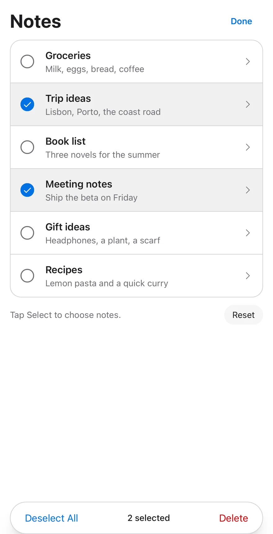
iOS
Selection List (editing) on iOS in light modeSelection List (editing) on iOS in dark mode
import { CaretRightIcon } from "phosphor-react-native"
import * as React from "react"
import { Pressable, View } from "react-native"
import { SelectionList, SelectionListBar, SelectionListCount, SelectionListItem, SelectionListTrigger, useSelectionList } from "@/components/interactions/selection-list"
import { Button } from "@/components/ui/button"
import { Icon } from "@/components/ui/icon"
import { Text } from "@/components/ui/text"

const initialNotes = [
  { id: "groceries", title: "Groceries", preview: "Milk, eggs, bread, coffee" },
  { id: "trip", title: "Trip ideas", preview: "Lisbon, Porto, the coast road" },
  { id: "books", title: "Book list", preview: "Three novels for the summer" },
  { id: "meeting", title: "Meeting notes", preview: "Ship the beta on Friday" },
  { id: "gifts", title: "Gift ideas", preview: "Headphones, a plant, a scarf" },
  { id: "recipes", title: "Recipes", preview: "Lemon pasta and a quick curry" },
]
import EsuissUI
import PhosphorSwift
import SwiftUI

struct SelectionListEditingExample: View {
  var body: some View {
    SelectionListNotes(editing: true, selection: ["trip", "meeting"])
  }
}

struct SelectionListNote: Identifiable {
  let id: String
  let title: String
  let preview: String
}
import androidx.compose.foundation.background
import androidx.compose.foundation.border
import androidx.compose.foundation.layout.Arrangement
import androidx.compose.foundation.layout.Box
import androidx.compose.foundation.layout.Column
import androidx.compose.foundation.layout.Row
import androidx.compose.foundation.layout.fillMaxWidth
import androidx.compose.foundation.layout.height
import androidx.compose.foundation.layout.padding
import androidx.compose.foundation.shape.RoundedCornerShape
import androidx.compose.runtime.Composable
import androidx.compose.runtime.getValue
import androidx.compose.runtime.mutableStateOf
import androidx.compose.runtime.remember
import androidx.compose.runtime.saveable.rememberSaveable
import androidx.compose.runtime.setValue

Icon actions

A mail list whose bar holds icon-only actions.
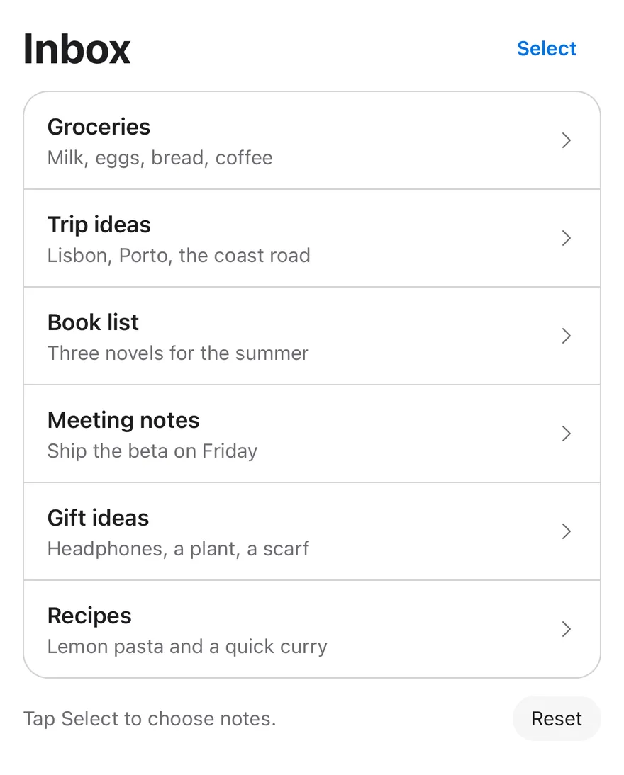
iOS
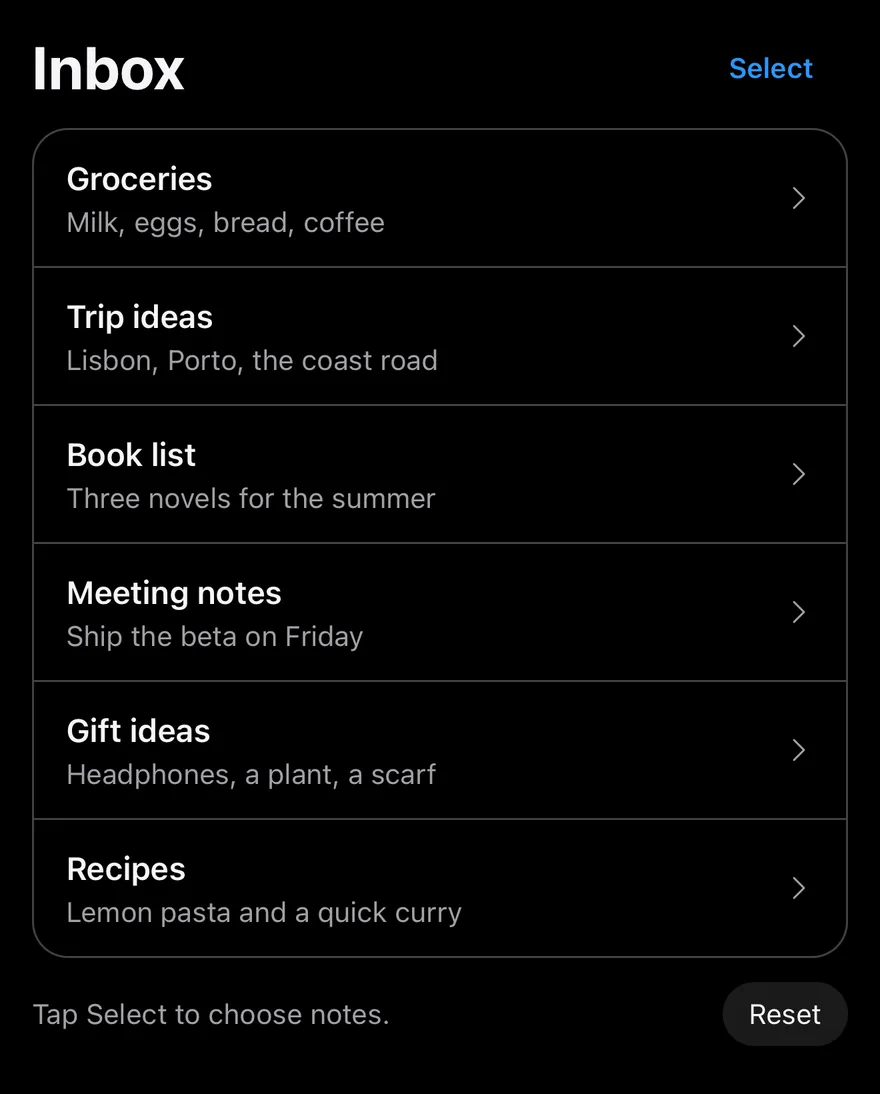
Selection List (icon actions) on iOS in light modeSelection List (icon actions) on iOS in dark mode
import { ArchiveIcon, CaretRightIcon, FolderSimpleIcon, TrashIcon } from "phosphor-react-native"
import * as React from "react"
import { Pressable, View } from "react-native"
import { SelectionList, SelectionListBar, SelectionListCount, SelectionListItem, SelectionListTrigger, useSelectionList } from "@/components/interactions/selection-list"
import { Button } from "@/components/ui/button"
import { Icon } from "@/components/ui/icon"
import { Text } from "@/components/ui/text"

const initialNotes = [
  { id: "groceries", title: "Groceries", preview: "Milk, eggs, bread, coffee" },
  { id: "trip", title: "Trip ideas", preview: "Lisbon, Porto, the coast road" },
  { id: "books", title: "Book list", preview: "Three novels for the summer" },
  { id: "meeting", title: "Meeting notes", preview: "Ship the beta on Friday" },
  { id: "gifts", title: "Gift ideas", preview: "Headphones, a plant, a scarf" },
  { id: "recipes", title: "Recipes", preview: "Lemon pasta and a quick curry" },
]
import EsuissUI
import PhosphorSwift
import SwiftUI

struct SelectionListNote: Identifiable {
  let id: String
  let title: String
  let preview: String
}

let selectionListInitialNotes = [
  SelectionListNote(id: "groceries", title: "Groceries", preview: "Milk, eggs, bread, coffee"),
  SelectionListNote(id: "trip", title: "Trip ideas", preview: "Lisbon, Porto, the coast road"),
  SelectionListNote(id: "books", title: "Book list", preview: "Three novels for the summer"),
  SelectionListNote(id: "meeting", title: "Meeting notes", preview: "Ship the beta on Friday"),
  SelectionListNote(id: "gifts", title: "Gift ideas", preview: "Headphones, a plant, a scarf"),
import androidx.compose.foundation.background
import androidx.compose.foundation.border
import androidx.compose.foundation.layout.Arrangement
import androidx.compose.foundation.layout.Box
import androidx.compose.foundation.layout.Column
import androidx.compose.foundation.layout.Row
import androidx.compose.foundation.layout.fillMaxWidth
import androidx.compose.foundation.layout.height
import androidx.compose.foundation.shape.RoundedCornerShape
import androidx.compose.runtime.Composable
import androidx.compose.runtime.getValue
import androidx.compose.runtime.mutableStateOf
import androidx.compose.runtime.remember
import androidx.compose.runtime.saveable.rememberSaveable
import androidx.compose.runtime.setValue
import androidx.compose.ui.Alignment

API Reference

01

SelectionList

The root that holds the editing state and selection.

PropTypeDefaultDescription
editingboolean-Controls editing mode.
defaultEditingbooleanfalseWhether editing starts on when uncontrolled.
onEditingChange(editing: boolean) => void-Called when editing turns on or off.
valuestring[]-Selected item values when controlled.
defaultValuestring[]EMPTYInitially selected values when uncontrolled.
onValueChange(value: string[]) => void-Called with the new selection.

Also accepts the props of ViewProps.

02

SelectionListTrigger

A plain button that toggles editing.

Also accepts the props of React.ComponentProps<typeof Button>.

03

SelectionListItem

A row that toggles its value while editing.

PropTypeDefaultDescription
valuestringRequiredThe value this row adds to the selection.
childrenReact.ReactNode-

Also accepts the props of React.ComponentProps<typeof Pressable>.

04

SelectionListBar

A floating toolbar shown while editing.

PropTypeDefaultDescription
portalHoststring-Name of a portal host to render into.

Also accepts the props of ViewProps.

05

SelectionListCount

Text showing the number of selected items.

Also accepts the props of React.ComponentProps<typeof Text>.

Accessibility

  • While editing, rows have the checkbox role and expose their checked state; otherwise the row wrapper is not focusable and its children are.
  • The trigger exposes a selected state while editing.
  • The bar has the toolbar role.
  • SelectionListCount is a polite live region, reading Select items or n selected by default.

Notes

  • Selected rows use bg-accent; checked circles use bg-primary with a primary-foreground check.
  • The bar uses bg-card, or bg-muted in dark mode, and is up to max-w-md wide.
  • Animations respect the system reduce motion setting.
NextStepperPreviousSection Index

On this page

  1. 01Installation
    • CLI
    • Manual
  2. 02Usage
  3. 03Examples
    • Icon actions
  4. 04API Reference
    • SelectionList
    • SelectionListTrigger
    • SelectionListItem
    • SelectionListBar
    • SelectionListCount
  5. 05Accessibility
  6. 06Notes
  7. 07Installation
    • Manual
  8. 08Usage
  9. 09Examples
    • Editing
    • Icon actions
  10. 10API Reference
    • SelectionList
    • SelectionListTrigger
    • SelectionListItem
    • SelectionListBar
    • SelectionListCount
  11. 11Accessibility
  12. 12Notes