suiss/ui · Interaction
Preview Menu
A context menu that lifts the pressed item into an enlarged preview above its actions, like iOS context menus.
Preview Menu is an open-source interaction from suiss/ui for React, React Native, SwiftUI and Jetpack Compose. The @esuiss/ui CLI copies its source into your project, so you own the code.
PreviewMenu builds on the menu primitives of the chosen base. Touching and holding the trigger, or right-clicking it, blurs the page and animates the trigger from its position into a centered preview up to 360px wide, morphing its corner radius along the way. The menu of actions opens below the preview and the trigger stays hidden until the menu finishes closing, so the preview appears to return to its place.
By default, the preview shows the trigger's own content. Pass preview to PreviewMenuContent to show richer content instead; the trigger's snapshot crossfades into it. Use it for items that benefit from a quick look before acting, such as photos, documents, or messages.
Installation
CLI
Works in any project with a components.json. See Installation for the one-line registry setup. Or use the suiss/ui CLI:
Manual
- Install the dependencies and add the
cnhelper:
- Copy the source into
components/interactions/preview-menu.tsx:
- Update the import paths to match your project.
Usage
- Compose
PreviewMenuTriggerandPreviewMenuContentinsidePreviewMenu, withPreviewMenuItemandPreviewMenuSeparatorinside the content. - The menu is uncontrolled by default; pass
openandonOpenChangeto control it. - Set
aspectRatiowhen a custompreviewhas a different shape than the trigger; otherwise the preview keeps the trigger's proportions. - Handle actions with
onClickon each item. Items close the menu when chosen.
Examples
Disabled item
A disabled item is announced as unavailable and does not act, while the other items still work.
Custom preview
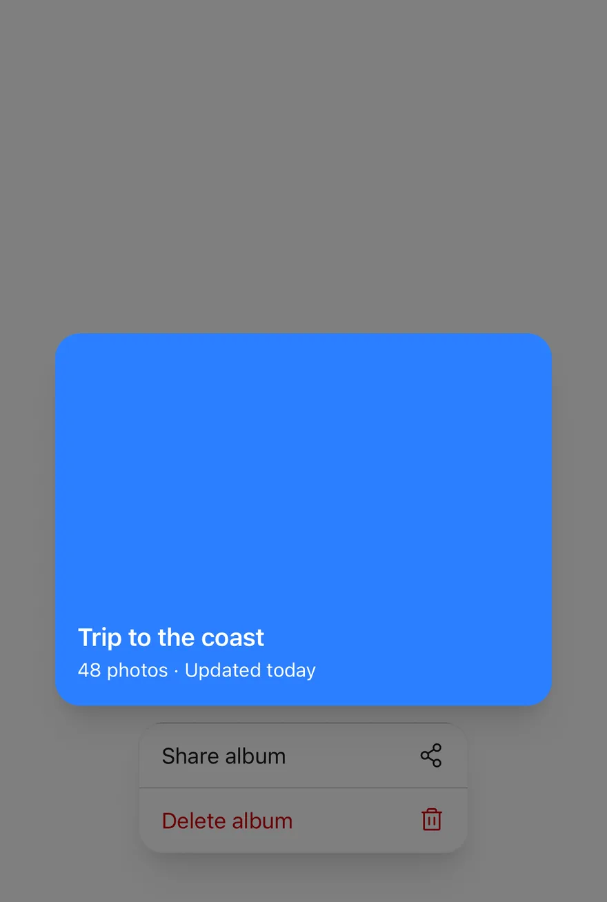
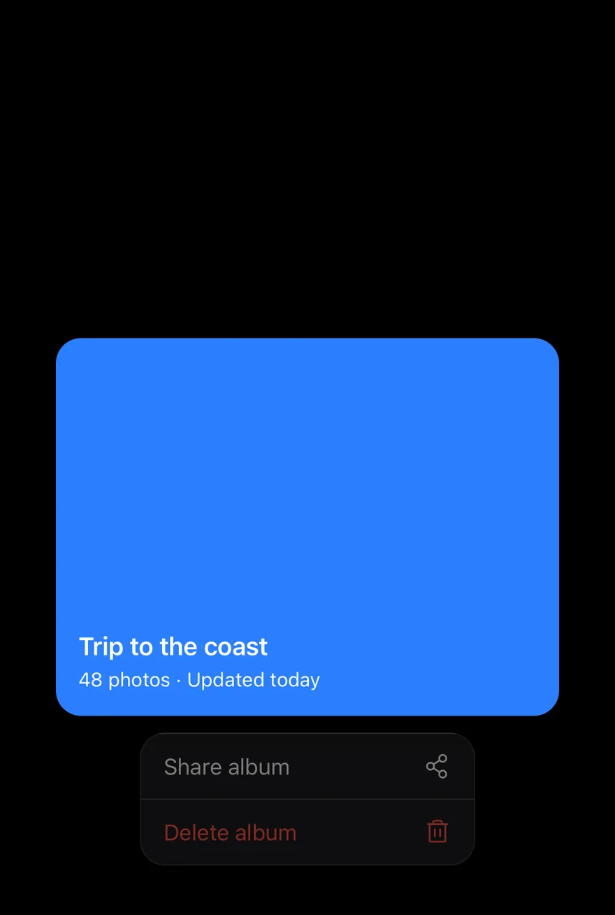
A compact album row opens a larger custom preview through the preview prop and aspectRatio.
API Reference
PreviewMenu
The root that manages open state and measures the preview frame.
| Prop | Type | Default | Description |
|---|---|---|---|
open | boolean | - | Whether the menu is open, for controlled use. |
defaultOpen | boolean | false | Whether the menu starts open when uncontrolled. |
onOpenChange | (open: boolean) => void | - | Called when the menu opens or closes. |
aspectRatio | number | - | The width-to-height ratio of the preview; defaults to the trigger's ratio. |
children | React.ReactNode | - | The trigger and content. |
PreviewMenuTrigger
The element that opens the menu on touch and hold or right-click.
Also accepts the props of the primitive part it wraps.
PreviewMenuContent
The backdrop, lifted preview, and popup that holds the menu items.
| Prop | Type | Default | Description |
|---|---|---|---|
preview | React.ReactNode | - | Custom content to show in the preview instead of the trigger's content. |
previewClassName | string | - | Classes for the clipped preview container. |
Also accepts the props of the primitive part it wraps.
PreviewMenuItem
An action in the menu.
| Prop | Type | Default | Description |
|---|---|---|---|
variant | "default" | "destructive" | "default" | The item style; destructive renders the label in the destructive color. |
Also accepts the props of the primitive part it wraps.
PreviewMenuSeparator
A thick divider between groups of items.
Also accepts the props of the primitive part it wraps.
Accessibility
- The popup has
role="menu"and items haverole="menuitem", with keyboard navigation from the menu primitive. Escapecloses the menu without running an action.- Disabled items set
aria-disabledand cannot be chosen. - The lifted preview is
aria-hidden, so assistive technologies read the trigger and menu only.
Notes
- Parts use
data-slotvaluespreview-menu-trigger,preview-menu-backdrop,preview-menu-preview,preview-menu-content,preview-menu-item, andpreview-menu-separator. Items setdata-variant. - The trigger carries
data-previewingwhile open anddata-lifteduntil the closing animation ends, and is invisible during that time. - The trigger disables text selection and the iOS touch callout so long presses open the menu.
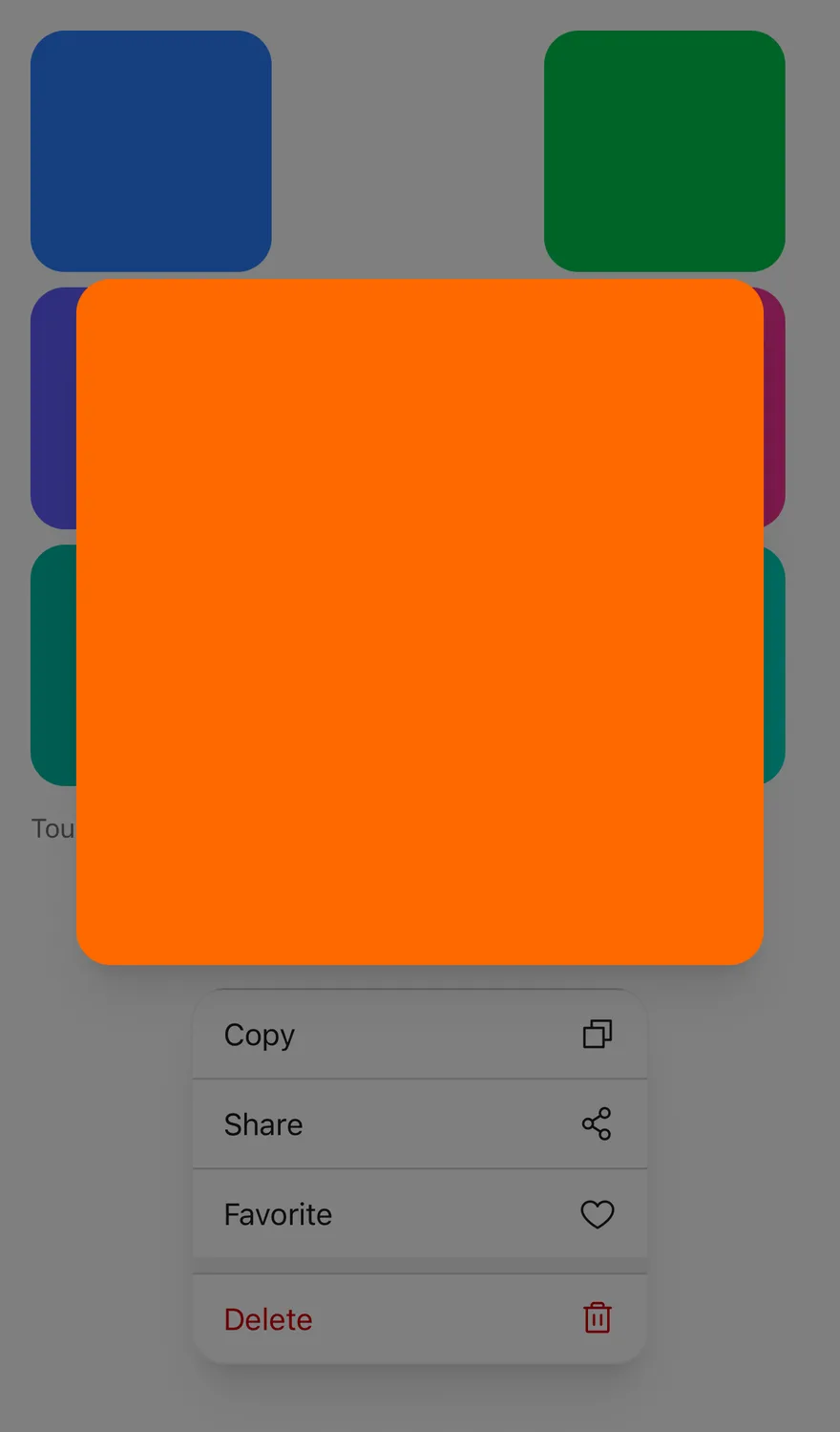
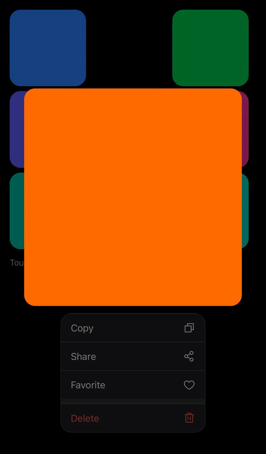
Long pressing a PreviewMenuTrigger measures it and the menu, then animates its content from its place on screen into a larger preview, up to 360 points wide. The preview and the menu below it are centered together between the top and bottom safe areas. The rest of the screen fades behind a scrim, and the menu grows out of the trigger into place.
The original trigger is hidden while lifted, so the preview appears to rise out of it. With custom preview content, the trigger's content cross-fades into it as it grows. Pressing outside closes the menu and the preview and menu shrink back into the trigger. Use it for photos, messages or cards that benefit from a closer look before acting.
Installation
The CLI also adds what it builds on: Icon, Text. On React Native it also adds the animated view components/ui/animated-view.tsx.
Manual
- Install the dependencies:
-
Add the pieces it builds on: Icon, Text, and the primitives
components/primitives/preview-menu.tsx,components/primitives/use-render.tsx, and the animated viewcomponents/ui/animated-view.tsxfrom the next step. -
Copy the animated view into
components/ui/animated-view.tsx:
- Copy the source into
components/interactions/preview-menu.tsx:
- Update the import paths to match your project.
- Install the dependencies:
-
Add the pieces it builds on: Icon, Text, and the primitives
components/primitives/preview-menu.tsx,components/primitives/use-render.tsx, and the animated viewcomponents/ui/animated-view.tsxfrom the next step. -
Copy the animated view into
components/ui/animated-view.tsx:
- Copy the source into
components/interactions/preview-menu.tsx:
- Update the import paths to match your project.
- Install the dependencies:
-
Add the pieces it builds on: Icon, Text, and the primitives
components/primitives/preview-menu.tsx,components/primitives/use-render.tsx, and the animated viewcomponents/ui/animated-view.tsxfrom the next step. -
Copy the animated view into
components/ui/animated-view.tsx:
- Copy the source into
components/interactions/preview-menu.tsx:
- Update the import paths to match your project.
-
Target iOS 17 or later.
-
Add the Swift package to your app:
- Copy the theme files every view uses:
- Copy the source and every file it uses:
- Add the files to your app target.
- Set
minSdkto 24 or higher and add the dependencies:
- Copy the theme files every view uses:
- Copy the source and every file it uses:
- Update the
com.esuiss.uipackage names to match your project.
Usage
Put a PreviewMenuTrigger with the element and a PreviewMenuContent with PreviewMenuItems inside PreviewMenu. By default the preview repeats the trigger's children; pass preview to show different content, such as a larger image.
Set aspectRatio to size the preview, for example 4 / 3. The menu can be uncontrolled or controlled with open, defaultOpen and onOpenChange. usePreviewMenu returns open, lifted and frame.
Examples
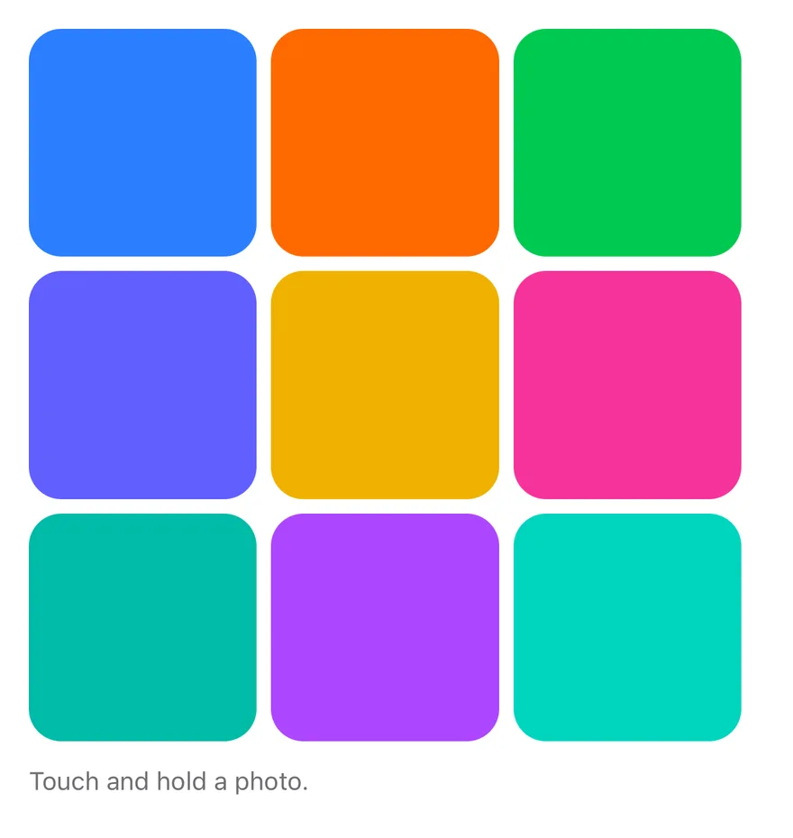
Default
Disabled item
Includes a disabled menu item.
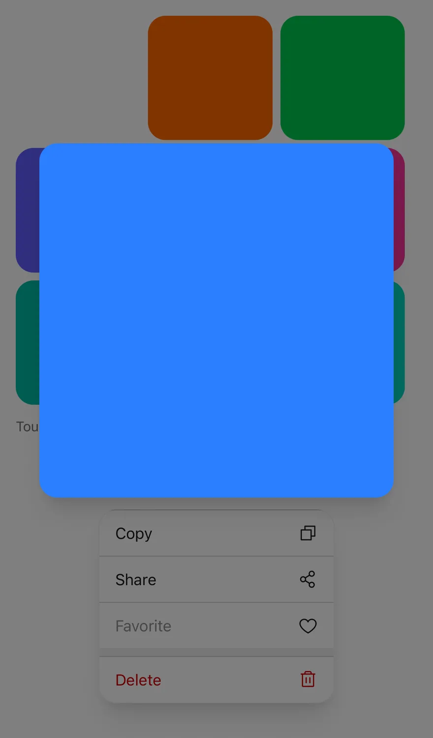
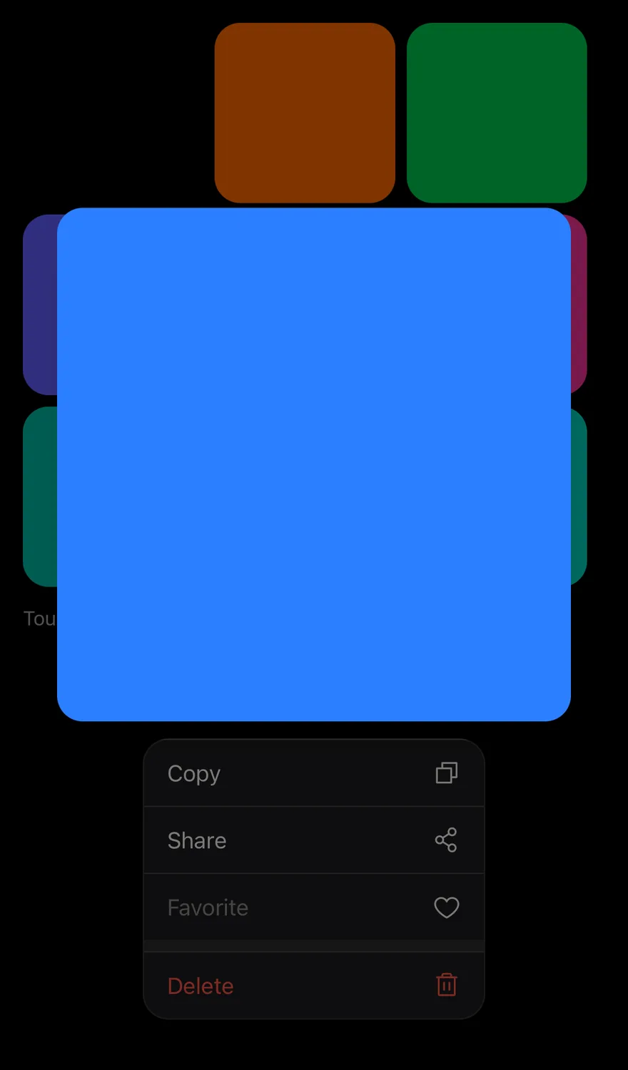
Custom preview
Shows custom preview content with a 4 / 3 aspect ratio.
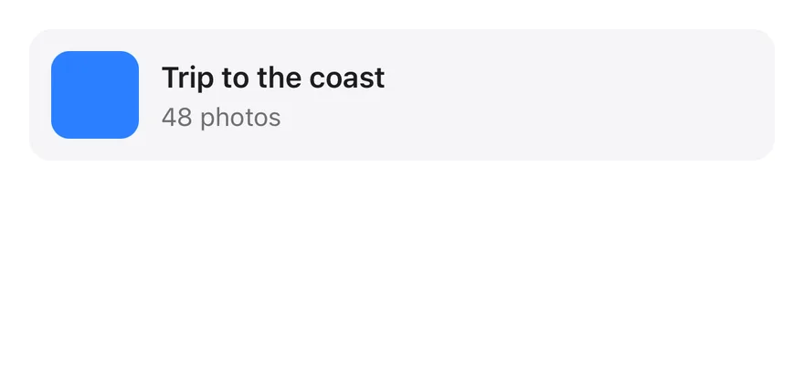
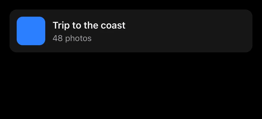
Custom preview open
The custom preview, open on first render.
API Reference
PreviewMenu
The root that owns the open state and preview size.
| Prop | Type | Default | Description |
|---|---|---|---|
open | boolean | - | Controls whether the preview is open. |
defaultOpen | boolean | - | Whether the preview starts open when uncontrolled. |
onOpenChange | (open: boolean) => void | - | Called when the preview opens or closes. |
aspectRatio | number | - | Width-to-height ratio of the lifted preview. |
children | React.ReactNode | - |
PreviewMenuTrigger
The element that opens the preview on long press.
Also accepts the props of React.ComponentProps<typeof PreviewMenuPrimitive.Trigger>.
PreviewMenuContent
The scrim, the lifted preview and the menu.
| Prop | Type | Default | Description |
|---|---|---|---|
preview | React.ReactNode | - | Content to show in the preview instead of the trigger's children. |
previewClassName | string | - | Classes for the preview container. |
portalHost | string | - | Name of a portal host to render into. |
Also accepts the props of React.ComponentProps<typeof PreviewMenuPrimitive.Popup>.
PreviewMenuItem
A menu action.
| Prop | Type | Default | Description |
|---|---|---|---|
variant | "default" | "destructive" | "default" | default or destructive, which uses text-destructive. |
children | React.ReactNode | - |
Also accepts the props of React.ComponentProps<typeof PreviewMenuPrimitive.Item>.
PreviewMenuSeparator
A thick divider between groups of items.
Also accepts the props of React.ComponentProps<typeof PreviewMenuPrimitive.Separator>.
Accessibility
- The trigger has a
longpressaccessibility action, so screen reader users can open the menu without holding. - The trigger exposes
expandedanddisabledstates. - The preview is hidden from screen readers; focus goes to the menu.
Notes
- A medium impact haptic plays when the menu opens, if the app provides an adapter through
HapticsProvider. - The menu uses
bg-popoverwith a border that is stronger in dark mode, and the backdrop usesbg-black/50. - The preview stays within the top and bottom safe areas and leaves room for the measured height of the menu.
- Animations respect the system reduce motion setting.
- On iOS the content renders in a full-window overlay so it appears above native screens.