suiss/ui
  • Docs
  • Components
  • Patterns
  • Interactions
  • Charts
  • Blocks
  • AI
GitHubCreate
DocsComponentsPatternsInteractionsChartsBlocksAICreate
Interactions15
  • Overview
  • Card Stack
  • Image Viewer
  • Island
  • OTP Autofill
  • Preview Menu
  • Pull to Refresh
  • Reorder List
  • Search Reveal
  • Section Index
  • Selection List
  • Stepper
  • Swipe Actions
  • Tip
  • Top Banner
  • Undo Bar

suiss/ui · Interaction

Section Index

An A to Z index bar for jumping between sections of a long list by tapping, dragging, or typing.

Section Index is an open-source interaction from suiss/ui for React, React Native, SwiftUI and Jetpack Compose. The @esuiss/ui CLI copies its source into your project, so you own the code.

import * as React from "react"
import {
  SectionIndex,
  SectionIndexBar,
  SectionIndexHeader,
  SectionIndexSection,
} from "@/components/interactions/section-index"
import { ScrollArea } from "@/components/ui/scroll-area"

const UPPERCASE = /[A-Z]/

const names = [
  "Aaron Price",
  "Abby Chen",
  "Alex Morgan",
  "Amira Haddad",

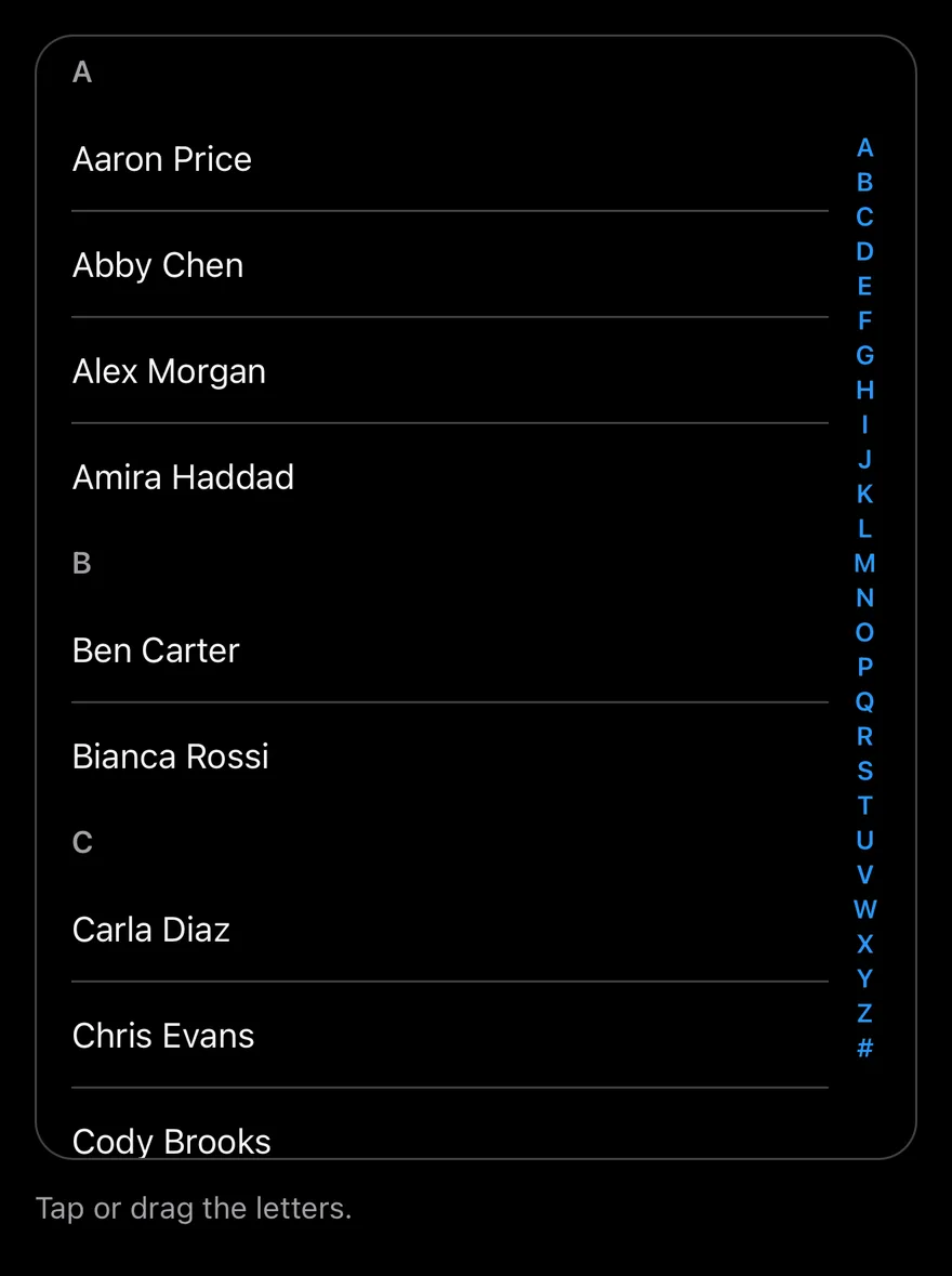
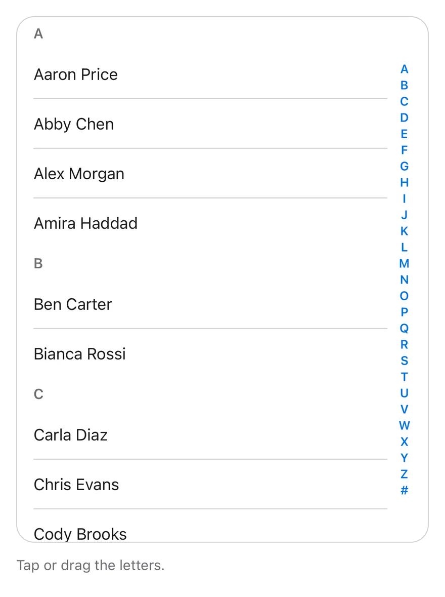
SectionIndex recreates the iOS list index. Sections marked with SectionIndexSection carry sticky SectionIndexHeader titles, and SectionIndexBar sits along the trailing edge. Tapping or dragging over the bar scrolls the nearest scrollable ancestor so the matching section is at the top; while dragging, a bubble shows the current letter. If a letter has no section, it jumps to the next one that exists.

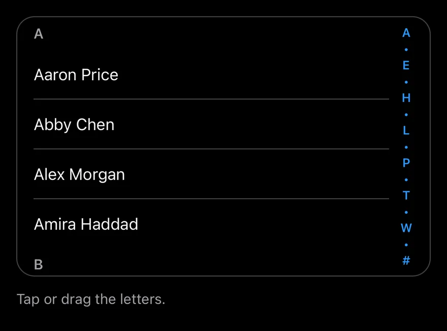
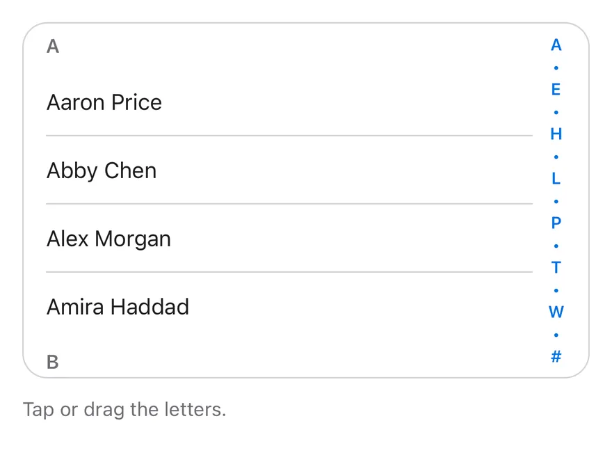
When the container is too short to fit every letter, the bar collapses to fewer letters separated by dots, while still mapping the full alphabet across its height. Use it for long alphabetized lists such as contacts.

Installation

CLI

$ pnpm dlx shadcn@latest add @esuiss/section-index

Works in any project with a components.json. See Installation for the one-line registry setup. Or use the suiss/ui CLI:

$ pnpm dlx @esuiss/ui@latest add interactions section-index

Manual

  1. Add the cn helper.

  2. Copy the source into components/interactions/section-index.tsx:

components/interactions/section-index.tsx
"use client"

import * as React from "react"
import { cn } from "@/lib/utils"

const LETTERS = [..."ABCDEFGHIJKLMNOPQRSTUVWXYZ", "#"]
const ROW_HEIGHT = 16
const PAGE = 5

function scrollParent(element: HTMLElement) {
  for (let node = element.parentElement; node; node = node.parentElement) {
    const { overflowY } = getComputedStyle(node)
    if (
      (overflowY === "auto" || overflowY === "scroll") &&
      node.scrollHeight > node.clientHeight
    )
  1. Update the import paths to match your project.

Usage

import { SectionIndex, SectionIndexSection, SectionIndexHeader, SectionIndexBar } from "@/components/interactions/section-index"
<ContactsExample className="h-[min(36rem,calc(100dvh-7rem))]" />
  • Wrap the scrolling list and SectionIndexBar in SectionIndex, which positions the bar. The list can scroll in its own container, such as ScrollArea, or in the page.
  • Set value on each SectionIndexSection to a letter from letters so the bar can find it.
  • Use onValueChange to react to jumps.

Examples

Compact

In a short list, the bar collapses its letters with dots and still jumps to any section.

import * as React from "react"
import {
  SectionIndex,
  SectionIndexBar,
  SectionIndexHeader,
  SectionIndexSection,
} from "@/components/interactions/section-index"
import { ScrollArea } from "@/components/ui/scroll-area"

const UPPERCASE = /[A-Z]/

const names = [
  "Aaron Price",
  "Abby Chen",
  "Alex Morgan",
  "Amira Haddad",

API Reference

01

SectionIndex

The relative container that holds the list and the index bar.

Also accepts the props of React.ComponentProps<"div">.

02

SectionIndexSection

A section of the list identified by a letter.

PropTypeDefaultDescription
valuestringRequiredThe letter this section belongs to.

Also accepts the props of React.ComponentProps<"section">.

03

SectionIndexHeader

The sticky title at the top of a section.

Also accepts the props of React.ComponentProps<"h3">.

04

SectionIndexBar

The vertical letter bar that jumps between sections.

PropTypeDefaultDescription
lettersstring[]LETTERSThe letters shown on the bar; defaults to A through Z followed by #.
onValueChange(value: string) => void-Called with the letter whenever the bar jumps to a section.

Also accepts the props of React.ComponentProps<"div">.

Accessibility

  • The bar is a vertical slider labelled Section index, with aria-valuetext set to the current letter.
  • Arrow keys move one letter, PageUp and PageDown move five, and Home and End reach the first and last letters.
  • Typing a letter jumps directly to it.
  • The visible letters and drag bubble are aria-hidden.

Notes

  • Parts use data-slot values section-index, section-index-section, section-index-header, section-index-bar, and section-index-bubble. Sections expose data-value, and the bar sets data-dragging during a drag.
  • The bar extends its hit area toward the list so it is easier to grab.
iOS
Section Index on iOS in light modeSection Index on iOS in dark mode
import * as React from "react"
import { Pressable, View } from "react-native"
import { SectionIndex, SectionIndexBar, SectionIndexHeader, SectionIndexScrollView, SectionIndexSection } from "@/components/interactions/section-index"
import { Text } from "@/components/ui/text"

const UPPERCASE = /[A-Z]/

const names = [
  "Aaron Price",
  "Abby Chen",
  "Alex Morgan",
  "Amira Haddad",
  "Ben Carter",
  "Bianca Rossi",
  "Carla Diaz",
  "Chris Evans",
import EsuissUI
import SwiftUI

struct SectionIndexExample: View {
  var body: some View {
    SectionIndexContacts(height: 520)
  }
}

let sectionIndexNames = [
  "Aaron Price", "Abby Chen", "Alex Morgan", "Amira Haddad", "Ben Carter", "Bianca Rossi",
  "Carla Diaz", "Chris Evans", "Cody Brooks", "Dana Scott", "Derek Hale", "Elena Petrova",
  "Ethan Wright", "Fatima Khan", "Felix Wagner", "Grace Kim", "Hana Sato", "Henry Ford",
  "Ivy Turner", "Jack Miller", "Jade Wilson", "Jonas Berg", "Kai Nakamura", "Laura Bell",
  "Leo Martin", "Lina Costa", "Maya Patel", "Mia Novak", "Noah Fischer", "Nora Lind",
  "Omar Aziz", "Paula Silva", "Quinn Avery", "Rosa Lopez", "Ryan Cole", "Sara Ahmed",
import androidx.compose.foundation.background
import androidx.compose.foundation.border
import androidx.compose.foundation.clickable
import androidx.compose.foundation.interaction.MutableInteractionSource
import androidx.compose.foundation.interaction.collectIsPressedAsState
import androidx.compose.foundation.layout.Arrangement
import androidx.compose.foundation.layout.Box
import androidx.compose.foundation.layout.Column
import androidx.compose.foundation.layout.fillMaxWidth
import androidx.compose.foundation.layout.height
import androidx.compose.foundation.layout.padding
import androidx.compose.foundation.shape.RoundedCornerShape
import androidx.compose.runtime.Composable
import androidx.compose.runtime.getValue
import androidx.compose.runtime.mutableStateOf
import androidx.compose.runtime.remember

SectionIndex pairs a scroll view of lettered sections with SectionIndexBar, a column of letters on the end edge. Tapping a letter scrolls to that section; dragging along the bar scrubs through sections and shows the current letter in a large bubble beside the finger.

When the bar is too short for every letter, it shows a subset with • between them. Use it for long alphabetical lists such as contacts.

Installation

$ pnpm dlx shadcn@latest add @esuiss-rn/section-index

See Installation for the components.json setup. Or use the suiss/ui CLI:

$ pnpm dlx @esuiss/ui@latest add section-index
$ pnpm dlx @esuiss/ui@latest add section-index --platform swift
$ pnpm dlx @esuiss/ui@latest add section-index --platform kotlin

The CLI also adds what it builds on: Text. On React Native it also adds the animated view components/ui/animated-view.tsx.

Manual

  1. Install the dependencies:
npx expo install cn react-native-reanimated react-native-worklets
  1. Add the pieces it builds on: Text, and the primitives components/primitives/section-index.tsx, components/primitives/use-render.tsx, and the animated view components/ui/animated-view.tsx from the next step.

  2. Copy the animated view into components/ui/animated-view.tsx:

uniwind/components/ui/animated-view.tsx
import { Pressable } from "react-native"
import Animated from "react-native-reanimated"

const AnimatedPressable = Animated.createAnimatedComponent(Pressable)

type AnimatedViewProps =
  | (React.ComponentProps<typeof Animated.View> &
      React.RefAttributes<React.ComponentRef<typeof Animated.View>> & {
        as?: "View"
      })
  | (React.ComponentProps<typeof AnimatedPressable> &
      React.RefAttributes<React.ComponentRef<typeof AnimatedPressable>> & {
        as: "Pressable"
      })

function AnimatedView(props: AnimatedViewProps) {
  1. Copy the source into components/interactions/section-index.tsx:
uniwind/components/interactions/section-index.tsx
import { cn } from "cn"
import type * as React from "react"
import { View } from "react-native"
import { FadeOut, ReduceMotion, ZoomIn } from "react-native-reanimated"
import * as SectionIndexPrimitive from "@/components/primitives/section-index"
import { resolveClassName } from "@/components/primitives/use-render"
import { AnimatedView } from "@/components/ui/animated-view"
import { Text } from "@/components/ui/text"

function SectionIndex({
  className,
  ...props
}: React.ComponentProps<typeof SectionIndexPrimitive.Root>) {
  return (
    <SectionIndexPrimitive.Root
      className={(state) => cn("relative", resolveClassName(className, state))}
  1. Update the import paths to match your project.
  1. Install the dependencies:
npx expo install cn react-native-reanimated react-native-worklets
  1. Add the pieces it builds on: Text, and the primitives components/primitives/section-index.tsx, components/primitives/use-render.tsx, and the animated view components/ui/animated-view.tsx from the next step.

  2. Copy the animated view into components/ui/animated-view.tsx:

nativewind/components/ui/animated-view.tsx
import { Pressable } from "react-native"
import Animated from "react-native-reanimated"

const AnimatedPressable = Animated.createAnimatedComponent(Pressable)

type AnimatedViewProps =
  | (React.ComponentProps<typeof Animated.View> &
      React.RefAttributes<React.ComponentRef<typeof Animated.View>> & {
        as?: "View"
      })
  | (React.ComponentProps<typeof AnimatedPressable> &
      React.RefAttributes<React.ComponentRef<typeof AnimatedPressable>> & {
        as: "Pressable"
      })

function AnimatedView(props: AnimatedViewProps) {
  1. Copy the source into components/interactions/section-index.tsx:
nativewind/components/interactions/section-index.tsx
import { cn } from "cn"
import type * as React from "react"
import { View } from "react-native"
import { FadeOut, ReduceMotion, ZoomIn } from "react-native-reanimated"
import * as SectionIndexPrimitive from "@/components/primitives/section-index"
import { resolveClassName } from "@/components/primitives/use-render"
import { AnimatedView } from "@/components/ui/animated-view"
import { Text } from "@/components/ui/text"

function SectionIndex({
  className,
  ...props
}: React.ComponentProps<typeof SectionIndexPrimitive.Root>) {
  return (
    <SectionIndexPrimitive.Root
      className={(state) => cn("relative", resolveClassName(className, state))}
  1. Update the import paths to match your project.
  1. Install the dependencies:
npx expo install react-native-reanimated react-native-worklets
  1. Add the pieces it builds on: Text, and the primitives components/primitives/section-index.tsx, components/primitives/use-render.tsx, and the animated view components/ui/animated-view.tsx from the next step.

  2. Copy the animated view into components/ui/animated-view.tsx:

stylesheet/components/ui/animated-view.tsx
import { Pressable } from "react-native"
import Animated from "react-native-reanimated"

const AnimatedPressable = Animated.createAnimatedComponent(Pressable)

type AnimatedViewProps =
  | (React.ComponentProps<typeof Animated.View> &
      React.RefAttributes<React.ComponentRef<typeof Animated.View>> & {
        as?: "View"
      })
  | (React.ComponentProps<typeof AnimatedPressable> &
      React.RefAttributes<React.ComponentRef<typeof AnimatedPressable>> & {
        as: "Pressable"
      })

function AnimatedView(props: AnimatedViewProps) {
  1. Copy the source into components/interactions/section-index.tsx:
stylesheet/components/interactions/section-index.tsx
import type * as React from "react"
import { StyleSheet, View, type ViewStyle } from "react-native"
import { FadeOut, ReduceMotion, ZoomIn } from "react-native-reanimated"
import * as SectionIndexPrimitive from "@/components/primitives/section-index"
import { resolveStyle } from "@/components/primitives/use-render"
import { AnimatedView } from "@/components/ui/animated-view"
import { Text } from "@/components/ui/text"
import { fontSize, radius, shadow, useTheme } from "@/components/ui/theme"

const styles = StyleSheet.create({
  root: { position: "relative" },
  scroll: { flex: 1 },
  header: { paddingHorizontal: 16, paddingVertical: 6 },
  headerText: { ...fontSize.sm, fontWeight: "600" },
  barFrame: {
    position: "absolute",
  1. Update the import paths to match your project.
  1. Target iOS 17 or later.

  2. Add the Swift package to your app:

Package.swift
.package(url: "https://github.com/phosphor-icons/swift", from: "2.1.0")
  1. Copy the theme files every view uses:
swift/Theme/Theme.swift
import CoreText
import SwiftUI
import UIKit

struct RGBA: Sendable {
  let red: CGFloat
  let green: CGFloat
  let blue: CGFloat
  let alpha: CGFloat

  init(_ hex: UInt32, _ alpha: CGFloat = 1) {
    red = CGFloat((hex >> 16) & 0xFF) / 255
    green = CGFloat((hex >> 8) & 0xFF) / 255
    blue = CGFloat(hex & 0xFF) / 255
    self.alpha = alpha
  }
swift/Theme/Tokens.swift
import SwiftUI

public enum EsuissColor {
  public static let background = Color.adaptive(light: .init(0xFFFFFF), dark: .init(0x000000))
  public static let foreground = Color.adaptive(light: .init(0x1D1D1F), dark: .init(0xF5F5F7))
  public static let card = Color.adaptive(light: .init(0xFFFFFF), dark: .init(0x1D1D1F))
  public static let cardForeground = Color.adaptive(light: .init(0x1D1D1F), dark: .init(0xF5F5F7))
  public static let popover = Color.adaptive(light: .init(0xFFFFFF), dark: .init(0x1D1D1F))
  public static let popoverForeground = Color.adaptive(light: .init(0x1D1D1F), dark: .init(0xF5F5F7))
  public static let primary = Color.adaptive(light: .init(0x0071E3), dark: .init(0x2997FF))
  public static let primaryForeground = Color.adaptive(light: .init(0xFFFFFF), dark: .init(0xFFFFFF))
  public static let secondary = Color.adaptive(light: .init(0x000000, 0.04), dark: .init(0xFFFFFF, 0.1))
  public static let secondaryForeground = Color.adaptive(light: .init(0x1D1D1F), dark: .init(0xF5F5F7))
  public static let muted = Color.adaptive(light: .init(0xF5F5F7), dark: .init(0x161617))
  public static let mutedForeground = Color.adaptive(light: .init(0x6E6E73), dark: .init(0xA1A1A6))
  public static let accent = Color.adaptive(light: .init(0x000000, 0.06), dark: .init(0xFFFFFF, 0.1))
  1. Copy the source and every file it uses:
swift/Interactions/SectionIndex.swift
import SwiftUI

struct SectionIndexItem: Equatable, Sendable {
  let key: String
  let label: String
}

enum SectionIndexMath {
  static let letters = "ABCDEFGHIJKLMNOPQRSTUVWXYZ".map(String.init) + ["#"]
  static let rowHeight: CGFloat = 16

  static func capacity(height: CGFloat) -> Int {
    max(0, Int(((height - rowHeight) / rowHeight).rounded(.down)))
  }

  static func displayItems(_ letters: [String], capacity: Int) -> [SectionIndexItem] {
swift/Components/Button.swift
import SwiftUI

public struct VariantButtonStyle: ButtonStyle {
  public enum Variant: CaseIterable, Sendable {
    case `default`, outline, secondary, tinted, ghost, plain, destructive, link
  }

  public enum Size: CaseIterable, Sendable {
    case `default`, xs, sm, lg, xl, icon, iconXs, iconSm, iconLg, iconXl

    var height: CGFloat {
      switch self {
      case .xs, .iconXs: Metrics.Height.buttonXs
      case .sm, .iconSm: Metrics.Height.buttonSm
      case .default, .icon: Metrics.Height.button
      case .lg, .iconLg: Metrics.Height.buttonLg
swift/Components/ButtonGroup.swift
import SwiftUI

extension EnvironmentValues {
  @Entry var buttonGroup: Axis? = nil
  @Entry var buttonGroupSize: CGSize = .zero
}

enum ButtonGroupSpace: Hashable {
  case group
}

struct ButtonGroupFrame {
  let bounds: Anchor<CGRect>
  let outlined: Bool
}
swift/Components/Checkbox.swift
import PhosphorSwift
import SwiftUI

extension Shadow {
  static let control = Shadow(color: .black.opacity(0.08), radius: 0.5, y: 0.5)
  static let thumb = Shadow(color: .black.opacity(0.12), radius: 1.5, y: 1)
}

struct SelectionIndicator<Mark: View>: View {
  let checked: Bool
  let pressed: Bool
  let cornerRadius: CGFloat
  let mark: Mark

  @Environment(\.isEnabled) private var isEnabled
  @Environment(\.isInvalid) private var invalid
swift/Components/Field.swift
import SwiftUI

extension EnvironmentValues {
  @Entry public var isInvalid = false
  @Entry var fieldInset = false
  @Entry var fieldGroupInset = false
  @Entry var fieldSetInset = false
}

extension View {
  public func invalid(_ isInvalid: Bool = true) -> some View {
    environment(\.isInvalid, isInvalid)
  }
}

public enum FieldOrientation: CaseIterable, Sendable {
swift/Components/Haptics.swift
import SwiftUI

extension EnvironmentValues {
  @Entry public var hapticsEnabled = true
}

extension View {
  public func haptics(_ enabled: Bool) -> some View {
    environment(\.hapticsEnabled, enabled)
  }

  func hapticFeedback<Trigger: Equatable>(_ feedback: SensoryFeedback, trigger: Trigger) -> some View {
    modifier(HapticFeedbackModifier(feedback: feedback, trigger: trigger) { _, _ in true })
  }

  func hapticFeedback<Trigger: Equatable>(
swift/Components/Header.swift
import PhosphorSwift
import SwiftUI

extension EnvironmentValues {
  @Entry var headerProgress: CGFloat?
  @Entry var headerReport: ((CGFloat) -> Void)?
}

enum HeaderMath {
  static func progress(minY: CGFloat, height: CGFloat) -> CGFloat {
    guard height > 0 else { return 0 }
    return min(max(-minY / height, 0), 1)
  }
}

public struct Header<Title: View, Leading: View, Trailing: View>: View {
swift/Components/KeyboardScrollView.swift
import SwiftUI
import UIKit

public struct KeyboardScrollView<Content: View>: View {
  let showsIndicators: Bool
  let content: Content

  public init(showsIndicators: Bool = true, @ViewBuilder content: () -> Content) {
    self.showsIndicators = showsIndicators
    self.content = content()
  }

  public var body: some View {
    ScrollView(.vertical, showsIndicators: showsIndicators) {
      content
        .frame(maxWidth: .infinity, alignment: .topLeading)
swift/Components/Screen.swift
import SwiftUI

extension EnvironmentValues {
  @Entry var screenBackground: Color = EsuissColor.background
}

public struct Screen<Content: View>: View {
  public enum Background: CaseIterable, Sendable {
    case background, muted

    var color: Color {
      switch self {
      case .background: EsuissColor.background
      case .muted: EsuissColor.muted
      }
    }
swift/Components/Separator.swift
import SwiftUI

public struct Separator: View {
  let orientation: Axis

  public init(_ orientation: Axis = .horizontal) {
    self.orientation = orientation
  }

  public var body: some View {
    Rectangle()
      .fill(EsuissColor.border)
      .frame(width: orientation == .vertical ? 1 : nil, height: orientation == .horizontal ? 1 : nil)
      .frame(maxWidth: orientation == .horizontal ? .infinity : nil, maxHeight: orientation == .vertical ? .infinity : nil)
      .accessibilityHidden(true)
  }
swift/Components/TextVariant.swift
import SwiftUI

public enum TextVariant: CaseIterable, Sendable {
  case `default`, h1, h2, h3, h4, p, blockquote, code, lead, large, small, muted

  var style: TextStyle {
    switch self {
    case .h1: .xl3
    case .h2: .xl2
    case .h3: .xl
    case .h4, .lead, .large: .lg
    case .code, .small, .muted: .sm
    default: .base
    }
  }
  1. Add the files to your app target.
  1. Set minSdk to 24 or higher and add the dependencies:
build.gradle.kts
implementation(platform("androidx.compose:compose-bom:2026.09.00"))
implementation("androidx.compose.foundation:foundation")
implementation("androidx.compose.ui:ui")
  1. Copy the theme files every view uses:
kotlin/theme/Theme.kt
package com.esuiss.ui.theme

import android.content.res.AssetManager
import androidx.compose.foundation.isSystemInDarkTheme
import androidx.compose.runtime.Composable
import androidx.compose.runtime.CompositionLocalProvider
import androidx.compose.runtime.Immutable
import androidx.compose.runtime.staticCompositionLocalOf
import androidx.compose.ui.Modifier
import androidx.compose.ui.draw.dropShadow
import androidx.compose.ui.graphics.Color
import androidx.compose.ui.graphics.Shape
import androidx.compose.ui.graphics.shadow.Shadow as DropShadow
import androidx.compose.ui.platform.LocalContext
import androidx.compose.ui.text.TextStyle
import androidx.compose.ui.text.font.Font
kotlin/theme/Tokens.kt
package com.esuiss.ui.theme

import androidx.compose.runtime.Immutable
import androidx.compose.ui.graphics.Color
import androidx.compose.ui.text.font.FontWeight
import androidx.compose.ui.unit.dp

@Immutable
data class Colors(
    val background: Color,
    val foreground: Color,
    val card: Color,
    val cardForeground: Color,
    val popover: Color,
    val popoverForeground: Color,
    val primary: Color,
  1. Copy the source and every file it uses:
kotlin/interactions/SectionIndex.kt
package com.esuiss.ui.interactions

import androidx.compose.animation.AnimatedVisibility
import androidx.compose.animation.core.tween
import androidx.compose.animation.fadeIn
import androidx.compose.animation.fadeOut
import androidx.compose.animation.scaleIn
import androidx.compose.animation.scaleOut
import androidx.compose.foundation.background
import androidx.compose.foundation.border
import androidx.compose.foundation.gestures.awaitEachGesture
import androidx.compose.foundation.gestures.awaitFirstDown
import androidx.compose.foundation.layout.Box
import androidx.compose.foundation.layout.BoxWithConstraints
import androidx.compose.foundation.layout.Column
import androidx.compose.foundation.layout.PaddingValues
kotlin/components/Haptics.kt
package com.esuiss.ui.components

import androidx.compose.runtime.Composable
import androidx.compose.runtime.CompositionLocalProvider
import androidx.compose.runtime.remember
import androidx.compose.runtime.staticCompositionLocalOf
import androidx.compose.ui.hapticfeedback.HapticFeedback
import androidx.compose.ui.hapticfeedback.HapticFeedbackType
import androidx.compose.ui.platform.LocalHapticFeedback

val LocalHapticsEnabled = staticCompositionLocalOf { true }

@Composable
fun ProvideHaptics(enabled: Boolean, content: @Composable () -> Unit) {
    CompositionLocalProvider(LocalHapticsEnabled provides enabled, content = content)
}
  1. Update the com.esuiss.ui package names to match your project.

Usage

import { SectionIndex, SectionIndexScrollView, SectionIndexSection, SectionIndexHeader, SectionIndexBar } from "@/components/interactions/section-index"
<ContactsExample className="h-[520px]" />

Put a SectionIndexScrollView and a SectionIndexBar inside SectionIndex. Wrap each group in a SectionIndexSection with its letter as value, and start it with a SectionIndexHeader.

The bar shows A to Z and # by default; pass letters to match your sections. onValueChange is called with the letter when the user jumps.

Examples

Compact

A short list where the bar collapses letters into dots.
iOS
Section Index (compact) on iOS in light modeSection Index (compact) on iOS in dark mode
import * as React from "react"
import { Pressable, View } from "react-native"
import { SectionIndex, SectionIndexBar, SectionIndexHeader, SectionIndexScrollView, SectionIndexSection } from "@/components/interactions/section-index"
import { Text } from "@/components/ui/text"

const UPPERCASE = /[A-Z]/

const names = [
  "Aaron Price",
  "Abby Chen",
  "Alex Morgan",
  "Amira Haddad",
  "Ben Carter",
  "Bianca Rossi",
  "Carla Diaz",
  "Chris Evans",
import EsuissUI
import SwiftUI

struct SectionIndexCompactExample: View {
  var body: some View {
    SectionIndexContacts(height: 256)
  }
}

let sectionIndexNames = [
  "Aaron Price", "Abby Chen", "Alex Morgan", "Amira Haddad", "Ben Carter", "Bianca Rossi",
  "Carla Diaz", "Chris Evans", "Cody Brooks", "Dana Scott", "Derek Hale", "Elena Petrova",
  "Ethan Wright", "Fatima Khan", "Felix Wagner", "Grace Kim", "Hana Sato", "Henry Ford",
  "Ivy Turner", "Jack Miller", "Jade Wilson", "Jonas Berg", "Kai Nakamura", "Laura Bell",
  "Leo Martin", "Lina Costa", "Maya Patel", "Mia Novak", "Noah Fischer", "Nora Lind",
  "Omar Aziz", "Paula Silva", "Quinn Avery", "Rosa Lopez", "Ryan Cole", "Sara Ahmed",
import androidx.compose.foundation.background
import androidx.compose.foundation.border
import androidx.compose.foundation.clickable
import androidx.compose.foundation.interaction.MutableInteractionSource
import androidx.compose.foundation.interaction.collectIsPressedAsState
import androidx.compose.foundation.layout.Arrangement
import androidx.compose.foundation.layout.Box
import androidx.compose.foundation.layout.Column
import androidx.compose.foundation.layout.fillMaxWidth
import androidx.compose.foundation.layout.height
import androidx.compose.foundation.layout.padding
import androidx.compose.foundation.shape.RoundedCornerShape
import androidx.compose.runtime.Composable
import androidx.compose.runtime.getValue
import androidx.compose.runtime.mutableStateOf
import androidx.compose.runtime.remember

API Reference

01

SectionIndex

The root that tracks section positions.

Also accepts the props of React.ComponentProps<typeof SectionIndexPrimitive.Root>.

02

SectionIndexScrollView

The scroll view that holds the sections.

Also accepts the props of React.ComponentProps<typeof SectionIndexPrimitive.ScrollView>.

03

SectionIndexSection

One section, registered by its value.

Also accepts the props of React.ComponentProps<typeof SectionIndexPrimitive.Section>.

04

SectionIndexHeader

A section heading; string children are styled.

Also accepts the props of React.ComponentProps<typeof View>.

05

SectionIndexBar

The letter bar with the drag bubble.

Also accepts the props of React.ComponentProps<typeof SectionIndexPrimitive.Bar>.

Accessibility

  • The bar is adjustable: swiping up or down with a screen reader moves to the previous or next section, and the current letter is announced as its value.
  • SectionIndexHeader has the heading role.

Notes

  • A selection haptic plays on each letter change from touch, if the app provides an adapter through HapticsProvider.
  • Letters use text-primary; the bubble uses bg-popover.
  • The bubble animation respects the system reduce motion setting.
NextSelection ListPreviousSearch Reveal

On this page

  1. 01Installation
    • CLI
    • Manual
  2. 02Usage
  3. 03Examples
    • Compact
  4. 04API Reference
    • SectionIndex
    • SectionIndexSection
    • SectionIndexHeader
    • SectionIndexBar
  5. 05Accessibility
  6. 06Notes
  7. 07Installation
    • Manual
  8. 08Usage
  9. 09Examples
    • Compact
  10. 10API Reference
    • SectionIndex
    • SectionIndexScrollView
    • SectionIndexSection
    • SectionIndexHeader
    • SectionIndexBar
  11. 11Accessibility
  12. 12Notes