suiss/ui · Component
Avatar
A circular image that represents a person, with initials or an icon when no image is available.
Avatar is an open-source component from suiss/ui for React, React Native, SwiftUI and Jetpack Compose. The @esuiss/ui CLI copies its source into your project, so you own the code.
Avatar wraps the avatar primitive of the chosen base. An Avatar contains an AvatarImage and an AvatarFallback; the fallback shows while the image is loading or if it fails to load. Add an AvatarBadge to show a status dot or icon in the bottom-end corner.
To show several people together, place avatars in an AvatarGroup, which overlaps them and rings each one with the background color. End the group with an AvatarGroupCount to indicate how many more people there are.
Installation
CLI
Works in any project with a components.json. See Installation for the one-line registry setup. Or use the suiss/ui CLI:
Manual
- Install the dependencies and add the
cnhelper:
- Copy the source into
components/ui/avatar.tsx:
- Update the import paths to match your project.
Usage
Always provide an AvatarFallback alongside AvatarImage, usually the person's initials. The fallback can also hold an icon, which scales to 60% of the avatar.
Set size on each Avatar. Inside an AvatarGroup, AvatarGroupCount matches the size of the avatars in the group automatically.
Examples
Fallback
Shows initials when no image is provided.
Fallback sizes
Initials fallbacks at every size.
Placeholder
Uses a person icon as the fallback at every size.
Sizes
Image avatars in the sm, default, lg and xl sizes.
With badge
Adds a check-mark status badge to each size.
Group
Overlaps several avatars and ends with a +4 count.
Group with icon count
A large group whose count shows a plus icon instead of a number.
API Reference
Avatar
The circular root that sets the size.
| Prop | Type | Default | Description |
|---|---|---|---|
size | "default" | "sm" | "lg" | "xl" | "default" | Diameter of the avatar: sm, default, lg or xl. Also scales the fallback text and badge. |
Also accepts the props of the primitive part it wraps.
AvatarImage
The person's image, cropped to a circle.
Also accepts the props of the primitive part it wraps.
AvatarFallback
Content shown when the image is missing or still loading.
Also accepts the props of the primitive part it wraps.
AvatarBadge
A small status indicator pinned to the bottom-end corner.
Also accepts the props of React.ComponentProps<"span">.
AvatarGroup
A row that overlaps avatars with a ring between them.
Also accepts the props of React.ComponentProps<"div">.
AvatarGroupCount
A trailing circle that shows how many avatars are not displayed.
Also accepts the props of React.ComponentProps<"div">.
Accessibility
- Give
AvatarImageanaltthat names the person. AvatarBadgeandAvatarGroupCountare plain elements; if they carry meaning, label them or describe the status in nearby text.
Notes
- Styling hooks:
data-slot="avatar","avatar-image","avatar-fallback","avatar-badge","avatar-group"and"avatar-group-count", plusdata-sizeon the root. AvatarBadgeusesbg-primaryby default; override it, for example withbg-green-500. At thesmsize, icons inside the badge are hidden.- The fallback uses a vertical gradient of
muted-foregroundwithtext-primary-foreground.


Avatar is a round View that holds an AvatarImage and an AvatarFallback. The image stays hidden until it loads, and the fallback is shown while it loads or if it fails. Four sizes are available: sm, default, lg and xl; the fallback text, icons and badge scale with the size.
AvatarBadge adds a small status dot in the bottom-end corner, and AvatarGroup overlaps several avatars with an outline between them, with AvatarGroupCount for the remaining number.
Installation
The CLI also adds what it builds on: Icon, Text.
Manual
-
Target iOS 17 or later.
-
Copy the theme files every view uses:
- Copy the source and every file it uses:
- Add the files to your app target.
- Set
minSdkto 24 or higher and add the dependencies:
- Copy the theme files every view uses:
- Copy the source and every file it uses:
- Update the
com.esuiss.uipackage names to match your project.
Usage
Give AvatarImage a source and an alt. Put initials or an Icon in AvatarFallback; plain strings are wrapped in Text. Use delay on the fallback to avoid a flash on fast connections, and onLoadingStatusChange on the image to react to loading.
Set size on each Avatar, and pass the same size to AvatarGroupCount. On the sm size, the badge hides its children and shows a plain dot.
Examples
Fallback
Initials shown when there is no image.


Sizes
The sm, default, lg and xl sizes.
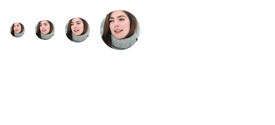
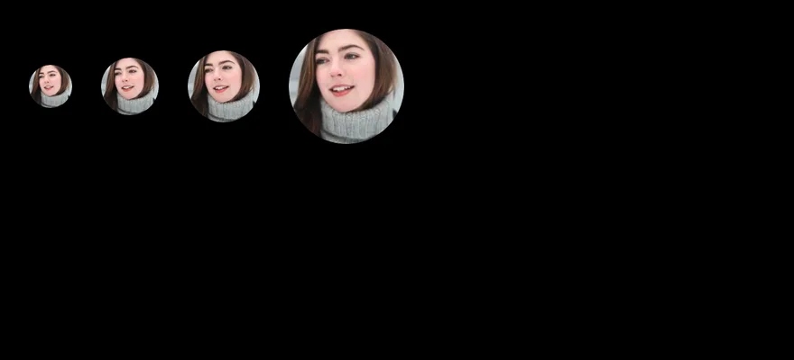
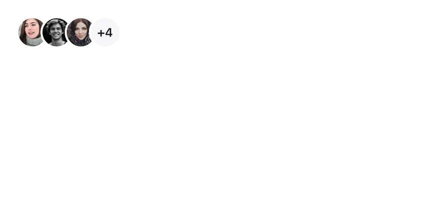
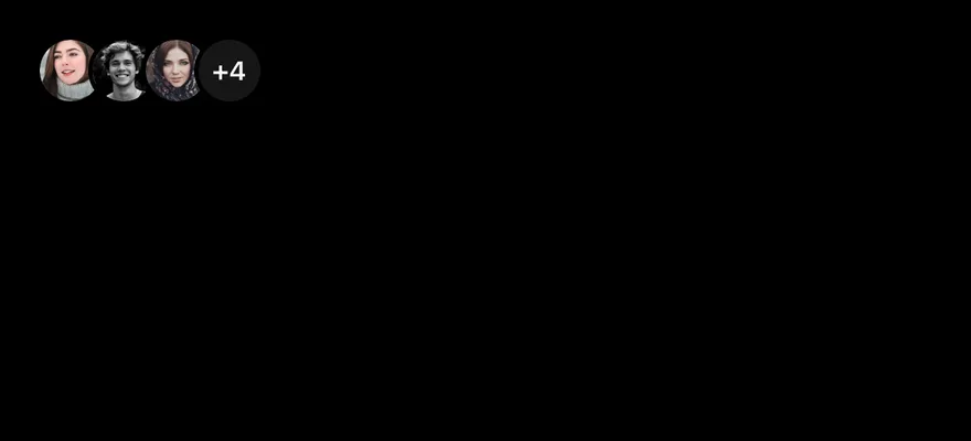
Group
Overlapping avatars in an AvatarGroup with a count.
With badge
A check badge at each size.


API Reference
Avatar
Round container that sets the size.
| Prop | Type | Default | Description |
|---|---|---|---|
size | AvatarSize | "default" | sm, default, lg or xl. |
Also accepts the props of React.ComponentProps<typeof AvatarPrimitive.Root>.
AvatarImage
Image that appears once it has loaded.
Also accepts the props of React.ComponentProps<typeof AvatarPrimitive.Image>.
AvatarFallback
Initials or icon shown while the image is missing.
Also accepts the props of React.ComponentProps<typeof AvatarPrimitive.Fallback>.
AvatarBadge
Status dot in the bottom-end corner.
Also accepts the props of React.ComponentProps<typeof View>, React.RefAttributes<View>.
AvatarGroup
Row that overlaps its avatars.
Also accepts the props of React.ComponentProps<typeof View>, React.RefAttributes<View>.
AvatarGroupCount
Round counter for the remaining items in a group.
| Prop | Type | Default | Description |
|---|---|---|---|
size | AvatarSize | "default" | Matches the size of the avatars in the group. |
Also accepts the props of React.ComponentProps<typeof View>, React.RefAttributes<View>.
Accessibility
AvatarImageusesaltas itsaccessibilityLabel.- The image is hidden from screen readers until it has loaded.
- The badge has no label; describe the status in nearby text if it matters.
Notes
- Uses
bg-muted-foreground,bg-primary,bg-mutedandborder-backgroundtokens; the fallback is softer in dark mode. - Light and dark follow the system appearance.