suiss/ui
  • Docs
  • Components
  • Patterns
  • Interactions
  • Charts
  • Blocks
  • AI
GitHubCreate
DocsComponentsPatternsInteractionsChartsBlocksAICreate
Components84
  • Overview
  • Accordion
  • Alert
  • Alert Dialog
  • Alert Sheet
  • Amount Input
  • Aspect Ratio
  • Attachment
  • Avatar
  • Badge
  • Bottom Bar
  • Breadcrumb
  • Bubble
  • Button
  • Button Group
  • Calendar
  • Card
  • Carousel
  • Chart
  • Checkbox
  • Chip
  • Code Block
  • Collapsible
  • Combobox
  • Command
  • Context Menu
  • Dialog
  • Direction
  • Drawer
  • Dropdown Menu
  • Empty
  • FAB
  • Field
  • Fullscreen Menu
  • Haptics
  • Header
  • Hover Card
  • Icon
  • Input
  • Input Accessory Bar
  • Input Group
  • Input OTP
  • Item
  • Kbd
  • Keyboard Scroll View
  • Keypad
  • Label
  • Marker
  • Menubar
  • Message
  • Message Scroller
  • Native Select
  • Navigation Menu
  • Page Indicator
  • Pagination
  • Pin Pad
  • Popover
  • Progress
  • QR Scanner
  • Questionnaire
  • Radio Group
  • Resizable
  • Screen
  • Scroll Area
  • Select
  • Separator
  • Sheet
  • Sidebar
  • Signature Pad
  • Skeleton
  • Slider
  • Spinner
  • Switch
  • Tab Bar
  • Table
  • Tabs
  • Text
  • Textarea
  • Toast
  • Toggle
  • Toggle Group
  • Tooltip
  • Trace
  • Wheel Picker
  • Widget

suiss/ui · Component

Message Scroller

A scroll container for chat transcripts that opens at the latest message and keeps scroll position stable.

Message Scroller is an open-source component from suiss/ui for React, React Native, SwiftUI and Jetpack Compose. The @esuiss/ui CLI copies its source into your project, so you own the code.

import { Bubble, BubbleContent } from "@/components/ui/bubble"
import { Message, MessageContent } from "@/components/ui/message"
import {
  MessageScroller,
  MessageScrollerButton,
  MessageScrollerContent,
  MessageScrollerItem,
  MessageScrollerProvider,
  MessageScrollerViewport,
} from "@/components/ui/message-scroller"

const messages = [
  { id: "1", from: "them", text: "Hey, do you have a minute?" },
  { id: "2", from: "me", text: "Sure, what's up?" },
  {
    id: "3",

Message Scroller manages scrolling for conversation views. MessageScrollerProvider creates the scroll controller and holds options such as the initial position and auto-scroll. Inside it, MessageScroller is the root, MessageScrollerViewport is the scrollable region, and MessageScrollerContent lists one MessageScrollerItem per message. MessageScrollerButton sits inside the root and jumps to the start or end.

The scroller opens at the end by default, preserves the reading position when older messages are prepended, and can anchor a newly added message to the top of the viewport. Use it for chat and activity feeds; use Scroll Area for general scrollable content.

Installation

CLI

$ pnpm dlx shadcn@latest add @esuiss/message-scroller

Works in any project with a components.json. See Installation for the one-line registry setup. Or use the suiss/ui CLI:

$ pnpm dlx @esuiss/ui@latest add message-scroller

Manual

  1. Install the dependencies and add the cn helper:
$ pnpm add @base-ui/react @phosphor-icons/react
  1. Add the pieces it builds on: Button, Scroll Area, use-message-scroller.

  2. Copy the source into components/ui/message-scroller.tsx:

components/ui/message-scroller.tsx
"use client"

import { mergeProps } from "@base-ui/react/merge-props"
import { ScrollArea as ScrollAreaPrimitive } from "@base-ui/react/scroll-area"
import { useRender } from "@base-ui/react/use-render"
import { ArrowDownIcon } from "@phosphor-icons/react"
import * as React from "react"
import { Button } from "@/components/ui/button"
import { ScrollBar } from "@/components/ui/scroll-area"
import {
  MessageScrollerContext,
  type MessageScrollerOptions,
  type MessageScrollerScrollDirection,
  useChildListObserver,
  useFrameThrottledResizeObserver,
  useMergedRefs,
  1. Update the import paths to match your project.

Usage

import { MessageScrollerProvider, MessageScroller, MessageScrollerViewport, MessageScrollerContent, MessageScrollerItem, MessageScrollerButton } from "@/components/ui/message-scroller"
<div className="h-96 w-96 overflow-hidden rounded-2xl border">
  <MessageScrollerProvider>
    <MessageScroller>
      <MessageScrollerViewport>
        <MessageScrollerContent className="gap-3 p-4">
          <Messages />
        </MessageScrollerContent>
      </MessageScrollerViewport>
      <MessageScrollerButton />
    </MessageScroller>
  </MessageScrollerProvider>
</div>

Place every part inside MessageScrollerProvider; the components and hooks throw outside of it. Provider options:

  • defaultScrollPosition: "end" (default), "start", or "last-anchor" to open at the last item marked with scrollAnchor.
  • autoScroll: when true, follows new content at the bottom until the user scrolls away. Defaults to false.
  • scrollEdgeThreshold, scrollPreviousItemPeek and scrollMargin: pixel values that tune edge detection and anchoring (defaults 8, 64 and 0).

Give each item a stable messageId so it can be targeted programmatically. The exported useMessageScroller hook returns scrollToEnd, scrollToStart and scrollToMessage; useMessageScrollerScrollable reports whether each edge can scroll, and useMessageScrollerVisibility reports the visible message IDs.

Examples

Start at top

A scroller that opens at the first message with defaultScrollPosition="start", with buttons for both directions.

import { Bubble, BubbleContent } from "@/components/ui/bubble"
import { Message, MessageContent } from "@/components/ui/message"
import {
  MessageScroller,
  MessageScrollerButton,
  MessageScrollerContent,
  MessageScrollerItem,
  MessageScrollerProvider,
  MessageScrollerViewport,
} from "@/components/ui/message-scroller"

const messages = [
  { id: "1", from: "them", text: "Hey, do you have a minute?" },
  { id: "2", from: "me", text: "Sure, what's up?" },
  {
    id: "3",

API Reference

Anatomy5 parts
<MessageScrollerProvider>
<MessageScroller>
<MessageScrollerViewport>
<MessageScrollerContent />
</MessageScrollerViewport>
<MessageScrollerButton />
</MessageScroller>
</MessageScrollerProvider>
01

MessageScrollerProvider

Creates the scroll controller and provides it to the parts and hooks inside.

PropTypeDefaultDescription
childrenReact.ReactNode-The scroller parts and any components that use the message scroller hooks.

Also accepts the props of MessageScrollerOptions.

02

MessageScroller

The root container, built on a scroll area.

Also accepts the props of React.ComponentProps<"div">.

03

MessageScrollerViewport

The focusable scrollable region, rendered with a vertical scrollbar.

PropTypeDefaultDescription
preserveScrollOnPrependbooleantrueKeeps the visible messages in place when items are inserted before the first one, such as when loading history.

Also accepts the props of React.ComponentProps<"div">.

04

MessageScrollerContent

The live log that holds the message items.

PropTypeDefaultDescription
spacerClassNamestring-Class name for the hidden spacer element the scroller appends after the items.

Also accepts the props of React.ComponentProps<"div">.

05

MessageScrollerItem

Wraps one message and registers it with the controller.

PropTypeDefaultDescription
messageIdstring-A stable ID used for scrollToMessage, visibility tracking and the data-message-id attribute.
scrollAnchorbooleanfalseMarks the item as an anchor; when it is added, the scroller aligns it to the top of the viewport instead of the bottom.

Also accepts the props of React.ComponentProps<"div">.

06

MessageScrollerButton

A floating button that appears when the scroller can move toward its direction and jumps there on click.

PropTypeDefaultDescription
behaviorScrollBehavior"smooth"The scroll behavior used when jumping, such as smooth or auto.
directionMessageScrollerScrollDirection"end"Which edge the button scrolls to: end or start. It also sets the button's position and icon rotation.

Also accepts the props of useRender.ComponentProps<"button", MessageScrollerButtonState>, React.ComponentProps<typeof Button>.

Accessibility

  • The viewport has role="region", an aria-label of Messages by default, and tabIndex={0} so it can be scrolled with the keyboard.
  • The content has role="log" with aria-relevant="additions", so assistive technology can announce new messages.
  • MessageScrollerButton includes a visually hidden label, Scroll to end or Scroll to start. While it cannot scroll, the button is inert and removed from the tab order.
  • Wheel, touch and scrolling keys stop auto-follow so the user's reading position is respected.

Notes

  • Styling hooks: data-slot values message-scroller, message-scroller-viewport, message-scroller-content, message-scroller-item and message-scroller-button.
  • The root and viewport receive data-pending-scroll until the initial position is applied; the viewport is invisible during that time. They also get data-scrollable with the scrollable edges and data-autoscrolling while a programmatic scroll is running.
  • The button exposes data-active, data-direction, data-variant and data-size. It defaults to the secondary variant and icon-sm size of Button.
  • Items set data-scroll-anchor and use content-visibility: auto to keep long transcripts fast.
iOS
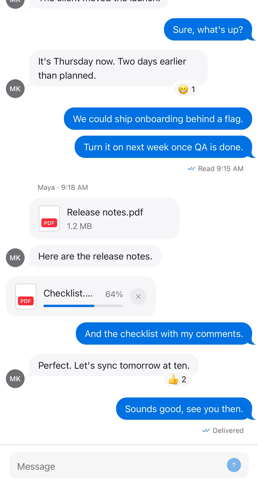
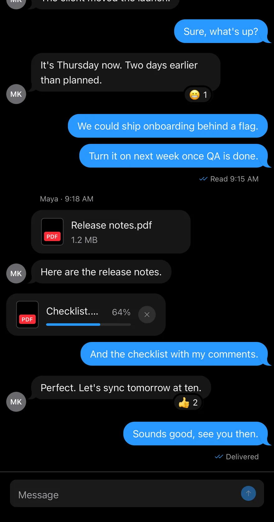
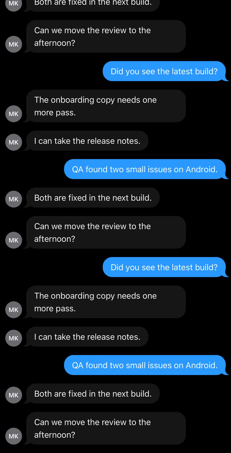
Message Scroller on iOS in light modeMessage Scroller on iOS in dark mode
import { ArrowUpIcon, ChecksIcon, XIcon } from "phosphor-react-native"
import * as React from "react"
import { View } from "react-native"
import { Attachment, AttachmentAction, AttachmentActions, AttachmentContent, AttachmentDescription, AttachmentLabel, AttachmentMedia, AttachmentProgress, AttachmentTitle } from "@/components/ui/attachment"
import { Avatar, AvatarFallback } from "@/components/ui/avatar"
import { BottomBar, BottomBarContent } from "@/components/ui/bottom-bar"
import { Bubble, BubbleContent, BubbleReactions } from "@/components/ui/bubble"
import { Icon } from "@/components/ui/icon"
import { InputGroup, InputGroupAddon, InputGroupButton, InputGroupInput } from "@/components/ui/input-group"
import { Message, MessageAvatar, MessageContent, MessageFooter, MessageHeader } from "@/components/ui/message"
import { MessageScroller, MessageScrollerButton, MessageScrollerItem, MessageScrollerProvider, MessageScrollerViewport, useMessageScroller } from "@/components/ui/message-scroller"
import { Text } from "@/components/ui/text"

type ChatMessage = {
  id: string
  from: "me" | "them"
import EsuissUI
import PhosphorSwift
import SwiftUI

struct MessageScrollerExample: View {
  var body: some View {
    MessageScrollerChat(initial: MessageScrollerData.thread)
  }
}

struct MessageScrollerAttachment: Hashable {
  let name: String
  let size: String
  var progress: Double?
}
import androidx.compose.foundation.layout.Arrangement
import androidx.compose.foundation.layout.Box
import androidx.compose.foundation.layout.Column
import androidx.compose.foundation.layout.ColumnScope
import androidx.compose.foundation.layout.PaddingValues
import androidx.compose.foundation.layout.fillMaxSize
import androidx.compose.foundation.layout.fillMaxWidth
import androidx.compose.foundation.layout.width
import androidx.compose.foundation.text.KeyboardActions
import androidx.compose.foundation.text.KeyboardOptions
import androidx.compose.runtime.Composable
import androidx.compose.runtime.LaunchedEffect
import androidx.compose.runtime.getValue
import androidx.compose.runtime.mutableStateOf
import androidx.compose.runtime.remember
import androidx.compose.runtime.rememberCoroutineScope

MessageScroller is a View that hosts a scroll controller. MessageScrollerViewport renders your messages in an inverted FlatList, so the newest message sits at the bottom and new messages keep the list anchored there through maintainVisibleContentPosition. You pass data in chronological order; the viewport reverses it internally and maps indexes back for renderItem and keyExtractor.

MessageScrollerButton is a floating icon button that animates in with Reanimated when there is more content in its direction. When the user has scrolled up and new messages arrive, it shows an unread count badge.

Installation

$ pnpm dlx shadcn@latest add @esuiss-rn/message-scroller

See Installation for the components.json setup. Or use the suiss/ui CLI:

$ pnpm dlx @esuiss/ui@latest add message-scroller
$ pnpm dlx @esuiss/ui@latest add message-scroller --platform swift
$ pnpm dlx @esuiss/ui@latest add message-scroller --platform kotlin

The CLI also adds what it builds on: Button, Icon, Text. On React Native it also adds the animated view components/ui/animated-view.tsx.

Manual

  1. Install the dependencies:
npx expo install cn phosphor-react-native react-native-reanimated react-native-svg react-native-worklets
  1. Add the pieces it builds on: Button, Icon, Text, and the primitives components/primitives/hooks.tsx, and the animated view components/ui/animated-view.tsx from the next step.

  2. Copy the animated view into components/ui/animated-view.tsx:

uniwind/components/ui/animated-view.tsx
import { Pressable } from "react-native"
import Animated from "react-native-reanimated"

const AnimatedPressable = Animated.createAnimatedComponent(Pressable)

type AnimatedViewProps =
  | (React.ComponentProps<typeof Animated.View> &
      React.RefAttributes<React.ComponentRef<typeof Animated.View>> & {
        as?: "View"
      })
  | (React.ComponentProps<typeof AnimatedPressable> &
      React.RefAttributes<React.ComponentRef<typeof AnimatedPressable>> & {
        as: "Pressable"
      })

function AnimatedView(props: AnimatedViewProps) {
  1. Copy the source into components/ui/message-scroller.tsx:
uniwind/components/ui/message-scroller.tsx
import { cn } from "cn"
import { ArrowDownIcon, ArrowUpIcon } from "phosphor-react-native"
import * as React from "react"
import {
  FlatList,
  type FlatListProps,
  Platform,
  View,
  type ViewProps,
} from "react-native"
import {
  Easing,
  ReduceMotion,
  useAnimatedStyle,
  useSharedValue,
  withTiming,
  1. Update the import paths to match your project.
  1. Install the dependencies:
npx expo install cn phosphor-react-native react-native-reanimated react-native-svg react-native-worklets
  1. Add the pieces it builds on: Button, Icon, Text, and the primitives components/primitives/hooks.tsx, and the animated view components/ui/animated-view.tsx from the next step.

  2. Copy the animated view into components/ui/animated-view.tsx:

nativewind/components/ui/animated-view.tsx
import { Pressable } from "react-native"
import Animated from "react-native-reanimated"

const AnimatedPressable = Animated.createAnimatedComponent(Pressable)

type AnimatedViewProps =
  | (React.ComponentProps<typeof Animated.View> &
      React.RefAttributes<React.ComponentRef<typeof Animated.View>> & {
        as?: "View"
      })
  | (React.ComponentProps<typeof AnimatedPressable> &
      React.RefAttributes<React.ComponentRef<typeof AnimatedPressable>> & {
        as: "Pressable"
      })

function AnimatedView(props: AnimatedViewProps) {
  1. Copy the source into components/ui/message-scroller.tsx:
nativewind/components/ui/message-scroller.tsx
import { cn } from "cn"
import { ArrowDownIcon, ArrowUpIcon } from "phosphor-react-native"
import * as React from "react"
import {
  FlatList,
  type FlatListProps,
  Platform,
  View,
  type ViewProps,
} from "react-native"
import {
  Easing,
  ReduceMotion,
  useAnimatedStyle,
  useSharedValue,
  withTiming,
  1. Update the import paths to match your project.
  1. Install the dependencies:
npx expo install phosphor-react-native react-native-reanimated react-native-svg react-native-worklets
  1. Add the pieces it builds on: Button, Icon, Text, and the primitives components/primitives/hooks.tsx, and the animated view components/ui/animated-view.tsx from the next step.

  2. Copy the animated view into components/ui/animated-view.tsx:

stylesheet/components/ui/animated-view.tsx
import { Pressable } from "react-native"
import Animated from "react-native-reanimated"

const AnimatedPressable = Animated.createAnimatedComponent(Pressable)

type AnimatedViewProps =
  | (React.ComponentProps<typeof Animated.View> &
      React.RefAttributes<React.ComponentRef<typeof Animated.View>> & {
        as?: "View"
      })
  | (React.ComponentProps<typeof AnimatedPressable> &
      React.RefAttributes<React.ComponentRef<typeof AnimatedPressable>> & {
        as: "Pressable"
      })

function AnimatedView(props: AnimatedViewProps) {
  1. Copy the source into components/ui/message-scroller.tsx:
stylesheet/components/ui/message-scroller.tsx
import { ArrowDownIcon, ArrowUpIcon } from "phosphor-react-native"
import * as React from "react"
import {
  FlatList,
  type FlatListProps,
  Platform,
  StyleSheet,
  View,
  type ViewProps,
} from "react-native"
import {
  Easing,
  ReduceMotion,
  useAnimatedStyle,
  useSharedValue,
  withTiming,
  1. Update the import paths to match your project.
  1. Target iOS 17 or later.

  2. Add the Swift package to your app:

Package.swift
.package(url: "https://github.com/phosphor-icons/swift", from: "2.1.0")
  1. Copy the theme files every view uses:
swift/Theme/Theme.swift
import CoreText
import SwiftUI
import UIKit

struct RGBA: Sendable {
  let red: CGFloat
  let green: CGFloat
  let blue: CGFloat
  let alpha: CGFloat

  init(_ hex: UInt32, _ alpha: CGFloat = 1) {
    red = CGFloat((hex >> 16) & 0xFF) / 255
    green = CGFloat((hex >> 8) & 0xFF) / 255
    blue = CGFloat(hex & 0xFF) / 255
    self.alpha = alpha
  }
swift/Theme/Tokens.swift
import SwiftUI

public enum EsuissColor {
  public static let background = Color.adaptive(light: .init(0xFFFFFF), dark: .init(0x000000))
  public static let foreground = Color.adaptive(light: .init(0x1D1D1F), dark: .init(0xF5F5F7))
  public static let card = Color.adaptive(light: .init(0xFFFFFF), dark: .init(0x1D1D1F))
  public static let cardForeground = Color.adaptive(light: .init(0x1D1D1F), dark: .init(0xF5F5F7))
  public static let popover = Color.adaptive(light: .init(0xFFFFFF), dark: .init(0x1D1D1F))
  public static let popoverForeground = Color.adaptive(light: .init(0x1D1D1F), dark: .init(0xF5F5F7))
  public static let primary = Color.adaptive(light: .init(0x0071E3), dark: .init(0x2997FF))
  public static let primaryForeground = Color.adaptive(light: .init(0xFFFFFF), dark: .init(0xFFFFFF))
  public static let secondary = Color.adaptive(light: .init(0x000000, 0.04), dark: .init(0xFFFFFF, 0.1))
  public static let secondaryForeground = Color.adaptive(light: .init(0x1D1D1F), dark: .init(0xF5F5F7))
  public static let muted = Color.adaptive(light: .init(0xF5F5F7), dark: .init(0x161617))
  public static let mutedForeground = Color.adaptive(light: .init(0x6E6E73), dark: .init(0xA1A1A6))
  public static let accent = Color.adaptive(light: .init(0x000000, 0.06), dark: .init(0xFFFFFF, 0.1))
  1. Copy the source:
swift/Components/MessageScroller.swift
import PhosphorSwift
import SwiftUI

public enum MessageScrollerDefaultScrollPosition: CaseIterable, Sendable {
  case start, end
}

public enum MessageScrollerScrollDirection: CaseIterable, Sendable, Hashable {
  case start, end
}

struct MessageScrollerChange: Equatable {
  var appended = 0
  var prepended = 0
  var reset = false
}
  1. Add the files to your app target.
  1. Set minSdk to 24 or higher and add the dependencies:
build.gradle.kts
implementation(platform("androidx.compose:compose-bom:2026.09.00"))
implementation("androidx.compose.foundation:foundation")
implementation("androidx.compose.ui:ui")
implementation("com.adamglin:phosphor-icon-android:1.0.0")
  1. Copy the theme files every view uses:
kotlin/theme/Theme.kt
package com.esuiss.ui.theme

import android.content.res.AssetManager
import androidx.compose.foundation.isSystemInDarkTheme
import androidx.compose.runtime.Composable
import androidx.compose.runtime.CompositionLocalProvider
import androidx.compose.runtime.Immutable
import androidx.compose.runtime.staticCompositionLocalOf
import androidx.compose.ui.Modifier
import androidx.compose.ui.draw.dropShadow
import androidx.compose.ui.graphics.Color
import androidx.compose.ui.graphics.Shape
import androidx.compose.ui.graphics.shadow.Shadow as DropShadow
import androidx.compose.ui.platform.LocalContext
import androidx.compose.ui.text.TextStyle
import androidx.compose.ui.text.font.Font
kotlin/theme/Tokens.kt
package com.esuiss.ui.theme

import androidx.compose.runtime.Immutable
import androidx.compose.ui.graphics.Color
import androidx.compose.ui.text.font.FontWeight
import androidx.compose.ui.unit.dp

@Immutable
data class Colors(
    val background: Color,
    val foreground: Color,
    val card: Color,
    val cardForeground: Color,
    val popover: Color,
    val popoverForeground: Color,
    val primary: Color,
  1. Copy the source and every file it uses:
kotlin/components/MessageScroller.kt
package com.esuiss.ui.components

import androidx.compose.animation.core.CubicBezierEasing
import androidx.compose.animation.core.animateFloatAsState
import androidx.compose.animation.core.tween
import androidx.compose.foundation.background
import androidx.compose.foundation.border
import androidx.compose.foundation.clickable
import androidx.compose.foundation.interaction.MutableInteractionSource
import androidx.compose.foundation.interaction.collectIsPressedAsState
import androidx.compose.foundation.layout.Arrangement
import androidx.compose.foundation.layout.Box
import androidx.compose.foundation.layout.BoxScope
import androidx.compose.foundation.layout.PaddingValues
import androidx.compose.foundation.layout.defaultMinSize
import androidx.compose.foundation.layout.fillMaxSize
kotlin/components/Button.kt
package com.esuiss.ui.components

import androidx.compose.foundation.background
import androidx.compose.foundation.border
import androidx.compose.foundation.clickable
import androidx.compose.foundation.interaction.MutableInteractionSource
import androidx.compose.foundation.interaction.collectIsPressedAsState
import androidx.compose.foundation.layout.Arrangement
import androidx.compose.foundation.layout.Row
import androidx.compose.foundation.layout.RowScope
import androidx.compose.foundation.layout.fillMaxWidth
import androidx.compose.foundation.layout.height
import androidx.compose.foundation.layout.padding
import androidx.compose.foundation.layout.size
import androidx.compose.foundation.shape.RoundedCornerShape
import androidx.compose.foundation.text.BasicText
kotlin/components/ButtonGroup.kt
package com.esuiss.ui.components

import androidx.compose.foundation.background
import androidx.compose.foundation.gestures.Orientation
import androidx.compose.foundation.layout.Arrangement
import androidx.compose.foundation.layout.Box
import androidx.compose.foundation.layout.Row
import androidx.compose.foundation.layout.RowScope
import androidx.compose.foundation.layout.padding
import androidx.compose.foundation.shape.CircleShape
import androidx.compose.foundation.shape.CornerSize
import androidx.compose.foundation.shape.RoundedCornerShape
import androidx.compose.runtime.Composable
import androidx.compose.runtime.CompositionLocalProvider
import androidx.compose.runtime.DisposableEffect
import androidx.compose.runtime.Immutable
kotlin/components/Content.kt
package com.esuiss.ui.components

import androidx.compose.runtime.compositionLocalOf
import androidx.compose.ui.graphics.Color
import androidx.compose.ui.text.TextStyle
import androidx.compose.ui.unit.Dp
import androidx.compose.ui.unit.dp

val LocalContentStyle = compositionLocalOf { TextStyle.Default }

val LocalContentColor = compositionLocalOf { Color.Unspecified }

val LocalIconSize = compositionLocalOf { 20.dp }
kotlin/components/FormSupport.kt
package com.esuiss.ui.components

import android.provider.Settings
import androidx.compose.animation.core.CubicBezierEasing
import androidx.compose.foundation.background
import androidx.compose.foundation.border
import androidx.compose.foundation.gestures.Orientation
import androidx.compose.foundation.text.selection.TextSelectionColors
import androidx.compose.runtime.Composable
import androidx.compose.runtime.mutableStateOf
import androidx.compose.runtime.remember
import androidx.compose.ui.Modifier
import androidx.compose.ui.draw.alpha
import androidx.compose.ui.draw.clip
import androidx.compose.ui.draw.drawWithContent
import androidx.compose.ui.geometry.Offset
kotlin/components/Icon.kt
package com.esuiss.ui.components

import androidx.compose.foundation.Image
import androidx.compose.foundation.layout.size
import androidx.compose.runtime.Composable
import androidx.compose.ui.Modifier
import androidx.compose.ui.graphics.Color
import androidx.compose.ui.graphics.ColorFilter
import androidx.compose.ui.graphics.takeOrElse
import androidx.compose.ui.graphics.vector.ImageVector
import androidx.compose.ui.unit.Dp
import com.esuiss.ui.theme.EsuissTheme

@Composable
fun Icon(
    imageVector: ImageVector,
kotlin/components/Spinner.kt
package com.esuiss.ui.components

import androidx.compose.animation.core.LinearEasing
import androidx.compose.animation.core.RepeatMode
import androidx.compose.animation.core.animateFloat
import androidx.compose.animation.core.infiniteRepeatable
import androidx.compose.animation.core.rememberInfiniteTransition
import androidx.compose.animation.core.tween
import androidx.compose.foundation.Canvas
import androidx.compose.foundation.layout.size
import androidx.compose.runtime.Composable
import androidx.compose.runtime.State
import androidx.compose.runtime.remember
import androidx.compose.runtime.mutableFloatStateOf
import androidx.compose.ui.Modifier
import androidx.compose.ui.geometry.CornerRadius
  1. Update the com.esuiss.ui package names to match your project.

Usage

import { MessageScrollerProvider, MessageScroller, MessageScrollerViewport, MessageScrollerItem, MessageScrollerButton } from "@/components/ui/message-scroller"
<Chat initial={thread} />

Place MessageScrollerViewport and MessageScrollerButton inside MessageScroller. Wrap everything in MessageScrollerProvider when components outside the scroller, such as a composer, need to call the scroll hooks.

useMessageScroller returns scrollToEnd, scrollToStart and scrollToMessage(id, { align, animated }). useMessageScrollerScrollable, useMessageScrollerUnreadCount and useMessageScrollerVisibility read whether each edge is scrollable, the unread count, and the visible message ids.

Set onLoadOlder to fetch older history when the user scrolls near the top. Other FlatList props such as ListEmptyComponent pass through.

Examples

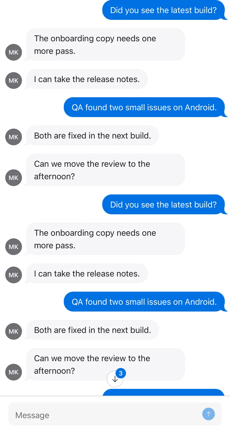
Unread while scrolled up

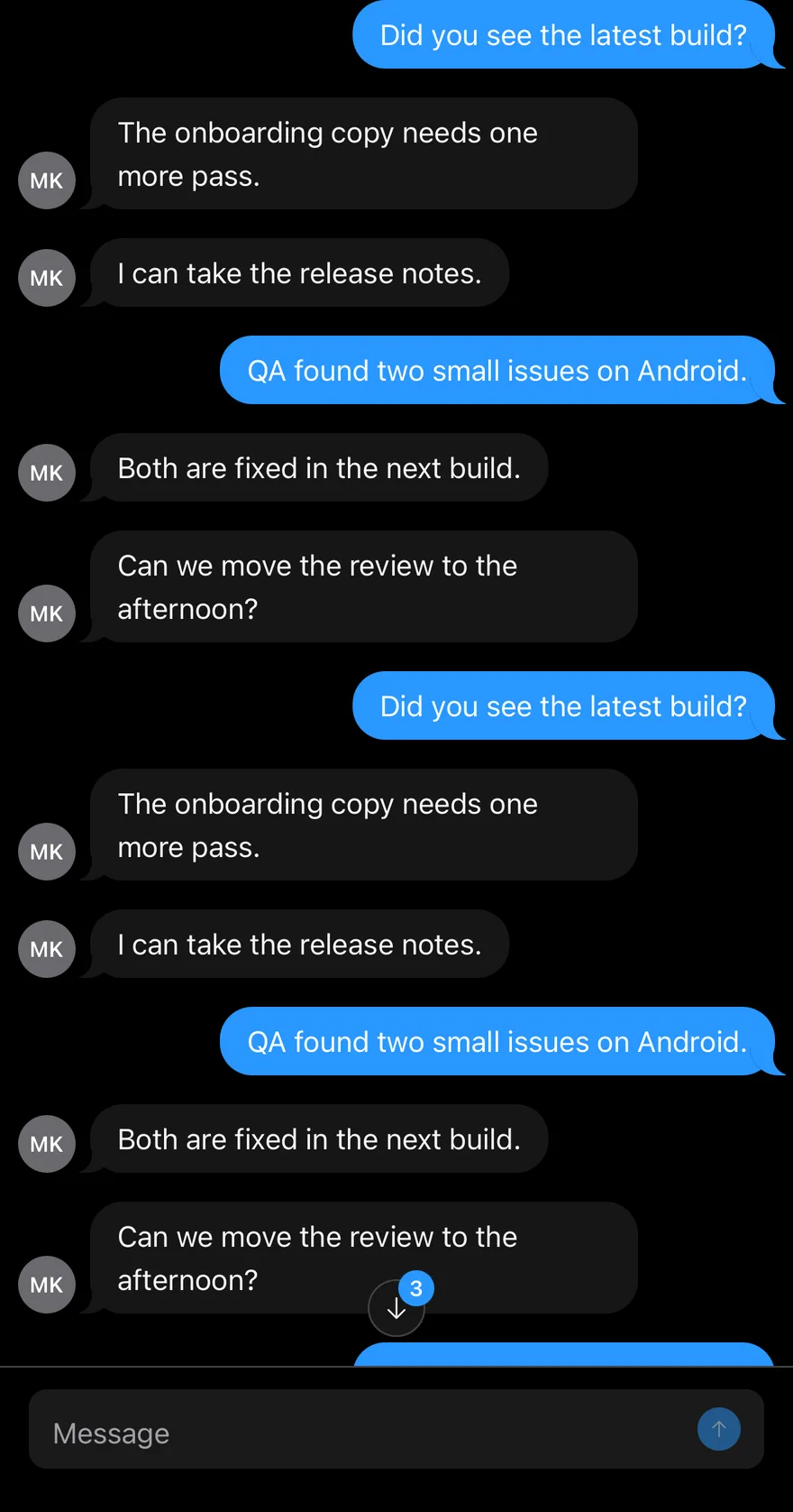
New messages arrive while scrolled up, so the button shows an unread count.
iOS
Message Scroller (unread while scrolled up) on iOS in light modeMessage Scroller (unread while scrolled up) on iOS in dark mode
import { ArrowUpIcon, ChecksIcon, XIcon } from "phosphor-react-native"
import * as React from "react"
import { View } from "react-native"
import { Attachment, AttachmentAction, AttachmentActions, AttachmentContent, AttachmentDescription, AttachmentLabel, AttachmentMedia, AttachmentProgress, AttachmentTitle } from "@/components/ui/attachment"
import { Avatar, AvatarFallback } from "@/components/ui/avatar"
import { BottomBar, BottomBarContent } from "@/components/ui/bottom-bar"
import { Bubble, BubbleContent, BubbleReactions } from "@/components/ui/bubble"
import { Icon } from "@/components/ui/icon"
import { InputGroup, InputGroupAddon, InputGroupButton, InputGroupInput } from "@/components/ui/input-group"
import { Message, MessageAvatar, MessageContent, MessageFooter, MessageHeader } from "@/components/ui/message"
import { MessageScroller, MessageScrollerButton, MessageScrollerItem, MessageScrollerProvider, MessageScrollerViewport, useMessageScroller } from "@/components/ui/message-scroller"
import { Text } from "@/components/ui/text"

type ChatMessage = {
  id: string
  from: "me" | "them"
import EsuissUI
import PhosphorSwift
import SwiftUI

struct MessageScrollerUnreadWhileScrolledUpExample: View {
  var body: some View {
    MessageScrollerChat(initial: MessageScrollerData.long(40), unreadDemo: true)
  }
}

struct MessageScrollerAttachment: Hashable {
  let name: String
  let size: String
  var progress: Double?
}
import androidx.compose.foundation.layout.Arrangement
import androidx.compose.foundation.layout.Box
import androidx.compose.foundation.layout.Column
import androidx.compose.foundation.layout.ColumnScope
import androidx.compose.foundation.layout.PaddingValues
import androidx.compose.foundation.layout.fillMaxSize
import androidx.compose.foundation.layout.fillMaxWidth
import androidx.compose.foundation.layout.width
import androidx.compose.foundation.text.KeyboardActions
import androidx.compose.foundation.text.KeyboardOptions
import androidx.compose.runtime.Composable
import androidx.compose.runtime.LaunchedEffect
import androidx.compose.runtime.getValue
import androidx.compose.runtime.mutableStateOf
import androidx.compose.runtime.remember
import androidx.compose.runtime.rememberCoroutineScope

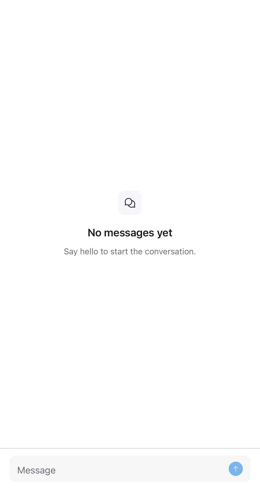
Empty thread

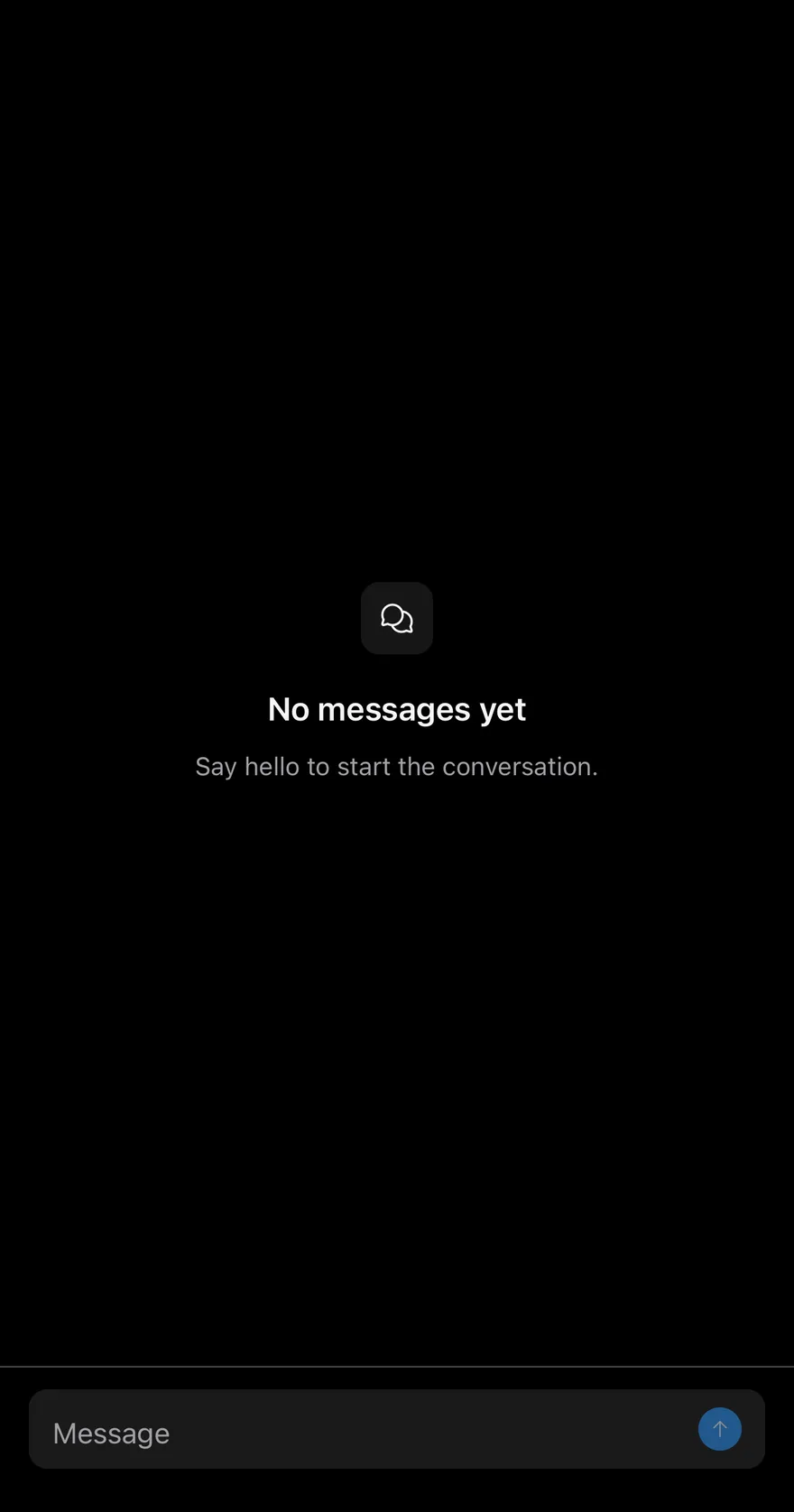
An empty thread that renders an Empty state through ListEmptyComponent.
iOS
Message Scroller (empty thread) on iOS in light modeMessage Scroller (empty thread) on iOS in dark mode
import { ArrowUpIcon, ChatsCircleIcon, ChecksIcon, XIcon } from "phosphor-react-native"
import * as React from "react"
import { View } from "react-native"
import { Attachment, AttachmentAction, AttachmentActions, AttachmentContent, AttachmentDescription, AttachmentLabel, AttachmentMedia, AttachmentProgress, AttachmentTitle } from "@/components/ui/attachment"
import { Avatar, AvatarFallback } from "@/components/ui/avatar"
import { BottomBar, BottomBarContent } from "@/components/ui/bottom-bar"
import { Bubble, BubbleContent, BubbleReactions } from "@/components/ui/bubble"
import { Empty, EmptyDescription, EmptyHeader, EmptyMedia, EmptyTitle } from "@/components/ui/empty"
import { Icon } from "@/components/ui/icon"
import { InputGroup, InputGroupAddon, InputGroupButton, InputGroupInput } from "@/components/ui/input-group"
import { Message, MessageAvatar, MessageContent, MessageFooter, MessageHeader } from "@/components/ui/message"
import { MessageScroller, MessageScrollerButton, MessageScrollerItem, MessageScrollerProvider, MessageScrollerViewport, useMessageScroller } from "@/components/ui/message-scroller"
import { Text } from "@/components/ui/text"

type ChatMessage = {
  id: string
import EsuissUI
import PhosphorSwift
import SwiftUI

struct MessageScrollerEmptyThreadExample: View {
  var body: some View {
    MessageScrollerChat(initial: [])
  }
}

struct MessageScrollerAttachment: Hashable {
  let name: String
  let size: String
  var progress: Double?
}
import androidx.compose.foundation.layout.Arrangement
import androidx.compose.foundation.layout.Box
import androidx.compose.foundation.layout.Column
import androidx.compose.foundation.layout.ColumnScope
import androidx.compose.foundation.layout.PaddingValues
import androidx.compose.foundation.layout.fillMaxSize
import androidx.compose.foundation.layout.fillMaxWidth
import androidx.compose.foundation.layout.width
import androidx.compose.foundation.text.KeyboardActions
import androidx.compose.foundation.text.KeyboardOptions
import androidx.compose.runtime.Composable
import androidx.compose.runtime.LaunchedEffect
import androidx.compose.runtime.getValue
import androidx.compose.runtime.mutableStateOf
import androidx.compose.runtime.remember
import androidx.compose.runtime.rememberCoroutineScope

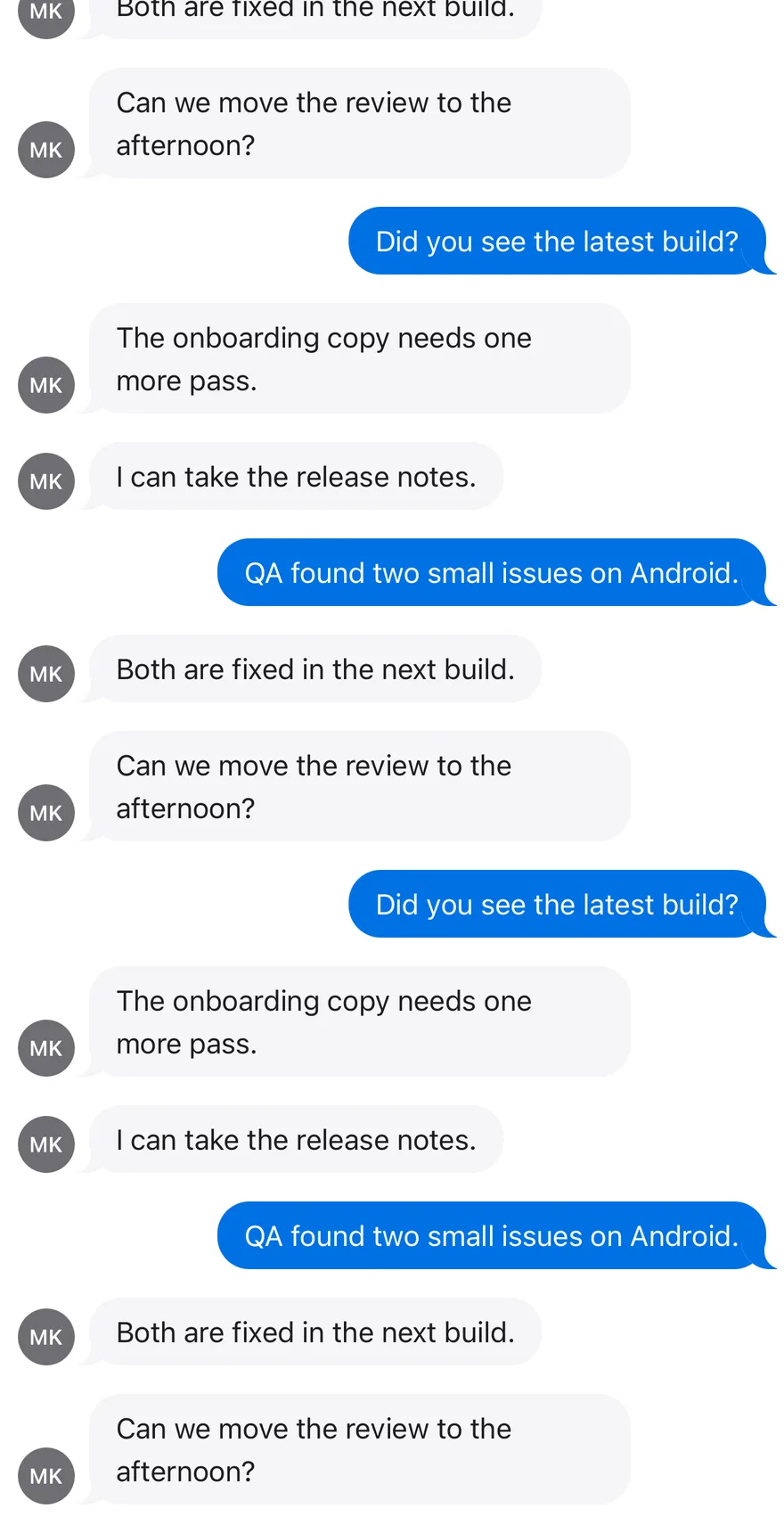
Load older

Loads earlier messages with onLoadOlder when scrolling to the top.
iOS
Message Scroller (load older) on iOS in light modeMessage Scroller (load older) on iOS in dark mode
import { ChecksIcon, XIcon } from "phosphor-react-native"
import * as React from "react"
import { View } from "react-native"
import { Attachment, AttachmentAction, AttachmentActions, AttachmentContent, AttachmentDescription, AttachmentLabel, AttachmentMedia, AttachmentProgress, AttachmentTitle } from "@/components/ui/attachment"
import { Avatar, AvatarFallback } from "@/components/ui/avatar"
import { Bubble, BubbleContent, BubbleReactions } from "@/components/ui/bubble"
import { Icon } from "@/components/ui/icon"
import { Message, MessageAvatar, MessageContent, MessageFooter, MessageHeader } from "@/components/ui/message"
import { MessageScroller, MessageScrollerButton, MessageScrollerItem, MessageScrollerProvider, MessageScrollerViewport } from "@/components/ui/message-scroller"
import { Spinner } from "@/components/ui/spinner"
import { Text } from "@/components/ui/text"

type ChatMessage = {
  id: string
  from: "me" | "them"
  texts: string[]
import EsuissUI
import PhosphorSwift
import SwiftUI

struct MessageScrollerAttachment: Hashable {
  let name: String
  let size: String
  var progress: Double?
}

struct MessageScrollerMessage: Identifiable, Hashable {
  let id: String
  let fromMe: Bool
  let texts: [String]
  var time: String?
  var status: String?
import androidx.compose.foundation.layout.Arrangement
import androidx.compose.foundation.layout.Column
import androidx.compose.foundation.layout.ColumnScope
import androidx.compose.foundation.layout.PaddingValues
import androidx.compose.foundation.layout.fillMaxSize
import androidx.compose.foundation.layout.fillMaxWidth
import androidx.compose.foundation.layout.width
import androidx.compose.runtime.Composable
import androidx.compose.runtime.getValue
import androidx.compose.runtime.mutableStateOf
import androidx.compose.runtime.remember
import androidx.compose.runtime.rememberCoroutineScope
import androidx.compose.runtime.setValue
import androidx.compose.ui.Alignment
import androidx.compose.ui.Modifier
import androidx.compose.ui.semantics.contentDescription

API Reference

01

MessageScrollerProvider

Shares one scroll controller with components outside the scroller.

PropTypeDefaultDescription
childrenReact.ReactNode-
scrollEdgeThresholdnumber8Distance in points from an edge that still counts as being at that edge.

Also accepts the props of MessageScrollerOptions.

02

MessageScroller

Container that clips the list and positions the button.

Also accepts the props of ViewProps.

03

MessageScrollerViewport

Inverted FlatList that renders the messages.

PropTypeDefaultDescription
datareadonly T[]RequiredThe messages to render.
keyExtractor(item: T, index: number) => stringRequiredReturns a stable key for each message.
renderItem(info: { item: T; index: number }) => React.ReactElement | nullRequiredRenders one message.
onLoadOlder() => void-Called near the top so older messages can be loaded.

Also accepts the props of MessageScrollerViewportProps<T>.

04

MessageScrollerItem

Row wrapper with horizontal padding.

Also accepts the props of ViewProps.

05

MessageScrollerButton

Floating button that scrolls to the newest or oldest message.

PropTypeDefaultDescription
childrenReact.ReactNode-
directionMessageScrollerScrollDirection"end"end scrolls to the newest message, start to the oldest. Defaults to end.
animatedbooleantrueWhether the scroll is animated. Defaults to true.

Also accepts the props of React.ComponentProps<typeof Button>.

Accessibility

  • The button has a default label, "Scroll to end" or "Scroll to start", and includes the number of new messages when there are any.
  • While the button is hidden it ignores touches and is hidden from VoiceOver and TalkBack.
  • The button animation respects the system reduce motion setting.

Notes

  • The keyboard dismisses interactively on iOS and on drag on Android, and taps on handled children keep it open.
  • The button uses bg-card with border-border, and the badge uses bg-primary with text-primary-foreground.
  • Light and dark colors follow the system appearance.
NextNative SelectPreviousMessage

On this page

  1. 01Installation
    • CLI
    • Manual
  2. 02Usage
  3. 03Examples
    • Start at top
  4. 04API Reference
    • MessageScrollerProvider
    • MessageScroller
    • MessageScrollerViewport
    • MessageScrollerContent
    • MessageScrollerItem
    • MessageScrollerButton
  5. 05Accessibility
  6. 06Notes
  7. 07Installation
    • Manual
  8. 08Usage
  9. 09Examples
    • Unread while scrolled up
    • Empty thread
    • Load older
  10. 10API Reference
    • MessageScrollerProvider
    • MessageScroller
    • MessageScrollerViewport
    • MessageScrollerItem
    • MessageScrollerButton
  11. 11Accessibility
  12. 12Notes