suiss/ui · Component
Questionnaire
A step-by-step form that shows one question at a time, with validation, skipping and keyboard shortcuts.
Questionnaire is an open-source component from suiss/ui for React, React Native, SwiftUI and Jetpack Compose. The @esuiss/ui CLI copies its source into your project, so you own the code.
Questionnaire renders a form that presents a sequence of questions, one at a time. Each QuestionnaireItem is a fieldset with a QuestionnaireTitle, an optional QuestionnaireDescription, an answer area and a QuestionnaireError. Answers are either QuestionnaireChoices holding QuestionnaireChoice cards (with optional QuestionnaireChoiceDescription), or a QuestionnaireInput.
QuestionnaireProgress shows the current position, and QuestionnaireActions lays out QuestionnairePrevious, QuestionnaireSkip, QuestionnaireNext and QuestionnaireSubmit, which show and hide themselves based on the current question. Use Questionnaire for onboarding flows and surveys; use Field and regular form controls when all fields should be visible at once.
Installation
CLI
Works in any project with a components.json. See Installation for the one-line registry setup. Or use the suiss/ui CLI:
Manual
- Install the dependencies and add the
cnhelper:
-
Add the pieces it builds on: Button,
use-questionnaire. -
Copy the source into
components/ui/questionnaire.tsx:
- Update the import paths to match your project.
Usage
Give every item a unique name; answers are submitted as form data under that name. The first item is shown by default. Use defaultItem to start elsewhere, or item with onItemChange to control the active question.
A required item blocks Next and Submit until it is answered. An optional item shows the Skip button. Set multiple on an item to render its choices as checkboxes instead of radio buttons.
Pass items to define the sequence, which items are required or disabled, and the order used for shortcut keys, instead of deriving them from the rendered items. Native browser validation is off by default (noValidate); the component runs its own validation on Next and Submit.
Examples
With shortcuts
Choices labelled with letter keys, so pressing a letter selects the matching answer.
Number shortcuts
Choices labelled with number keys from 1 to 9.
Multiple choice
A multiple item with checkboxes, a default selection, a disabled choice and a custom error.
With choice descriptions
Choice cards with a title and a secondary description.
Text input
A required email question answered with QuestionnaireInput.
Start on later question
A questionnaire that opens on its second question with defaultItem.
API Reference
Questionnaire
The form root that tracks the active question and handles navigation and submission.
| Prop | Type | Default | Description |
|---|---|---|---|
defaultItem | string | - | The name of the item shown first when uncontrolled. |
item | string | - | The name of the active item, for controlled use. |
items | readonly QuestionnaireItemDefinition[] | - | Optional item definitions with name, required, disabled and choices, used to define the sequence and shortcut order. |
onItemChange | (item: string) => void | - | Called with the next item's name when the active question changes. |
shortcuts | QuestionnaireShortcutMode | - | Enables single-key answer shortcuts using letters (A to Z) or numbers (1 to 9). |
Also accepts the props of React.ComponentProps<"form">.
QuestionnaireProgress
Shows the position as text, such as Question 2 of 3, and exposes it to assistive technology with the progressbar role.
Also accepts the props of useRender.ComponentProps<"div", QuestionnaireState>.
QuestionnaireItem
A fieldset for one question, visible only while it is active.
| Prop | Type | Default | Description |
|---|---|---|---|
invalid | boolean | false | Forces the item into the invalid state. |
multiple | boolean | false | Allows several answers, rendering choices as checkboxes. |
name | string | Required | The unique item name, used for navigation and as the form field name. |
onStatusChange | (status: QuestionnaireItemStatus) => void | - | Called when the item's status changes between unanswered, answered and skipped. |
required | boolean | false | Requires an answer before moving on and hides the Skip button. |
Also accepts the props of React.ComponentProps<"fieldset">.
QuestionnaireTitle
The question text, rendered as the fieldset's legend.
Also accepts the props of useRender.ComponentProps<"legend">.
QuestionnaireDescription
Supporting text that describes the question.
Also accepts the props of useRender.ComponentProps<"p">.
QuestionnaireChoices
The grid that holds the answer choices.
Also accepts the props of useRender.ComponentProps< "div", { shortcuts: QuestionnaireShortcutMode | null } >.
QuestionnaireChoice
A selectable answer card containing a radio button or checkbox.
| Prop | Type | Default | Description |
|---|---|---|---|
checked | boolean | - | The checked state, for controlled use. |
defaultChecked | boolean | false | Whether the choice starts checked when uncontrolled. |
disabled | boolean | false | Prevents the choice from being selected. |
onChange | React.ChangeEventHandler<HTMLInputElement> | - | Called when the underlying input changes. |
value | string | Required | The value submitted for this choice. |
Also accepts the props of useRender.ComponentProps<"label", QuestionnaireChoiceState>.
QuestionnaireChoiceDescription
Secondary text inside a choice that describes it.
Also accepts the props of React.ComponentProps<"span">.
QuestionnaireInput
A text-style input for free-form answers.
| Prop | Type | Default | Description |
|---|---|---|---|
type | QuestionnaireInputType | "text" | The input type, such as text, email, number, date or url. |
Also accepts the props of useRender.ComponentProps<"input", QuestionnaireInputState>.
QuestionnaireError
The validation message shown when the question needs an answer.
Also accepts the props of useRender.ComponentProps<"p", { invalid: boolean }>.
QuestionnaireActions
Lays out the navigation buttons in one row.
Also accepts the props of React.ComponentProps<"div">.
QuestionnairePrevious
Goes back to the previous question; hidden on the first.
Also accepts the props of QuestionnaireNavigationProps.
QuestionnaireSkip
Skips the current optional question; hidden when the question is required.
Also accepts the props of QuestionnaireNavigationProps.
QuestionnaireNext
Validates the current question and moves to the next; hidden on the last.
Also accepts the props of QuestionnaireNavigationProps.
QuestionnaireSubmit
Submits the form; shown only on the last question.
Also accepts the props of QuestionnaireNavigationProps.
Accessibility
- Each item is a
fieldsetnamed by itslegendtitle; inactive items arehiddenandinert. - Choices are native radio buttons or checkboxes inside a
label. A choice description is linked witharia-describedby. QuestionnaireInputis labelled by the question title unless you passaria-label.- The item's description and, when invalid, its error are linked with
aria-describedby. The error usesrole="alert"and focus moves to the invalid answer. QuestionnaireProgresshasrole="progressbar", anaria-labelofQuestionnaire progress,aria-valuetextandaria-live="polite".- Keyboard: Enter on an answered control advances or submits; Command or Control plus Enter advances from anywhere; ArrowUp and ArrowDown move between answers; outside text fields and radio buttons, ArrowLeft goes back and ArrowRight goes forward once the question has an answer. The active item lists these in
aria-keyshortcuts. - Hidden navigation buttons are
aria-hidden,inertand removed from the tab order.
Notes
- Styling hooks: every part sets a
data-slot, such asquestionnaire,questionnaire-item,questionnaire-choice,questionnaire-choice-indicator,questionnaire-choice-shortcut,questionnaire-inputandquestionnaire-error. - Choices expose
data-checkedordata-unchecked, plusdata-type,data-disabled,data-invalidanddata-shortcut. Inputs exposedata-filledordata-empty. Navigation buttons exposedata-visibleordata-hidden. - Shortcut badges are hidden below the
mdbreakpoint. - The default error text is
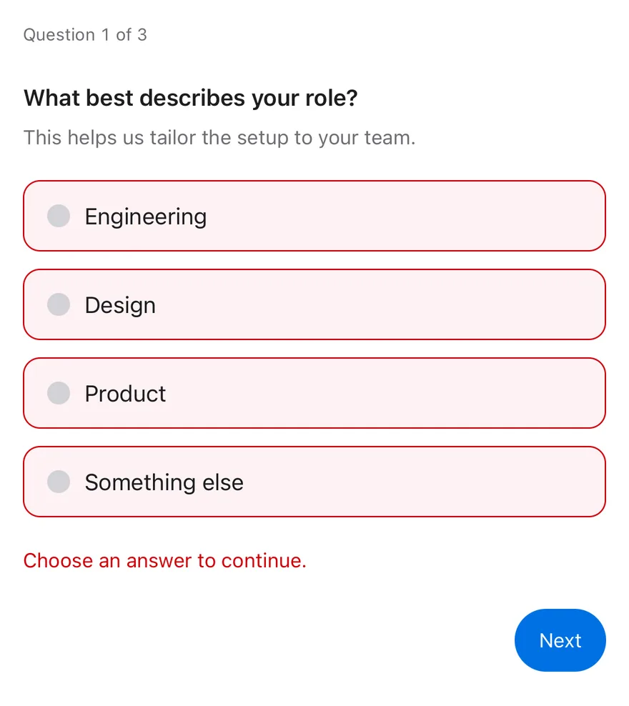
Choose an answer to continue.for required items; pass children to customize it. - Uses the
primary,border,secondary,destructiveandaccentcolors.
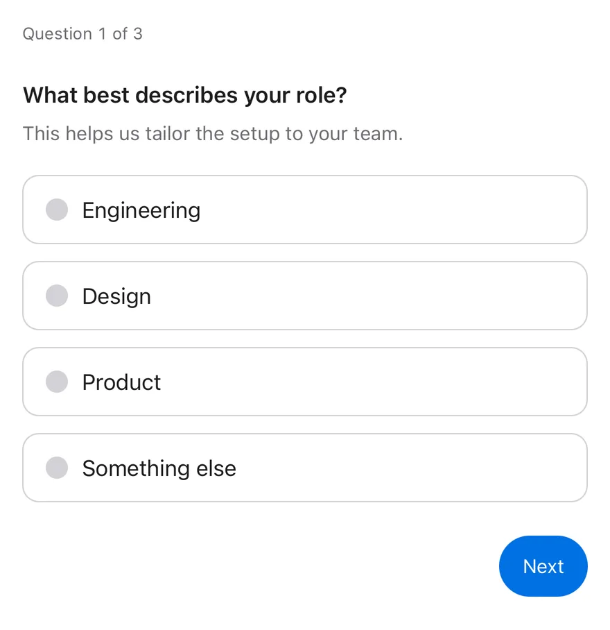
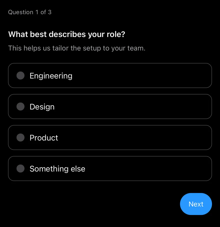
Questionnaire is a View that tracks which question is active, collects answers and validates them. Each QuestionnaireItem is one question; only the active item is shown, and moving between items slides the content horizontally with a Reanimated keyframe that follows the layout direction.
Items hold QuestionnaireChoice rows, which are Pressable radios or, with multiple, checkboxes, or a QuestionnaireInput for a typed answer. QuestionnaireActions holds the Previous, Skip, Next and Submit buttons, each of which only appears when it applies.
Installation
The CLI also adds what it builds on: Button, Icon, Input, Text.
Manual
- Install the dependencies:
-
Add the pieces it builds on: Button, Icon, Input, Text, and the primitives
components/primitives/haptics.tsx,components/primitives/hooks.tsx,components/primitives/use-render.tsx. -
Copy the source into
components/ui/questionnaire.tsx:
- Update the import paths to match your project.
- Install the dependencies:
-
Add the pieces it builds on: Button, Icon, Input, Text, and the primitives
components/primitives/haptics.tsx,components/primitives/hooks.tsx,components/primitives/use-render.tsx. -
Copy the source into
components/ui/questionnaire.tsx:
- Update the import paths to match your project.
- Install the dependencies:
-
Add the pieces it builds on: Button, Icon, Input, Text, and the primitives
components/primitives/haptics.tsx,components/primitives/hooks.tsx,components/primitives/use-render.tsx. -
Copy the source into
components/ui/questionnaire.tsx:
- Update the import paths to match your project.
-
Target iOS 17 or later.
-
Add the Swift package to your app:
- Copy the theme files every view uses:
- Copy the source and every file it uses:
- Add the files to your app target.
- Set
minSdkto 24 or higher and add the dependencies:
- Copy the theme files every view uses:
- Copy the source and every file it uses:
- Update the
com.esuiss.uipackage names to match your project.
Usage
Give every QuestionnaireItem a unique name; answers are collected under that name. Mark items required to block moving on without an answer; optional items show the Skip button. QuestionnaireError appears only when the item is invalid and has a default message you can replace.
The active item is uncontrolled through defaultItem or controlled with item and onItemChange. onSubmit receives the collected values: a string for single-answer items and a string array for multiple items.
QuestionnaireChoice supports defaultChecked, or controlled checked with onCheckedChange. QuestionnaireInput takes a type that sets the keyboard, autocomplete and secure entry. QuestionnaireProgress shows "Question 1 of 3" by default and accepts a render function. Use useQuestionnaireContext to build custom controls, or useQuestionnaire for the underlying state.
Examples
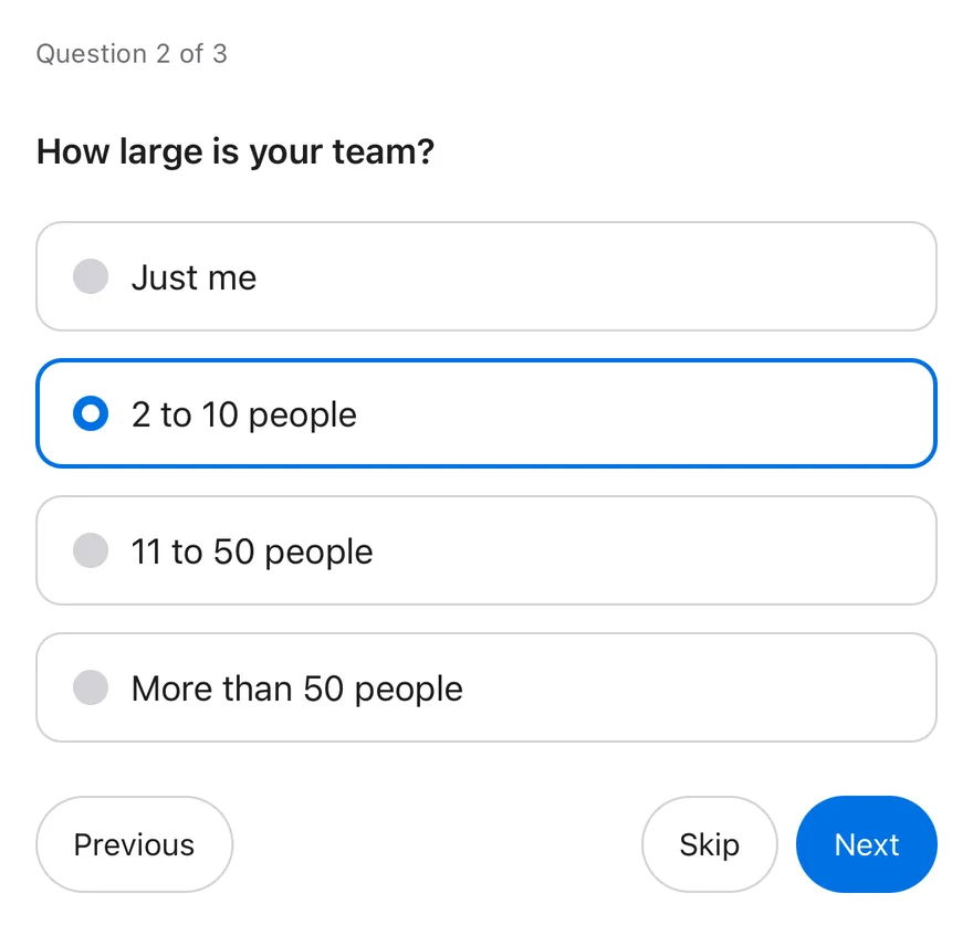
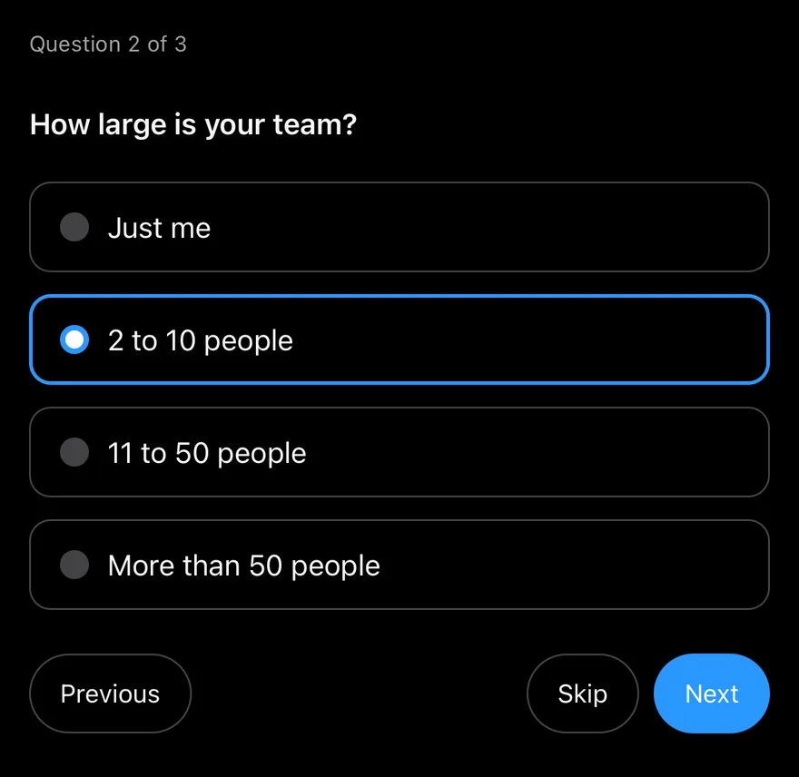
Mid flow
Starts on the second question with defaultItem.
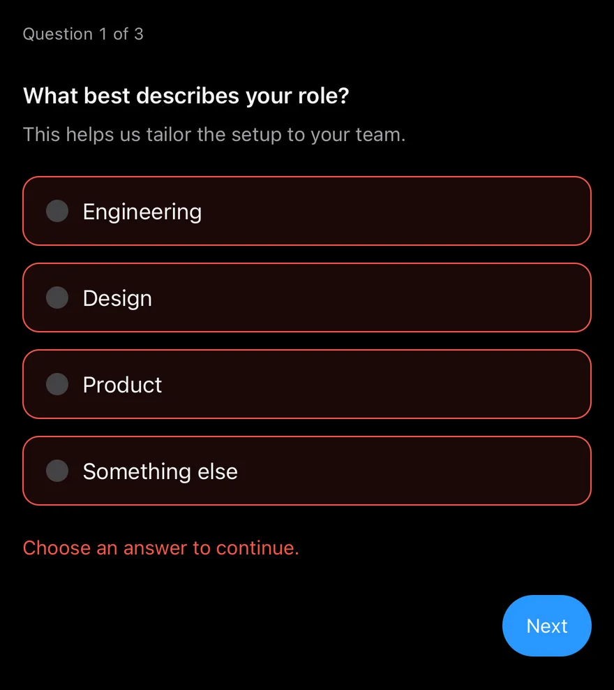
Invalid
A required question shown in its invalid state with an error message.
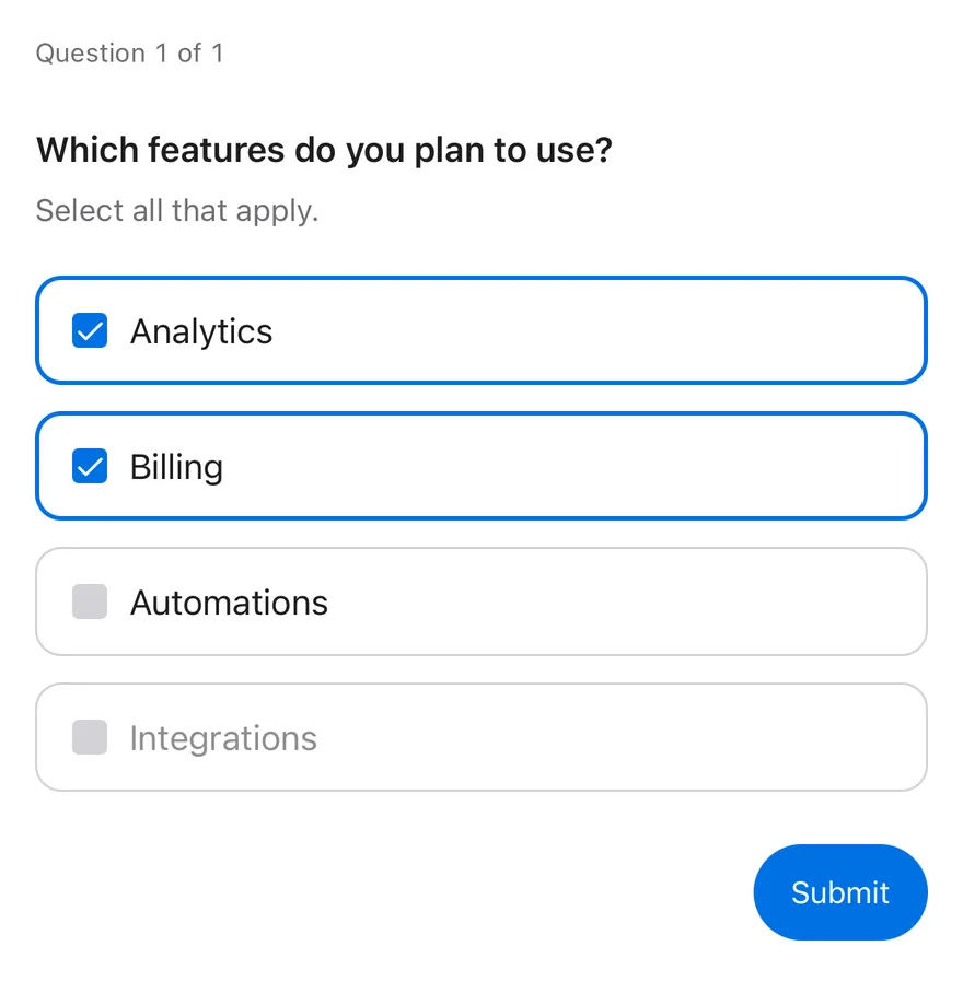
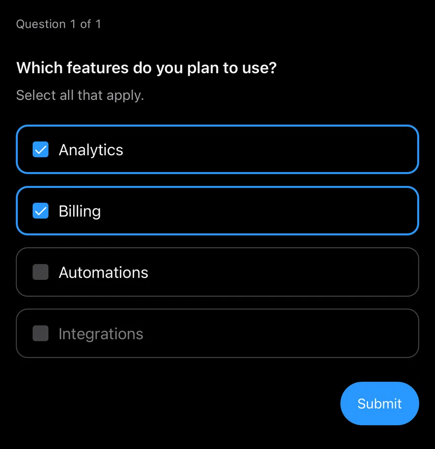
Multiple choice
A multiple item that accepts several checked choices.
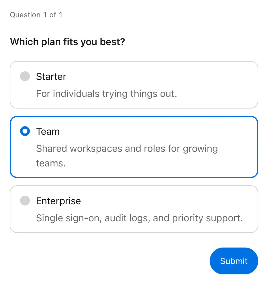
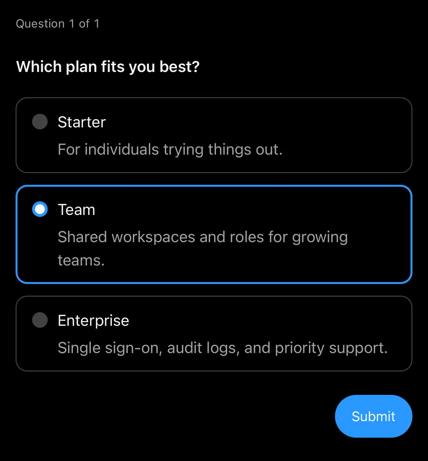
With choice descriptions
Choices with secondary text from QuestionnaireChoiceDescription.
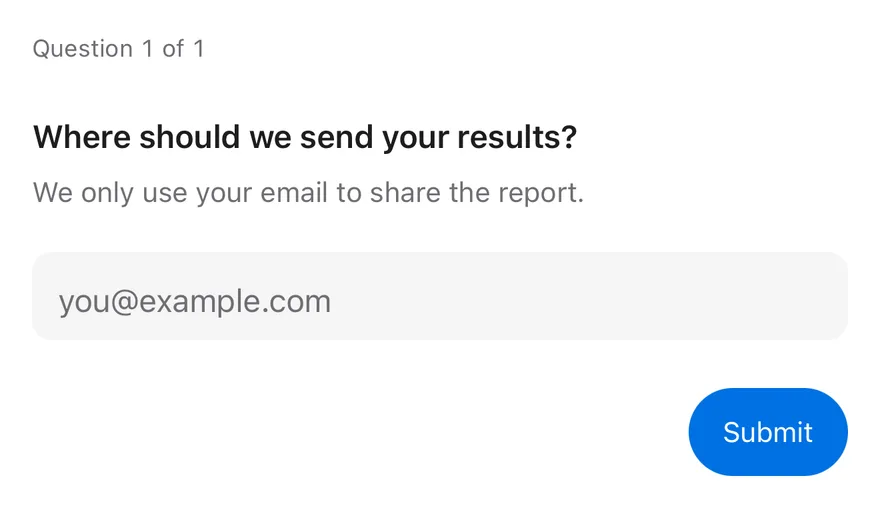
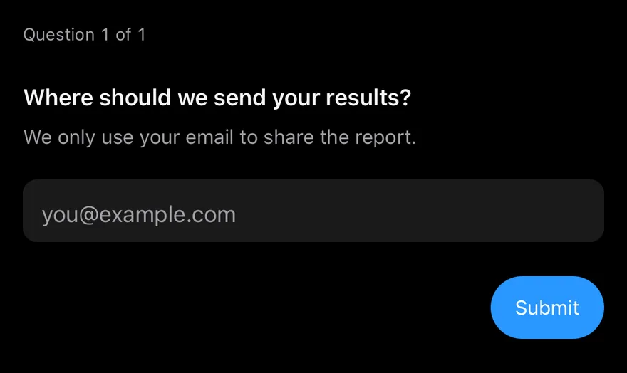
Text input
A required question answered with QuestionnaireInput.
API Reference
Questionnaire
Root that holds the state and the active question.
| Prop | Type | Default | Description |
|---|---|---|---|
items | QuestionnaireItemDefinition[] | - | The questions in order, each with a name and optional required and disabled. |
item | string | - | The name of the current question, for controlled use. |
defaultItem | string | - | The question to start on when uncontrolled. |
onItemChange | (item: string) => void | - | Called when the current question changes. |
onSubmit | (values: QuestionnaireValues) => void | - | Called with the answers when the last question is submitted. |
Also accepts the props of React.ComponentProps<typeof View>, React.RefAttributes<View>, UseQuestionnaireParameters.
QuestionnaireProgress
Shows the current question number and total.
| Prop | Type | Default | Description |
|---|---|---|---|
children | | React.ReactNode | ((state: QuestionnaireState) => React.ReactNode) | - |
Also accepts the props of React.ComponentProps<typeof View>, React.RefAttributes<View>.
QuestionnaireItem
One question; shown only while active.
| Prop | Type | Default | Description |
|---|---|---|---|
name | string | Required | Unique key for the answer. |
required | boolean | false | Requires an answer before moving on and hides Skip. |
disabled | boolean | false | Removes the item from the sequence. |
invalid | boolean | false | Forces the invalid state. |
multiple | boolean | false | Allows more than one choice. |
onStatusChange | (status: QuestionnaireItemStatus) => void | - | Called when the status changes to unanswered, answered or skipped. |
Also accepts the props of React.ComponentProps<typeof View>, React.RefAttributes<View>.
QuestionnaireTitle
The question heading.
Also accepts the props of React.ComponentProps<typeof Text>, React.RefAttributes<typeof Text>.
QuestionnaireDescription
Secondary text under the title.
Also accepts the props of React.ComponentProps<typeof Text>, React.RefAttributes<typeof Text>.
QuestionnaireChoices
Stack of choice rows.
Also accepts the props of React.ComponentProps<typeof View>, React.RefAttributes<View>.
QuestionnaireChoice
A selectable answer row.
| Prop | Type | Default | Description |
|---|---|---|---|
value | string | Required | Value stored when the choice is selected. |
checked | boolean | - | Controlled checked state. |
defaultChecked | boolean | false | Initial checked state. |
disabled | boolean | false | Disables the choice. |
onCheckedChange | (checked: boolean) => void | - | Called with the next checked state. |
children | React.ReactNode | - |
Also accepts the props of React.ComponentProps<typeof Pressable>, React.RefAttributes<View>.
QuestionnaireChoiceDescription
Secondary text inside a choice.
Also accepts the props of React.ComponentProps<typeof Text>, React.RefAttributes<typeof Text>.
QuestionnaireInput
Text field for a typed answer.
| Prop | Type | Default | Description |
|---|---|---|---|
type | QuestionnaireInputType | "text" | text, email, number, tel, url, password or search; sets keyboard and autofill props. |
Also accepts the props of React.ComponentProps<typeof Input>.
QuestionnaireError
Validation message shown when the item is invalid.
Also accepts the props of React.ComponentProps<typeof Text>, React.RefAttributes<typeof Text>.
QuestionnaireActions
Row for the navigation buttons.
Also accepts the props of React.ComponentProps<typeof View>, React.RefAttributes<View>.
QuestionnairePrevious
Goes to the previous question.
Also accepts the props of QuestionnaireNavigationProps.
QuestionnaireSkip
Skips the active question when it is optional.
Also accepts the props of QuestionnaireNavigationProps.
QuestionnaireNext
Validates and moves to the next question.
Also accepts the props of QuestionnaireNavigationProps.
QuestionnaireSubmit
Validates all questions and calls onSubmit on the last step.
Also accepts the props of QuestionnaireNavigationProps.
Accessibility
- Each item has the
radiogrouprole, orgroupwhenmultiple, and is labelled by itsQuestionnaireTitle, which has theheadingrole. - Choices have the
radioorcheckboxrole with checked and disabled states. QuestionnaireInputis labelled by the title unless you pass anaccessibilityLabel.QuestionnaireProgresshas theprogressbarrole, a value such as "Question 2 of 3" and a polite live region.QuestionnaireErrorhas thealertrole with a polite live region.- Slide transitions respect the system reduce motion setting.
Notes
- Selecting a choice plays a selection haptic when a haptics adapter is provided through
HapticsContext. - Selected choices use
border-primaryandbg-primary; invalid items useborder-destructive. - The slide direction flips for right-to-left layouts.
- Light and dark colors follow the system appearance.