suiss/ui · Component
Screen
A full-screen container that pads for safe area insets and sets the status bar style.
Screen is an open-source component from suiss/ui for React Native, SwiftUI and Jetpack Compose. The @esuiss/ui CLI copies its source into your project, so you own the code.
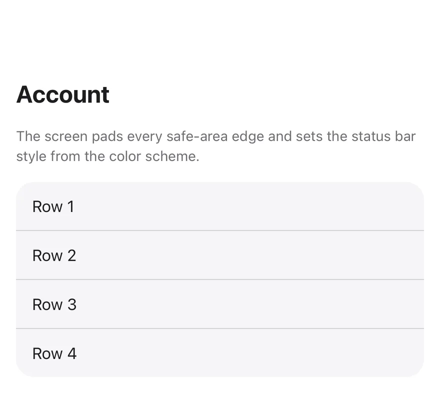
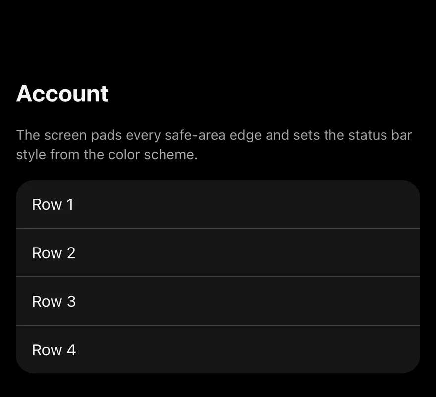
Screen is a View that fills the screen, paints the bg-background color (or bg-muted for the secondary variant) and adds padding for the safe area insets on the edges you choose. It also renders a StatusBar with light or dark content to match the color scheme.
ScreenContent lays out the body with padding and gaps. With scrollable, it renders a KeyboardScrollView so content scrolls and stays above the keyboard.
Installation
The CLI also adds what it builds on: Keyboard Scroll View.
Manual
- Install the dependencies:
-
Add the pieces it builds on: Keyboard Scroll View.
-
Copy the source into
components/ui/screen.tsx:
- Update the import paths to match your project.
- Install the dependencies:
-
Add the pieces it builds on: Keyboard Scroll View.
-
Copy the source into
components/ui/screen.tsx:
- Update the import paths to match your project.
- Install the dependencies:
-
Add the pieces it builds on: Keyboard Scroll View.
-
Copy the source into
components/ui/screen.tsx:
- Update the import paths to match your project.
-
Target iOS 17 or later.
-
Copy the theme files every view uses:
- Copy the source and every file it uses:
- Add the files to your app target.
- Set
minSdkto 24 or higher and add the dependencies:
- Copy the theme files every view uses:
- Copy the source and every file it uses:
- Update the
com.esuiss.uipackage names to match your project.
Usage
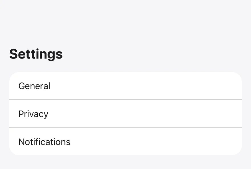
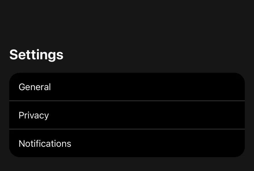
Wrap each screen in Screen and put the body in ScreenContent. Use variant="secondary" for grouped screens such as settings.
Pass edges to pad only some sides, for example ["top"] when a tab bar or bottom bar handles the bottom inset. Set scrollable on ScreenContent for content taller than the screen or for forms.
The app must be wrapped in a SafeAreaProvider from react-native-safe-area-context. ScreenContext exposes the active edges to children.
Examples
Secondary
A screen with the secondary background.
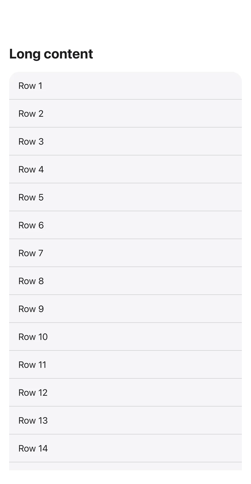
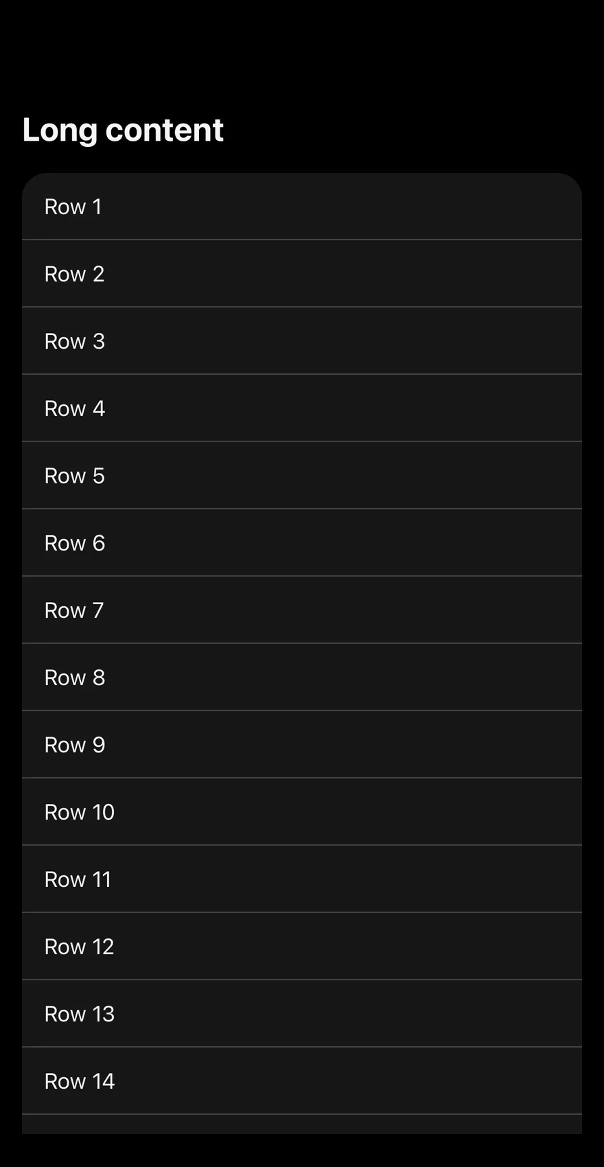
Scrollable
A screen whose content scrolls.
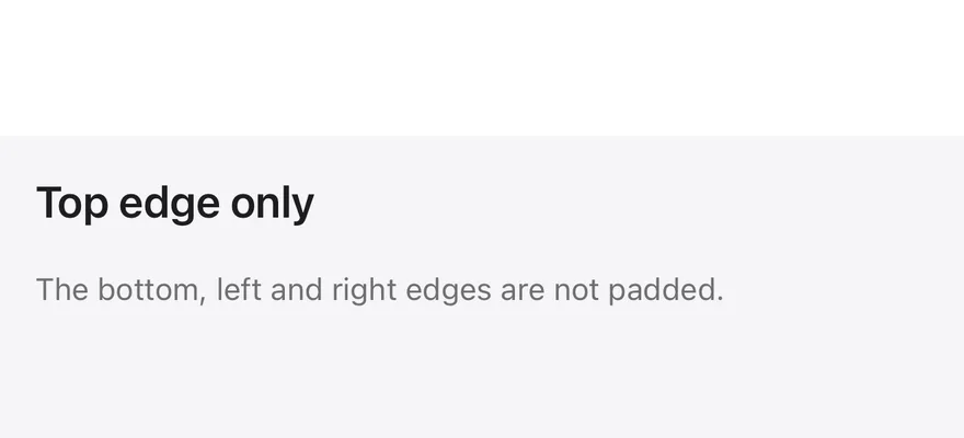
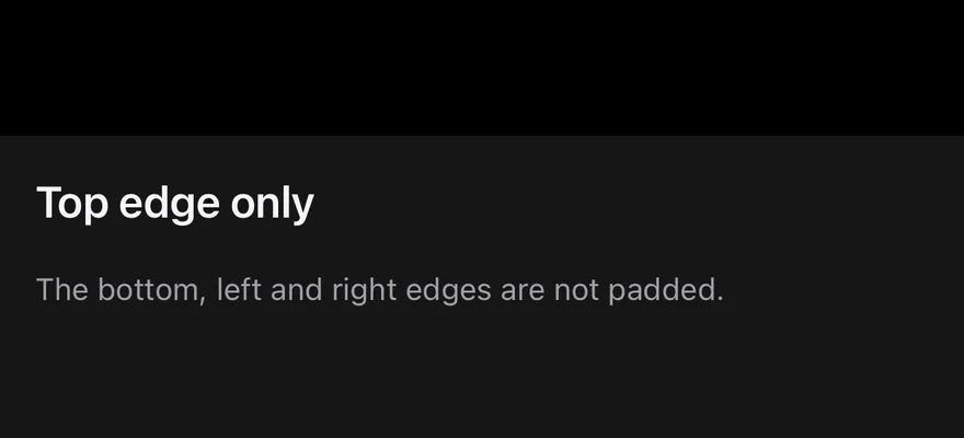
Top edge only
A screen that pads only the top inset.
With bottom bar
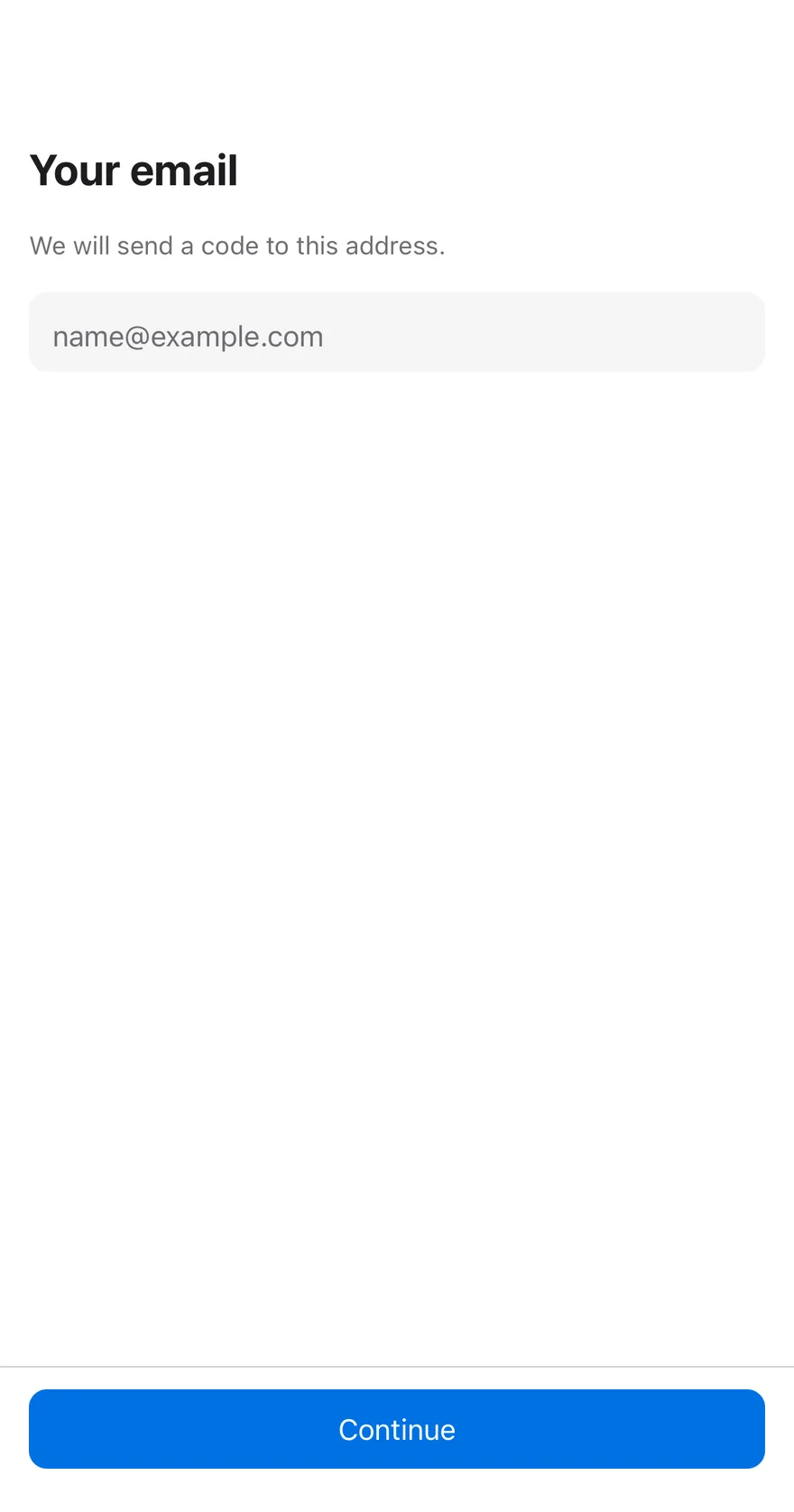
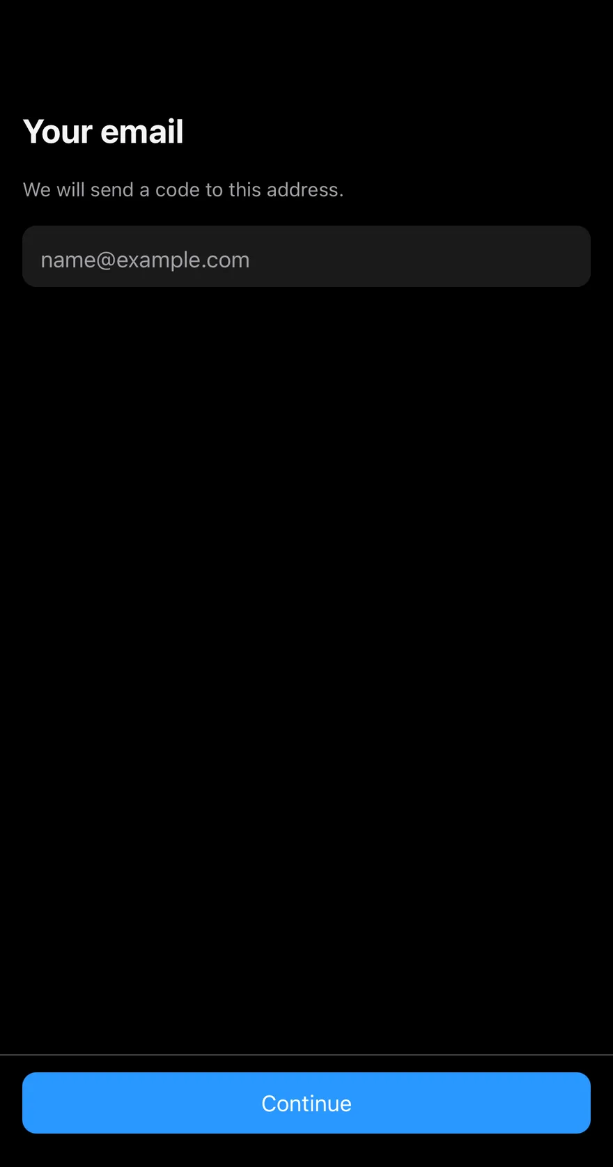
A scrollable form with a bottom bar holding the main action.
API Reference
Screen
The root view that pads for safe area insets.
| Prop | Type | Default | Description |
|---|---|---|---|
edges | readonly ScreenEdge[] | ALL_EDGES | Which sides get safe area padding: any of top, right, bottom, left. Defaults to all four. |
variant | "default" | "secondary" | "default" | Background: default or secondary. |
Also accepts the props of ViewProps.
ScreenContent
The padded body, optionally scrollable.
| Prop | Type | Default | Description |
|---|---|---|---|
scrollable | boolean | false | Renders a KeyboardScrollView instead of a View. Defaults to false. |
Also accepts the props of ViewProps.
Notes
- Uses the
bg-backgroundandbg-mutedtokens. - The status bar uses
light-contentin dark mode anddark-contentin light mode, following the system appearance. - Requires
react-native-safe-area-contextand the Keyboard Scroll View component.