suiss/ui · Component
Tabs
A set of tabs that switches between panels of related content in the same place.
Tabs is an open-source component from suiss/ui for React, React Native, SwiftUI and Jetpack Compose. The @esuiss/ui CLI copies its source into your project, so you own the code.
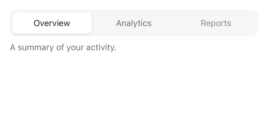
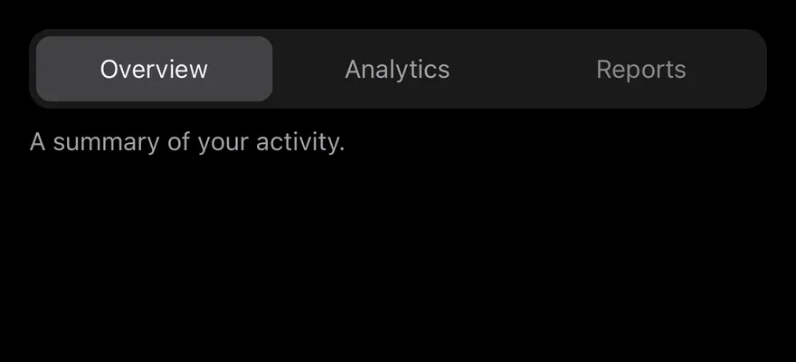
Tabs wraps the tabs primitive of the chosen base. TabsList holds the TabsTrigger buttons, and each TabsContent panel is shown when its value matches the selected tab. An indicator slides to the active tab: a raised pill in the default variant, or an underline in the line variant.
When there are more tabs than fit, the list scrolls horizontally and keeps the active tab in view. On small screens, a horizontal list bleeds to the edges of its scroll container. Use Tabs to switch views within a page. For app-level navigation, use TabBar or Sidebar; for a compact single-choice control, consider a segmented ToggleGroup.
Installation
CLI
Works in any project with a components.json. See Installation for the one-line registry setup. Or use the suiss/ui CLI:
Manual
- Install the dependencies and add the
cnhelper:
- Copy the source into
components/ui/tabs.tsx:
- Update the import paths to match your project.
Usage
Use defaultValue on Tabs for an uncontrolled set, or value with onValueChange to control it. Give each TabsTrigger and its TabsContent the same value. Set orientation="vertical" on Tabs to stack the triggers beside the panel.
Examples
Line
Uses the line variant, which underlines the active tab.
Vertical
Stacks the tabs vertically beside the panel.
With icons
Places an icon before each tab's label.
Disabled tab
Disables one tab so it can't be selected.
Many tabs
Holds more tabs than fit, so the list scrolls.
Many tabs line
Combines a scrolling list with the line variant.
API Reference
Tabs
The root that holds the selected value and orientation.
Also accepts the props of the primitive part it wraps.
TabsList
The row or column of tabs, with the sliding indicator.
| Prop | Type | Default | Description |
|---|---|---|---|
variant | "default" | "line" | "default" | Chooses a filled default list with a raised pill, or a line list with an underline. |
Also accepts the props of the primitive part it wraps.
TabsTrigger
A tab that selects its panel.
Also accepts the props of the primitive part it wraps.
TabsContent
The panel shown when its tab is selected.
Also accepts the props of the primitive part it wraps.
Accessibility
- The list has the
tablistrole witharia-orientation; triggers aretabelements witharia-selected, and panels aretabpanelelements. - Arrow keys move focus between tabs, wrapping at the ends;
EnterorSpaceselects the focused tab. Vertical tabs use the up and down arrow keys. HomeandEndmove focus to the first and last tabs.- Disabled tabs set
aria-disabledand can't be selected by click or keyboard.
Notes
- Parts carry
data-slotattributes:tabs,tabs-list,tabs-list-content,tabs-indicator,tabs-triggerandtabs-content. The list and indicator setdata-variant, and the active trigger setsdata-active. - The edge bleed on small screens is set through the
--tabs-list-bleed-startand--tabs-list-bleed-endproperties, which the list measures itself. classNameonTabsListstyles the innertabs-list-contentelement, not the scrolling list.- Indicator and scroll animations are removed when reduced motion is preferred.
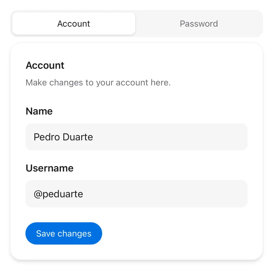
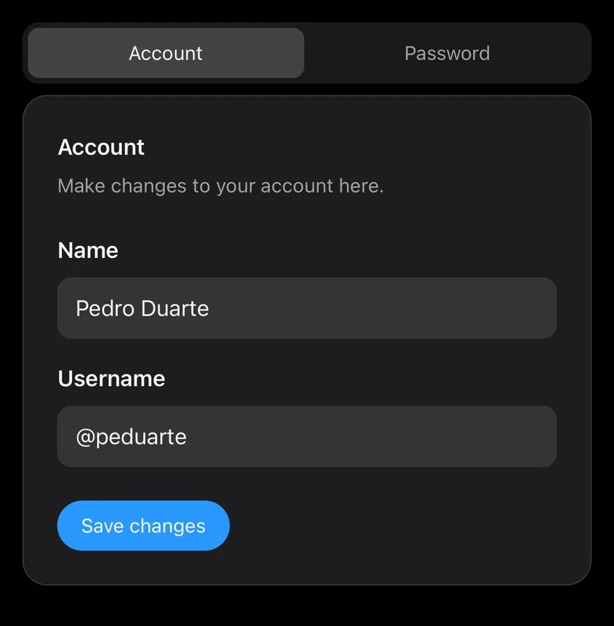
Tabs groups a TabsList of TabsTrigger buttons with matching TabsContent panels. The active tab is marked by an indicator that slides between tabs with a Reanimated layout transition.
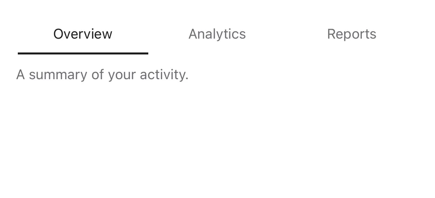
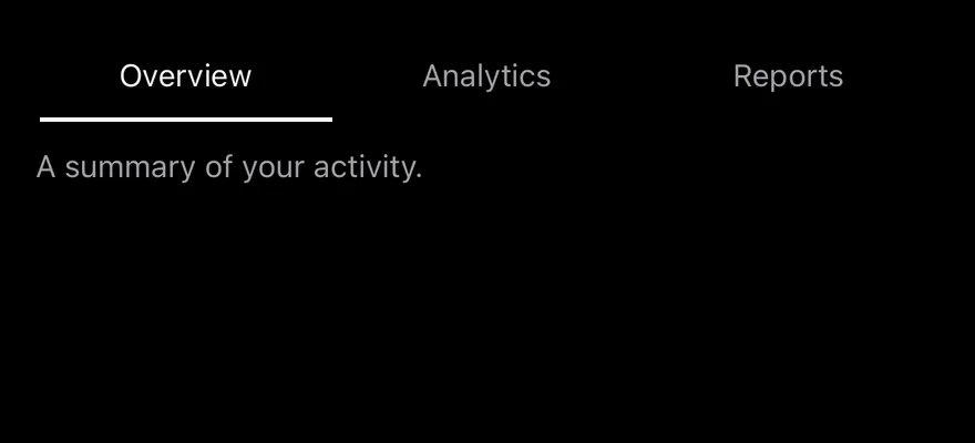
TabsList has two variants: default, a segmented control with a raised indicator on a filled track, and line, a transparent list with a thin underline. Both work in horizontal and vertical orientation.
Installation
The CLI also adds what it builds on: Text.
Manual
- Install the dependencies:
-
Add the pieces it builds on: Text, and the primitives
components/primitives/tabs.tsx,components/primitives/use-render.tsx. -
Copy the source into
components/ui/tabs.tsx:
- Update the import paths to match your project.
- Install the dependencies:
-
Add the pieces it builds on: Text, and the primitives
components/primitives/tabs.tsx,components/primitives/use-render.tsx. -
Copy the source into
components/ui/tabs.tsx:
- Update the import paths to match your project.
- Install the dependencies:
-
Add the pieces it builds on: Text, and the primitives
components/primitives/tabs.tsx,components/primitives/use-render.tsx. -
Copy the source into
components/ui/tabs.tsx:
- Update the import paths to match your project.
-
Target iOS 17 or later.
-
Add the Swift package to your app:
- Copy the theme files every view uses:
- Copy the source and every file it uses:
- Add the files to your app target.
- Set
minSdkto 24 or higher and add the dependencies:
- Copy the theme files every view uses:
- Copy the source and every file it uses:
- Update the
com.esuiss.uipackage names to match your project.
Usage
Give each TabsTrigger and its TabsContent the same value. Use defaultValue for an uncontrolled tab set, or value with onValueChange to control it.
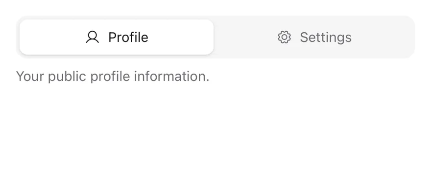
Set orientation="vertical" on Tabs to stack the list beside the panels. Put an Icon next to the Text in a trigger for icon tabs.
Inactive panels are unmounted unless you set keepMounted on TabsContent. tabsListVariants is exported for reuse.
Examples
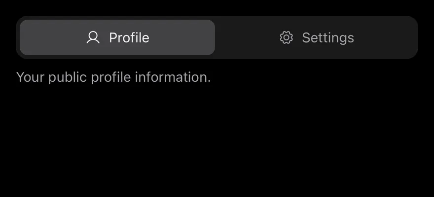
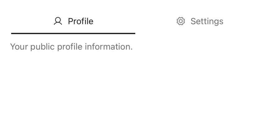
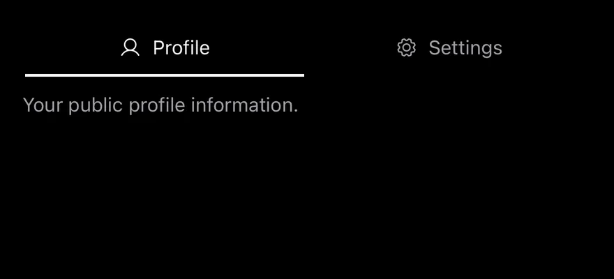
With icons
Tabs with an icon beside each label.
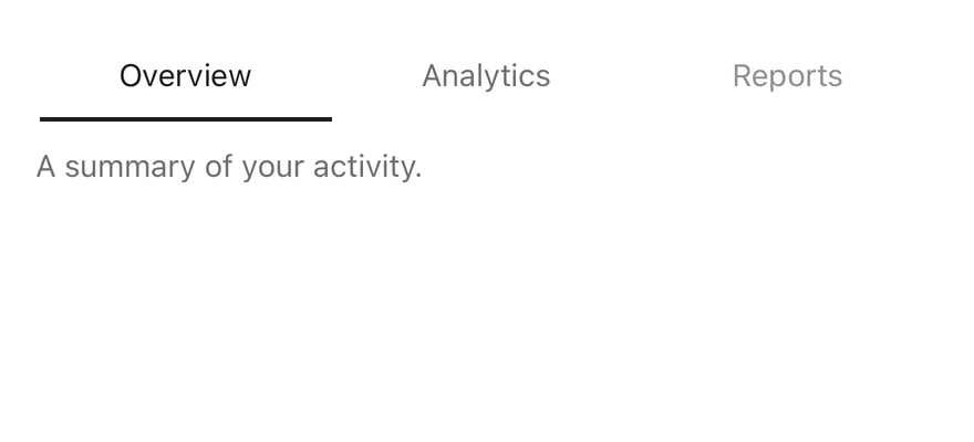
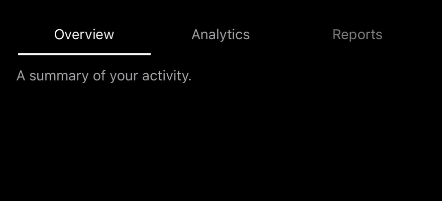
Disabled tab
A tab set with one disabled tab.
Line
The line variant with an underline indicator.
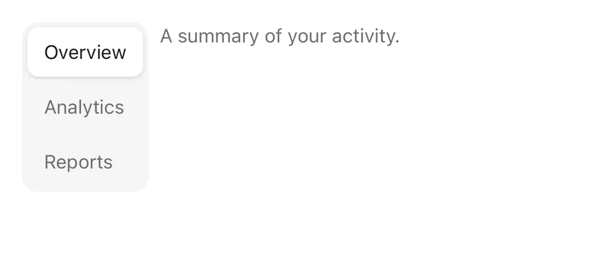
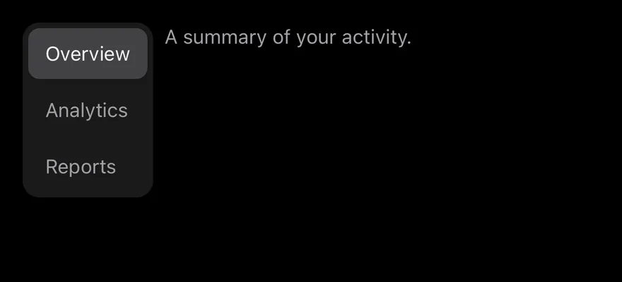
Vertical
A vertical tab list next to its panels.
Vertical line
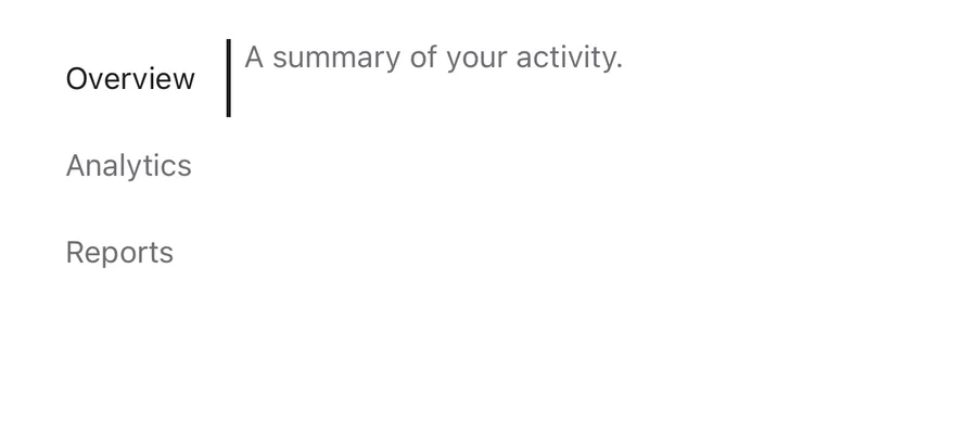
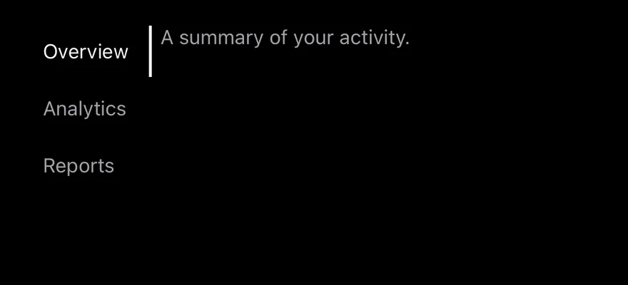
A vertical line list with a side indicator.
With icons line
Icon tabs in the line variant.
Disabled tab line
A disabled tab in the line variant.
API Reference
Tabs
Root that holds the active value and orientation.
Also accepts the props of React.ComponentProps<typeof TabsPrimitive.Root>.
TabsList
Row or column of triggers with the animated indicator.
| Prop | Type | Default | Description |
|---|---|---|---|
variant | "default" | "line" | "default" | default for a filled segmented track, or line for an underline. |
Also accepts the props of React.ComponentProps<typeof TabsPrimitive.List>.
TabsTrigger
Pressable tab that activates its panel.
Also accepts the props of React.ComponentProps<typeof TabsPrimitive.Tab>.
TabsContent
Panel shown when its value is active.
Also accepts the props of React.ComponentProps<typeof TabsPrimitive.Panel>.
Accessibility
TabsListhas thetablistrole and each trigger has thetabrole.- Triggers report
selectedanddisabledin their accessibility state, so VoiceOver and TalkBack announce the current tab. - Hidden panels kept with
keepMountedare removed from the accessibility tree. - The indicator animation follows the system reduce motion setting.
Notes
- The
defaulttrack usesbg-secondarywith abg-cardindicator (bg-borderin dark mode); thelineindicator usesbg-foreground. - Labels use
text-foregroundwhen active,text-muted-foregroundwhen inactive andopacity-50when disabled. - Light and dark colors follow the system appearance.