suiss/ui · Component
Input
A single-line text field for entering and editing short values.
Input is an open-source component from suiss/ui for React, React Native, SwiftUI and Jetpack Compose. The @esuiss/ui CLI copies its source into your project, so you own the code.
Input renders a native input element with a filled control style. It supports every native input type, including email, password, number, search and file, and adds a size prop for three heights.
Use it for short, free-form values. For multi-line text use a textarea, for icons, buttons or text attached to the field use InputGroup, and for one-time codes use InputOTP.
Installation
CLI
Works in any project with a components.json. See Installation for the one-line registry setup. Or use the suiss/ui CLI:
Manual
- Install the dependencies and add the
cnhelper:
- Copy the source into
components/ui/input.tsx:
- Update the import paths to match your project.
Usage
Use defaultValue for an uncontrolled field, or value with onChange to control it. Give every input a visible label, for example with FieldLabel inside a Field, or set aria-label when a visible label is not possible. Choose a size that matches neighboring controls such as a Button.
Examples
Sizes
The sm, md and default sizes, each next to a button of matching height.
Types
Inputs with email, password, number and search types.
With value
An input that starts with a defaultValue.
File
A file input with an accessible name that accepts a chosen file.
Invalid
An input marked with aria-invalid, showing the error style.
Disabled
A disabled input that ignores typing.
API Reference
Input
The text field.
| Prop | Type | Default | Description |
|---|---|---|---|
size | "sm" | "md" | "default" | "default" | Sets the height and text size: default is the tallest, md is medium and sm is the most compact with a smaller radius. |
Also accepts the props of React.ComponentProps<"input">.
Accessibility
- Renders a native
input, so the role follows itstype:textboxby default,spinbuttonfornumberandsearchboxforsearch. - Needs an accessible name from an associated label or
aria-label. - Set
aria-invalidto communicate a validation error. - A disabled input cannot be focused or edited.
Notes
- Styling hooks:
data-slot="input"anddata-size. - Uses the
secondary,primary(caret),muted-foreground(placeholder) anddestructivecolors, andopacity-50when disabled. - The native
sizeattribute is replaced by thesizeprop.
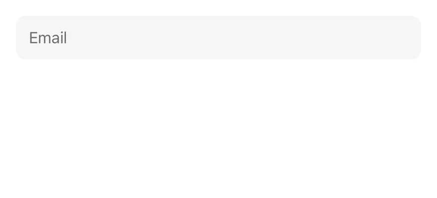
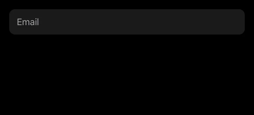
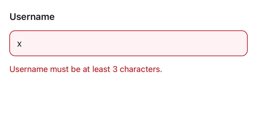
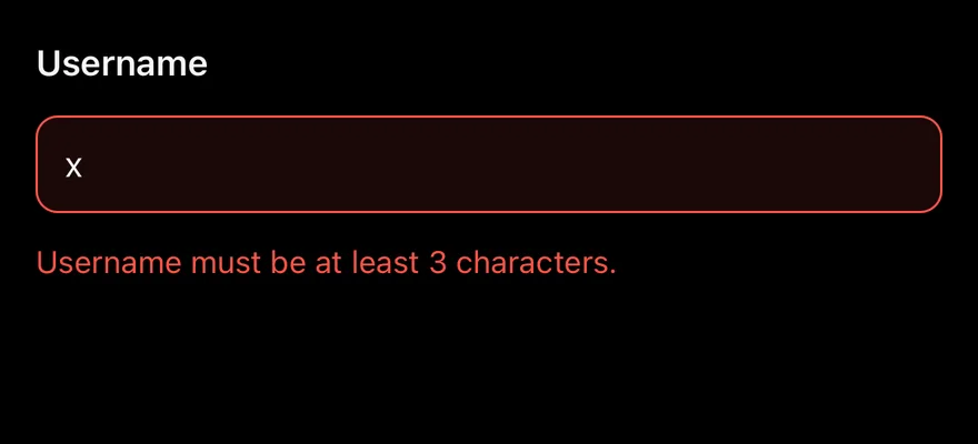
Input wraps a TextInput through the field control primitive. It tracks its own focused, filled, invalid and disabled state and styles itself from that state: a focus border while editing, a destructive border and tint when invalid, and 50% opacity when disabled.
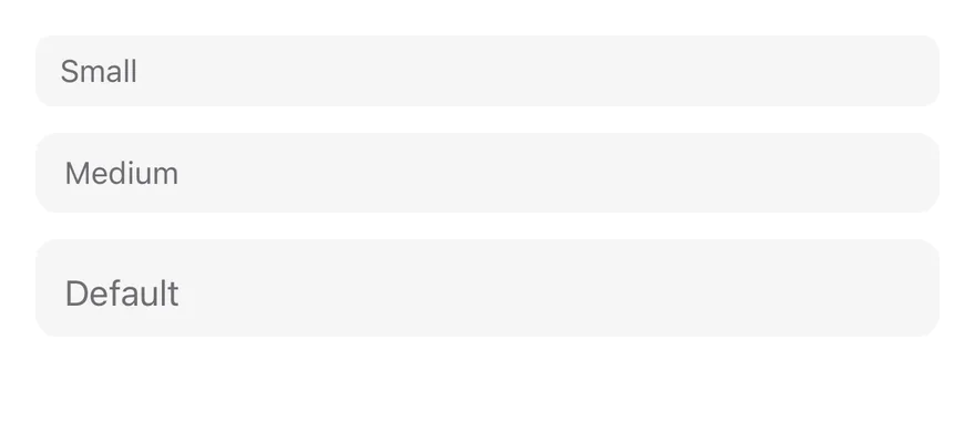
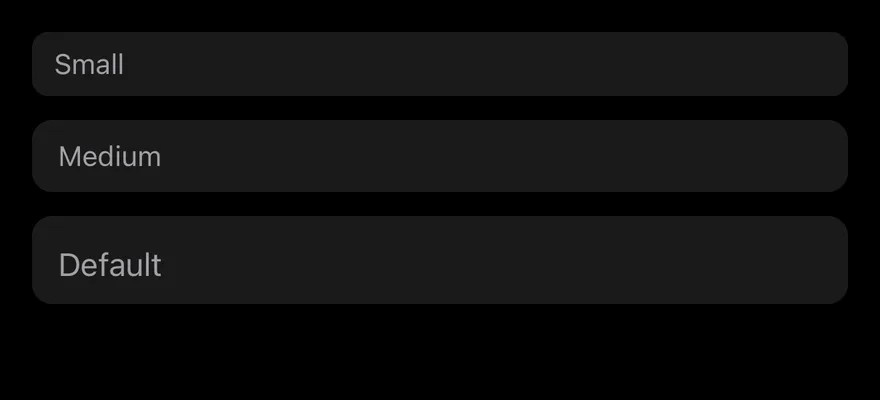
It comes in three sizes: default (44 pt), md and sm. Use the default size for forms on a full screen, and the smaller sizes inside dense layouts such as toolbars or sheets.
Installation
Manual
- Install the dependencies:
-
Add the pieces it builds on: the primitives
components/primitives/input.tsx,components/primitives/use-render.tsx. -
Copy the source into
components/ui/input.tsx:
- Update the import paths to match your project.
- Install the dependencies:
-
Add the pieces it builds on: the primitives
components/primitives/input.tsx,components/primitives/use-render.tsx. -
Copy the source into
components/ui/input.tsx:
- Update the import paths to match your project.
-
Add the pieces it builds on: the primitives
components/primitives/input.tsx,components/primitives/use-render.tsx. -
Copy the source into
components/ui/input.tsx:
- Update the import paths to match your project.
-
Target iOS 17 or later.
-
Copy the theme files every view uses:
- Copy the source and every file it uses:
- Add the files to your app target.
- Set
minSdkto 24 or higher and add the dependencies:
- Copy the theme files every view uses:
- Copy the source and every file it uses:
- Update the
com.esuiss.uipackage names to match your project.
Usage
Pass any TextInput prop, such as placeholder, secureTextEntry, keyboardType or inputMode, to get the matching field type.
The value works controlled with value and onValueChange(value, details), or uncontrolled with defaultValue. Inside a Field, the input picks up the field's label, description, invalid and disabled state, so you usually set invalid on the Field instead of on the input.
className can be a function that receives the state (focused, invalid, disabled, filled, …) and returns classes.
Examples
Types
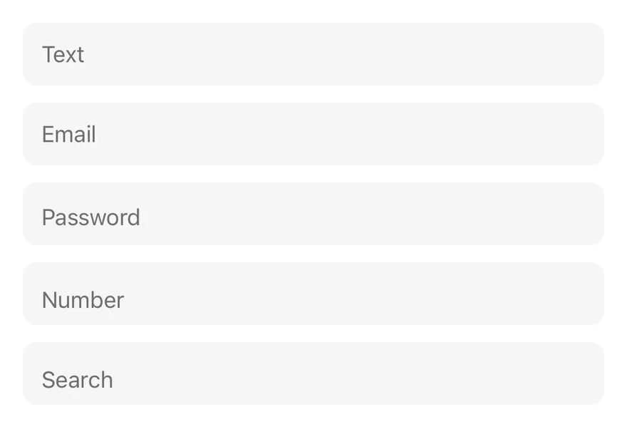
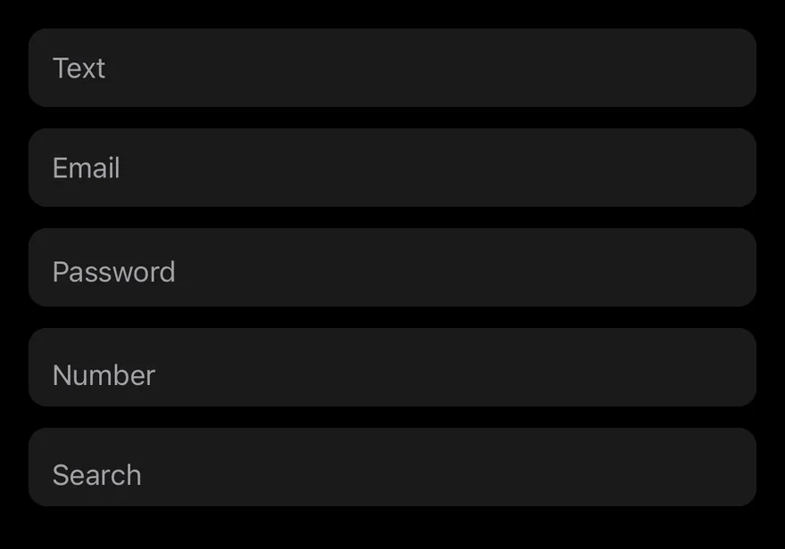
Text, email, password, number and search fields set through standard TextInput props.
Sizes
The sm, md and default sizes.
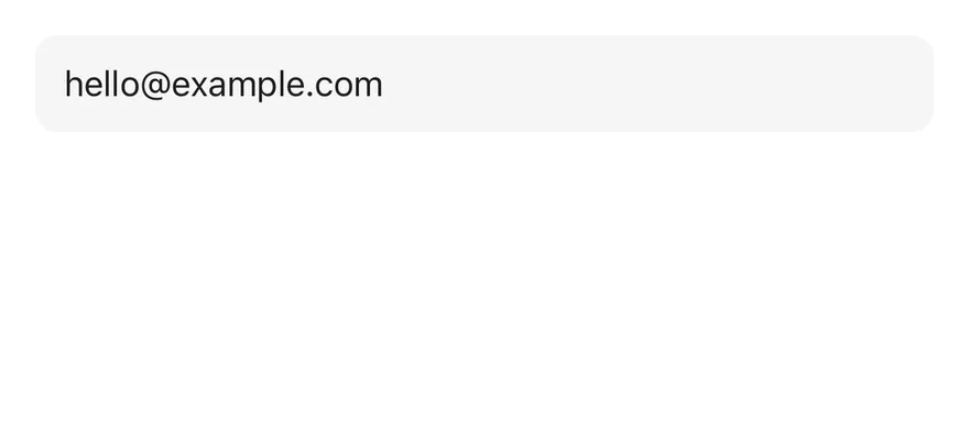
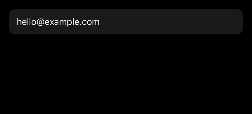
With value
An input that starts with a defaultValue.
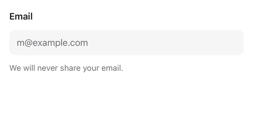
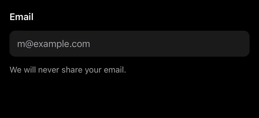
With label
An input inside a Field with a label and description.
Invalid
An input inside an invalid Field with an error message.
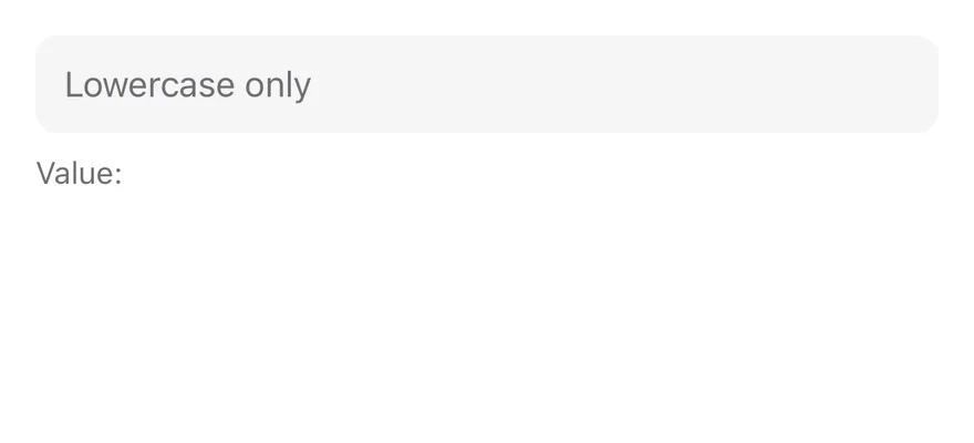
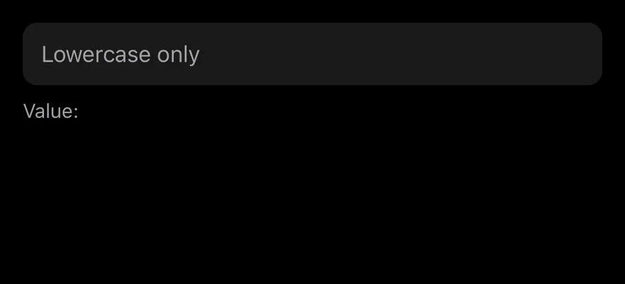
Controlled
A controlled input that mirrors its value below.
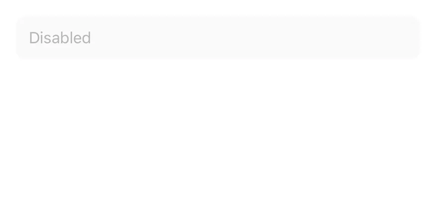
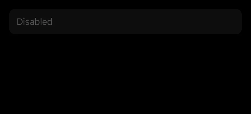
Disabled
A disabled input.
API Reference
Input
| Prop | Type | Default | Description |
|---|---|---|---|
size | InputSize | "default" | Height and text size: default, md or sm. |
Also accepts the props of React.ComponentProps<typeof InputPrimitive.Root>.
Accessibility
- Inside a
Field, the input is linked to the field label throughaccessibilityLabelledByand gets the label asaccessibilityLabeland the description asaccessibilityHint. disabledis set inaccessibilityStateand makes the input non-editable.- Outside a
Field, give the input anaccessibilityLabel; a placeholder alone is not a label.
Notes
- Uses the
bg-secondary,border-ringandborder-destructivetokens, withopacity-50when disabled. - In Uniwind and NativeWind, a focused field also draws the
ring-3 ring-ring/50focus ring. - Placeholder, cursor and selection colors come from the
muted-foregroundandprimarytokens. - Light and dark colors follow the system appearance.