suiss/ui · Component
Popover
A floating panel anchored to a trigger, for supplementary content and lightweight controls.
Popover is an open-source component from suiss/ui for React, React Native, SwiftUI and Jetpack Compose. The @esuiss/ui CLI copies its source into your project, so you own the code.
Popover wraps the popover primitive of the chosen base. Popover is the root that holds the open state, PopoverTrigger toggles it, and PopoverContent renders the positioned panel in a portal. Inside the content, PopoverHeader groups a PopoverTitle and PopoverDescription above any other content, such as form fields.
Use a popover for interactive content that relates to its trigger. Use Tooltip for short, non-interactive hints, and Dialog when the task needs the user's full attention.
Installation
CLI
Works in any project with a components.json. See Installation for the one-line registry setup. Or use the suiss/ui CLI:
Manual
- Install the dependencies and add the
cnhelper:
- Copy the source into
components/ui/popover.tsx:
- Update the import paths to match your project.
Usage
The popover is uncontrolled by default; use defaultOpen, or the open state with onOpenChange to control it. PopoverContent accepts the positioning props side, sideOffset, align and alignOffset, defaulting to bottom, 4, center and 0.
Use the trigger's render prop to render it as another component, such as a Button.
Set asChild on PopoverTrigger to render another component, such as a Button, as the trigger.
The Button placed first inside Popover opens it, and isOpen controls the open state.
Examples
Sides
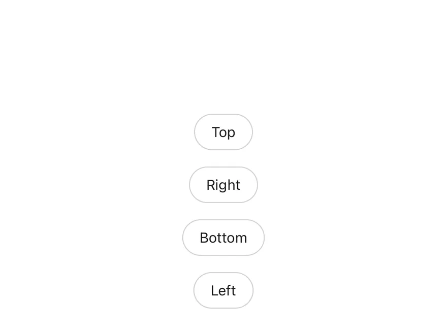
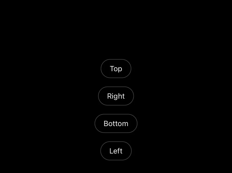
Four popovers that open on the top, right, bottom and left of their triggers.
Simple
A plain text popover opened from a ghost button, without a header.
API Reference
Popover
The root that manages the popover's open state.
Also accepts the props of the primitive part it wraps.
PopoverTrigger
The button that opens and closes the popover.
Also accepts the props of the primitive part it wraps.
PopoverContent
The positioned panel that renders in a portal.
Also accepts the props of the primitive parts it wraps.
PopoverHeader
Groups the title and description at the top of the panel.
Also accepts the props of React.ComponentProps<"div">.
PopoverTitle
The heading that names the popover.
Also accepts the props of the primitive part it wraps.
PopoverDescription
Secondary text that describes the popover.
Also accepts the props of the primitive part it wraps.
Accessibility
- The panel has the
dialogrole.PopoverTitleprovides its accessible name andPopoverDescriptionits accessible description. - The trigger exposes
aria-expanded. - Escape closes the popover and returns focus to the trigger.
- Clicking outside the panel, or clicking the trigger again, closes it.
Notes
- Styling hooks:
data-slotvaluespopover,popover-trigger,popover-content,popover-header,popover-titleandpopover-description. - The panel is
w-72by default; override it withclassName. - The panel animates in from the side it opens on.
- Uses the
popover,popover-foregroundandmuted-foregroundtokens.
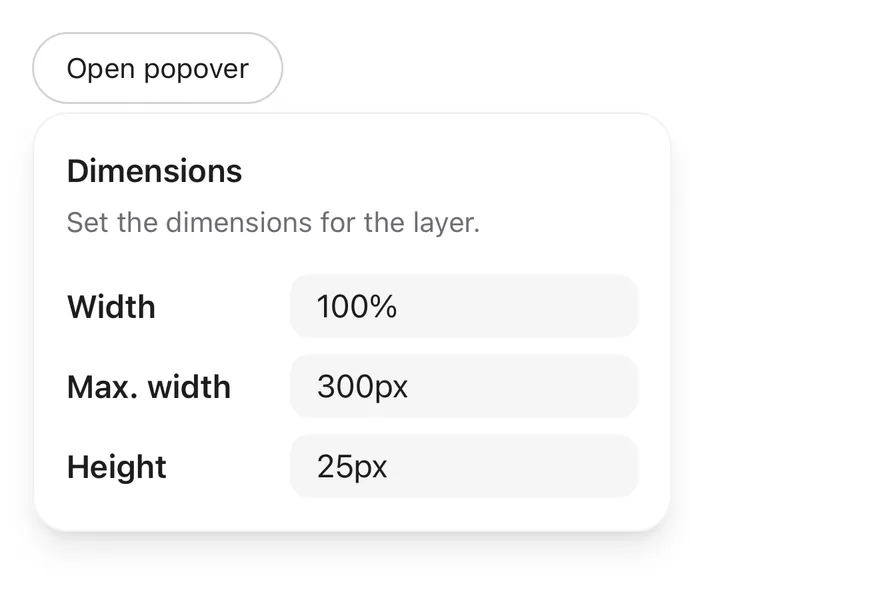
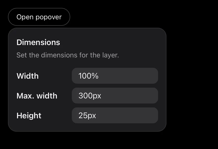
Popover positions a panel next to its PopoverTrigger. PopoverContent renders in a portal, is placed on any side with an align and offsets, and animates in with a short fade, scale and slide using Reanimated. On iOS the content is wrapped in a FullWindowOverlay from react-native-screens, so it draws above native modals.
Use PopoverHeader, PopoverTitle and PopoverDescription to label the panel. For short hints, use Tooltip instead.
Installation
The CLI also adds what it builds on: Text. On React Native it also adds the animated view components/ui/animated-view.tsx.
Manual
- Install the dependencies:
-
Add the pieces it builds on: Text, and the primitives
components/primitives/popover.tsx,components/primitives/types.tsx,components/primitives/use-render.tsx, and the animated viewcomponents/ui/animated-view.tsxfrom the next step. -
Copy the animated view into
components/ui/animated-view.tsx:
- Copy the source into
components/ui/popover.tsx:
- Update the import paths to match your project.
- Install the dependencies:
-
Add the pieces it builds on: Text, and the primitives
components/primitives/popover.tsx,components/primitives/types.tsx,components/primitives/use-render.tsx, and the animated viewcomponents/ui/animated-view.tsxfrom the next step. -
Copy the animated view into
components/ui/animated-view.tsx:
- Copy the source into
components/ui/popover.tsx:
- Update the import paths to match your project.
- Install the dependencies:
-
Add the pieces it builds on: Text, and the primitives
components/primitives/popover.tsx,components/primitives/types.tsx,components/primitives/use-render.tsx, and the animated viewcomponents/ui/animated-view.tsxfrom the next step. -
Copy the animated view into
components/ui/animated-view.tsx:
- Copy the source into
components/ui/popover.tsx:
- Update the import paths to match your project.
-
Target iOS 17 or later.
-
Add the Swift package to your app:
- Copy the theme files every view uses:
- Copy the source and every file it uses:
- Add the files to your app target.
- Set
minSdkto 24 or higher and add the dependencies:
- Copy the theme files every view uses:
- Copy the source and every file it uses:
- Update the
com.esuiss.uipackage names to match your project.
Usage
The popover is uncontrolled by default. Use defaultOpen to start open, or open with onOpenChange to control it. onOpenChangeComplete runs after the open or close animation.
Pass a render element to PopoverTrigger, such as a Button, to use your own pressable.
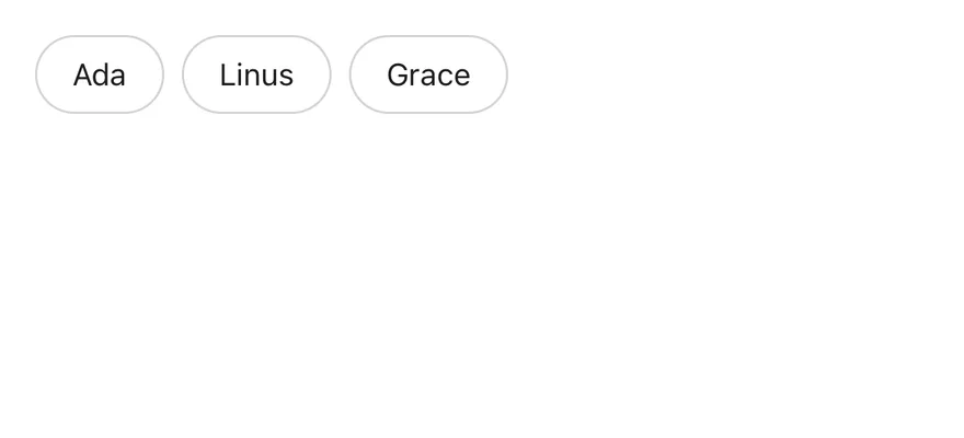
To share one popover between several triggers, create a handle with createHandle from the popover primitive, pass it as handle to the Popover and each PopoverTrigger, and give each trigger a payload. The Popover children can be a function that receives the active payload.
Use portalHost on PopoverContent to render into a named portal host.
Examples
Default
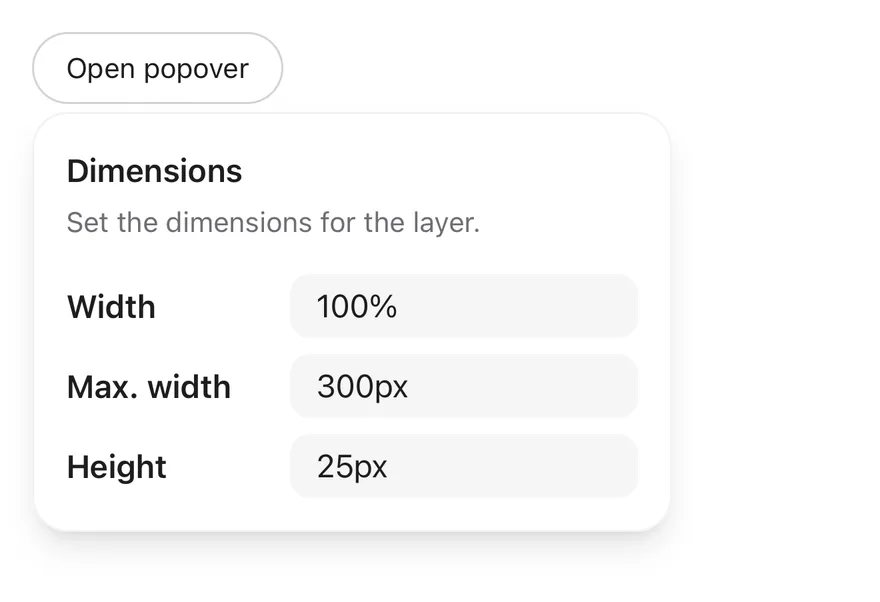
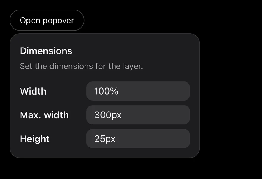
Sides
Popovers opened on each of the four sides.
Simple
A short text popover aligned to the start of its trigger.

Detached triggers
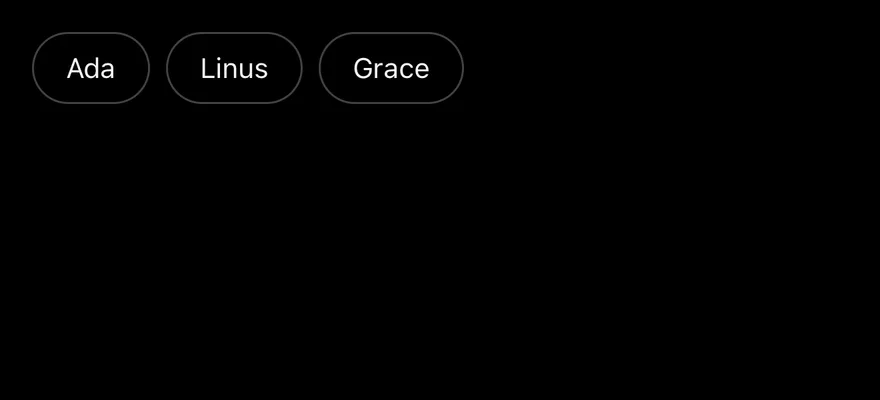
Several triggers sharing one popover through a handle, each passing its own payload.
API Reference
Popover
The root that manages the open state.
| Prop | Type | Default | Description |
|---|---|---|---|
open | boolean | - | Whether the popover is open, for controlled use. |
defaultOpen | boolean | false | Whether the popover starts open when uncontrolled. |
onOpenChange | (open: boolean, details) => void | - | Called when the popover opens or closes. |
modal | boolean | false | Blocks interaction with the rest of the screen while open. |
PopoverContent
Animated panel rendered in a portal and positioned next to the trigger.
| Prop | Type | Default | Description |
|---|---|---|---|
portalHost | string | - | Name of the portal host to render into. |
Also accepts the props of React.ComponentProps<typeof PopoverPrimitive.Popup>, React.ComponentProps<typeof PopoverPrimitive.Positioner>.
PopoverHeader
Column for the title and description.
Also accepts the props of ViewProps.
PopoverTitle
Heading that labels the panel.
Also accepts the props of React.ComponentProps<typeof PopoverPrimitive.Title>.
PopoverDescription
Secondary text under the title.
Also accepts the props of React.ComponentProps<typeof PopoverPrimitive.Description>.
Accessibility
- The panel has the
dialogrole and is labeled byPopoverTitlewhen one is present. PopoverTitlehas theheadingrole.- When the popover opens, focus moves to the title by default.
- The popover can close from an outside press, the Android back button, or the screen reader escape gesture.
- Animations follow the system reduce motion setting.
Notes
- The panel uses
bg-popover, a subtleborder-foreground/5border (border-foreground/10in dark mode) andshadow-lg. FullWindowOverlayis used only on iOS; on Android the content renders in the portal directly.- Light and dark colors follow the system appearance.