suiss/ui · Component
Calendar
A month-grid date picker for selecting a single date, several dates or a date range.
Calendar is an open-source component from suiss/ui for React, React Native, SwiftUI and Jetpack Compose. The @esuiss/ui CLI copies its source into your project, so you own the code.
Calendar is a styled wrapper around DayPicker from react-day-picker, so it accepts the full DayPicker API, including mode, selected, onSelect, numberOfMonths, captionLayout, disabled and showWeekNumber. It replaces the day cells with CalendarDayButton, which renders each day as a Button and styles today, single selections and range start, middle and end.
Use a calendar when people need to see dates in context, such as availability or a stay range. Place it inside a Popover to build a compact date picker; the calendar's background becomes transparent inside popover and card content.
Installation
CLI
Works in any project with a components.json. See Installation for the one-line registry setup. Or use the suiss/ui CLI:
Manual
- Install the dependencies and add the
cnhelper:
-
Add the pieces it builds on: Button.
-
Copy the source into
components/ui/calendar.tsx:
- Update the import paths to match your project.
Usage
Set mode to single, multiple or range, and control the selection with selected and onSelect. For ranges, numberOfMonths={2} shows two months side by side on wider screens.
Set captionLayout to dropdown, dropdown-months or dropdown-years to let people jump to a month or year directly; the default is label.
Unlike the DayPicker default, outside days are hidden unless you pass showOutsideDays. The default locale is enUS. Pass disabled with a matcher, such as { dayOfWeek: [0, 6] }, to block days.
Use CalendarDayButton when you supply your own components and still want the library's day styling.
Examples
Sizes
Compares the sm, default and lg sizes.
Range
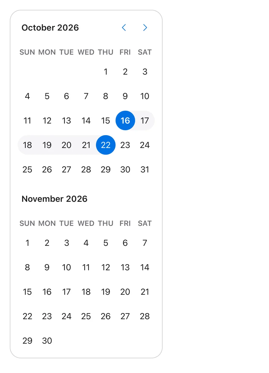
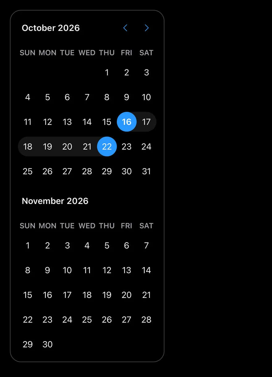
Selects a seven-day range across two months with mode="range".
Dropdown caption
Replaces the month label with month and year dropdowns.
Week numbers
Shows the week number at the start of each row.
Disabled days
Disables weekends with a dayOfWeek matcher.
API Reference
Calendar
The date grid, with month navigation and caption.
| Prop | Type | Default | Description |
|---|---|---|---|
buttonVariant | React.ComponentProps<typeof Button>["variant"] | "plain" | Button variant used for the previous and next month buttons. Defaults to plain. |
size | "sm" | "default" | "lg" | "default" | Cell size and type scale: sm, default or lg. |
Also accepts the props of React.ComponentProps<typeof DayPicker>.
CalendarDayButton
The button rendered for each day, styled by its selection state.
Also accepts the props of DayButtonProps.
Accessibility
- Each month renders as a
gridlabelled with its month and year; selected days setaria-selectedon their cell. - Arrow keys move focus between days, and clicking or pressing a day selects it.
- The navigation buttons are labelled for the next and previous month.
- Disabled days render disabled buttons.
- Caption dropdowns are native
selectelements labelled for month and year.
Notes
- Styling hooks:
data-slot="calendar"anddata-sizeon the root; day buttons exposedata-day,data-today,data-selected-single,data-range-start,data-range-middleanddata-range-end. - Cell size and radius come from the
--cell-sizeand--cell-radiuscustom properties, whichsizeadjusts. - Pass
classNamesto override anyreact-day-pickerclass key; your values replace the defaults for that key. - Navigation chevrons flip in right-to-left layouts.
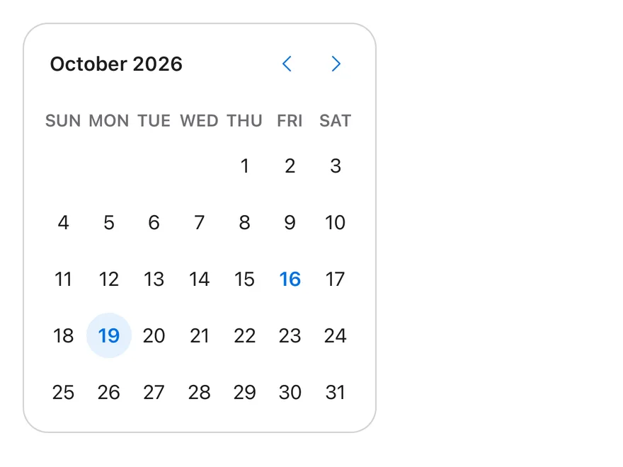
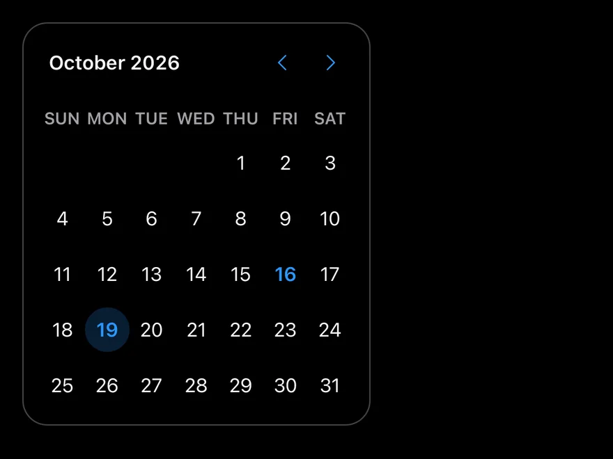
Calendar renders one or more month grids with a caption, previous and next buttons, weekday headers and pressable day cells. Selection mode is set with mode: single, multiple or range. Ranges are drawn as a continuous shaded band with filled start and end days.
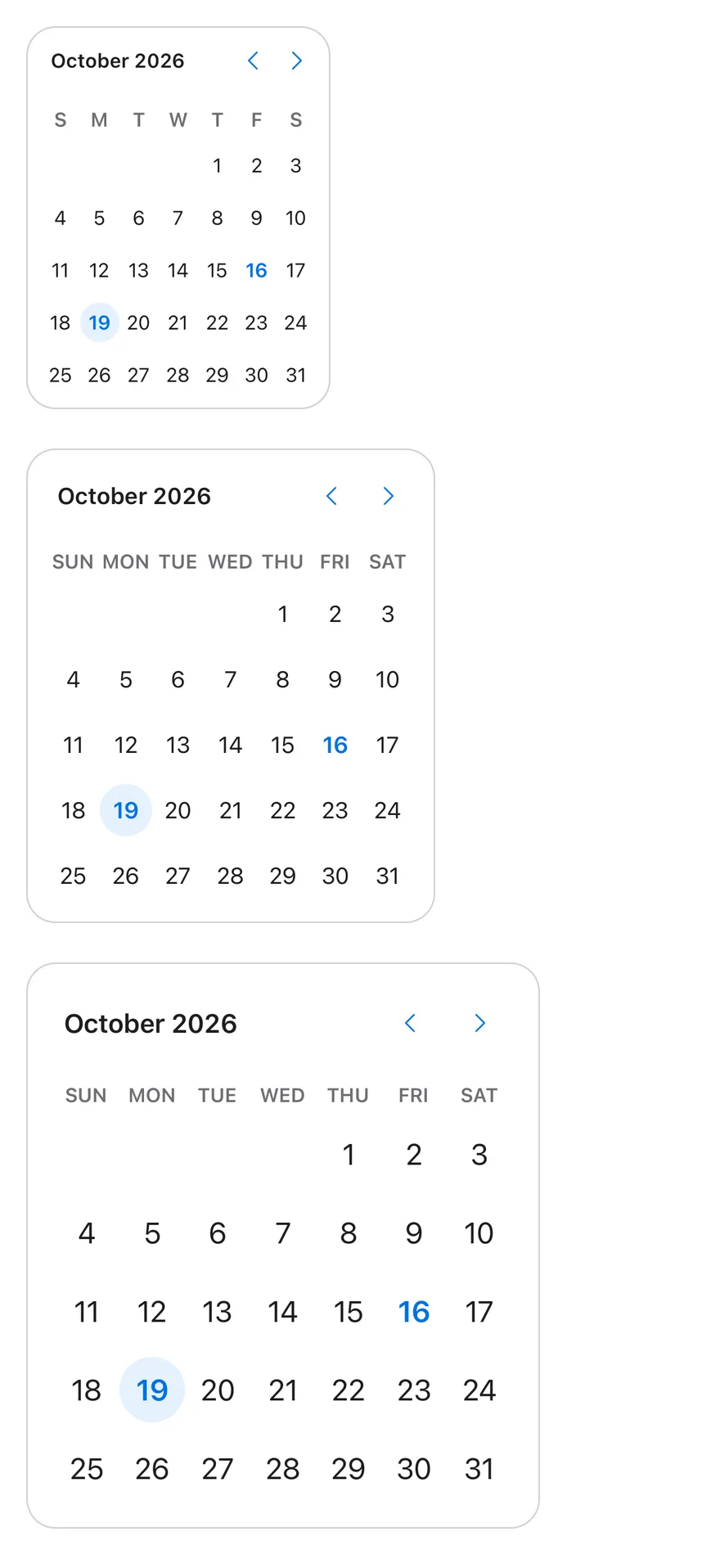
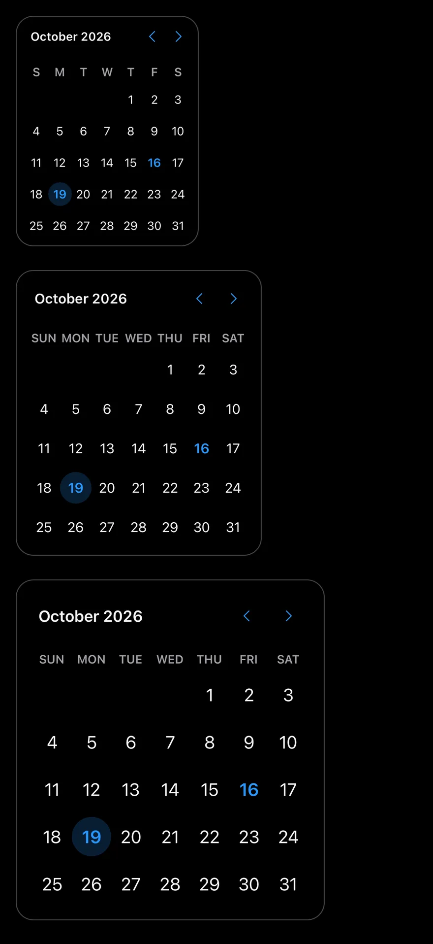
Three sizes are available: sm, default and lg. The caption can be a plain label or month and year dropdowns built on Select, which suits birth dates and other dates far from today.
Installation
The CLI also adds what it builds on: Button, Icon, Select, Text.
Manual
- Install the dependencies:
-
Add the pieces it builds on: Button, Icon, Select, Text, and the primitives
components/primitives/calendar.tsx,components/primitives/use-render.tsx. -
Copy the source into
components/ui/calendar.tsx:
- Update the import paths to match your project.
- Install the dependencies:
-
Add the pieces it builds on: Button, Icon, Select, Text, and the primitives
components/primitives/calendar.tsx,components/primitives/use-render.tsx. -
Copy the source into
components/ui/calendar.tsx:
- Update the import paths to match your project.
- Install the dependencies:
-
Add the pieces it builds on: Button, Icon, Select, Text, and the primitives
components/primitives/calendar.tsx,components/primitives/use-render.tsx. -
Copy the source into
components/ui/calendar.tsx:
- Update the import paths to match your project.
-
Target iOS 17 or later.
-
Add the Swift package to your app:
- Copy the theme files every view uses:
- Copy the source and every file it uses:
- Add the files to your app target.
- Set
minSdkto 24 or higher and add the dependencies:
- Copy the theme files every view uses:
- Copy the source and every file it uses:
- Update the
com.esuiss.uipackage names to match your project.
Usage
Pass mode, selected and onSelect to control the selection; selected is a Date, a Date[] or a { from, to } range depending on the mode. Use month, defaultMonth and onMonthChange to control the visible month, and numberOfMonths to show several months.
Use disabled with date matchers, such as { dayOfWeek: [0, 6] }, to block days. Limit navigation with startMonth and endMonth; with a year dropdown they default to the last 100 years.
Set locale for month and weekday names, and weekStartsOn to change the first day of the week. CalendarDayButton is exported for custom day rendering.
Examples
Sizes
The sm, default and lg sizes.
Range
Range selection across two months.
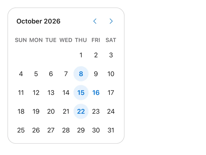
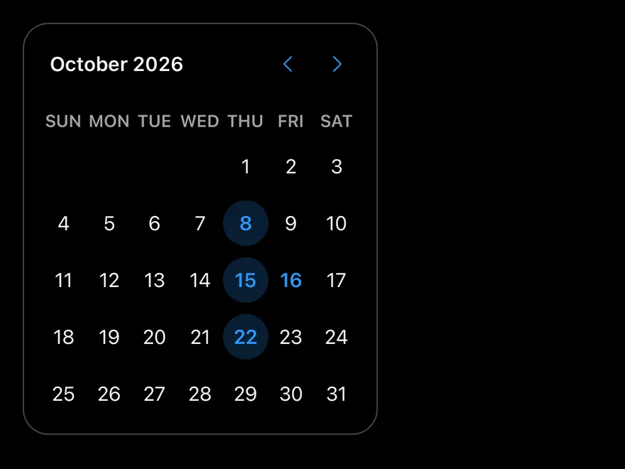
Multiple
Several separate dates selected with mode="multiple".
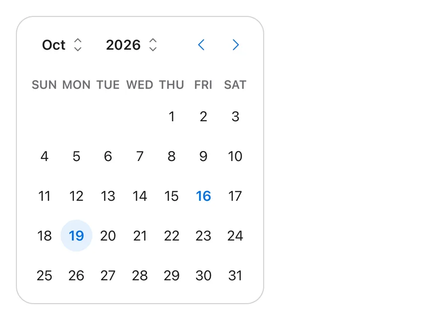
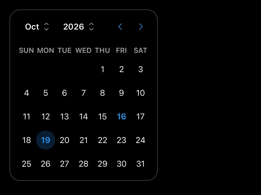
Dropdown caption
Month and year dropdowns in the caption.
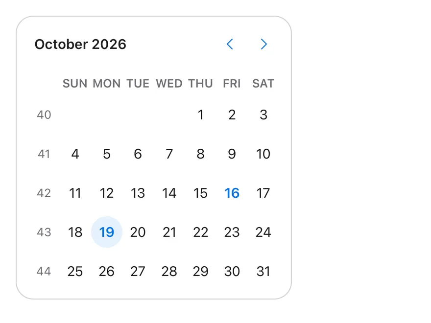
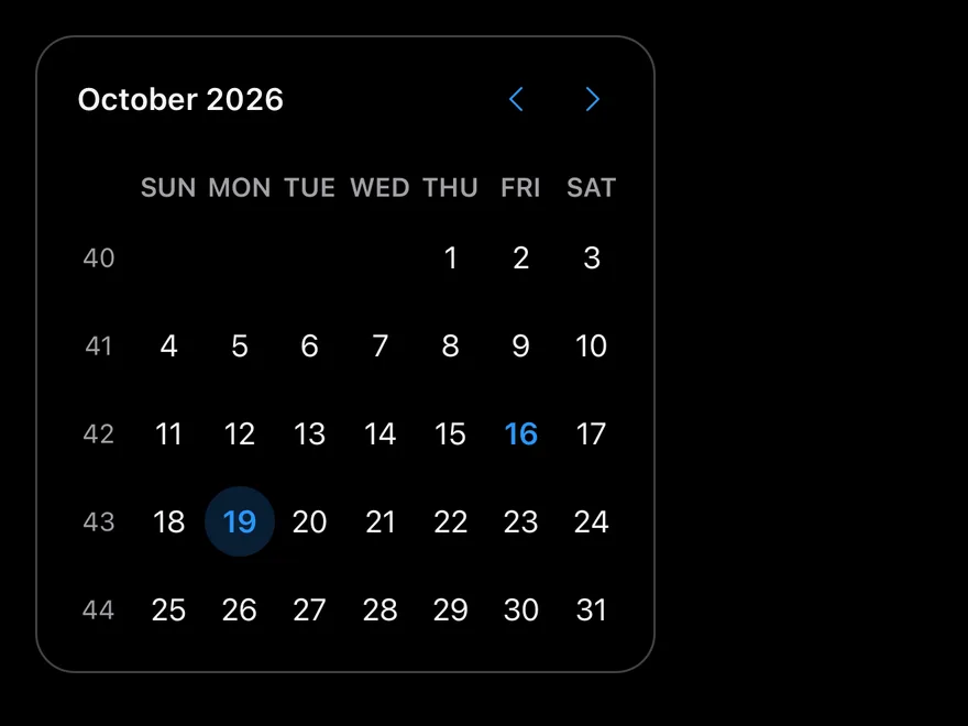
Week numbers
Week numbers in a leading column.
Disabled days
Weekends disabled with a dayOfWeek matcher.
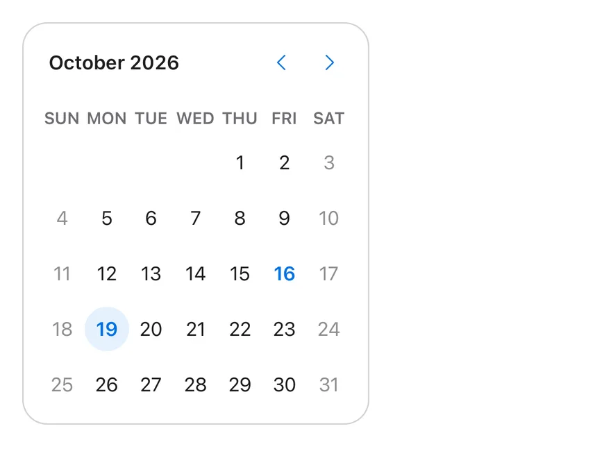
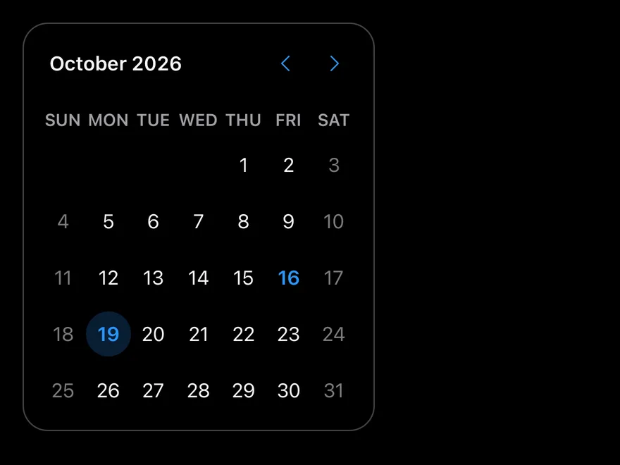
Outside days
Days from adjacent months shown with showOutsideDays.
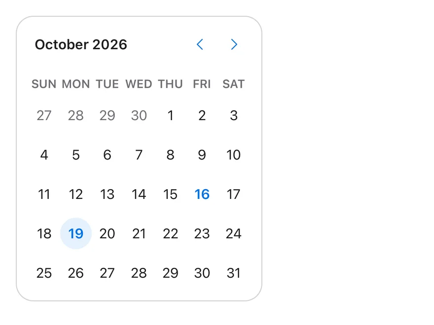
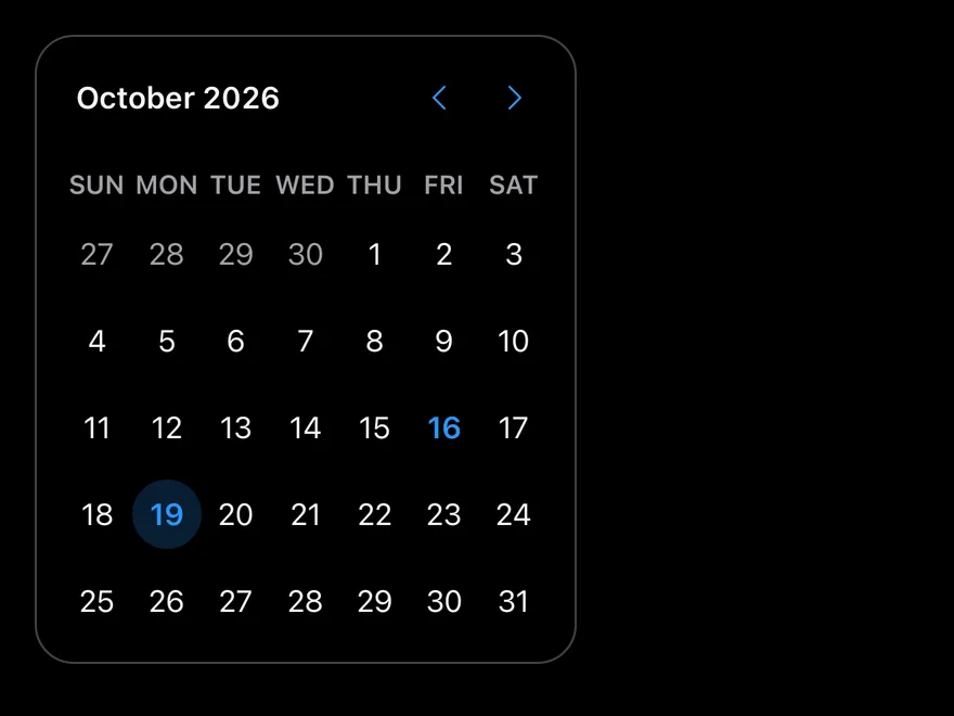
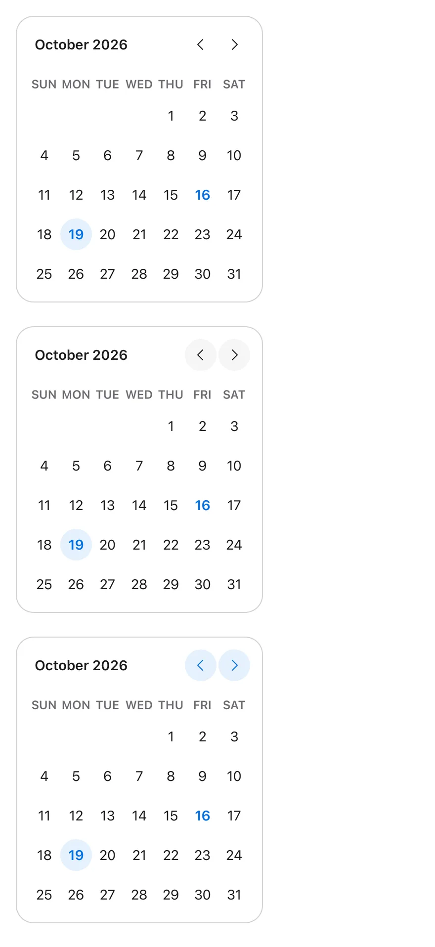
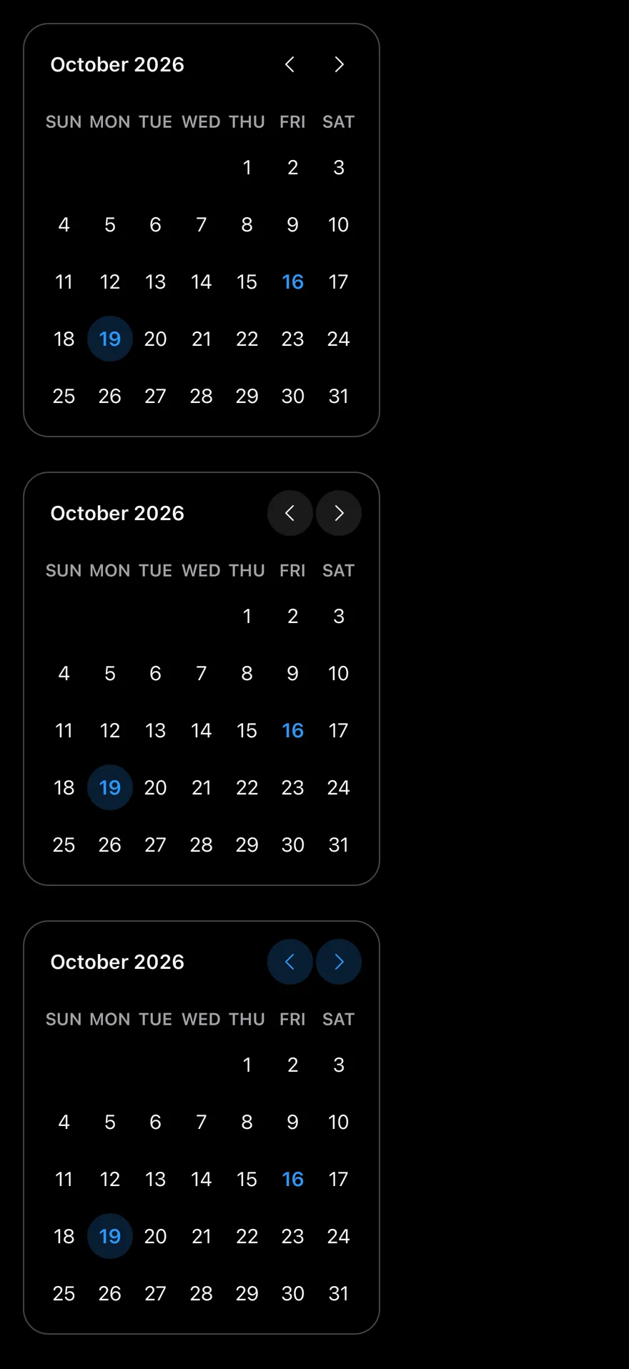
Button variants
Navigation buttons in the ghost, secondary and tinted variants.
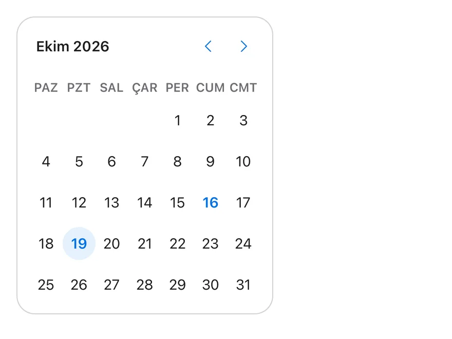
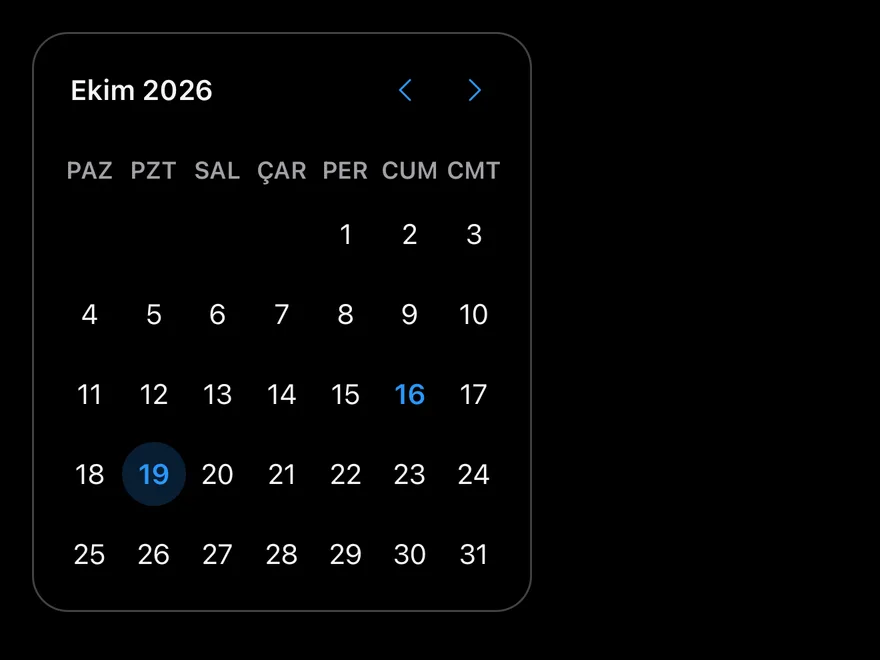
Locale
Turkish month and weekday names with locale="tr-TR".
API Reference
CalendarDayButton
Pressable day cell styled for each selection state.
Also accepts the props of React.ComponentProps<typeof CalendarPrimitive.DayButton>.
Calendar
Month grids with caption and navigation.
| Prop | Type | Default | Description |
|---|---|---|---|
buttonVariant | ButtonProps["variant"] | "plain" | Button variant for the navigation buttons. Defaults to plain. |
size | CalendarSize | "default" | sm, default or lg. |
captionLayout | CaptionLayout | "label" | label, dropdown, dropdown-months or dropdown-years. |
showWeekNumber | boolean | false | Shows week numbers. |
Also accepts the props of React.ComponentProps<typeof CalendarPrimitive.Root>.
Accessibility
- Each month is a
gridlabelled with its caption. - Day cells have the
buttonrole, a full date label, andselectedanddisabledstate. - On React Native and Android, the previous and next buttons are labelled with the relative month in the calendar's locale, such as "Last month" and "Next month" in English. On iOS they are labelled "Previous month" and "Next month".
- Caption dropdowns are labelled "Choose the Month" and "Choose the Year".
Notes
- Navigation arrows swap in right-to-left layouts.
- Uses
bg-primary,bg-primary/10 dark:bg-primary/20,bg-mutedandtext-primarytokens; light and dark follow the system appearance.