suiss/ui · Component
Widget
A rounded card in the style of home screen widgets, with fixed sizes and optional drag-to-resize.
Widget is an open-source component from suiss/ui for React, React Native, SwiftUI and Jetpack Compose. The @esuiss/ui CLI copies its source into your project, so you own the code.
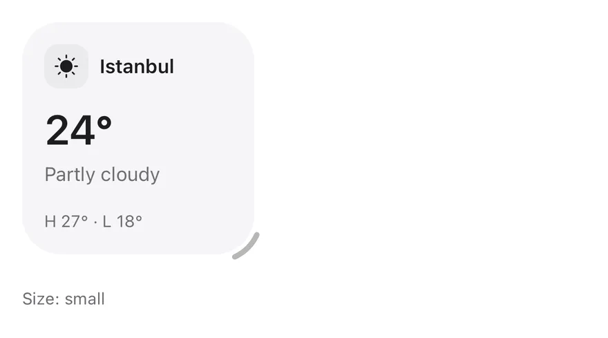
Widget is a rounded muted card that comes in four sizes: small (168 × 168), medium (352 × 168), large (352 × 352) and extra-large (720 × 352), or auto to fill its parent. Compose it from WidgetHeader, which holds a WidgetIcon, WidgetTitle and an optional WidgetAction, followed by WidgetValue, WidgetDescription, WidgetContent and a WidgetFooter pinned to the bottom.
With resizable, a corner handle lets people drag the widget to another size. While dragging, a dashed outline previews the size it will snap to on release. Use widgets for glanceable summaries on a dashboard; for general grouped content, use Card.
Installation
CLI
Works in any project with a components.json. See Installation for the one-line registry setup. Or use the suiss/ui CLI:
Manual
-
Add the
cnhelper. -
Copy the source into
components/ui/widget.tsx:
- Update the import paths to match your project.
Usage
Use size with onSizeChange to control the size, or defaultSize to set where an uncontrolled widget starts. Without either, a resizable widget starts small and a fixed widget is auto. Limit the sizes a drag can snap to with sizes.
Set resizable="free" to follow the pointer without snapping; the widget stays between the smallest size and the largest allowed size. Double-click the handle to return to the starting size.
Adapt the content to the current size with the group/widget group and data-size, for example group-data-[size=small]/widget:hidden.
Examples
Sales
Shows a resizable widget whose chart and list adapt to each size.
Kitchen
Places the resize handle inside the widget's corner.
Reservations
Limits resizing to the small and medium sizes.
Weekly report
Starts at extra-large and reveals extra content only at that size.
Free resize
Resizes freely with the pointer instead of snapping to sizes.
Auto resize
Fills its parent with auto, and snaps to fixed sizes when dragged.
Centered
Centers the icon, title and description with align="center".
Sizes
Shows each fixed size side by side.
Dashboard
Arranges fixed widgets in a grid as a dashboard.
API Reference
Widget
The rounded card that sets the size, alignment and resize behavior.
| Prop | Type | Default | Description |
|---|---|---|---|
size | WidgetSize | "auto" | - | Controls the current size, or auto to fill the parent. |
defaultSize | WidgetSize | "auto" | - | Sets the starting size when uncontrolled; double-clicking the handle also returns to it. |
onSizeChange | (size: WidgetSize | "auto") => void | - | Called with the new size when a drag snaps to a different size or the size is reset. |
sizes | WidgetSize[] | ["small", "medium", "large", "extra-large"] | Lists the sizes a drag can snap to; the largest also caps free resizing. |
resizable | boolean | "free" | false | Adds a resize handle; true snaps to sizes, and free follows the pointer. |
handle | "inside" | "outside" | "outside" | Places the resize handle inside or outside the bottom corner. |
align | "start" | "center" | "start" | Centers the content horizontally and vertically when set to center. |
Also accepts the props of React.ComponentProps<"div">.
WidgetHeader
A row that holds the icon, title and action.
Also accepts the props of React.ComponentProps<"div">.
WidgetIcon
A decorative icon, shown on a tile in the default and lg sizes.
| Prop | Type | Default | Description |
|---|---|---|---|
size | "default" | "sm" | "lg" | "default" | Sets the icon size: sm without a tile, or default and lg on a rounded tile. |
Also accepts the props of React.ComponentProps<"span">.
WidgetTitle
The widget's title, truncated to one line.
Also accepts the props of React.ComponentProps<"p">.
WidgetAction
A slot at the end of the header for a control; hidden when centered.
Also accepts the props of React.ComponentProps<"div">.
WidgetDescription
Secondary text that explains the content.
Also accepts the props of React.ComponentProps<"p">.
WidgetValue
A large figure in tabular numbers, such as a total or temperature.
Also accepts the props of React.ComponentProps<"p">.
WidgetContent
A flexible column that fills the remaining space.
Also accepts the props of React.ComponentProps<"div">.
WidgetFooter
Small secondary text pinned to the bottom of the widget.
Also accepts the props of React.ComponentProps<"div">.
Accessibility
WidgetIconis hidden from assistive technologies, so make sure the title conveys its meaning.- The resize handle is hidden from assistive technologies and works with a pointer only. Offer another way to change the size, such as a control that sets
size, if it matters.
Notes
Widgetsetsdata-sizeanddata-align, anddata-resizingwhile dragging. It's also a@container/widgetcontainer for container queries.- Parts carry
data-slotattributes such aswidget,widget-container,widget-handle,widget-previewandwidget-header. - The handle is visible on hover and always visible on touch screens. It mirrors in right-to-left layouts.
- Size changes animate over
500ms, and the animation is removed when reduced motion is preferred.


Widget is a View with a rounded, filled surface. It comes in four fixed sizes, small (168×168), medium (352×168), large (352×352) and extra-large (720×352), or auto, which fills its parent. Fixed sizes animate with Reanimated when the size changes.
With resizable, a corner handle lets the user drag the widget between sizes: a dashed outline previews the size it will snap to, a selection haptic plays on each new snap (when a haptics adapter is provided through HapticsContext), and double-tapping the handle returns to the initial size. Only sizes that fit the available width are offered. Set align="center" to center the content, which also hides WidgetAction.
Installation
The CLI also adds what it builds on: Icon, Text. On React Native it also adds the animated view components/ui/animated-view.tsx.
Manual
- Install the dependencies:
-
Add the pieces it builds on: Icon, Text, and the primitives
components/primitives/haptics.tsx, and the animated viewcomponents/ui/animated-view.tsxfrom the next step. -
Copy the animated view into
components/ui/animated-view.tsx:
- Copy the source into
components/ui/widget.tsx:
- Update the import paths to match your project.
- Install the dependencies:
-
Add the pieces it builds on: Icon, Text, and the primitives
components/primitives/haptics.tsx, and the animated viewcomponents/ui/animated-view.tsxfrom the next step. -
Copy the animated view into
components/ui/animated-view.tsx:
- Copy the source into
components/ui/widget.tsx:
- Update the import paths to match your project.
- Install the dependencies:
-
Add the pieces it builds on: Icon, Text, and the primitives
components/primitives/haptics.tsx, and the animated viewcomponents/ui/animated-view.tsxfrom the next step. -
Copy the animated view into
components/ui/animated-view.tsx:
- Copy the source into
components/ui/widget.tsx:
- Update the import paths to match your project.
-
Target iOS 17 or later.
-
Add the Swift package to your app:
- Copy the theme files every view uses:
- Copy the source and every file it uses:
- Add the files to your app target.
- Set
minSdkto 24 or higher and add the dependencies:
- Copy the theme files every view uses:
- Copy the source and every file it uses:
- Update the
com.esuiss.uipackage names to match your project.
Usage
Compose the content from WidgetHeader (with WidgetIcon, WidgetTitle and WidgetAction), then WidgetValue, WidgetDescription or WidgetContent, and WidgetFooter, which sticks to the bottom. Plain strings passed to WidgetContent and WidgetFooter are wrapped in Text.
The size is uncontrolled with defaultSize, or controlled with size and onSizeChange. Use sizes to limit which sizes the user can pick. A non-resizable widget defaults to auto; a resizable one defaults to small.
useWidget returns the current size and align so custom content can adapt to the widget size.
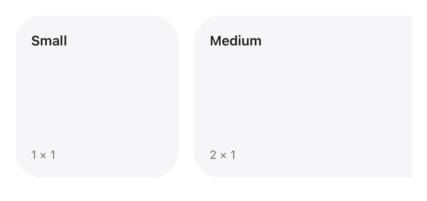
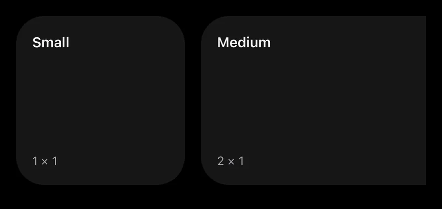
Examples
Sizes
The four fixed sizes side by side.
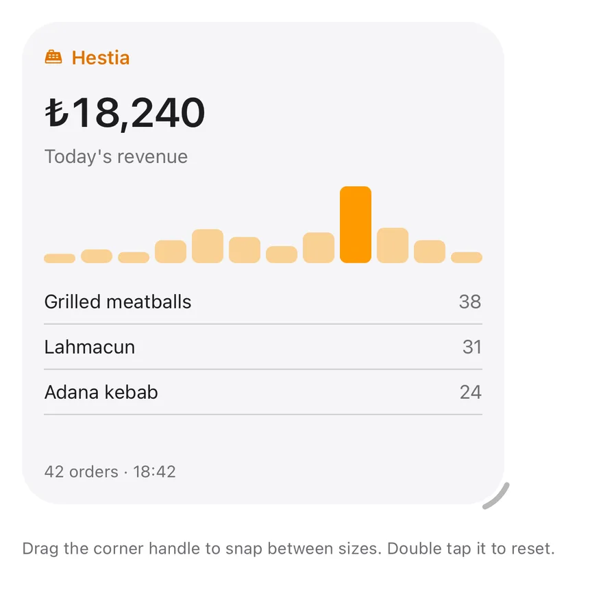
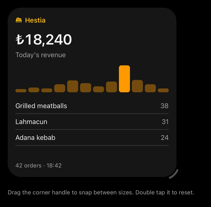
Editing
A resizable widget starting at large.
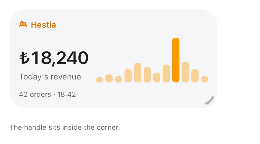
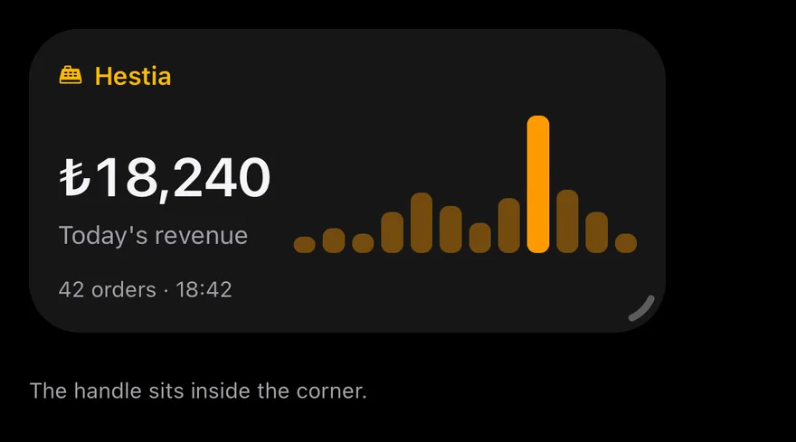
Inside handle
A resizable widget with the handle drawn inside the corner.
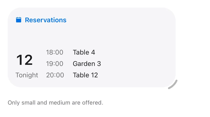
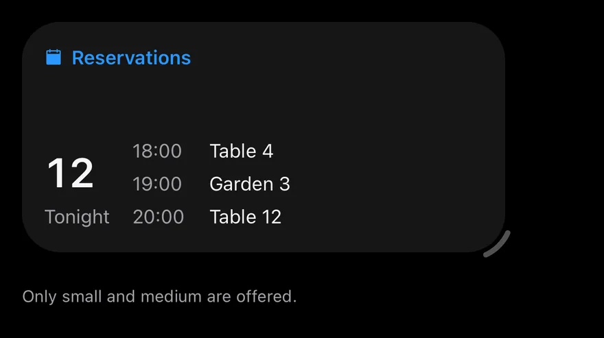
Limited sizes
Resizing limited to small and medium.
Controlled
Controls the size with size and onSizeChange.

Centered
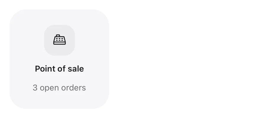
Centered content with align="center".

Auto
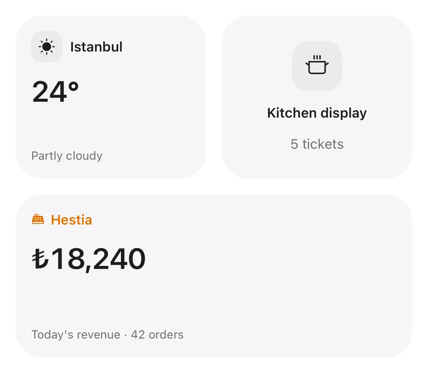
An auto widget that fills its parent.


Dashboard
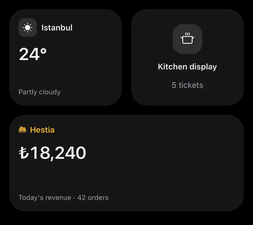
Several auto-sized widgets arranged in a grid.
API Reference
Widget
The card surface and optional resize handle.
| Prop | Type | Default | Description |
|---|---|---|---|
className | string | - | |
size | WidgetSize | "auto" | - | Controlled size: small, medium, large, extra-large or auto. |
defaultSize | WidgetSize | "auto" | - | Initial size when uncontrolled. |
onSizeChange | (size: WidgetSize | "auto") => void | - | Called with the new size after a resize. |
sizes | WidgetSize[] | ALL_SIZES | Sizes the user can resize to. Defaults to all four. |
resizable | boolean | false | Shows a drag handle for resizing. |
handle | WidgetHandlePlacement | "outside" | Handle placement: outside the corner or inside it. Defaults to outside. |
align | WidgetAlign | "start" | start or center content alignment. |
resizeLabel | string | "Resize widget" | Accessibility label for the handle. Defaults to "Resize widget". |
Also accepts the props of ViewProps, React.RefAttributes<View>.
WidgetHeader
Row for the icon, title and action.
| Prop | Type | Default | Description |
|---|---|---|---|
className | string | - |
Also accepts the props of ViewProps, React.RefAttributes<View>.
WidgetIcon
Icon frame in default, sm or lg size.
| Prop | Type | Default | Description |
|---|---|---|---|
className | string | - | |
iconClassName | string | - | Classes applied to the icon inside. |
size | "default" | "sm" | "lg" | "default" | default, sm or lg. |
Also accepts the props of ViewProps, React.RefAttributes<View>.
WidgetTitle
Single-line heading.
Also accepts the props of React.ComponentProps<typeof Text>, React.RefAttributes<typeof Text>.
WidgetAction
Trailing slot in the header; hidden when centered.
| Prop | Type | Default | Description |
|---|---|---|---|
className | string | - |
Also accepts the props of ViewProps, React.RefAttributes<View>.
WidgetDescription
Secondary text.
Also accepts the props of React.ComponentProps<typeof Text>, React.RefAttributes<typeof Text>.
WidgetValue
Large number with tabular figures.
Also accepts the props of React.ComponentProps<typeof Text>, React.RefAttributes<typeof Text>.
WidgetContent
Flexible body area that clips overflow.
| Prop | Type | Default | Description |
|---|---|---|---|
className | string | - |
Also accepts the props of ViewProps, React.RefAttributes<View>.
WidgetFooter
Small secondary text and icons pinned to the bottom.
| Prop | Type | Default | Description |
|---|---|---|---|
className | string | - |
Also accepts the props of ViewProps, React.RefAttributes<View>.
Accessibility
- The resize handle has the
adjustablerole, itsresizeLabeland the current size as its value; increment and decrement actions step through the available sizes, so VoiceOver and TalkBack users can resize without dragging. WidgetTitlehas theheadingrole.WidgetIconand the resize preview outline are hidden from assistive technology.- Size animations respect the system reduce motion setting.
Notes
- Uses
bg-mutedfor the surface,bg-secondaryfor icon frames, andtext-muted-foreground/50for the handle, which turnstext-primarywhile dragging. - The handle and drag direction mirror in right-to-left layouts.
- Light and dark colors follow the system appearance.