suiss/ui · Component
Switch
A toggle control that turns a single setting on or off.
Switch is an open-source component from suiss/ui for React, React Native, SwiftUI and Jetpack Compose. The @esuiss/ui CLI copies its source into your project, so you own the code.
Switch wraps the switch primitive of the chosen base and renders the track and thumb together. The thumb stretches while pressed, and the track fills with the primary color when on.
Use a switch for settings that take effect immediately. To select an option in a form that's submitted later, use Checkbox.
Installation
CLI
Works in any project with a components.json. See Installation for the one-line registry setup. Or use the suiss/ui CLI:
Manual
- Install the dependencies and add the
cnhelper:
- Copy the source into
components/ui/switch.tsx:
- Update the import paths to match your project.
Usage
Use defaultChecked for an uncontrolled switch, or checked with onCheckedChange to control it. Wrap the switch and its text in a Label so the text toggles it too.
Examples
Checked
Starts in the on state.
Sizes
Compares the sm and default sizes.
With label
Wraps the switch in a Label so the text names and toggles it.
Disabled
Shows disabled switches in the off and on states.
Invalid
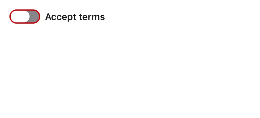
Marks the switch with aria-invalid to show an error state.
API Reference
Switch
The switch track and its sliding thumb.
| Prop | Type | Default | Description |
|---|---|---|---|
size | "sm" | "default" | "default" | Sets the switch size: default or the smaller sm. |
Also accepts the props of the primitive part it wraps.
Accessibility
- Renders with the
switchrole andaria-checked. - Give it a name with
aria-labelor by wrapping it in aLabel. Spacetoggles the focused switch.- A disabled switch sets
aria-disabledand ignores clicks.
Notes
- Uses
data-slot="switch"anddata-slot="switch-thumb", plusdata-sizeand the primitive's state attributes. - An invalid switch draws a
destructiveborder. - A transparent hit area extends around the track to make it easier to tap.
- The thumb's travel flips in right-to-left layouts.


Switch is a pressable track with a round thumb that slides between the off and on positions. The thumb animates with Reanimated and stretches slightly while pressed. It comes in two sizes, default and sm, and has an invalid state that adds a destructive border.
Use a switch for settings that take effect immediately. For choices that are submitted later, use Checkbox.
Installation
Manual
- Install the dependencies:
-
Add the pieces it builds on: the primitives
components/primitives/switch.tsx,components/primitives/use-render.tsx. -
Copy the source into
components/ui/switch.tsx:
- Update the import paths to match your project.
- Install the dependencies:
-
Add the pieces it builds on: the primitives
components/primitives/switch.tsx,components/primitives/use-render.tsx. -
Copy the source into
components/ui/switch.tsx:
- Update the import paths to match your project.
- Install the dependencies:
-
Add the pieces it builds on: the primitives
components/primitives/switch.tsx,components/primitives/use-render.tsx. -
Copy the source into
components/ui/switch.tsx:
- Update the import paths to match your project.
-
Target iOS 17 or later.
-
Add the Swift package to your app:
- Copy the theme files every view uses:
- Copy the source and every file it uses:
- Add the files to your app target.
- Set
minSdkto 24 or higher and add the dependencies:
- Copy the theme files every view uses:
- Copy the source and every file it uses:
- Update the
com.esuiss.uipackage names to match your project.
Usage
Use defaultChecked for an uncontrolled switch, or checked with onCheckedChange to control it.
A switch has no visible text of its own. Pair it with a Label and link them with accessibilityLabelledBy and the label's nativeID, or set an accessibilityLabel. Give the Label an onPress that toggles the value if the label should be pressable too.
The switch has a hit slop around it, so it is easier to press than its visual size.
Examples
Checked
A switch that starts on.


Sizes
The sm and default sizes side by side.


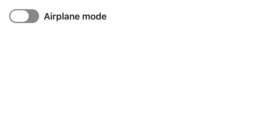
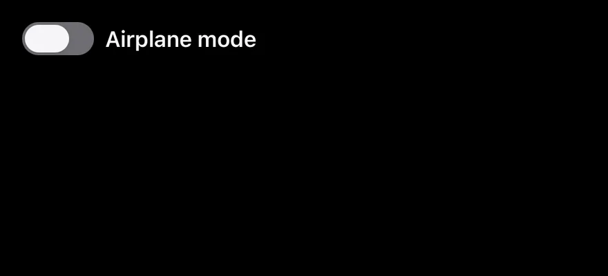
With label
A controlled switch next to a pressable label.
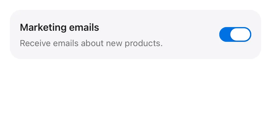
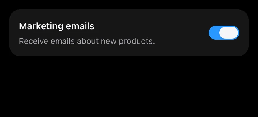
With description
A switch with a label and a line of supporting text.
Disabled
Disabled switches in the off and on states.


Invalid
A switch with the invalid border next to its label.

API Reference
Switch
| Prop | Type | Default | Description |
|---|---|---|---|
size | SwitchSize | "default" | default or sm. |
invalid | boolean | - | Adds a destructive border when not disabled. |
Also accepts the props of React.ComponentProps<typeof SwitchPrimitives.Root>.
Accessibility
- The root has the
switchrole and reportscheckedanddisabledin its accessibility state, so VoiceOver and TalkBack announce whether it is on. - The thumb is hidden from the accessibility tree.
- Label every switch with
accessibilityLabeloraccessibilityLabelledBy. - The thumb animation follows the system reduce motion setting.
Notes
- The track uses
bg-primarywhen on andbg-inputwhen off, withopacity-50when disabled. - The thumb uses
bg-background, orbg-foregroundin dark mode. - Light and dark colors follow the system appearance.