suiss/ui · Component
Collapsible
A section that people can expand and collapse to show or hide its content.
Collapsible is an open-source component from suiss/ui for React, React Native, SwiftUI and Jetpack Compose. The @esuiss/ui CLI copies its source into your project, so you own the code.
Collapsible wraps the collapsible primitive of the chosen base. The Collapsible root holds the open state, a CollapsibleTrigger toggles it, and CollapsibleContent holds the content that is shown or hidden. The parts are unstyled, so you control layout and appearance with className, or render the trigger as another component such as Button.
Render the trigger as another component with the render prop.
Set asChild on CollapsibleTrigger to render another component as the trigger.
Any Button with slot="trigger" inside Collapsible toggles it.
Use a collapsible for a single disclosure region. For a set of related, stacked sections, use an accordion instead.
Installation
CLI
Works in any project with a components.json. See Installation for the one-line registry setup. Or use the suiss/ui CLI:
Manual
- Install the dependencies:
- Copy the source into
components/ui/collapsible.tsx:
- Update the import paths to match your project.
Usage
The root is uncontrolled by default; set defaultOpen to start expanded. To control it, pass open and onOpenChange. Set disabled on the root to prevent toggling. While collapsed, the content is removed from the page.
Examples
By default
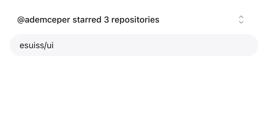
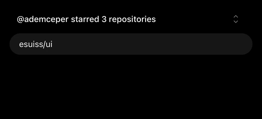
A collapsible that starts expanded using defaultOpen.
Disabled
A disabled collapsible whose trigger does not toggle the content.
API Reference
Collapsible
The root that holds the open state and groups the trigger and content.
Also accepts the props of the primitive part it wraps.
CollapsibleTrigger
The button that toggles the content open and closed.
Also accepts the props of the primitive part it wraps.
CollapsibleContent
The panel that is shown when the collapsible is open.
Also accepts the props of the primitive part it wraps.
Accessibility
- The trigger renders as a button and sets
aria-expandedto reflect the open state. - The trigger toggles on click, and with Enter or Space when focused.
- Give an icon-only trigger an accessible name with
aria-label.
Notes
- Styling hooks:
data-slot="collapsible",data-slot="collapsible-trigger"anddata-slot="collapsible-content". - The primitive sets state attributes on the parts, which you can use for styling and animation.
- No styles are applied by default.
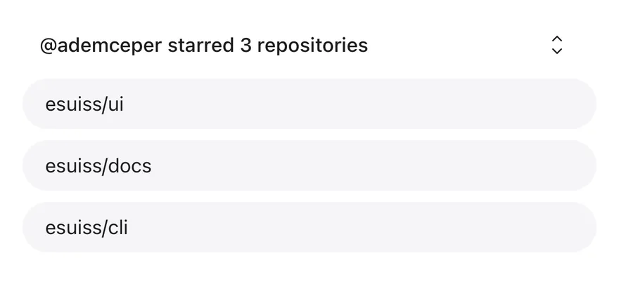
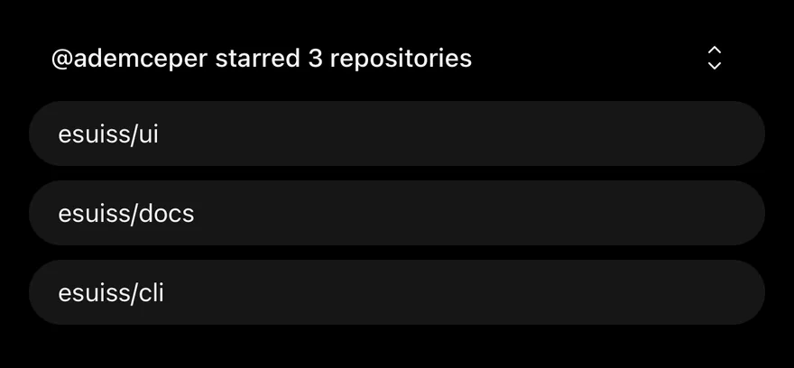
Collapsible is an unstyled root with a CollapsibleTrigger and a CollapsibleContent panel. It handles the open state and accessibility, and leaves the look to you.
Use it for a single show-more section. For a list of sections where opening one can close another, use Accordion.
Installation
Manual
-
Add the pieces it builds on: the primitives
components/primitives/collapsible.tsx. -
Copy the source into
components/ui/collapsible.tsx:
- Update the import paths to match your project.
-
Add the pieces it builds on: the primitives
components/primitives/collapsible.tsx. -
Copy the source into
components/ui/collapsible.tsx:
- Update the import paths to match your project.
-
Add the pieces it builds on: the primitives
components/primitives/collapsible.tsx. -
Copy the source into
components/ui/collapsible.tsx:
- Update the import paths to match your project.
-
Target iOS 17 or later.
-
Copy the theme files every view uses:
- Copy the source:
- Add the files to your app target.
- Set
minSdkto 24 or higher and add the dependencies:
- Copy the theme files every view uses:
- Copy the source and every file it uses:
- Update the
com.esuiss.uipackage names to match your project.
Usage
Put any content in CollapsibleTrigger, for example a Text and a caret Icon, and use render to render it as a Button. Use open with onOpenChange for controlled state, or defaultOpen for uncontrolled.
Set keepMounted on CollapsibleContent to keep the content mounted while closed.
Examples
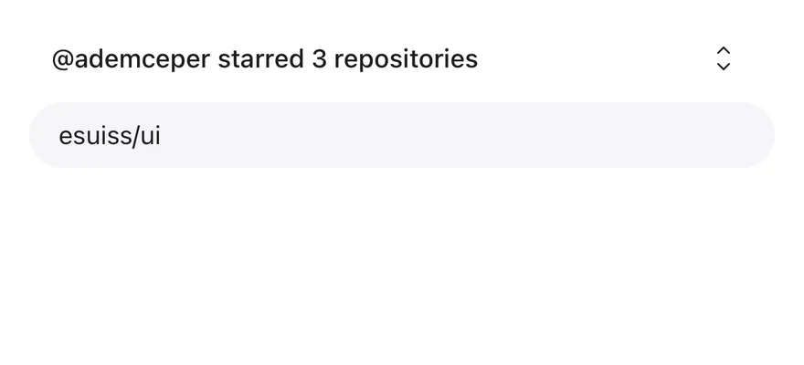
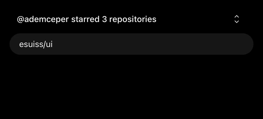
Default
Disabled
A disabled collapsible whose trigger cannot toggle it.
Accessibility
- The trigger has the
buttonrole withexpandedanddisabledstate. - Closed content is hidden from VoiceOver and TalkBack.