suiss/ui · Component
Tab Bar
A floating bottom navigation bar whose overflow and extra sections expand from a More button.
Tab Bar is an open-source component from suiss/ui for React, React Native, SwiftUI and Jetpack Compose. The @esuiss/ui CLI copies its source into your project, so you own the code.
TabBar renders a fixed nav centered at the bottom of the screen. TabBarList holds the primary TabBarItem buttons. TabBarTrigger is the More button: pressing it expands TabBarContent above the list, with a spring animation, to show TabBarSection columns. Each section has a TabBarSectionTitle and a set of TabBarLink entries.
The list measures itself and moves items that don't fit into the expanded content, where they appear as links. When every item fits and there are no sections, the More button is hidden. Use TabBar for top-level navigation on any screen size; for in-page panels, use Tabs, and for an app's side navigation, use Sidebar.
Installation
CLI
Works in any project with a components.json. See Installation for the one-line registry setup. Or use the suiss/ui CLI:
Manual
- Install the dependencies and add the
cnhelper:
-
Add the pieces it builds on: Button.
-
Copy the source into
components/ui/tab-bar.tsx:
- Update the import paths to match your project.
Usage
Use defaultOpen on TabBar for an uncontrolled bar, or open with onOpenChange to control it. Give the nav a name with aria-label.
Mark the current destination with isActive on a TabBarItem or TabBarLink. A TabBarItem can render as a link or router link. Choosing a TabBarLink or an overflowed item closes the bar. Child components can read the bar's state with the useTabBar hook.
Use the render prop to render a TabBarItem as a link or router link.
Set asChild on a TabBarItem and pass a link or router link as the child.
Pass a render function to a TabBarItem that returns a link or router link with the props it receives.
Examples
Open
Renders with the sections expanded on mount; an outside click closes them.
Fits without more
Hides the More button because every item fits and there are no sections.
Overflow into more
Holds more items than fit, so the extra items move behind More.
Links
Renders each item as a link, with the active one marked as the current page.
Disabled item
Disables one item in the list.
API Reference
TabBar
The floating nav container that holds the open state.
| Prop | Type | Default | Description |
|---|---|---|---|
open | boolean | - | Whether the More panel is open, for controlled use. |
defaultOpen | boolean | false | Whether the More panel starts open when uncontrolled. |
onOpenChange | (open: boolean) => void | - | Called when the More panel opens or closes. |
Also accepts the props of React.ComponentProps<"nav">, TabBarProps.
TabBarList
The row of primary items; items that don't fit move into the content.
Also accepts the props of React.ComponentProps<"div">.
TabBarItem
A primary destination in the list, rendered as a button by default.
| Prop | Type | Default | Description |
|---|---|---|---|
isActive | boolean | false | Marks the item as the current page with aria-current="page". |
Also accepts the props of useRender.ComponentProps<"button">, React.ComponentProps<"button">.
TabBarTrigger
The More button that expands and collapses the content.
Also accepts the props of React.ComponentProps<typeof Button>.
TabBarContent
The expandable area above the list that holds overflowed items and sections.
Also accepts the props of React.ComponentProps<"div">.
TabBarSection
A column of related links in the content.
Also accepts the props of React.ComponentProps<"div">.
TabBarSectionTitle
The heading of a section, marked with a small dot.
Also accepts the props of React.ComponentProps<"div">.
TabBarLink
A link inside a section that closes the bar when chosen.
| Prop | Type | Default | Description |
|---|---|---|---|
isActive | boolean | false | Marks the link as the current page with aria-current="page". |
Also accepts the props of useRender.ComponentProps<"a">, React.ComponentProps<"a">.
Accessibility
TabBaris anavigationlandmark; name it witharia-label.- Active items and links set
aria-current="page". - The More button sets
aria-expandedandaria-controlsto point to the content. Escapecloses the open bar and returns focus to the More button. A pointer press outside the bar also closes it.- While open, the list is
inert. Items moved into the overflow are hidden from assistive technologies and removed from the tab order in the list, and appear as links in the content instead. - When the More button isn't needed, it's hidden and removed from the tab order.
Notes
TabBarsetsdata-open,data-overflowinganddata-sectionsfor styling. The trigger setsdata-idlewhen it's hidden, and items and links setdata-active.- Parts carry
data-slotattributes such astab-bar,tab-bar-list,tab-bar-item,tab-bar-triggerandtab-bar-content. - The bar sits above the safe-area inset at the bottom of the screen and uses a
cardbackground with a thin border and a shadow. The active item gets asecondaryfill andprimarytext. - Animations are removed when reduced motion is preferred.
useTabBarthrows if it's used outside aTabBar.
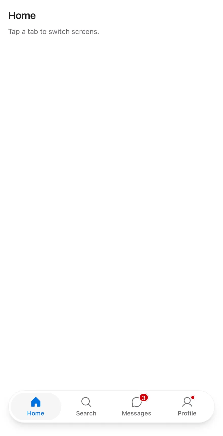
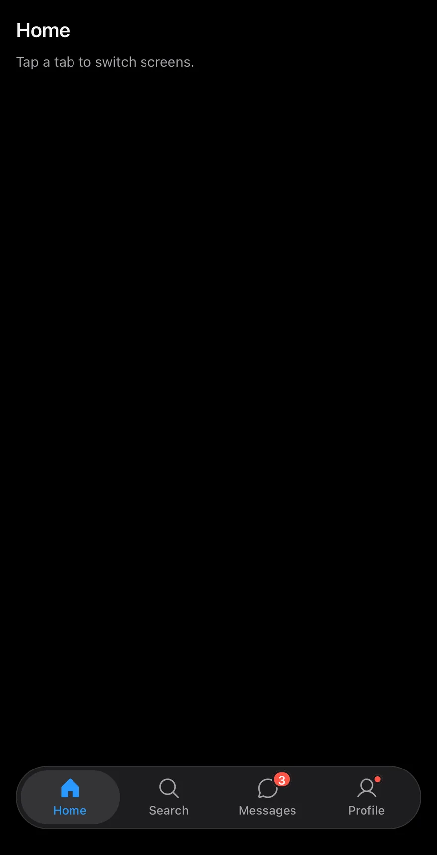
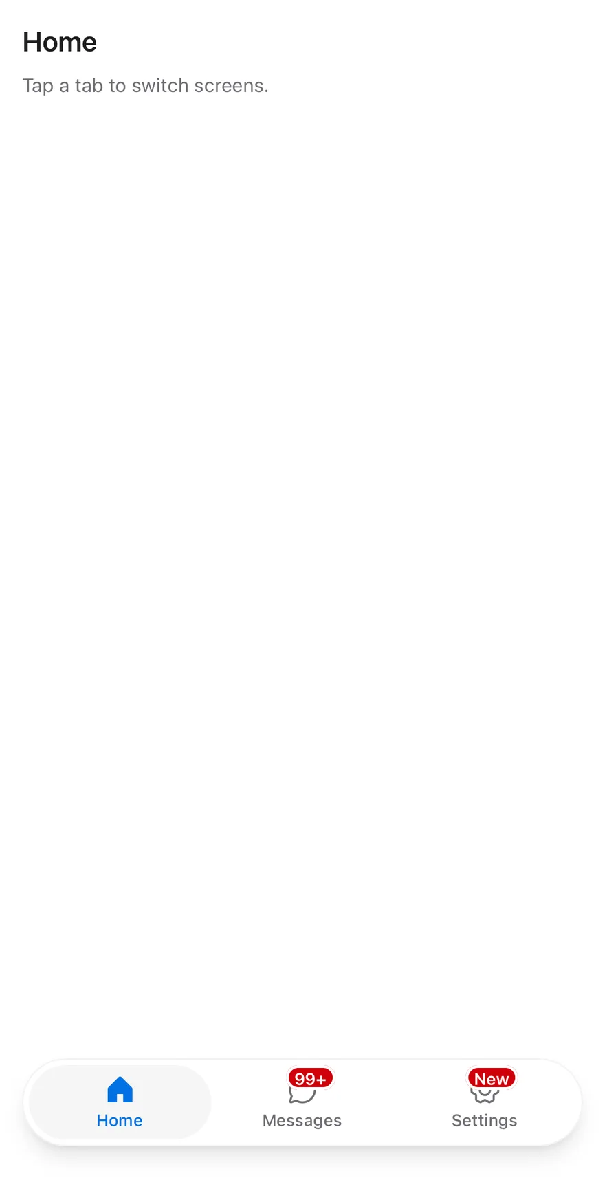
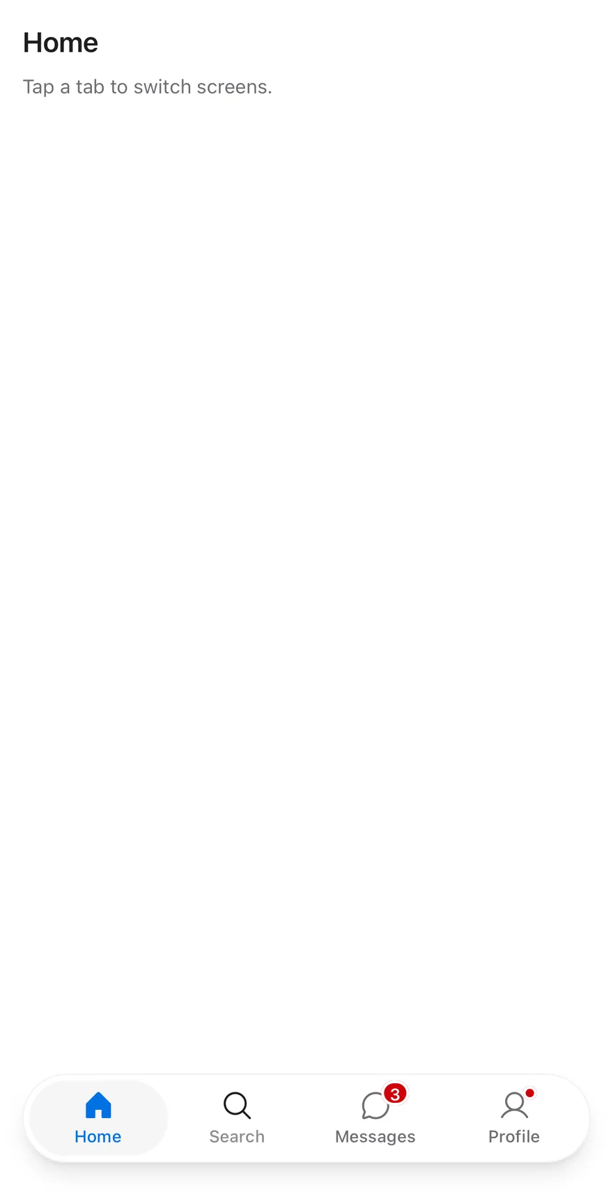
TabBar is built on the tabs primitive and sits at the bottom of a screen. TabBarList is a rounded capsule with a shadow, inset from the screen edges, so the bar floats above the page. The root adds bottom padding for the safe area, minus any inset an enclosing Screen already handles, and never less than 12 points. TabBarItem stacks an icon over a short label; the active tab sits on a bg-secondary pill and uses text-primary and a filled icon weight.
Use it for switching between the top-level sections of an app. For switching views within a screen, use Tabs.
Installation
The CLI also adds what it builds on: Icon, Screen, Text.
Manual
- Install the dependencies:
-
Add the pieces it builds on: Icon, Screen, Text, and the primitives
components/primitives/haptics.tsx,components/primitives/tabs.tsx,components/primitives/use-render.tsx. -
Copy the source into
components/ui/tab-bar.tsx:
- Update the import paths to match your project.
- Install the dependencies:
-
Add the pieces it builds on: Icon, Screen, Text, and the primitives
components/primitives/haptics.tsx,components/primitives/tabs.tsx,components/primitives/use-render.tsx. -
Copy the source into
components/ui/tab-bar.tsx:
- Update the import paths to match your project.
- Install the dependencies:
-
Add the pieces it builds on: Icon, Screen, Text, and the primitives
components/primitives/haptics.tsx,components/primitives/tabs.tsx,components/primitives/use-render.tsx. -
Copy the source into
components/ui/tab-bar.tsx:
- Update the import paths to match your project.
-
Target iOS 17 or later.
-
Add the Swift package to your app:
- Copy the theme files every view uses:
- Copy the source and every file it uses:
- Add the files to your app target.
- Set
minSdkto 24 or higher and add the dependencies:
- Copy the theme files every view uses:
- Copy the source and every file it uses:
- Update the
com.esuiss.uipackage names to match your project.
Usage
Put TabBarItem entries inside a TabBarList, inside TabBar. Give each item a value, an icon and a label as children. Control the active tab with value and onValueChange, or set defaultValue.
The badge prop shows a count, text or a dot: numbers above 99 show as 99+, 0 and empty strings show nothing, and true shows a small dot. A selection haptic plays whenever the tab changes, when a haptics adapter is provided through HapticsContext.
The TabBarBadgeValue type is also exported.
Examples
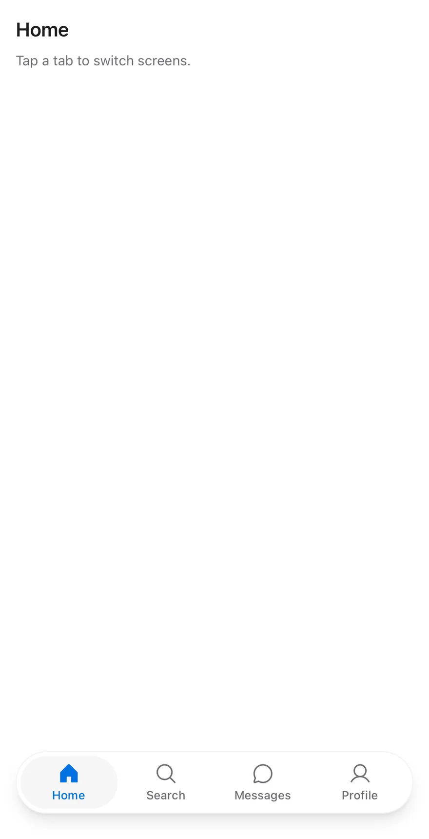
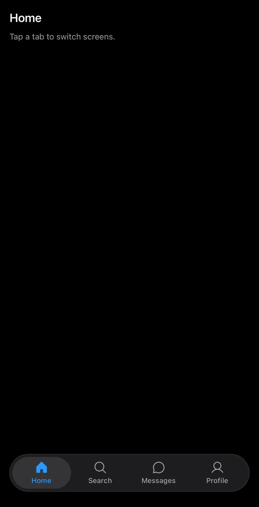
Without badges
The tab bar without badges.
Large badge
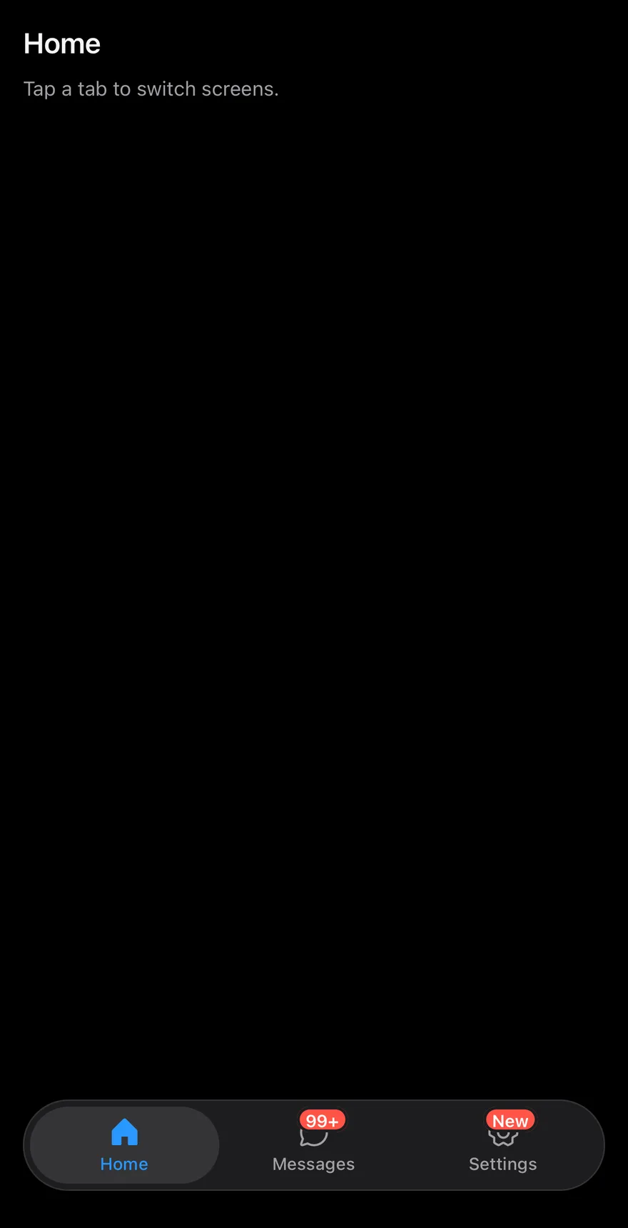
A count above 99 shown as 99+ and a text badge.
Disabled item
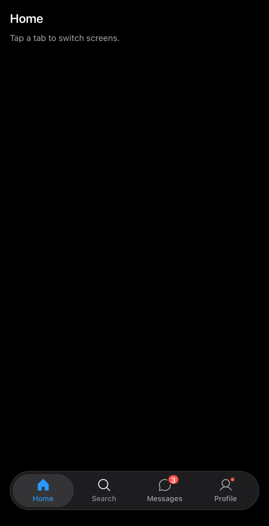
A tab bar with one disabled tab.
API Reference
TabBar
Root that holds the active tab, the side inset and the safe area padding.
Also accepts the props of React.ComponentProps<typeof TabsPrimitive.Root>.
TabBarList
Capsule that holds the tabs.
Also accepts the props of React.ComponentProps<typeof TabsPrimitive.List>.
TabBarItem
One tab with an icon, a label and an optional badge.
| Prop | Type | Default | Description |
|---|---|---|---|
icon | PhosphorIcon | - | Phosphor icon shown above the label. Uses the fill weight when active. |
badge | TabBarBadgeValue | - | Number, text or true for a dot, shown on the icon's corner. |
Also accepts the props of React.ComponentProps<typeof TabsPrimitive.Tab>.
Accessibility
- The list has the
tablistrole and each item has thetabrole, with selected and disabled states. - A badge with a count or text is exposed as the tab's accessibility value, so VoiceOver and TalkBack read it after the label.
- A dot badge is visual only and is not announced.
Notes
- The capsule uses
bg-cardwith aborder-foreground/5border (border-foreground/10in dark mode) and a large shadow. The active tab usesbg-secondaryandtext-primary, and badges usebg-destructive; colors follow the system appearance. - The bottom padding is the remaining safe area inset minus 8 points, and never less than 12 points.