suiss/ui · Component
Input Accessory Bar
A toolbar above the keyboard with previous, next and done buttons for moving through form fields.
Input Accessory Bar is an open-source component from suiss/ui for React Native, SwiftUI and Jetpack Compose. The @esuiss/ui CLI copies its source into your project, so you own the code.
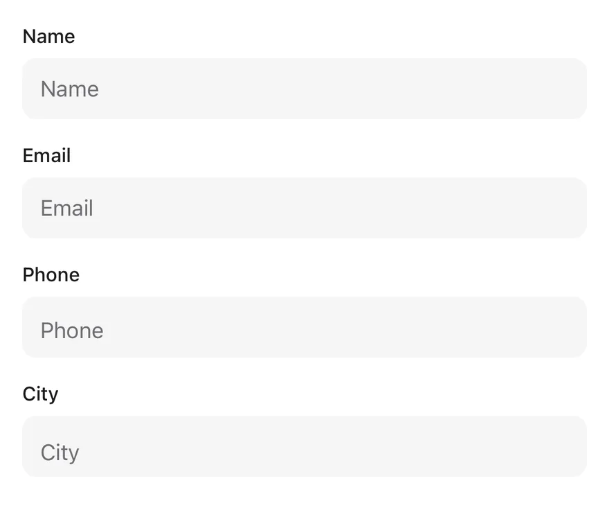
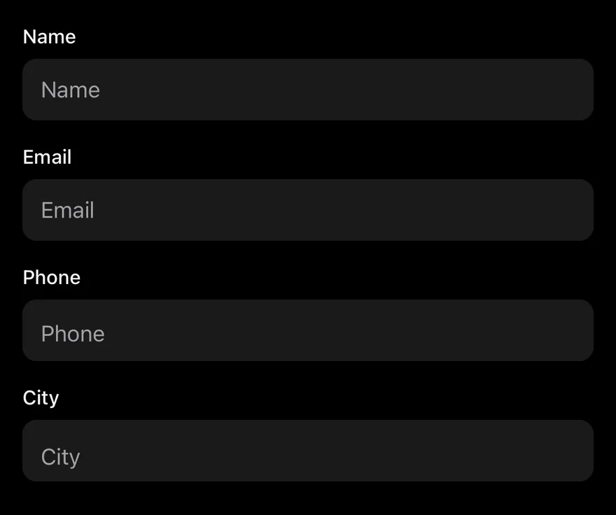
InputAccessoryBar connects a set of inputs and shows a bar above the keyboard while one of them is focused. The up and down arrows move focus to the previous or next input, and the done button dismisses the keyboard.
On iOS the bar is a native InputAccessoryView, attached to the keyboard. On Android it is rendered through a portal and positioned just above the keyboard while an input is focused.
Installation
The CLI also adds what it builds on: Button, Icon, Input, Keyboard Scroll View, Text.
Manual
- Install the dependencies:
-
Add the pieces it builds on: Button, Icon, Input, Keyboard Scroll View, Text, and the primitives
components/primitives/hooks.tsx,components/primitives/keyboard.tsx,components/primitives/portal.tsx. -
Copy the source into
components/ui/input-accessory-bar.tsx:
- Update the import paths to match your project.
- Install the dependencies:
-
Add the pieces it builds on: Button, Icon, Input, Keyboard Scroll View, Text, and the primitives
components/primitives/hooks.tsx,components/primitives/keyboard.tsx,components/primitives/portal.tsx. -
Copy the source into
components/ui/input-accessory-bar.tsx:
- Update the import paths to match your project.
- Install the dependencies:
-
Add the pieces it builds on: Button, Icon, Input, Keyboard Scroll View, Text, and the primitives
components/primitives/hooks.tsx,components/primitives/keyboard.tsx,components/primitives/portal.tsx. -
Copy the source into
components/ui/input-accessory-bar.tsx:
- Update the import paths to match your project.
-
Target iOS 17 or later.
-
Add the Swift package to your app:
- Copy the theme files every view uses:
- Copy the source and every file it uses:
- Add the files to your app target.
- Set
minSdkto 24 or higher and add the dependencies:
- Copy the theme files every view uses:
- Copy the source and every file it uses:
- Update the
com.esuiss.uipackage names to match your project.
Usage
Wrap the form in InputAccessoryBar and use InputAccessoryBarInput in place of Input. Inputs are ordered by the order they mount. The return key reads "next" on every input but the last, which reads "done" and dismisses the keyboard.
For other text inputs, such as a Textarea, call useInputAccessoryBarInput() and spread the returned props onto the input. Inside a Keyboard Scroll View, the focused input is scrolled into view.
Use previousLabel, nextLabel and doneLabel to localize the buttons, and onDone to react when done is pressed.
Examples
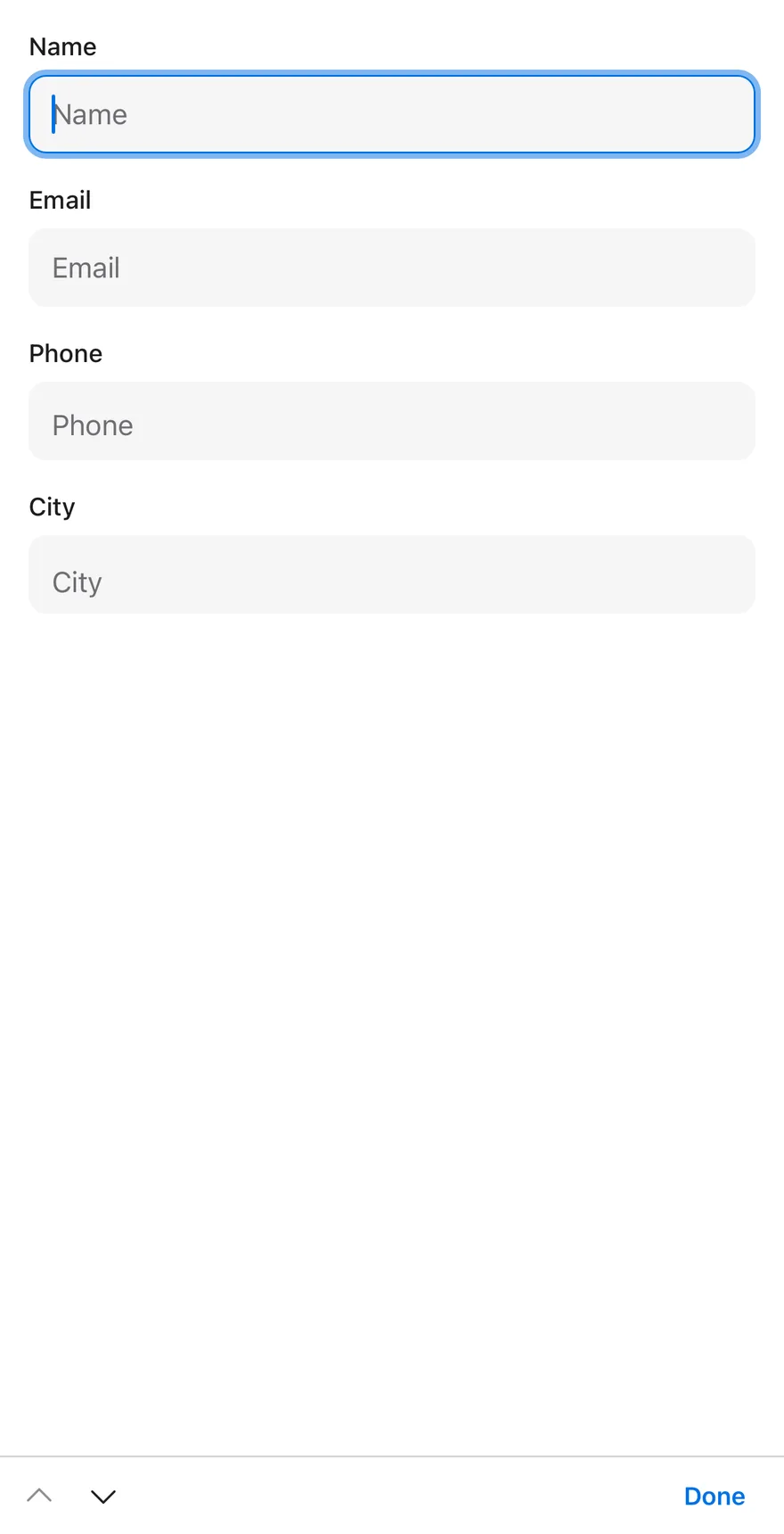
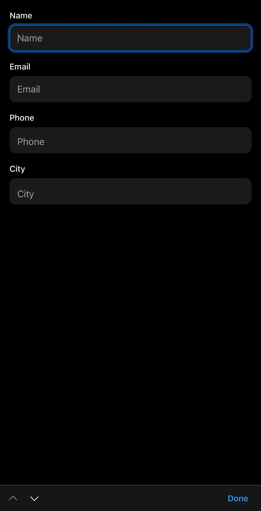
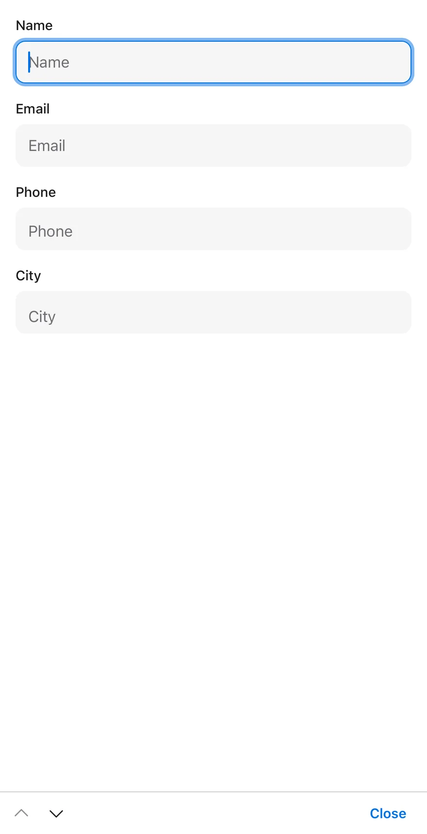
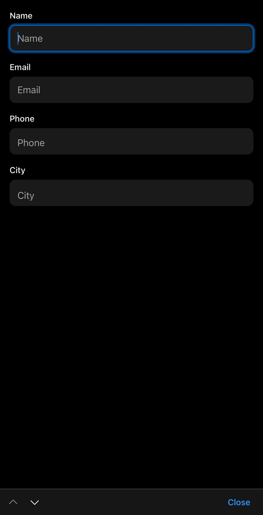
Focused
The first input focused, so the bar is visible.
Custom labels
Custom labels for the previous, next and done buttons.
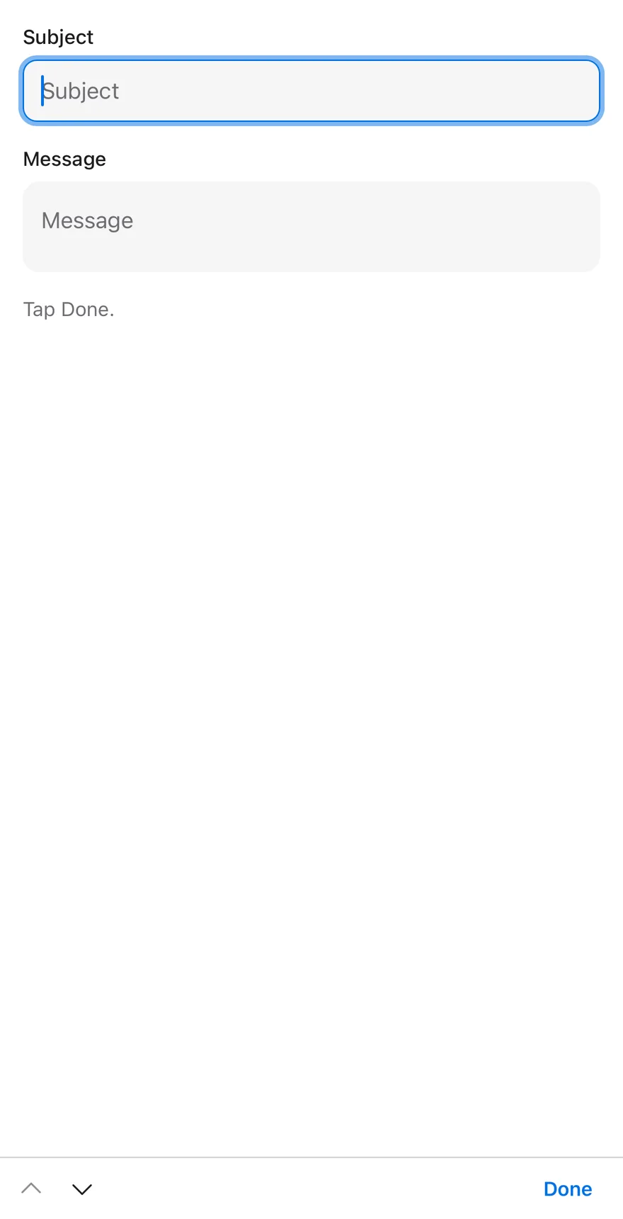
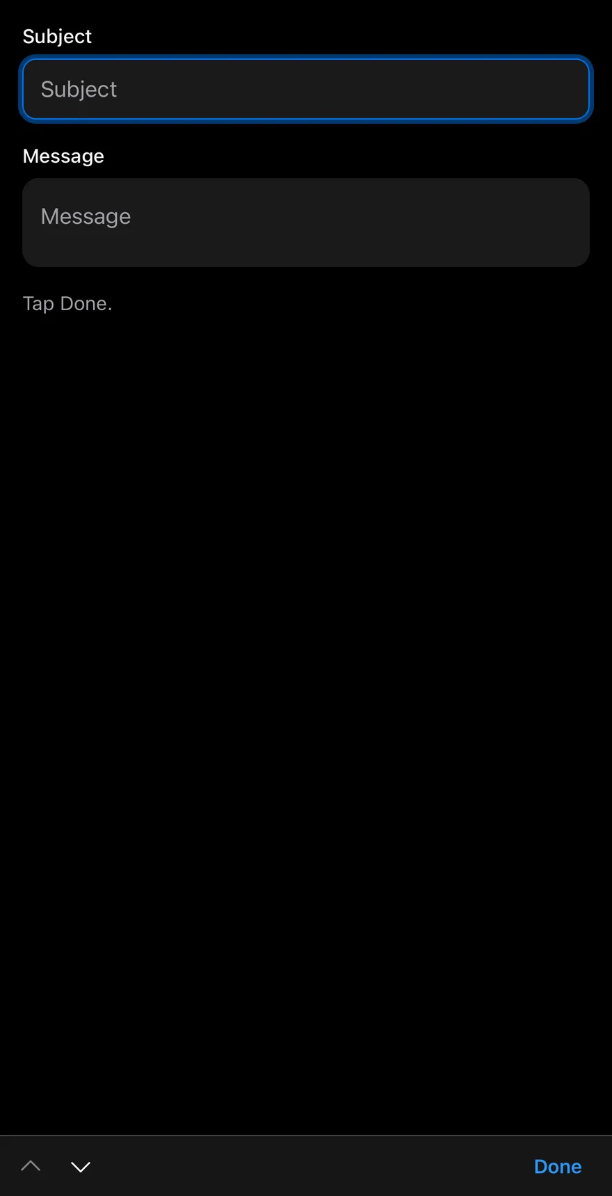
With textarea
A textarea connected through useInputAccessoryBarInput.
API Reference
InputAccessoryBar
Provider that tracks the inputs and renders the bar.
| Prop | Type | Default | Description |
|---|---|---|---|
previousLabel | string | "Previous" | Label for the previous button. Defaults to "Previous". |
nextLabel | string | "Next" | Label for the next button. Defaults to "Next". |
doneLabel | React.ReactNode | "Done" | Text or node for the done button. Defaults to "Done". |
onDone | () => void | - | Called after the keyboard is dismissed with done. |
portalHost | string | - | Name of the portal host on Android. |
className | string | - | |
children | React.ReactNode | - |
InputAccessoryBarInput
Input connected to the bar.
Also accepts the props of React.ComponentProps<typeof Input>.
Accessibility
- The arrow buttons are labelled with
previousLabelandnextLabeland are disabled at the first and last input. - The done button is a text button that dismisses the keyboard.
Notes
- iOS uses the native input accessory view; Android uses a portal and reserves the bar height so keyboard-aware layouts stay above it.
- Uses
bg-card(bg-mutedin dark mode) andborder-bordertokens.