suiss/ui · Component
Checkbox
A control that lets people turn a single option on or off.
Checkbox is an open-source component from suiss/ui for React, React Native, SwiftUI and Jetpack Compose. The @esuiss/ui CLI copies its source into your project, so you own the code.
Checkbox wraps the checkbox primitive and renders a check icon inside its indicator when checked. It is a single self-contained part: there are no child components to compose.
Use a checkbox for independent options that people can select in any combination, such as accepting terms or opting in to email. For a mutually exclusive choice, use a radio group; for a setting that takes effect immediately, consider a switch.
Installation
CLI
Works in any project with a components.json. See Installation for the one-line registry setup. Or use the suiss/ui CLI:
Manual
- Install the dependencies and add the
cnhelper:
- Copy the source into
components/ui/checkbox.tsx:
- Update the import paths to match your project.
Usage
Leave the checkbox uncontrolled with defaultChecked, or control it with checked and onCheckedChange. Pair it with a visible Label: wrapping the checkbox in Label makes the whole label text clickable. To add supporting text, give the checkbox an id and an aria-describedby that points to the description element.
Examples
Checked
A checkbox that starts checked using defaultChecked.
With label
A checkbox wrapped in a Label, so clicking the text toggles it.
With description
A checkbox labelled with htmlFor and described by supporting text through aria-describedby.
Disabled
Disabled checkboxes, both unchecked and checked, that ignore clicks and are skipped by Tab.
Invalid
A checkbox marked with aria-invalid to show a validation error.
API Reference
Checkbox
The checkbox control, rendering the box and its check indicator.
Also accepts the props of the primitive part it wraps.
Accessibility
- Renders with the
checkboxrole and exposes its checked state to assistive technology. - Toggles on click and with Space when focused.
- Needs an accessible name: wrap it in a
Label, associate aLabelthroughhtmlForandid, or setaria-label. - When
disabled, it setsaria-disabled, ignores clicks, and is removed from the Tab order. - Set
aria-invalidto communicate a validation error; the border turns to thedestructivecolor.
Notes
- Styling hooks:
data-slot="checkbox"on the root anddata-slot="checkbox-indicator"on the indicator. - State attributes set by the primitive drive the checked and disabled styles.
- Uses the
primary,primary-foreground,backgroundandbordercolors, andopacity-50when disabled. - The hit area extends beyond the visible box through an
afterpseudo-element, making the small control easier to tap.


Checkbox is a Pressable with the checkbox role that shows a check icon when checked and a minus icon when indeterminate. It has an enlarged hit area around the box so it is easy to tap.
Use it for options that can be combined, such as terms acceptance or multi-select lists. For a single on/off setting that applies right away, use Switch.
Installation
The CLI also adds what it builds on: Icon, Text.
Manual
-
Target iOS 17 or later.
-
Add the Swift package to your app:
- Copy the theme files every view uses:
- Copy the source and every file it uses:
- Add the files to your app target.
- Set
minSdkto 24 or higher and add the dependencies:
- Copy the theme files every view uses:
- Copy the source and every file it uses:
- Update the
com.esuiss.uipackage names to match your project.
Usage
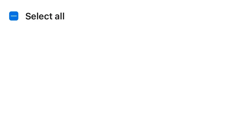
Use checked with onCheckedChange for controlled state, or defaultChecked for uncontrolled. Set indeterminate for a parent checkbox whose children are partly selected.
Pair the checkbox with a Label: give the label a nativeID and the checkbox a matching accessibilityLabelledBy, and toggle the value from the label's onPress. Set invalid to show a destructive border.
Examples
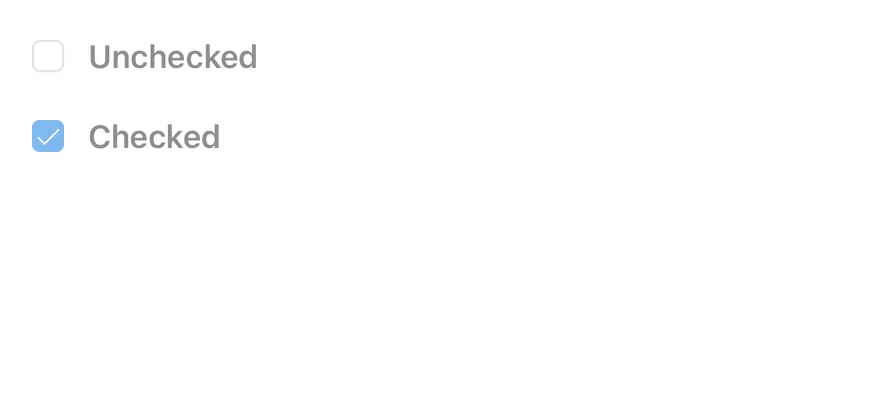
Checked
Starts checked.


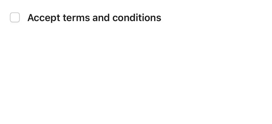
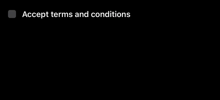
With label
Linked to a Label that also toggles it.
With description
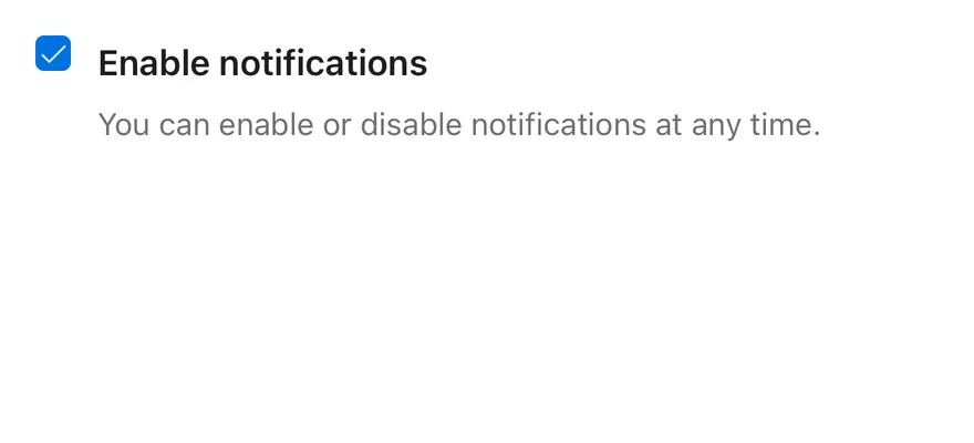
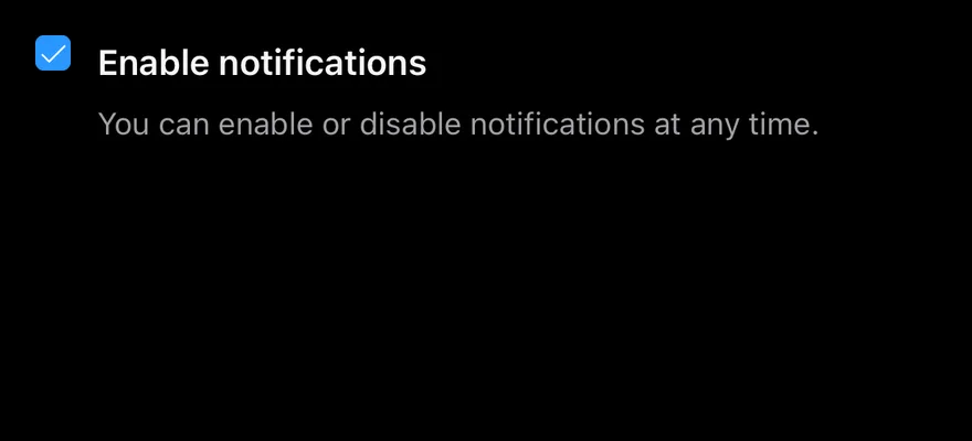
A label with a supporting description.
Disabled
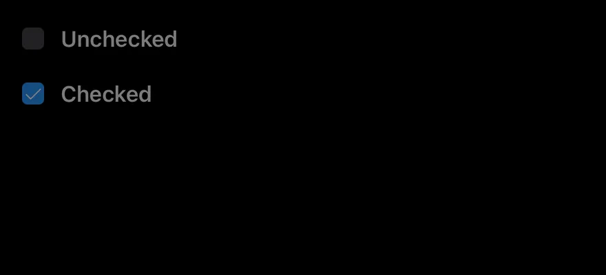
Disabled checkboxes in both states.
Indeterminate
A select-all checkbox in the indeterminate state.

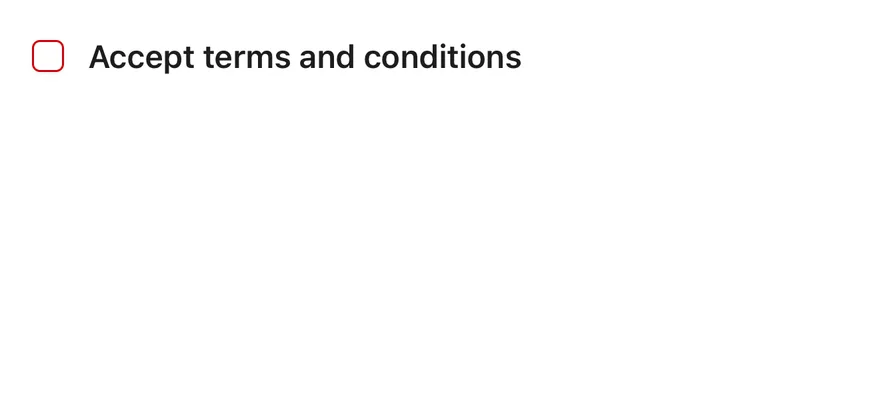
Invalid
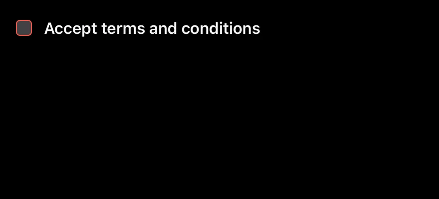
A required checkbox with the invalid border.
API Reference
Checkbox
| Prop | Type | Default | Description |
|---|---|---|---|
iconClassName | string | - | Extra classes for the check icon. |
invalid | boolean | - | Shows a destructive border. |
Also accepts the props of React.ComponentProps<typeof CheckboxPrimitive.Root>.
Accessibility
- Has the
checkboxrole withchecked(ormixedwhen indeterminate) anddisabledstate. - Link it to a visible label with
accessibilityLabelledBy, or give it anaccessibilityLabel.
Notes
- Uses
bg-primarywhen checked andbg-backgroundwith a translucent border when unchecked; in dark mode the unchecked box is filled instead of outlined. - Light and dark follow the system appearance.