suiss/ui · Component
FAB
A floating action button pinned to the bottom corner, with an optional label and speed-dial actions.
FAB is an open-source component from suiss/ui for React Native, SwiftUI and Jetpack Compose. The @esuiss/ui CLI copies its source into your project, so you own the code.
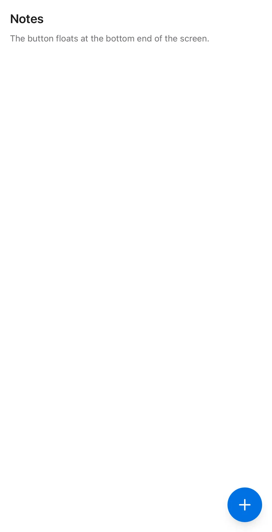
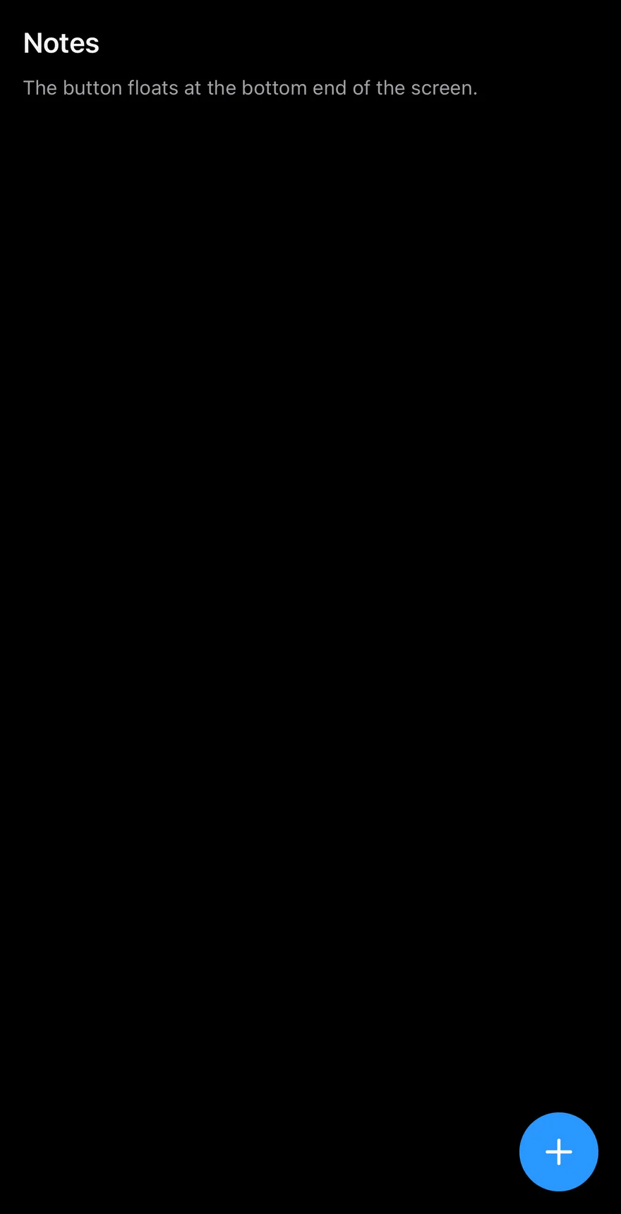
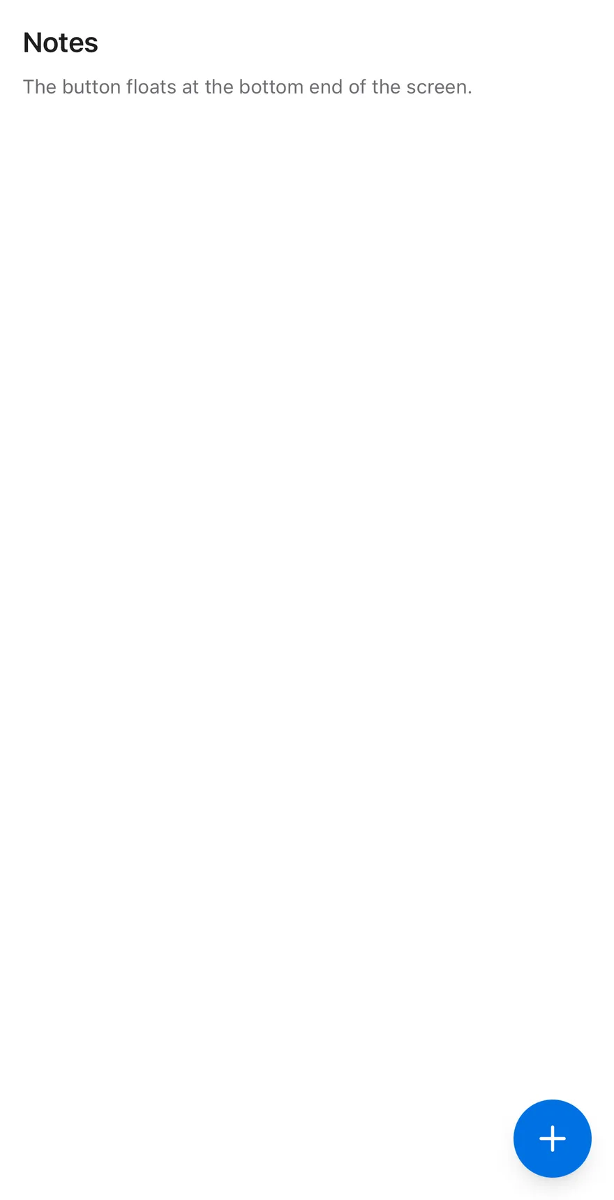
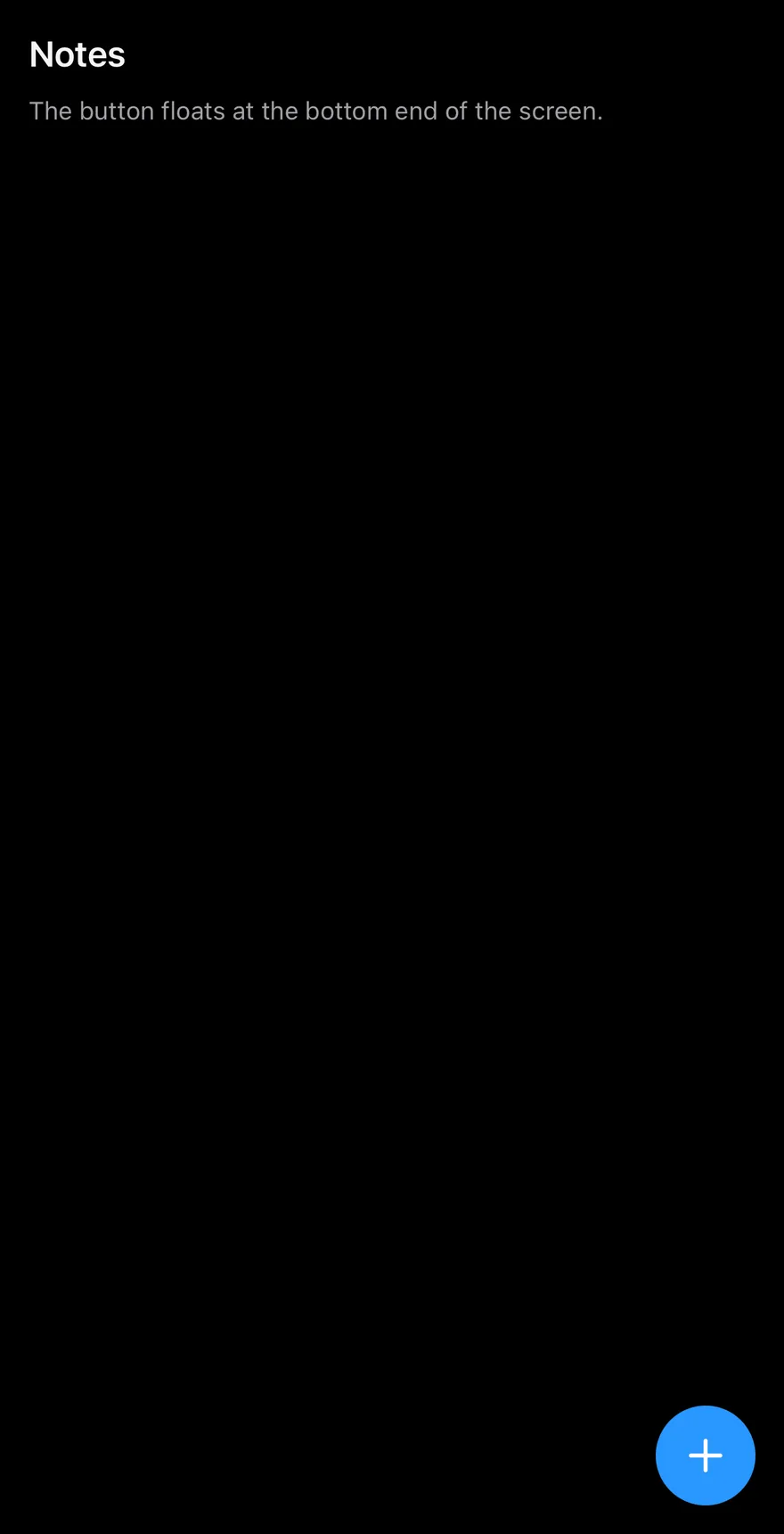
Fab is a round primary Pressable rendered through a portal and pinned to the bottom-end corner of the screen, above the safe-area insets. It comes in default and lg sizes, and becomes an extended pill when you pass a label.
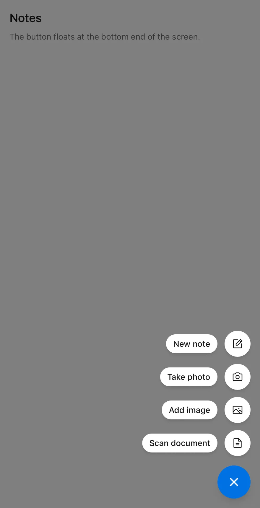
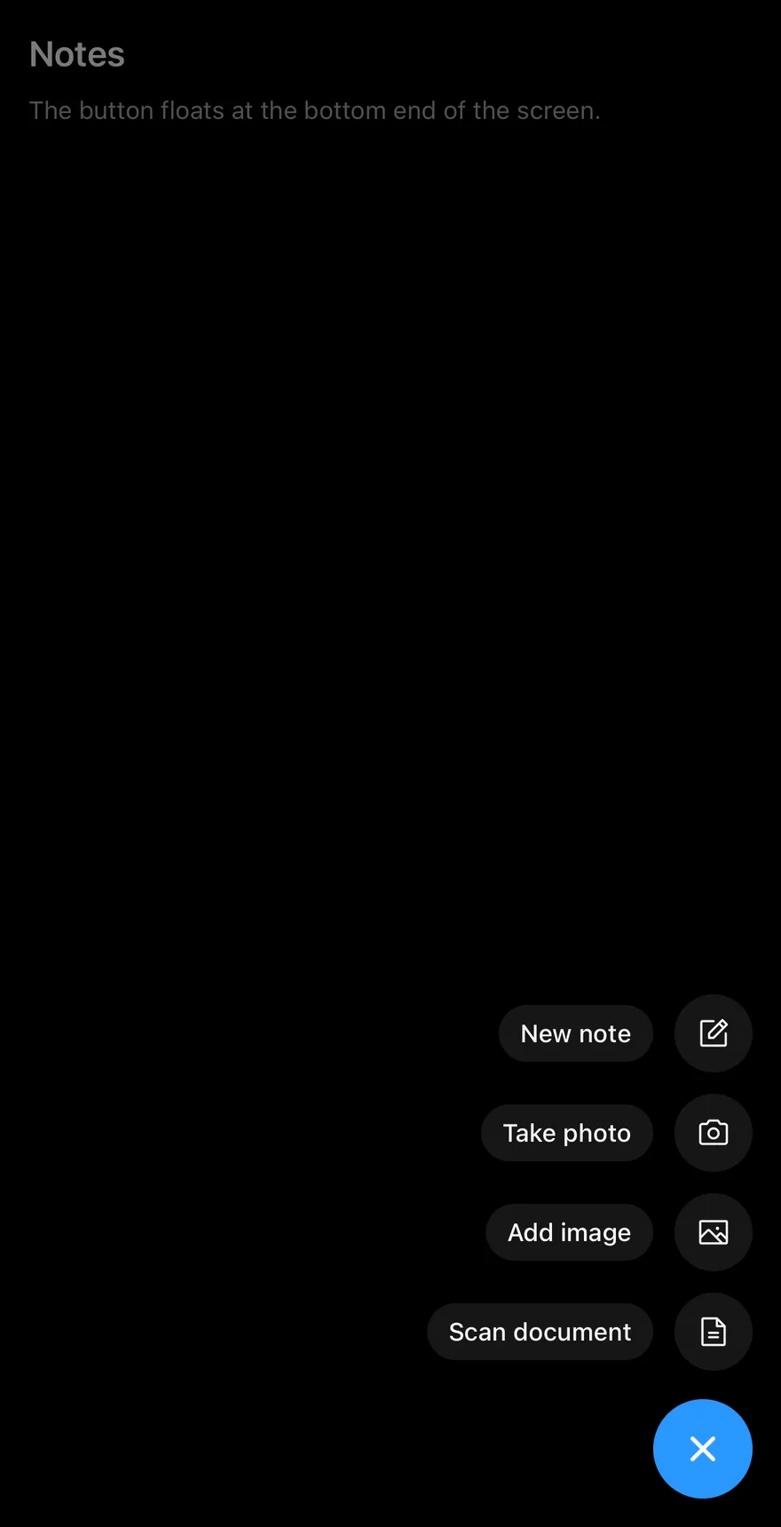
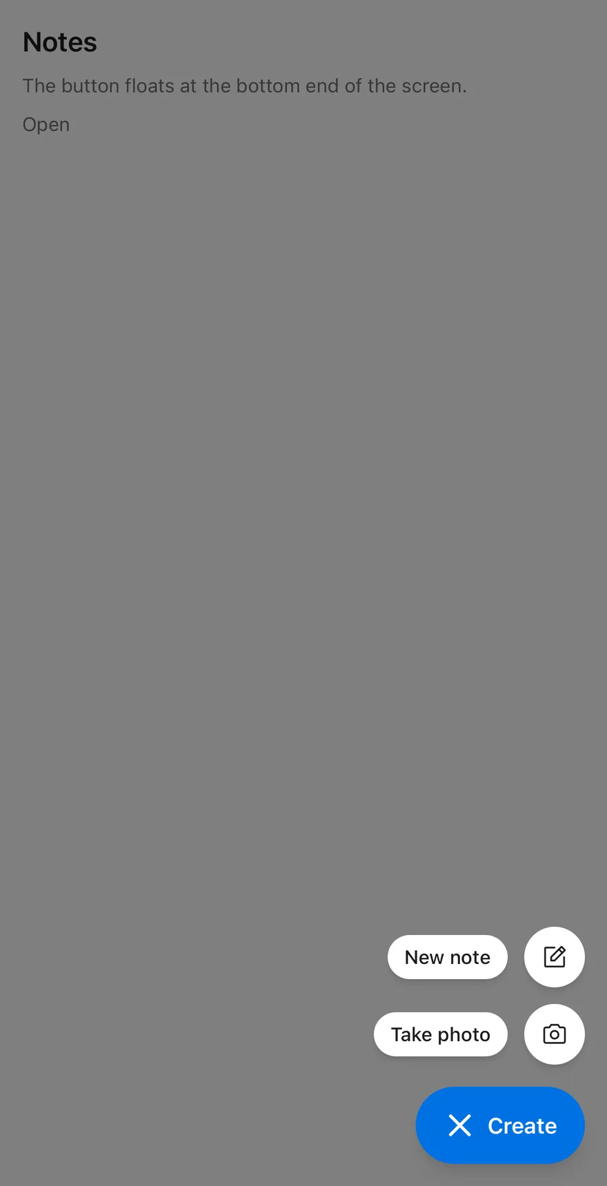
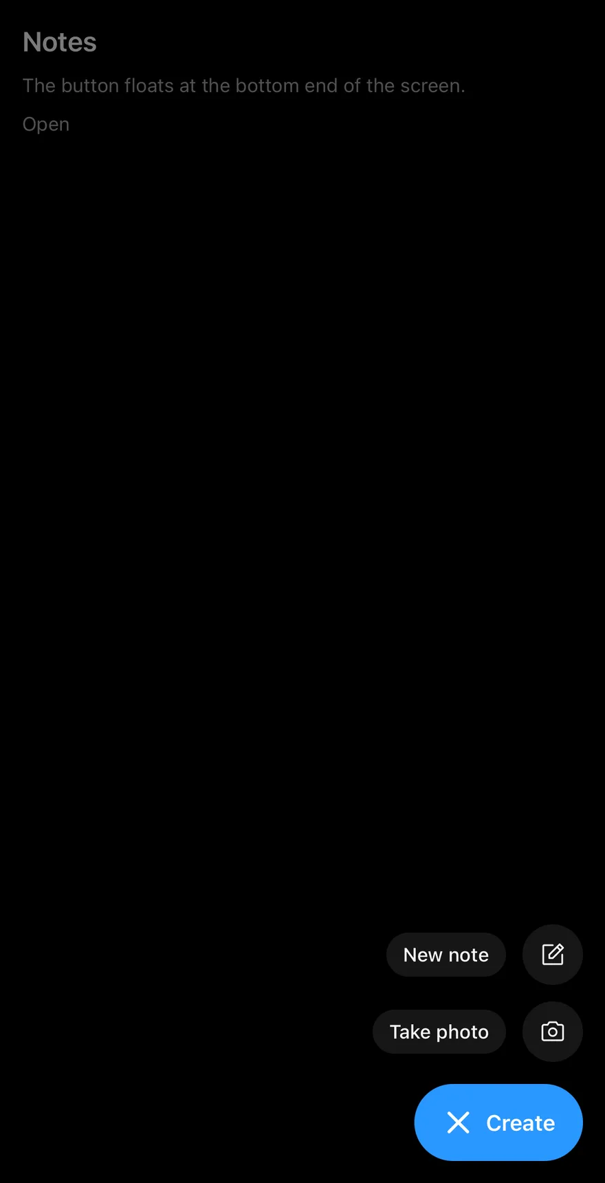
When it has FabAction children, pressing it opens a speed dial: a scrim dims the screen and the actions rise above the button one after another. The plus icon rotates 45 degrees into a close mark; other icons swap to an X.
Installation
The CLI also adds what it builds on: Icon, Text. On React Native it also adds the animated view components/ui/animated-view.tsx.
Manual
- Install the dependencies:
-
Add the pieces it builds on: Icon, Text, and the primitives
components/primitives/hooks.tsx,components/primitives/portal.tsx, and the animated viewcomponents/ui/animated-view.tsxfrom the next step. -
Copy the animated view into
components/ui/animated-view.tsx:
- Copy the source into
components/ui/fab.tsx:
- Update the import paths to match your project.
- Install the dependencies:
-
Add the pieces it builds on: Icon, Text, and the primitives
components/primitives/hooks.tsx,components/primitives/portal.tsx, and the animated viewcomponents/ui/animated-view.tsxfrom the next step. -
Copy the animated view into
components/ui/animated-view.tsx:
- Copy the source into
components/ui/fab.tsx:
- Update the import paths to match your project.
- Install the dependencies:
-
Add the pieces it builds on: Icon, Text, and the primitives
components/primitives/hooks.tsx,components/primitives/portal.tsx, and the animated viewcomponents/ui/animated-view.tsxfrom the next step. -
Copy the animated view into
components/ui/animated-view.tsx:
- Copy the source into
components/ui/fab.tsx:
- Update the import paths to match your project.
-
Target iOS 17 or later.
-
Add the Swift package to your app:
- Copy the theme files every view uses:
- Copy the source and every file it uses:
- Add the files to your app target.
- Set
minSdkto 24 or higher and add the dependencies:
- Copy the theme files every view uses:
- Copy the source and every file it uses:
- Update the
com.esuiss.uipackage names to match your project.
Usage
Use the default plus icon or pass any Phosphor icon to icon. Give an icon-only button an accessibilityLabel.
For a speed dial, add FabAction children with an icon and an optional text label. Pressing an action calls its onPress and closes the dial. Tapping the scrim or pressing the Android back button also closes it. Use open, defaultOpen and onOpenChange to control it.
Pass portalHost to render into a named portal host.
Examples
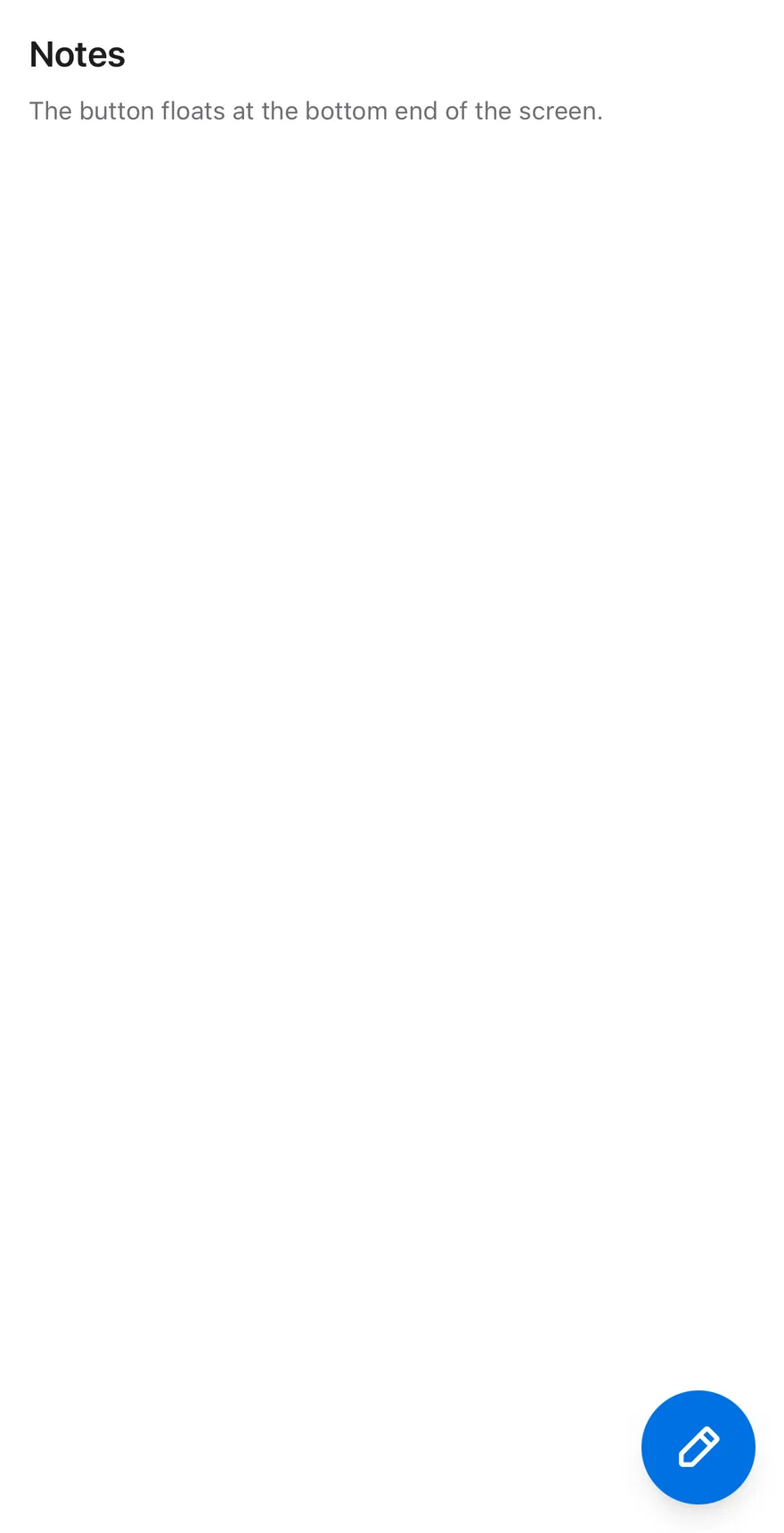
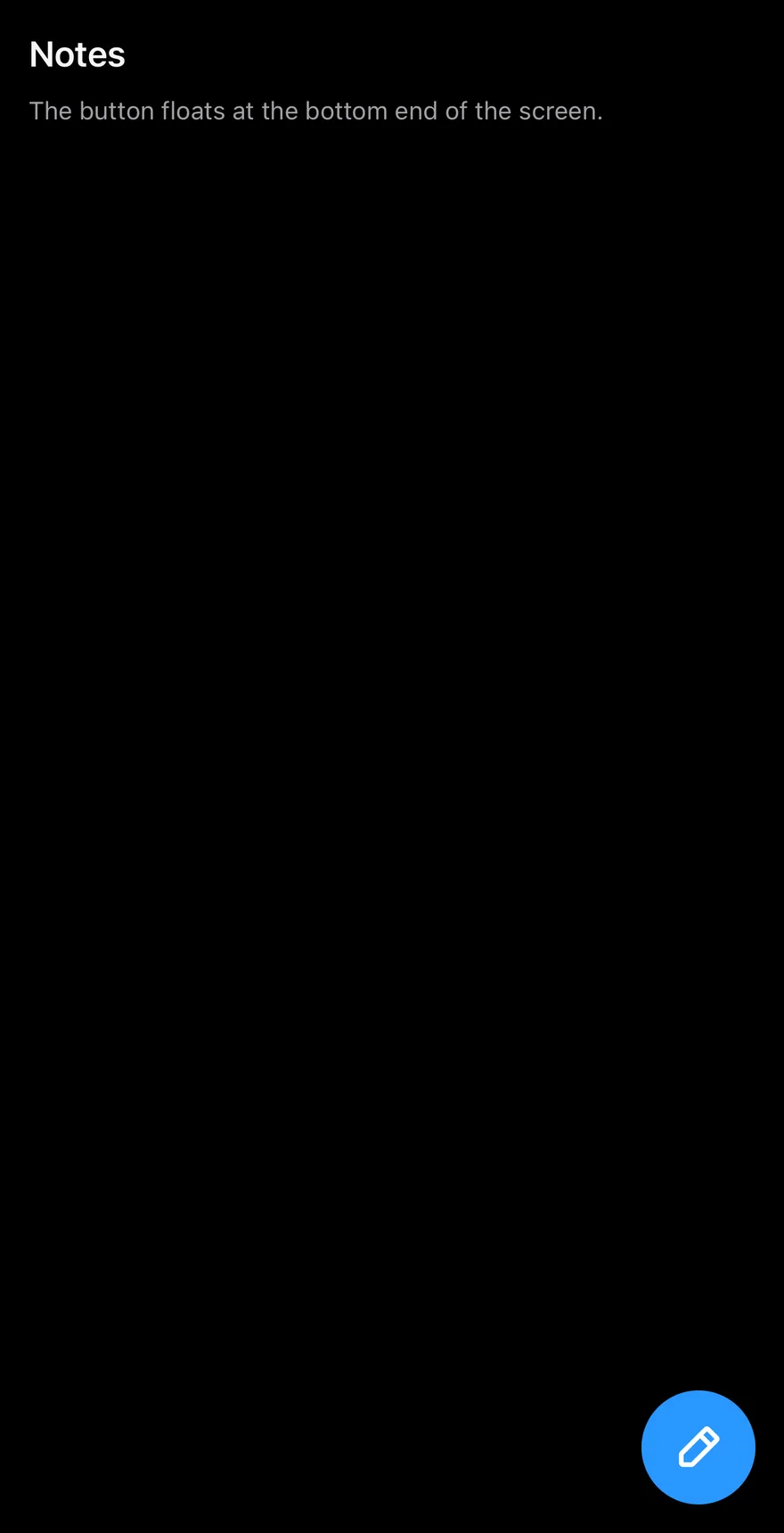
Large
The lg size with a custom icon.
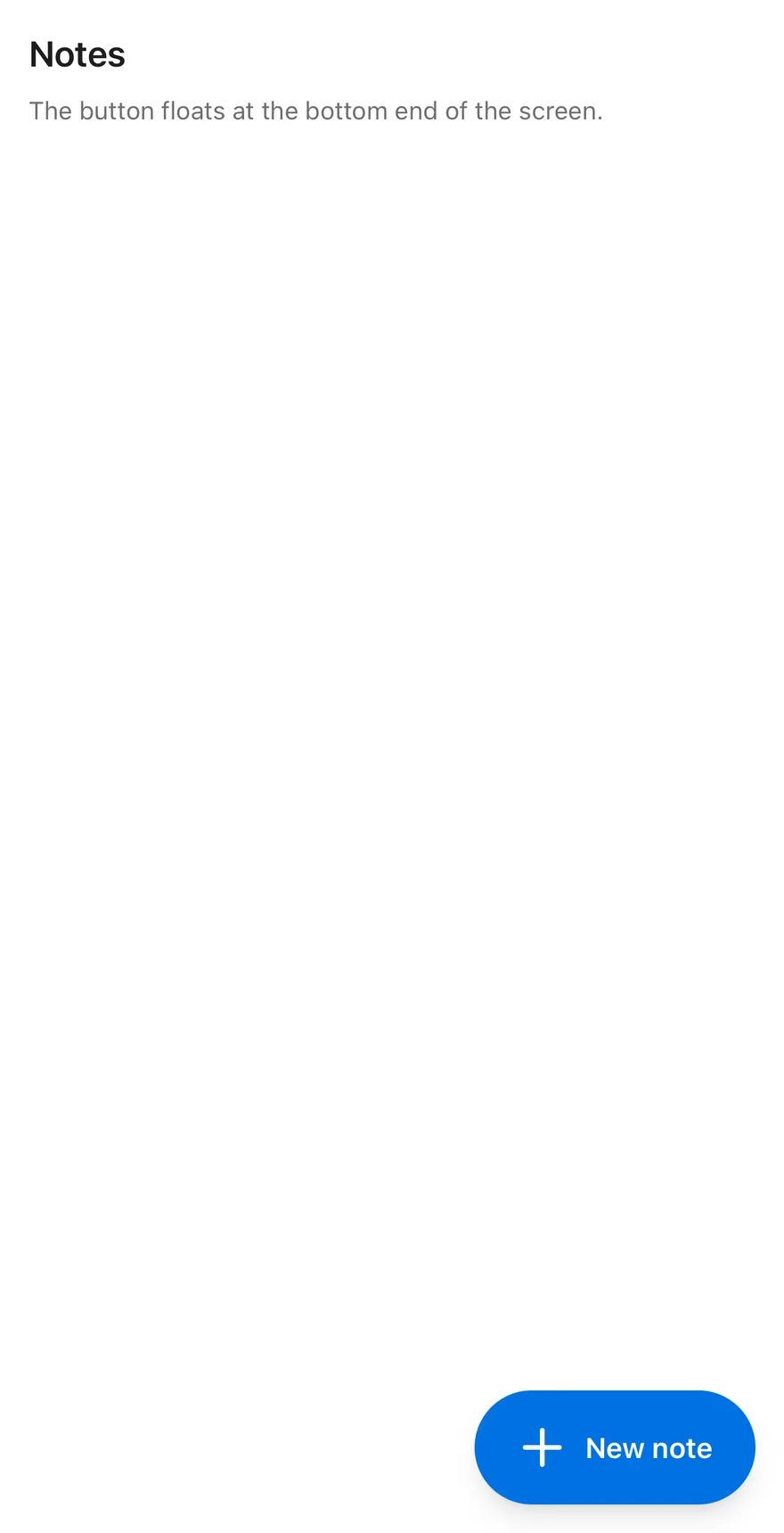
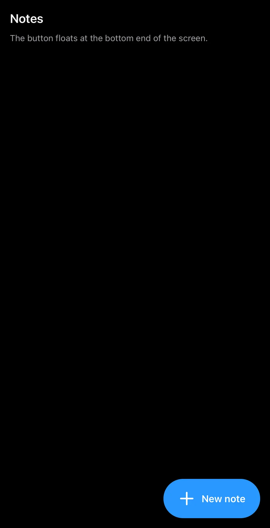
Extended
A label beside the icon.
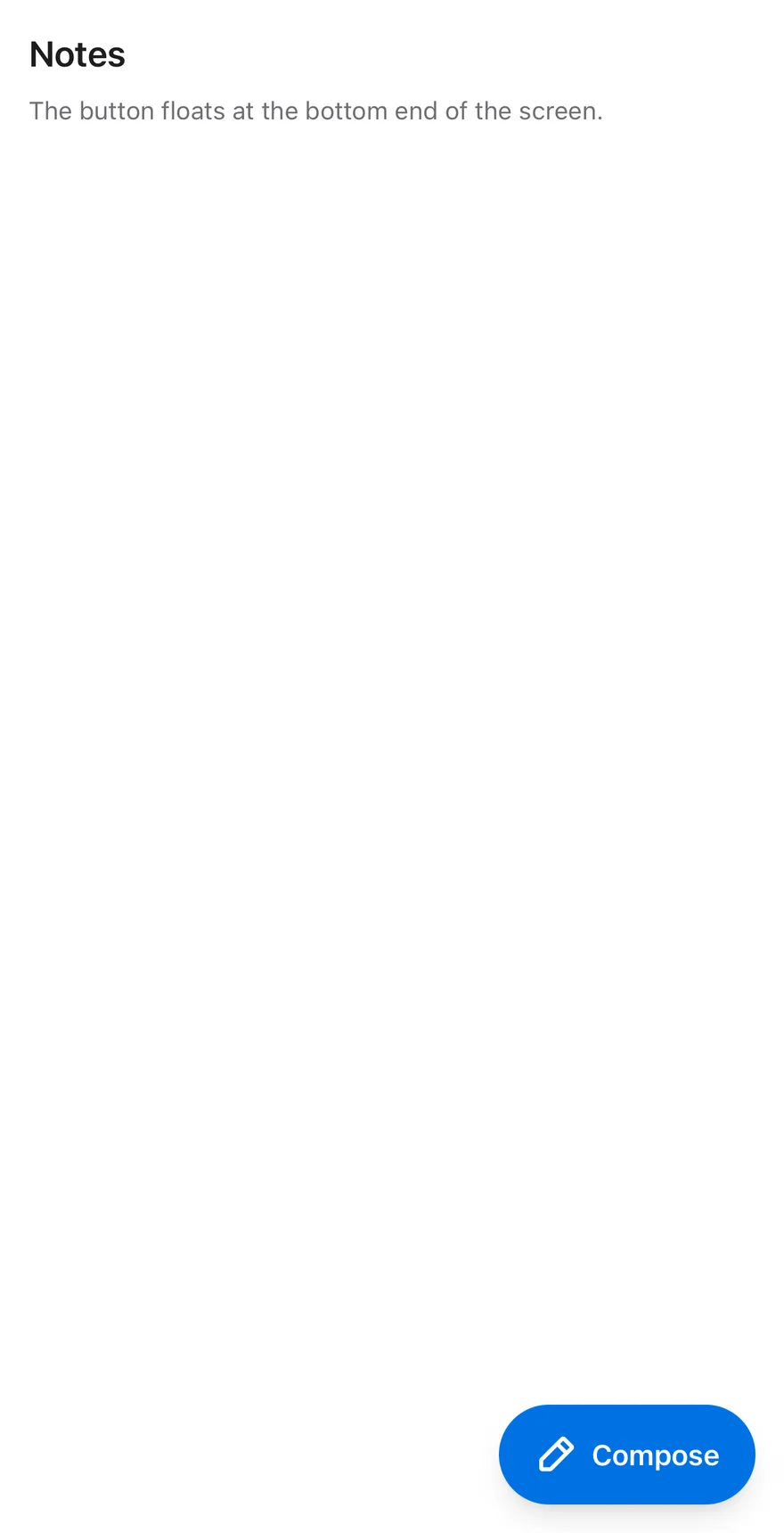
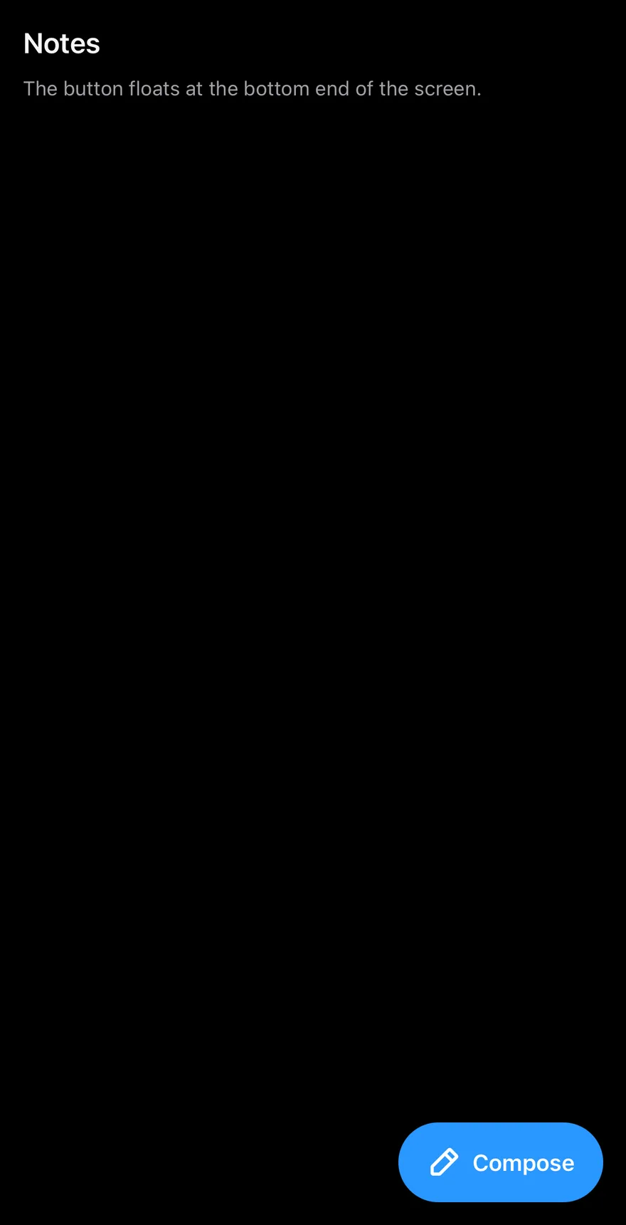
Large extended
A large extended button.
Speed dial open
A speed dial that starts open.
Speed dial closed
A speed dial that opens on press.
Controlled
A speed dial controlled with open and onOpenChange.
API Reference
Fab
Floating button that also hosts the speed dial.
| Prop | Type | Default | Description |
|---|---|---|---|
size | FabSize | "default" | default or lg. |
icon | PhosphorIcon | PlusIcon | Phosphor icon component. Defaults to a plus. |
label | React.ReactNode | - | Text or node shown beside the icon. |
open | boolean | - | Controlled speed dial state. |
defaultOpen | boolean | false | Initial speed dial state. |
onOpenChange | (open: boolean) => void | - | Called when the speed dial opens or closes. |
portalHost | string | - | Name of the portal host to render into. |
children | React.ReactNode | - |
Also accepts the props of React.ComponentProps<typeof Pressable>.
FabAction
One action in the speed dial, with an icon and optional label.
| Prop | Type | Default | Description |
|---|---|---|---|
icon | PhosphorIcon | Required | Phosphor icon component for the action. |
children | React.ReactNode | - |
Also accepts the props of React.ComponentProps<typeof Pressable>.
Accessibility
- The button and each action have the
buttonrole. - With actions, the button reports its
expandedstate. - The VoiceOver escape gesture and the Android back button close the speed dial.
- The scrim is hidden from screen readers.
Notes
- Position follows the safe-area insets and flips sides in right-to-left layouts.
- Animations respect the system Reduce Motion setting.
- Uses
bg-primary,bg-cardandbg-black/50tokens; actions usebg-mutedin dark mode.