suiss/ui · Component
Progress
A horizontal bar that shows the completion of a task.
Progress is an open-source component from suiss/ui for React, React Native, SwiftUI and Jetpack Compose. The @esuiss/ui CLI copies its source into your project, so you own the code.
Progress wraps the progress primitive of the chosen base. Progress is the root and always renders a ProgressTrack containing a ProgressIndicator after its children. Add a ProgressLabel to name the bar and a ProgressValue to show the formatted value; they sit on one row above the track.
Use Progress for determinate or indeterminate task progress.
Installation
CLI
Works in any project with a components.json. See Installation for the one-line registry setup. Or use the suiss/ui CLI:
Manual
- Install the dependencies and add the
cnhelper:
- Copy the source into
components/ui/progress.tsx:
- Update the import paths to match your project.
Usage
Pass value as a number between min and max (by default 0 and 100). Set value={null} for an indeterminate state when the amount of work is unknown.
The track and indicator are rendered for you, so ProgressTrack and ProgressIndicator are not needed inside Progress children. ProgressValue shows the formatted value, a percentage by default.
Examples
With label
A bar with a label and its current value shown above the track.
Complete
A labelled bar at 100.
Indeterminate
A labelled bar with value={null} for work of unknown length.
API Reference
Progress
The root that holds the value and renders the track and indicator.
Also accepts the props of the primitive part it wraps.
ProgressTrack
The full-width rail behind the indicator.
Also accepts the props of the primitive part it wraps.
ProgressIndicator
The filled portion of the track that reflects the value.
Also accepts the props of the primitive part it wraps.
ProgressLabel
Text that names the progress bar.
Also accepts the props of the primitive part it wraps.
ProgressValue
The formatted current value, aligned to the end of the row.
Also accepts the props of the primitive part it wraps.
Accessibility
- The root has the
progressbarrole witharia-valuenowreflecting the value. ProgressLabelprovides the accessible name. Without it, passaria-label.- When
valueisnull,aria-valuenowis omitted to signal an indeterminate state.
Notes
- Styling hooks:
data-slotvaluesprogress,progress-track,progress-indicator,progress-labelandprogress-value. - The track uses
mutedand the indicator usesprimary; the indicator animates width changes.


Progress renders a thin track with an indicator whose width follows value. The width animates with a Reanimated spring, clamped between 0 and 100 percent. Any children, such as ProgressLabel and ProgressValue, are placed in a row above the bar.
Use it for uploads, downloads and other tasks with a known amount of work.
Installation
Manual
- Install the dependencies:
-
Add the pieces it builds on: the primitives
components/primitives/progress.tsx,components/primitives/use-render.tsx. -
Copy the source into
components/ui/progress.tsx:
- Update the import paths to match your project.
- Install the dependencies:
-
Add the pieces it builds on: the primitives
components/primitives/progress.tsx,components/primitives/use-render.tsx. -
Copy the source into
components/ui/progress.tsx:
- Update the import paths to match your project.
- Install the dependencies:
-
Add the pieces it builds on: the primitives
components/primitives/progress.tsx,components/primitives/use-render.tsx. -
Copy the source into
components/ui/progress.tsx:
- Update the import paths to match your project.
-
Target iOS 17 or later.
-
Copy the theme files every view uses:
- Copy the source and every file it uses:
- Add the files to your app target.
- Set
minSdkto 24 or higher and add the dependencies:
- Copy the theme files every view uses:
- Copy the source:
- Update the
com.esuiss.uipackage names to match your project.
Usage
Set value between min and max (0 and 100 by default). Pass null when the progress is unknown.
Add a ProgressLabel and a ProgressValue as children to show a caption and the formatted value; the value is pushed to the end of the row. Format the value with format and locale.
Style the bar with trackClassName and indicatorClassName. ProgressTrack and ProgressIndicator are also exported for custom layouts.
Examples
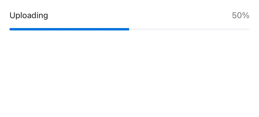
With label
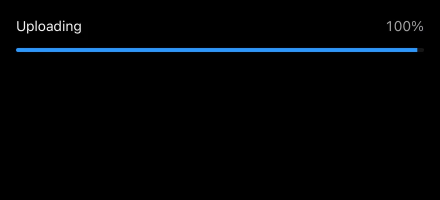
A bar with a label and a live percentage value.
Complete
A bar at 100 percent.


Values
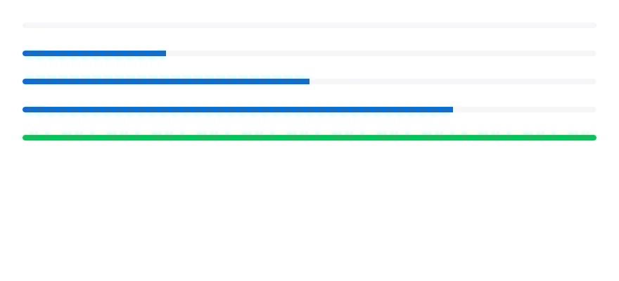
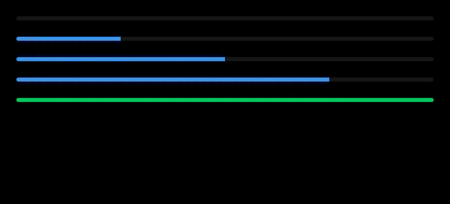
Bars at 0, 25, 50, 75 and 100 percent, the last with a custom indicator color.
API Reference
Progress
Root that holds the value and renders the track and indicator.
| Prop | Type | Default | Description |
|---|---|---|---|
trackClassName | string | - | Extra classes for the track. |
indicatorClassName | string | - | Extra classes for the indicator. |
Also accepts the props of React.ComponentProps<typeof ProgressPrimitive.Root>.
ProgressTrack
Background bar.
Also accepts the props of React.ComponentProps<typeof ProgressPrimitive.Track>.
ProgressIndicator
Animated fill that shows the current value.
Also accepts the props of React.ComponentProps<typeof ProgressPrimitive.Indicator>.
ProgressLabel
Caption text above the bar.
Also accepts the props of React.ComponentProps<typeof ProgressPrimitive.Label>.
ProgressValue
Formatted value text, aligned to the end.
Also accepts the props of React.ComponentProps<typeof ProgressPrimitive.Value>.
Accessibility
- The root has the
progressbarrole and reportsmin,max, the current value and a value text, so VoiceOver and TalkBack announce the progress. - Use
getAccessibilityValueTextto customize the announced text.
Notes
- The track uses
bg-mutedand the indicatorbg-primary. - Label and value text use
text-foregroundandtext-muted-foreground, with tabular numbers for the value. - Light and dark colors follow the system appearance.