suiss/ui · Component
Separator
A thin line that visually divides content, horizontally or vertically.
Separator is an open-source component from suiss/ui for React, React Native, SwiftUI and Jetpack Compose. The @esuiss/ui CLI copies its source into your project, so you own the code.
Separator wraps the separator primitive of the chosen base. It draws a 1px line in the border color: full width when horizontal, and stretched to the container's height when vertical.
Use it between groups of content or between inline items. Inside menus and selects, use the dedicated separator part of that component instead.
Installation
CLI
Works in any project with a components.json. See Installation for the one-line registry setup. Or use the suiss/ui CLI:
Manual
- Install the dependencies and add the
cnhelper:
- Copy the source into
components/ui/separator.tsx:
- Update the import paths to match your project.
Usage
orientation defaults to horizontal. Set orientation="vertical" inside a flex row; the line stretches to the row's height, so give the row a height.
Examples
Horizontal
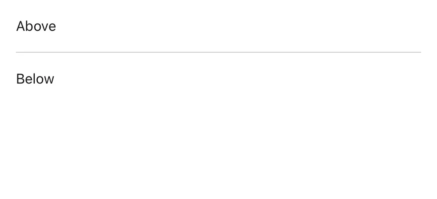
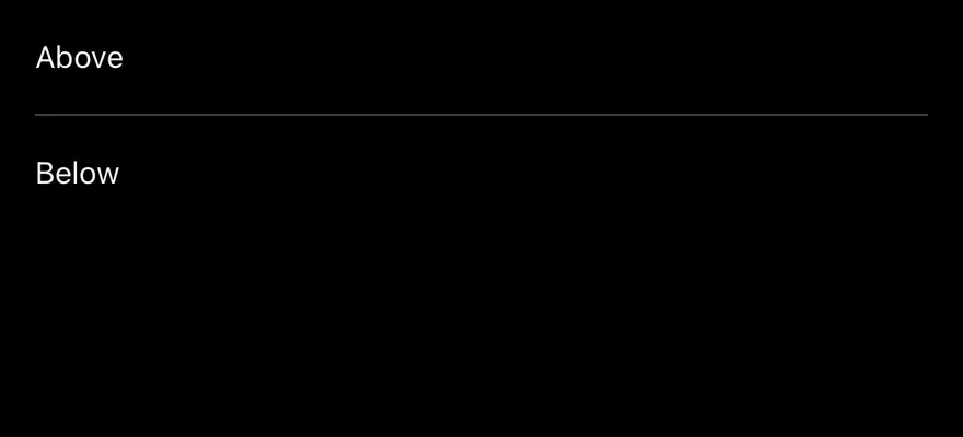
Divides two stacked lines of text.
Vertical
Divides inline links in a row.
API Reference
Separator
Draws the dividing line.
Also accepts the props of the primitive part it wraps.
Accessibility
- Renders with the
separatorrole and anaria-orientationthat matchesorientation.
Notes
- Uses
data-slot="separator", and the primitive's orientation attributes set its size. - The color comes from the
bg-bordertoken.
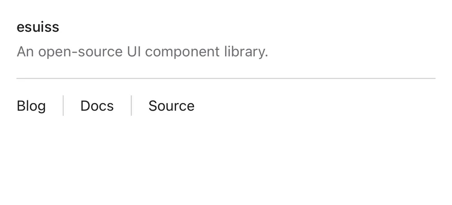
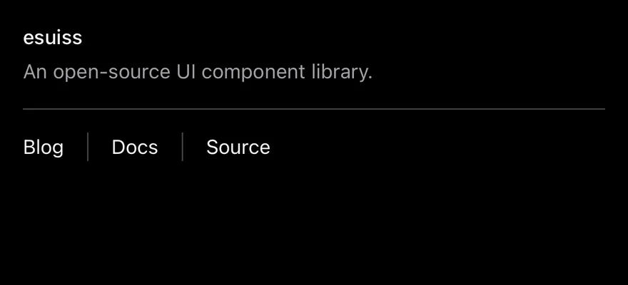
Separator is a View drawn as a one-pixel line. Horizontal separators fill the width of their container; vertical separators stretch to the height of a row.
Installation
Manual
- Install the dependencies:
-
Add the pieces it builds on: the primitives
components/primitives/separator.tsx,components/primitives/use-render.tsx. -
Copy the source into
components/ui/separator.tsx:
- Update the import paths to match your project.
- Install the dependencies:
-
Add the pieces it builds on: the primitives
components/primitives/separator.tsx,components/primitives/use-render.tsx. -
Copy the source into
components/ui/separator.tsx:
- Update the import paths to match your project.
-
Add the pieces it builds on: the primitives
components/primitives/separator.tsx,components/primitives/use-render.tsx. -
Copy the source into
components/ui/separator.tsx:
- Update the import paths to match your project.
-
Target iOS 17 or later.
-
Copy the theme files every view uses:
- Copy the source:
- Add the files to your app target.
- Set
minSdkto 24 or higher and add the dependencies:
- Copy the theme files every view uses:
- Copy the source:
- Update the
com.esuiss.uipackage names to match your project.
Usage
Use the default horizontal orientation between stacked blocks, and orientation="vertical" between items in a row. Add spacing with className, such as my-4.
Examples
Horizontal
A horizontal separator between two lines of text.
Vertical
A vertical separator between two items in a row.


API Reference
Separator
Also accepts the props of React.ComponentProps<typeof SeparatorPrimitive>.
Accessibility
- The separator is decorative and hidden from VoiceOver and TalkBack.
Notes
- Uses the
bg-bordertoken. - Light and dark colors follow the system appearance.