suiss/ui · Component
Slider
A track with one or more draggable thumbs for choosing a value or range.
Slider is an open-source component from suiss/ui for React, React Native, SwiftUI and Jetpack Compose. The @esuiss/ui CLI copies its source into your project, so you own the code.
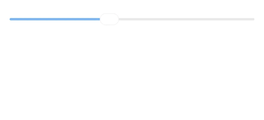
Slider wraps the slider primitive of the chosen base in a single component. It renders the track, the filled range and one thumb per value. The thumb is a wide capsule that stretches while it's dragged or pressed.
Use a slider when an approximate value within a range matters more than a precise number, such as volume or brightness. For exact numbers, use a number field or Input.
Installation
CLI
Works in any project with a components.json. See Installation for the one-line registry setup. Or use the suiss/ui CLI:
Manual
- Install the dependencies and add the
cnhelper:
- Copy the source into
components/ui/slider.tsx:
- Update the import paths to match your project.
Usage
Pass defaultValue or value as an array: one number for a single thumb, two for a range. min defaults to 0 and max to 100; use step to snap to increments. Use onValueChange with value to control it, and set orientation="vertical" for a vertical slider.
Examples
Range
Uses two values to select a range with two thumbs.
Steps
Moves in increments of 10.
Vertical
Runs vertically.
Disabled
Disables interaction and removes the thumb from the tab order.
API Reference
Slider
The complete slider: track, filled range and thumbs.
Also accepts the props of the primitive part it wraps.
Accessibility
- Each thumb has the
sliderrole witharia-valuenowandaria-orientation. aria-labelandaria-labelledbyonSliderare passed to every thumb, so each thumb is named.- Arrow keys move the focused thumb by one step;
HomeandEndjump to the minimum and maximum. Vertical sliders use the up and down arrow keys. - In a range,
Tabmoves between thumbs, and each thumb moves independently. - A disabled slider can't be focused.
Notes
- If neither
valuenordefaultValueis an array, the slider renders two thumbs. Always pass an array. - Parts carry
data-slotattributes:slider,slider-track,slider-rangeandslider-thumb. - The range uses
bg-primary, the track usesbg-border, and disabled sliders are dimmed withopacity-50. - Thumbs use
thumbAlignment="edge", so they stay inside the track at both ends.


Slider renders a thin track, a filled indicator and one thumb per value. Pass a number for a single value, or an array for a range or several thumbs. The active thumb widens while it is dragged. It works horizontally or vertically.
Thumbs are aligned to the edges of the track, so they stay within it at min and max.
Installation
Manual
- Install the dependencies:
-
Add the pieces it builds on: the primitives
components/primitives/slider.tsx,components/primitives/use-render.tsx. -
Copy the source into
components/ui/slider.tsx:
- Update the import paths to match your project.
- Install the dependencies:
-
Add the pieces it builds on: the primitives
components/primitives/slider.tsx,components/primitives/use-render.tsx. -
Copy the source into
components/ui/slider.tsx:
- Update the import paths to match your project.
-
Add the pieces it builds on: the primitives
components/primitives/slider.tsx,components/primitives/use-render.tsx. -
Copy the source into
components/ui/slider.tsx:
- Update the import paths to match your project.
-
Target iOS 17 or later.
-
Copy the theme files every view uses:
- Copy the source and every file it uses:
- Add the files to your app target.
- Set
minSdkto 24 or higher and add the dependencies:
- Copy the theme files every view uses:
- Copy the source and every file it uses:
- Update the
com.esuiss.uipackage names to match your project.
Usage
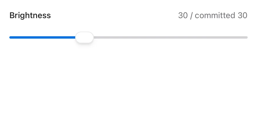
Use defaultValue for an uncontrolled slider, or value with onValueChange to control it. onValueCommitted runs when a drag or track press ends, which suits saving or fetching.
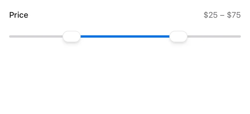
Set min, max and step to define the range; min defaults to 0 and max to 100. For ranges, minStepsBetweenValues keeps thumbs apart and thumbCollisionBehavior decides whether thumbs push each other, swap, or stop (none).
The number of thumbs comes from the array length of value or defaultValue.
Examples
Controlled
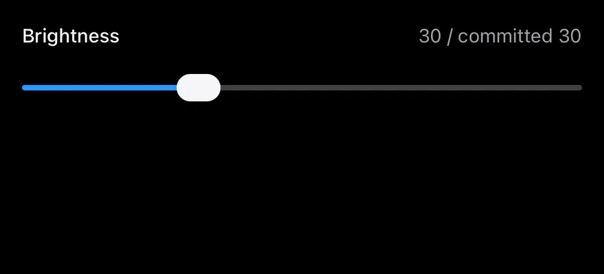
A controlled slider that shows the live and committed values.
Range
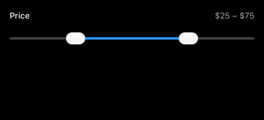
A two-thumb price range with a step and a minimum gap.
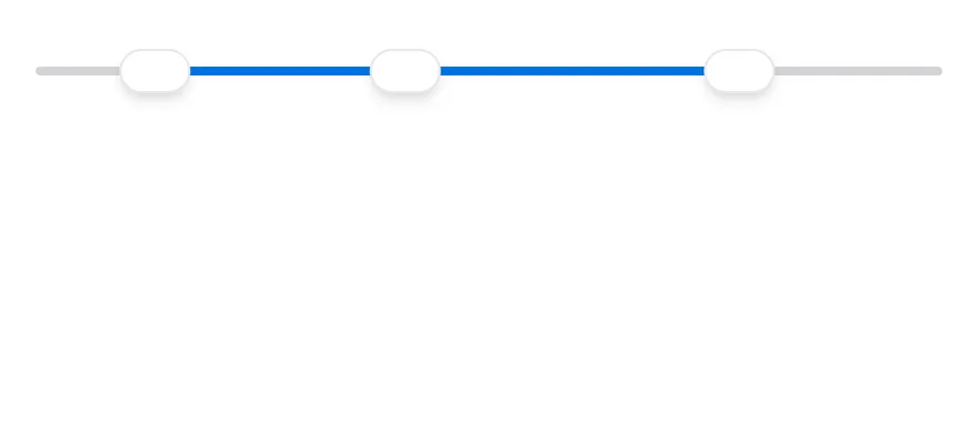
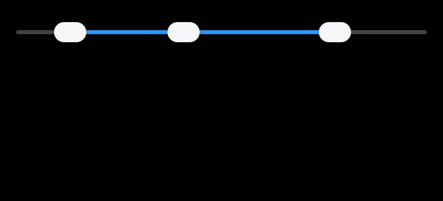
Multiple thumbs
Three thumbs that swap when they cross.
Step
A slider that moves in decimal steps.


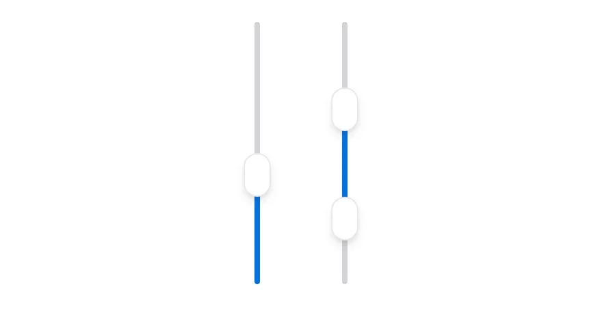
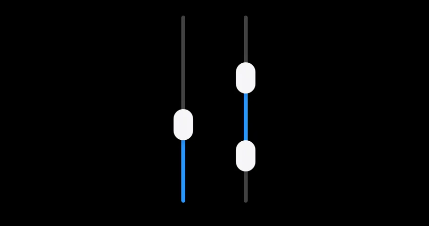
Vertical
Single and range sliders in vertical orientation.
Disabled
A disabled slider with muted colors.

API Reference
Slider
Also accepts the props of SliderPrimitive.RootProps<Value>.
Accessibility
- Each thumb has the
adjustablerole with its min, max and current value, so VoiceOver and TalkBack users can swipe up or down to change it. accessibilityLabelonSlideris passed to every thumb; set it, since the slider has no visible label.- Disabled thumbs report
disabledin their accessibility state.
Notes
- The track uses
bg-borderand the indicatorbg-primary, and the slider is shown atopacity-50when disabled. - Thumbs use
bg-backgroundwith a shadow, orbg-foregroundin dark mode. - Light and dark colors follow the system appearance.