suiss/ui · Component
Badge
A small inline label for status, counts or metadata.
Badge is an open-source component from suiss/ui for React, React Native, SwiftUI and Jetpack Compose. The @esuiss/ui CLI copies its source into your project, so you own the code.
Badge is a single element that renders a span by default and can render as another element, such as a link. Badges can hold text and an icon on either side.
Use the render prop to render the badge as another element: render={<a href="/" />}.
Set asChild and pass the element as the only child to render the badge as it.
Pass a render function that returns the element; spread the props it receives onto it.
Use a badge to tag content with a short status or category. For actions, use Button instead.
Installation
CLI
Works in any project with a components.json. See Installation for the one-line registry setup. Or use the suiss/ui CLI:
Manual
- Install the dependencies and add the
cnhelper:
- Copy the source into
components/ui/badge.tsx:
- Update the import paths to match your project.
Usage
Mark icons with data-icon="inline-start" or data-icon="inline-end" so the outline and ghost variants tighten their padding on that side. Icons are sized to size-3.
Pass render with an anchor element, for example an a with an href, to make the badge a link. Linked badges get hover styles that depend on the variant.
To use a custom color, override the text color with a className such as text-green-600 dark:text-green-400.
Examples
Variants
Shows the default, secondary, destructive, outline, ghost and link variants.
With icon
Places icons before and after the label with data-icon.
As link
Renders the badge as a link.
Custom color
Overrides the text color with utility classes.
API Reference
Badge
The inline label element.
| Prop | Type | Default | Description |
|---|---|---|---|
variant | "default" | "secondary" | "destructive" | "outline" | "ghost" | "link" | "default" | Visual style. default, secondary, destructive and link are text-only; outline adds a border and ghost adds horizontal padding. |
Also accepts the props of useRender.ComponentProps<"span">.
Accessibility
- A badge is static text by default and is not focusable.
- When rendered as a link, it shows a focus ring on keyboard focus.
aria-invalidadds aborder-destructiveborder.
Notes
- Styling hook:
data-slot="badge", plusdata-variantfrom the render state. - The
destructivevariant also tints the focus ring withring-destructive/20(ring-destructive/40in dark mode). - Badges are a fixed
h-5with fully rounded corners and do not wrap text.

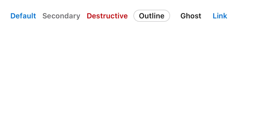
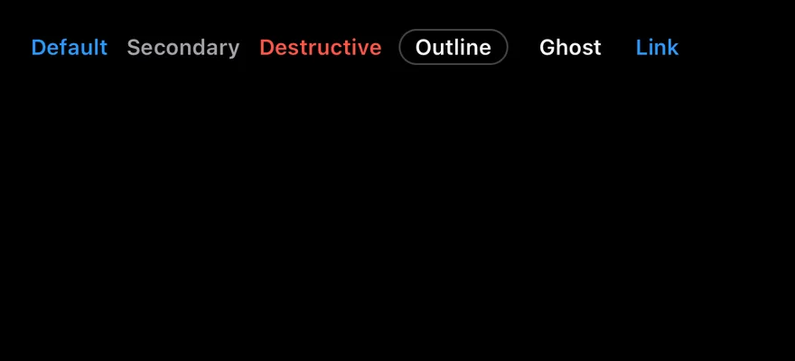
Badge is a compact pill View that passes a small, bold text style and a 12-point icon size to its children. Six variants are available. default, secondary, destructive and link show colored text with no background, while outline adds a hairline border and ghost adds horizontal padding.
Use default for highlighted labels, secondary for neutral metadata, destructive for errors and outline when the badge needs a visible edge.
Installation
The CLI also adds what it builds on: Icon, Text.
Manual
-
Target iOS 17 or later.
-
Copy the theme files every view uses:
- Copy the source and every file it uses:
- Add the files to your app target.
- Set
minSdkto 24 or higher and add the dependencies:
- Copy the theme files every view uses:
- Copy the source and every file it uses:
- Update the
com.esuiss.uipackage names to match your project.
Usage
Put the label in a Text and icons in an Icon. Use render to render the badge as a different component, such as a Pressable, while keeping its styles.
badgeVariants and badgeTextVariants are also exported if you need the classes on another element.
Examples
Variants
All six variants side by side.
With icon
Badges with a leading icon.


API Reference
Badge
| Prop | Type | Default | Description |
|---|---|---|---|
variant | "default" | "secondary" | "destructive" | "outline" | "ghost" | "link" | "default" | Visual style. |
render | RenderProp | - | Renders the badge as another element. |
Also accepts the props of BadgeProps.
Accessibility
- The badge adds no role; it is read as plain text.
- If you render it as a pressable element, give that element a role and label.
Notes
- Text colors come from
text-primary,text-muted-foreground,text-destructiveandtext-foreground; light and dark follow the system appearance.