suiss/ui · Component
Radio Group
A set of radio buttons where only one option can be selected at a time.
Radio Group is an open-source component from suiss/ui for React, React Native, SwiftUI and Jetpack Compose. The @esuiss/ui CLI copies its source into your project, so you own the code.
Radio Group wraps the radio group primitive of the chosen base. RadioGroup holds the selected value and contains one RadioGroupItem per option. Each item renders a round control with an indicator dot when checked; pair it with a Label to give it visible text.
Use a radio group for a small set of mutually exclusive options that should all stay visible. Use Select or Native Select for longer lists, and Checkbox when several options can be selected.
Installation
CLI
Works in any project with a components.json. See Installation for the one-line registry setup. Or use the suiss/ui CLI:
Manual
- Install the dependencies and add the
cnhelper:
- Copy the source into
components/ui/radio-group.tsx:
- Update the import paths to match your project.
Usage
Give each RadioGroupItem a unique value. The group is uncontrolled with defaultValue, or controlled with value and onValueChange. Set disabled on the group to disable every item, or on a single item.
Wrap each item and its text in a Label so clicking the text selects the option. The label switches to regular weight automatically next to a radio item.
Examples
With descriptions
Options with a title and a secondary description, linked with aria-labelledby and aria-describedby.
Disabled item
A group where one option is disabled and skipped by arrow-key navigation.
Disabled
A fully disabled group that ignores clicks.
Invalid
Items marked with aria-invalid and shown with a destructive border.
API Reference
RadioGroup
The container that manages the selected value and keyboard navigation.
Also accepts the props of the primitive part it wraps.
RadioGroupItem
A single radio button with a checked indicator.
Also accepts the props of the primitive part it wraps.
Accessibility
- The group has the
radiogrouprole and each item theradiorole witharia-checked. - Name the group with
aria-labeloraria-labelledby, and name each item with a wrappingLabeloraria-labelledby. - Arrow keys move focus and selection between items, skipping disabled ones.
- Set
aria-invalidon items to communicate a validation error. - Each item has an enlarged invisible hit area for easier pointer targeting.
Notes
- Styling hooks:
data-slotvaluesradio-group,radio-group-itemandradio-group-indicator. - Items carry the
peerclass, so a followingLabelcan react to their state. - Uses the
primary,primary-foregroundanddestructivecolors, andopacity-50when disabled.
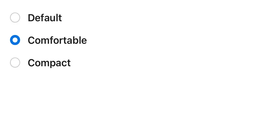
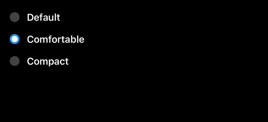
RadioGroup is a View with the radiogroup role that holds the selected value. Each RadioGroupItem is a small round Pressable with the radio role; when checked it fills with the primary color and shows a dot. Items have an enlarged hit area so they are easy to press.
Installation
Manual
- Install the dependencies:
-
Add the pieces it builds on: the primitives
components/primitives/radio.tsx,components/primitives/radio-group.tsx,components/primitives/use-render.tsx. -
Copy the source into
components/ui/radio-group.tsx:
- Update the import paths to match your project.
- Install the dependencies:
-
Add the pieces it builds on: the primitives
components/primitives/radio.tsx,components/primitives/radio-group.tsx,components/primitives/use-render.tsx. -
Copy the source into
components/ui/radio-group.tsx:
- Update the import paths to match your project.
-
Add the pieces it builds on: the primitives
components/primitives/radio.tsx,components/primitives/radio-group.tsx,components/primitives/use-render.tsx. -
Copy the source into
components/ui/radio-group.tsx:
- Update the import paths to match your project.
-
Target iOS 17 or later.
-
Add the Swift package to your app:
- Copy the theme files every view uses:
- Copy the source and every file it uses:
- Add the files to your app target.
- Set
minSdkto 24 or higher and add the dependencies:
- Copy the theme files every view uses:
- Copy the source and every file it uses:
- Update the
com.esuiss.uipackage names to match your project.
Usage
Give every RadioGroupItem a unique value. Control the group with value and onValueChange(value, details), or leave it uncontrolled with defaultValue. Values are generic, so they can be strings or other types.
Put a Label next to each item and link it through nativeID and accessibilityLabelledBy. Set disabled on the group to disable all items, or on a single item. Set invalid on items to show the destructive border.
Examples
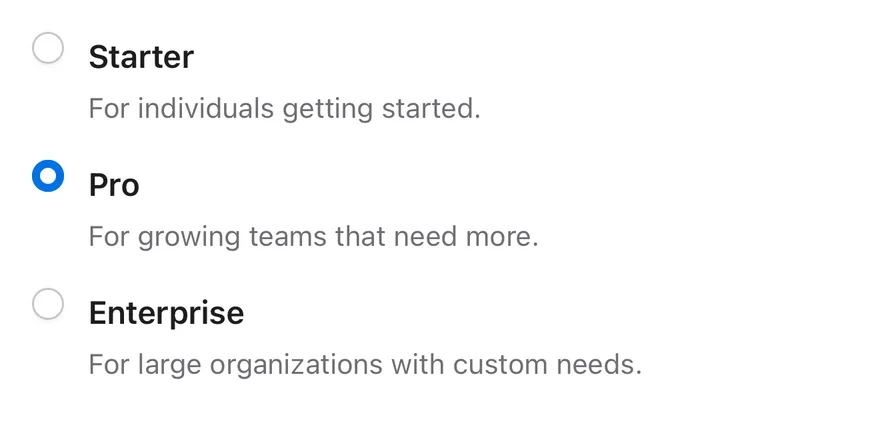
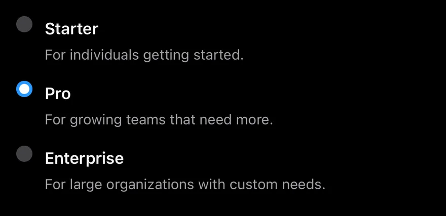
With descriptions
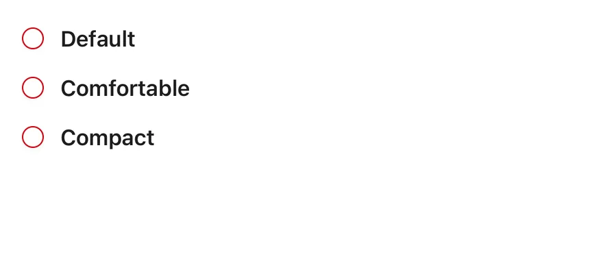
Options with a label and a line of description each.
Disabled item
A group with one disabled option.
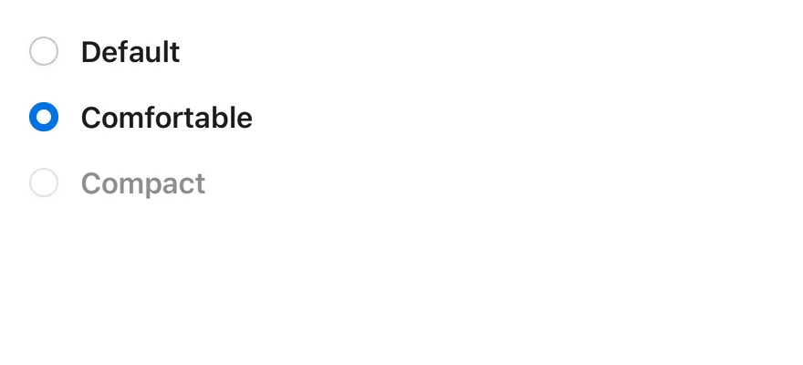
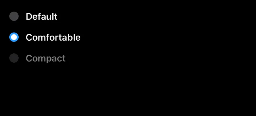
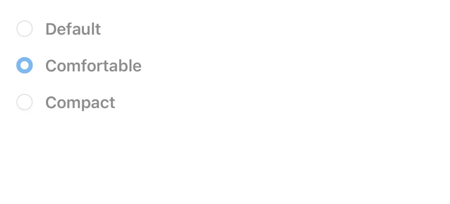
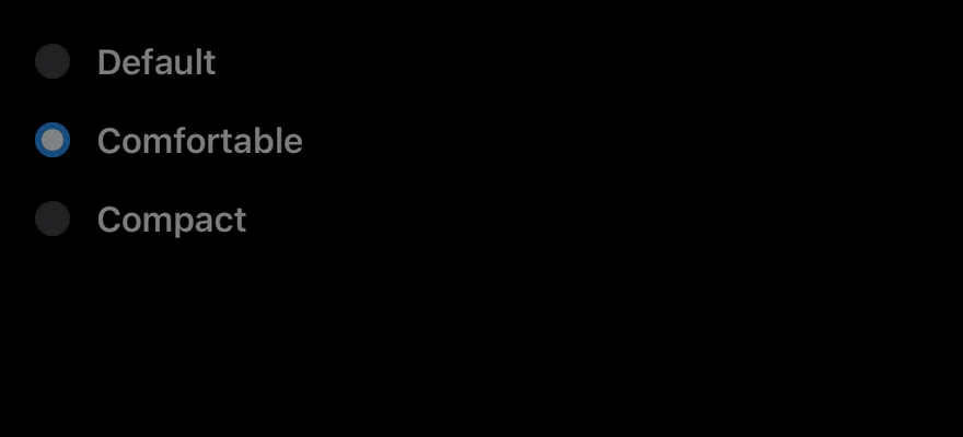
Disabled
A fully disabled group.
Invalid
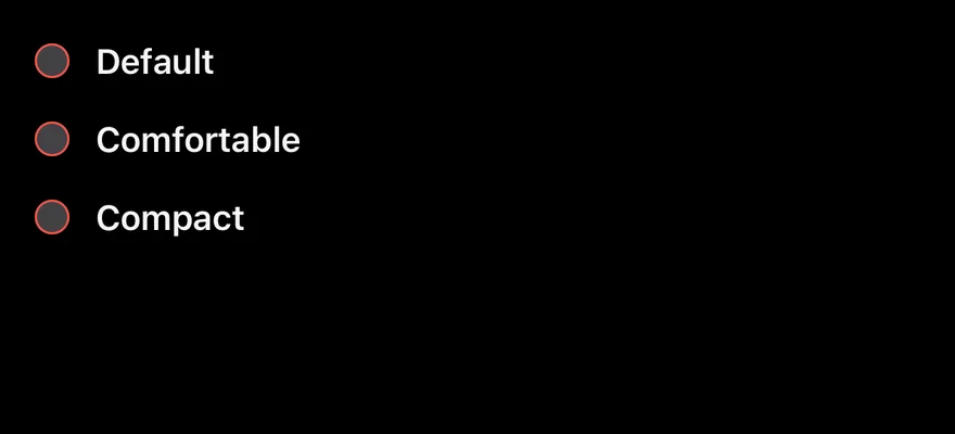
Items with the invalid border.
API Reference
RadioGroup
The container that holds the selected value.
Also accepts the props of RadioGroupProps<Value>.
RadioGroupItem
A single radio button with its checked indicator.
| Prop | Type | Default | Description |
|---|---|---|---|
invalid | boolean | - | Shows a destructive border while unchecked. |
Also accepts the props of RadioPrimitive.RootProps<Value>.
Accessibility
- The group has the
radiogrouprole and reportsdisabledinaccessibilityState. - Each item has the
radiorole and reportscheckedanddisabledinaccessibilityState. - The indicator is hidden from screen readers; label each item with a linked
Labelor anaccessibilityLabel.
Notes
- Selecting an item triggers a selection haptic when a haptics adapter is provided through
HapticsContext. - Uses the
bg-primary,bg-primary-foregroundandborder-destructivetokens, withopacity-50when disabled. - Light and dark colors follow the system appearance; in dark mode unchecked items drop the border and shadow.