suiss/ui
  • Docs
  • Components
  • Patterns
  • Interactions
  • Charts
  • Blocks
  • AI
GitHubCreate
DocsComponentsPatternsInteractionsChartsBlocksAICreate
Components84
  • Overview
  • Accordion
  • Alert
  • Alert Dialog
  • Alert Sheet
  • Amount Input
  • Aspect Ratio
  • Attachment
  • Avatar
  • Badge
  • Bottom Bar
  • Breadcrumb
  • Bubble
  • Button
  • Button Group
  • Calendar
  • Card
  • Carousel
  • Chart
  • Checkbox
  • Chip
  • Code Block
  • Collapsible
  • Combobox
  • Command
  • Context Menu
  • Dialog
  • Direction
  • Drawer
  • Dropdown Menu
  • Empty
  • FAB
  • Field
  • Fullscreen Menu
  • Haptics
  • Header
  • Hover Card
  • Icon
  • Input
  • Input Accessory Bar
  • Input Group
  • Input OTP
  • Item
  • Kbd
  • Keyboard Scroll View
  • Keypad
  • Label
  • Marker
  • Menubar
  • Message
  • Message Scroller
  • Native Select
  • Navigation Menu
  • Page Indicator
  • Pagination
  • Pin Pad
  • Popover
  • Progress
  • QR Scanner
  • Questionnaire
  • Radio Group
  • Resizable
  • Screen
  • Scroll Area
  • Select
  • Separator
  • Sheet
  • Sidebar
  • Signature Pad
  • Skeleton
  • Slider
  • Spinner
  • Switch
  • Tab Bar
  • Table
  • Tabs
  • Text
  • Textarea
  • Toast
  • Toggle
  • Toggle Group
  • Tooltip
  • Trace
  • Wheel Picker
  • Widget

suiss/ui · Component

Chart

Themed building blocks for Recharts charts, with a shared color config, tooltip and legend.

Chart is an open-source component from suiss/ui for React, React Native, SwiftUI and Jetpack Compose. The @esuiss/ui CLI copies its source into your project, so you own the code.

import { Bar, BarChart, CartesianGrid, XAxis } from "recharts"
import {
  type ChartConfig,
  ChartContainer,
  ChartTooltip,
  ChartTooltipContent,
} from "@/components/ui/chart"

const visitors = [
  { month: "January", desktop: 186, mobile: 80 },
  { month: "February", desktop: 305, mobile: 200 },
  { month: "March", desktop: 237, mobile: 120 },
  { month: "April", desktop: 73, mobile: 190 },
  { month: "May", desktop: 209, mobile: 130 },
  { month: "June", desktop: 214, mobile: 140 },
]

Chart does not draw charts itself; it styles charts you compose with recharts. A ChartContainer takes a config that maps each data key to a label, an optional icon and a color, and wraps your Recharts chart in a ResponsiveContainer. Inside the chart, use ChartTooltip with content={<ChartTooltipContent />} and ChartLegend with content={<ChartLegendContent />} to render a tooltip and legend that read labels and colors from the config.

Use it for bar, line, area and pie charts in dashboards and reports. Because you work with Recharts directly, every Recharts chart type and prop remains available.

Installation

CLI

$ pnpm dlx shadcn@latest add @esuiss/chart

Works in any project with a components.json. See Installation for the one-line registry setup. Or use the suiss/ui CLI:

$ pnpm dlx @esuiss/ui@latest add chart

Manual

  1. Install the dependencies and add the cn helper:
$ pnpm add recharts
  1. Copy the source into components/ui/chart.tsx:
components/ui/chart.tsx
"use client"

import * as React from "react"
import type { TooltipValueType } from "recharts"
import * as RechartsPrimitive from "recharts"
import { cn } from "@/lib/utils"

const THEMES = { light: "", dark: ".dark" } as const

const INITIAL_DIMENSION = { width: 320, height: 200 } as const
const UNSAFE_IDENTIFIER_CHARACTERS = /[^\w-]/g
const UNSAFE_VALUE_CHARACTERS = /[;{}<>\\]/
type TooltipNameType = number | string

export type ChartConfig = Record<
  string,
  1. Update the import paths to match your project.

Usage

import { ChartContainer, ChartTooltipContent, ChartLegendContent } from "@/components/ui/chart"
<div className="w-[min(32rem,calc(100vw-2rem))]">
  <ChartContainer config={visitorsConfig} className="w-full">{(
        <BarChart accessibilityLayer data={visitors}>
          <CartesianGrid vertical={false} />
          <XAxis
            dataKey="month"
            tickLine={false}
            tickMargin={10}
            axisLine={false}
            tickFormatter={shortMonth}
          />
          <ChartTooltip content={<ChartTooltipContent />} />
          <Bar dataKey="desktop" fill="var(--color-desktop)" radius={8} />
        </BarChart>
      )}</ChartContainer>
</div>

Each key in config becomes a CSS custom property scoped to the chart, such as --color-desktop. Reference it from your series, as in fill="var(--color-desktop)". Set color for a single value, or theme with light and dark values to switch colors with the .dark class.

For data where each row is its own category, such as a pie chart, put the color in the row (for example fill: "var(--color-safari)") and pass nameKey to ChartLegendContent so labels are looked up by that field.

The container is aspect-video by default; override its size with className, for example aspect-square max-w-72. Enable accessibilityLayer on the Recharts chart to support keyboard navigation.

ChartTooltip, ChartLegend and ChartStyle are also exported; the first two are the Recharts Tooltip and Legend components.

Examples

Multiple series

Two bar series with a legend and a dashed tooltip indicator.

import { Bar, BarChart, CartesianGrid, XAxis } from "recharts"
import {
  type ChartConfig,
  ChartContainer,
  ChartLegend,
  ChartLegendContent,
  ChartTooltip,
  ChartTooltipContent,
} from "@/components/ui/chart"

const visitors = [
  { month: "January", desktop: 186, mobile: 80 },
  { month: "February", desktop: 305, mobile: 200 },
  { month: "March", desktop: 237, mobile: 120 },
  { month: "April", desktop: 73, mobile: 190 },
  { month: "May", desktop: 209, mobile: 130 },

Stacked

Stacks two bar series and hides the tooltip label.

import { Bar, BarChart, CartesianGrid, XAxis } from "recharts"
import {
  type ChartConfig,
  ChartContainer,
  ChartLegend,
  ChartLegendContent,
  ChartTooltip,
  ChartTooltipContent,
} from "@/components/ui/chart"

const visitors = [
  { month: "January", desktop: 186, mobile: 80 },
  { month: "February", desktop: 305, mobile: 200 },
  { month: "March", desktop: 237, mobile: 120 },
  { month: "April", desktop: 73, mobile: 190 },
  { month: "May", desktop: 209, mobile: 130 },

Line series

Two smooth lines with a line tooltip indicator.

import { CartesianGrid, Line, LineChart, XAxis } from "recharts"
import {
  type ChartConfig,
  ChartContainer,
  ChartTooltip,
  ChartTooltipContent,
} from "@/components/ui/chart"

const visitors = [
  { month: "January", desktop: 186, mobile: 80 },
  { month: "February", desktop: 305, mobile: 200 },
  { month: "March", desktop: 237, mobile: 120 },
  { month: "April", desktop: 73, mobile: 190 },
  { month: "May", desktop: 209, mobile: 130 },
  { month: "June", desktop: 214, mobile: 140 },
]

Area series

Two stacked, semi-transparent areas.

import { Area, AreaChart, CartesianGrid, XAxis } from "recharts"
import {
  type ChartConfig,
  ChartContainer,
  ChartTooltip,
  ChartTooltipContent,
} from "@/components/ui/chart"

const visitors = [
  { month: "January", desktop: 186, mobile: 80 },
  { month: "February", desktop: 305, mobile: 200 },
  { month: "March", desktop: 237, mobile: 120 },
  { month: "April", desktop: 73, mobile: 190 },
  { month: "May", desktop: 209, mobile: 130 },
  { month: "June", desktop: 214, mobile: 140 },
]

Donut

A pie chart with an inner radius, colored per row and labelled through nameKey.

import { Pie, PieChart } from "recharts"
import {
  type ChartConfig,
  ChartContainer,
  ChartLegend,
  ChartLegendContent,
  ChartTooltip,
  ChartTooltipContent,
} from "@/components/ui/chart"

const browsers = [
  { browser: "safari", visitors: 275, fill: "var(--color-safari)" },
  { browser: "chrome", visitors: 200, fill: "var(--color-chrome)" },
  { browser: "firefox", visitors: 187, fill: "var(--color-firefox)" },
  { browser: "edge", visitors: 173, fill: "var(--color-edge)" },
  { browser: "other", visitors: 90, fill: "var(--color-other)" },

API Reference

01

ChartContainer

Provides the config, injects the color variables and makes the chart responsive.

PropTypeDefaultDescription
configChartConfigRequiredMaps data keys to a label, optional icon, and a color or per-theme theme colors.
childrenReact.ComponentProps< typeof RechartsPrimitive.ResponsiveContainer >["children"]RequiredThe Recharts chart element to render responsively.
initialDimension{ width: number height: number }INITIAL_DIMENSIONWidth and height used before the container is measured. Defaults to 320 by 200.

Also accepts the props of React.ComponentProps<"div">.

02

ChartTooltipContent

A styled tooltip body that lists each series with its indicator, label and value.

PropTypeDefaultDescription
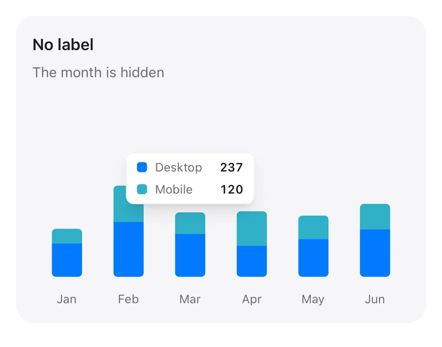
hideLabelbooleanfalseHides the tooltip's heading label.
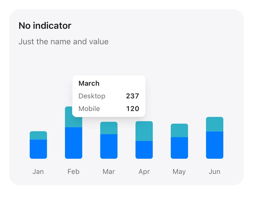
hideIndicatorbooleanfalseHides the color indicator next to each series.
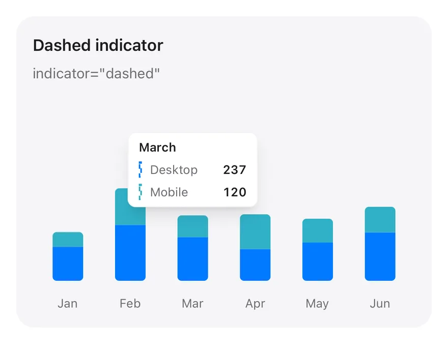
indicator"line" | "dot" | "dashed""dot"Shape of the series indicator: dot, line or dashed.
nameKeystring-Field used to look up each item's config entry instead of its name or data key.
labelKeystring-Field used to look up the heading label in the config.

Also accepts the props of React.ComponentProps<typeof RechartsPrimitive.Tooltip>, React.ComponentProps<"div">, RechartsPrimitive.DefaultTooltipContentProps< TooltipValueType, TooltipNameType >.

03

ChartLegendContent

A styled legend that lists series in config order with a swatch or icon.

PropTypeDefaultDescription
hideIconbooleanfalseShows a color swatch even when the config entry has an icon.
nameKeystring-Field used to look up each legend item's config entry instead of its data key.

Also accepts the props of React.ComponentProps<"div">, RechartsPrimitive.DefaultLegendContentProps.

Accessibility

  • With accessibilityLayer on the Recharts chart, the chart is focusable and arrow keys move between data points, showing the tooltip for each.
  • Charts are visual; provide a nearby summary or table when the exact values matter.
  • Do not rely on color alone to tell series apart; the legend and tooltip pair each color with its label.

Notes

  • Styling hooks: data-slot="chart" and a unique data-chart id on the container, which scopes the generated --color-* variables.
  • Config keys and color values containing unsafe characters are skipped when generating CSS.
  • The container restyles Recharts defaults, such as grid lines, axis ticks and the tooltip cursor, with the border, muted-foreground and muted colors.
  • Tooltip values that are numbers are formatted with toLocaleString().
iOS
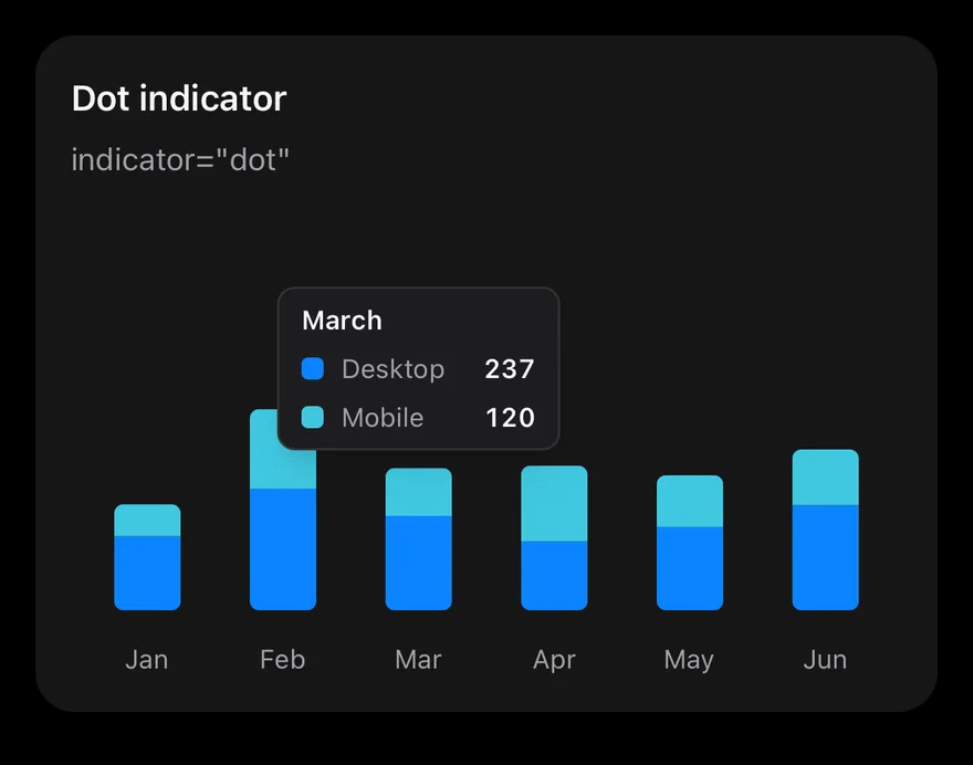
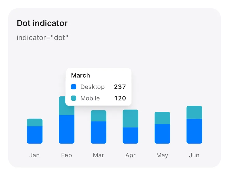
Chart (tooltip dot) on iOS in light modeChart (tooltip dot) on iOS in dark mode
import * as React from "react"
import { Card, CardContent, CardDescription, CardHeader, CardTitle } from "@/components/ui/card"
import { Bar, BarChart, type ChartConfig, ChartContainer, ChartTooltip, ChartTooltipContent, XAxis } from "@/components/ui/chart"

const monthData = [
  { month: "January", desktop: 186, mobile: 80 },
  { month: "February", desktop: 305, mobile: 200 },
  { month: "March", desktop: 237, mobile: 120 },
  { month: "April", desktop: 173, mobile: 190 },
  { month: "May", desktop: 209, mobile: 130 },
  { month: "June", desktop: 264, mobile: 140 },
]

const deviceConfig = {
  desktop: { label: "Desktop", color: "chart-1" },
  mobile: { label: "Mobile", color: "chart-2" },
import Charts
import EsuissUI
import SwiftUI

struct ChartTooltipDotExample: View {
  var body: some View {
    ChartStackedTooltip(title: "Dot indicator", description: "indicator=\"dot\"", defaultIndex: 2) { payload in
      ChartTooltipContent(payload, indicator: .dot)
    }
  }
}

let chartMonthData: [(month: String, desktop: Double, mobile: Double)] = [
  ("January", 186, 80),
  ("February", 305, 200),
  ("March", 237, 120),
import androidx.compose.foundation.layout.fillMaxWidth
import androidx.compose.foundation.layout.height
import androidx.compose.runtime.Composable
import androidx.compose.ui.Modifier
import androidx.compose.ui.unit.dp
import com.adamglin.phosphoricons.regular.Desktop
import com.esuiss.ui.components.BarChart
import com.esuiss.ui.components.Card
import com.esuiss.ui.components.CardContent
import com.esuiss.ui.components.CardHeader
import com.esuiss.ui.components.CardSize
import com.esuiss.ui.components.CardVariant
import com.esuiss.ui.components.ChartConfig
import com.esuiss.ui.components.ChartConfigItem
import com.esuiss.ui.components.ChartContainer
import com.esuiss.ui.components.ChartMargin

Charts are composed declaratively: a chart root such as LineChart, AreaChart, BarChart, ComposedChart, PieChart, RadialBarChart or RadarChart goes inside a ChartContainer, and series and axes such as Line, Area, Bar, XAxis, YAxis and CartesianGrid are added as children. These child components render nothing themselves; the root reads them and draws everything with react-native-svg.

Charts animate in when they first render: bars grow from the baseline, lines draw along their path, areas reveal from left to right, pie and radial sectors sweep open and radar shapes grow from the center. When the data changes, shapes animate from their previous values to the new ones.

Colors are theme tokens, not hex values. A series color such as chart-1, chart-2 or primary resolves to the current token color, so charts follow light and dark mode automatically.

Installation

$ pnpm dlx shadcn@latest add @esuiss-rn/chart

See Installation for the components.json setup. Or use the suiss/ui CLI:

$ pnpm dlx @esuiss/ui@latest add chart
$ pnpm dlx @esuiss/ui@latest add chart --platform swift
$ pnpm dlx @esuiss/ui@latest add chart --platform kotlin

The CLI also adds what it builds on: Icon, Text.

Manual

  1. Install the dependencies:
npx expo install cn phosphor-react-native react-native-svg
  1. Add the pieces it builds on: Icon, Text, and the primitives components/primitives/chart.tsx.

  2. Copy the source into components/ui/chart.tsx:

uniwind/components/ui/chart.tsx
import { cn } from "cn"
import type {
  Icon as PhosphorIcon,
  IconProps as PhosphorIconProps,
} from "phosphor-react-native"
import * as React from "react"
import { View } from "react-native"
import Svg, {
  Circle,
  ClipPath,
  Defs,
  LinearGradient,
  Path,
  Rect,
  Stop,
} from "react-native-svg"
  1. Update the import paths to match your project.
  1. Install the dependencies:
npx expo install cn phosphor-react-native react-native-svg
  1. Add the pieces it builds on: Icon, Text, and the primitives components/primitives/chart.tsx.

  2. Copy the source into components/ui/chart.tsx:

nativewind/components/ui/chart.tsx
import { cn } from "cn"
import type {
  Icon as PhosphorIcon,
  IconProps as PhosphorIconProps,
} from "phosphor-react-native"
import * as React from "react"
import { View } from "react-native"
import Svg, {
  Circle,
  ClipPath,
  Defs,
  LinearGradient,
  Path,
  Rect,
  Stop,
} from "react-native-svg"
  1. Update the import paths to match your project.
  1. Install the dependencies:
npx expo install phosphor-react-native react-native-svg
  1. Add the pieces it builds on: Icon, Text, and the primitives components/primitives/chart.tsx.

  2. Copy the source into components/ui/chart.tsx:

stylesheet/components/ui/chart.tsx
import type { Icon as PhosphorIcon } from "phosphor-react-native"
import * as React from "react"
import {
  type StyleProp,
  StyleSheet,
  type TextStyle,
  View,
  type ViewStyle,
} from "react-native"
import Svg, {
  Circle,
  ClipPath,
  Defs,
  LinearGradient,
  Path,
  Rect,
  1. Update the import paths to match your project.
  1. Target iOS 17 or later.

  2. Copy the theme files every view uses:

swift/Theme/Theme.swift
import CoreText
import SwiftUI
import UIKit

struct RGBA: Sendable {
  let red: CGFloat
  let green: CGFloat
  let blue: CGFloat
  let alpha: CGFloat

  init(_ hex: UInt32, _ alpha: CGFloat = 1) {
    red = CGFloat((hex >> 16) & 0xFF) / 255
    green = CGFloat((hex >> 8) & 0xFF) / 255
    blue = CGFloat(hex & 0xFF) / 255
    self.alpha = alpha
  }
swift/Theme/Tokens.swift
import SwiftUI

public enum EsuissColor {
  public static let background = Color.adaptive(light: .init(0xFFFFFF), dark: .init(0x000000))
  public static let foreground = Color.adaptive(light: .init(0x1D1D1F), dark: .init(0xF5F5F7))
  public static let card = Color.adaptive(light: .init(0xFFFFFF), dark: .init(0x1D1D1F))
  public static let cardForeground = Color.adaptive(light: .init(0x1D1D1F), dark: .init(0xF5F5F7))
  public static let popover = Color.adaptive(light: .init(0xFFFFFF), dark: .init(0x1D1D1F))
  public static let popoverForeground = Color.adaptive(light: .init(0x1D1D1F), dark: .init(0xF5F5F7))
  public static let primary = Color.adaptive(light: .init(0x0071E3), dark: .init(0x2997FF))
  public static let primaryForeground = Color.adaptive(light: .init(0xFFFFFF), dark: .init(0xFFFFFF))
  public static let secondary = Color.adaptive(light: .init(0x000000, 0.04), dark: .init(0xFFFFFF, 0.1))
  public static let secondaryForeground = Color.adaptive(light: .init(0x1D1D1F), dark: .init(0xF5F5F7))
  public static let muted = Color.adaptive(light: .init(0xF5F5F7), dark: .init(0x161617))
  public static let mutedForeground = Color.adaptive(light: .init(0x6E6E73), dark: .init(0xA1A1A6))
  public static let accent = Color.adaptive(light: .init(0x000000, 0.06), dark: .init(0xFFFFFF, 0.1))
  1. Copy the source and every file it uses:
swift/Components/Chart.swift
import Charts
import SwiftUI

public struct ChartConfig: ExpressibleByDictionaryLiteral, Sendable {
  public struct Item: Sendable {
    public var label: String?
    public var color: Color?
    public var icon: Image?

    public init(_ label: String? = nil, color: Color? = nil, icon: Image? = nil) {
      self.label = label
      self.color = color
      self.icon = icon
    }
  }
swift/Components/Haptics.swift
import SwiftUI

extension EnvironmentValues {
  @Entry public var hapticsEnabled = true
}

extension View {
  public func haptics(_ enabled: Bool) -> some View {
    environment(\.hapticsEnabled, enabled)
  }

  func hapticFeedback<Trigger: Equatable>(_ feedback: SensoryFeedback, trigger: Trigger) -> some View {
    modifier(HapticFeedbackModifier(feedback: feedback, trigger: trigger) { _, _ in true })
  }

  func hapticFeedback<Trigger: Equatable>(
swift/Components/Item.swift
import SwiftUI

public enum ItemVariant: CaseIterable, Sendable {
  case `default`, outline, muted
}

public enum ItemSize: CaseIterable, Sendable {
  case `default`, sm, xs

  var horizontalPadding: CGFloat {
    switch self {
    case .default: 16
    case .sm: 14
    case .xs: 12
    }
  }
swift/Components/Separator.swift
import SwiftUI

public struct Separator: View {
  let orientation: Axis

  public init(_ orientation: Axis = .horizontal) {
    self.orientation = orientation
  }

  public var body: some View {
    Rectangle()
      .fill(EsuissColor.border)
      .frame(width: orientation == .vertical ? 1 : nil, height: orientation == .horizontal ? 1 : nil)
      .frame(maxWidth: orientation == .horizontal ? .infinity : nil, maxHeight: orientation == .vertical ? .infinity : nil)
      .accessibilityHidden(true)
  }
swift/Components/TextVariant.swift
import SwiftUI

public enum TextVariant: CaseIterable, Sendable {
  case `default`, h1, h2, h3, h4, p, blockquote, code, lead, large, small, muted

  var style: TextStyle {
    switch self {
    case .h1: .xl3
    case .h2: .xl2
    case .h3: .xl
    case .h4, .lead, .large: .lg
    case .code, .small, .muted: .sm
    default: .base
    }
  }
  1. Add the files to your app target.
  1. Set minSdk to 24 or higher and add the dependencies:
build.gradle.kts
implementation(platform("androidx.compose:compose-bom:2026.09.00"))
implementation("androidx.compose.foundation:foundation")
implementation("androidx.compose.ui:ui")
  1. Copy the theme files every view uses:
kotlin/theme/Theme.kt
package com.esuiss.ui.theme

import android.content.res.AssetManager
import androidx.compose.foundation.isSystemInDarkTheme
import androidx.compose.runtime.Composable
import androidx.compose.runtime.CompositionLocalProvider
import androidx.compose.runtime.Immutable
import androidx.compose.runtime.staticCompositionLocalOf
import androidx.compose.ui.Modifier
import androidx.compose.ui.draw.dropShadow
import androidx.compose.ui.graphics.Color
import androidx.compose.ui.graphics.Shape
import androidx.compose.ui.graphics.shadow.Shadow as DropShadow
import androidx.compose.ui.platform.LocalContext
import androidx.compose.ui.text.TextStyle
import androidx.compose.ui.text.font.Font
kotlin/theme/Tokens.kt
package com.esuiss.ui.theme

import androidx.compose.runtime.Immutable
import androidx.compose.ui.graphics.Color
import androidx.compose.ui.text.font.FontWeight
import androidx.compose.ui.unit.dp

@Immutable
data class Colors(
    val background: Color,
    val foreground: Color,
    val card: Color,
    val cardForeground: Color,
    val popover: Color,
    val popoverForeground: Color,
    val primary: Color,
  1. Copy the source and every file it uses:
kotlin/components/Chart.kt
package com.esuiss.ui.components

import androidx.compose.animation.core.Animatable
import androidx.compose.animation.core.CubicBezierEasing
import androidx.compose.animation.core.Easing
import androidx.compose.animation.core.LinearEasing
import androidx.compose.animation.core.tween
import androidx.compose.foundation.Canvas
import androidx.compose.foundation.background
import androidx.compose.foundation.border
import androidx.compose.foundation.gestures.detectHorizontalDragGestures
import androidx.compose.foundation.gestures.detectTapGestures
import androidx.compose.foundation.layout.Arrangement
import androidx.compose.foundation.layout.Box
import androidx.compose.foundation.layout.BoxScope
import androidx.compose.foundation.layout.BoxWithConstraints
kotlin/components/Content.kt
package com.esuiss.ui.components

import androidx.compose.runtime.compositionLocalOf
import androidx.compose.ui.graphics.Color
import androidx.compose.ui.text.TextStyle
import androidx.compose.ui.unit.Dp
import androidx.compose.ui.unit.dp

val LocalContentStyle = compositionLocalOf { TextStyle.Default }

val LocalContentColor = compositionLocalOf { Color.Unspecified }

val LocalIconSize = compositionLocalOf { 20.dp }
kotlin/components/FormSupport.kt
package com.esuiss.ui.components

import android.provider.Settings
import androidx.compose.animation.core.CubicBezierEasing
import androidx.compose.foundation.background
import androidx.compose.foundation.border
import androidx.compose.foundation.gestures.Orientation
import androidx.compose.foundation.text.selection.TextSelectionColors
import androidx.compose.runtime.Composable
import androidx.compose.runtime.mutableStateOf
import androidx.compose.runtime.remember
import androidx.compose.ui.Modifier
import androidx.compose.ui.draw.alpha
import androidx.compose.ui.draw.clip
import androidx.compose.ui.draw.drawWithContent
import androidx.compose.ui.geometry.Offset
kotlin/components/Haptics.kt
package com.esuiss.ui.components

import androidx.compose.runtime.Composable
import androidx.compose.runtime.CompositionLocalProvider
import androidx.compose.runtime.remember
import androidx.compose.runtime.staticCompositionLocalOf
import androidx.compose.ui.hapticfeedback.HapticFeedback
import androidx.compose.ui.hapticfeedback.HapticFeedbackType
import androidx.compose.ui.platform.LocalHapticFeedback

val LocalHapticsEnabled = staticCompositionLocalOf { true }

@Composable
fun ProvideHaptics(enabled: Boolean, content: @Composable () -> Unit) {
    CompositionLocalProvider(LocalHapticsEnabled provides enabled, content = content)
}
kotlin/components/Icon.kt
package com.esuiss.ui.components

import androidx.compose.foundation.Image
import androidx.compose.foundation.layout.size
import androidx.compose.runtime.Composable
import androidx.compose.ui.Modifier
import androidx.compose.ui.graphics.Color
import androidx.compose.ui.graphics.ColorFilter
import androidx.compose.ui.graphics.takeOrElse
import androidx.compose.ui.graphics.vector.ImageVector
import androidx.compose.ui.unit.Dp
import com.esuiss.ui.theme.EsuissTheme

@Composable
fun Icon(
    imageVector: ImageVector,
  1. Update the com.esuiss.ui package names to match your project.

Usage

import { ChartPalette, ChartContainer, LineChart, AreaChart, BarChart, ComposedChart, PieChart, RadialBarChart, RadarChart, ChartTooltipContent, ChartLegendContent } from "@/components/ui/chart"
<StackedTooltipChart
  title="Dot indicator"
  description='indicator="dot"'
  defaultIndex={2}
  content={<ChartTooltipContent indicator="dot" />}
/>

Describe each series in a ChartConfig object with a label, a token color and an optional icon, and pass it to ChartContainer as config. The container is full width with a 16:9 aspect ratio unless you give it an h-, size- or aspect- class.

Add ChartTooltip with content={<ChartTooltipContent />} to make the chart respond to touch: touching or dragging selects the nearest data point, draws a cursor and shows the tooltip, with a selection haptic. ChartTooltipContent supports indicator (dot, line or dashed), hideLabel, hideIndicator, labelFormatter, formatter and nameKey. Use defaultIndex on ChartTooltip to start with a point selected, or onActiveIndexChange on the chart to react to selection.

Line, Area, Bar, Pie, RadialBar and Radar take isAnimationActive, animationDuration and animationEasing. Bars default to 400 ms and curves, sectors and radar shapes to 1500 ms, with ease easing. Set isAnimationActive={false} to draw a series in its final state, for example when its data changes on every interaction.

Add ChartLegend with content={<ChartLegendContent />} for a legend in config order. useChart() returns the config inside a container, and ChartPalette resolves token colors for custom drawing.

Examples

Tooltip line

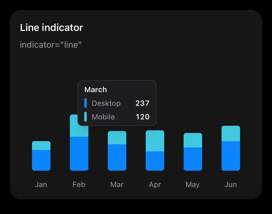
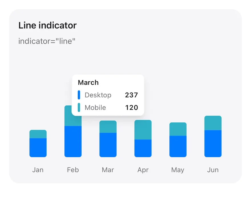
Tooltip with a line indicator.
iOS
Chart (tooltip line) on iOS in light modeChart (tooltip line) on iOS in dark mode
import * as React from "react"
import { Card, CardContent, CardDescription, CardHeader, CardTitle } from "@/components/ui/card"
import { Bar, BarChart, type ChartConfig, ChartContainer, ChartTooltip, ChartTooltipContent, XAxis } from "@/components/ui/chart"

const monthData = [
  { month: "January", desktop: 186, mobile: 80 },
  { month: "February", desktop: 305, mobile: 200 },
  { month: "March", desktop: 237, mobile: 120 },
  { month: "April", desktop: 173, mobile: 190 },
  { month: "May", desktop: 209, mobile: 130 },
  { month: "June", desktop: 264, mobile: 140 },
]

const deviceConfig = {
  desktop: { label: "Desktop", color: "chart-1" },
  mobile: { label: "Mobile", color: "chart-2" },
import Charts
import EsuissUI
import SwiftUI

struct ChartTooltipLineExample: View {
  var body: some View {
    ChartStackedTooltip(title: "Line indicator", description: "indicator=\"line\"", defaultIndex: 2) { payload in
      ChartTooltipContent(payload, indicator: .line)
    }
  }
}

let chartMonthData: [(month: String, desktop: Double, mobile: Double)] = [
  ("January", 186, 80),
  ("February", 305, 200),
  ("March", 237, 120),
import androidx.compose.foundation.layout.fillMaxWidth
import androidx.compose.foundation.layout.height
import androidx.compose.runtime.Composable
import androidx.compose.ui.Modifier
import androidx.compose.ui.unit.dp
import com.adamglin.phosphoricons.regular.Desktop
import com.esuiss.ui.components.BarChart
import com.esuiss.ui.components.Card
import com.esuiss.ui.components.CardContent
import com.esuiss.ui.components.CardHeader
import com.esuiss.ui.components.CardSize
import com.esuiss.ui.components.CardVariant
import com.esuiss.ui.components.ChartConfig
import com.esuiss.ui.components.ChartConfigItem
import com.esuiss.ui.components.ChartContainer
import com.esuiss.ui.components.ChartMargin

Tooltip dashed

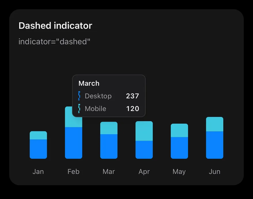
Tooltip with a dashed indicator.
iOS
Chart (tooltip dashed) on iOS in light modeChart (tooltip dashed) on iOS in dark mode
import * as React from "react"
import { Card, CardContent, CardDescription, CardHeader, CardTitle } from "@/components/ui/card"
import { Bar, BarChart, type ChartConfig, ChartContainer, ChartTooltip, ChartTooltipContent, XAxis } from "@/components/ui/chart"

const monthData = [
  { month: "January", desktop: 186, mobile: 80 },
  { month: "February", desktop: 305, mobile: 200 },
  { month: "March", desktop: 237, mobile: 120 },
  { month: "April", desktop: 173, mobile: 190 },
  { month: "May", desktop: 209, mobile: 130 },
  { month: "June", desktop: 264, mobile: 140 },
]

const deviceConfig = {
  desktop: { label: "Desktop", color: "chart-1" },
  mobile: { label: "Mobile", color: "chart-2" },
import Charts
import EsuissUI
import SwiftUI

struct ChartTooltipDashedExample: View {
  var body: some View {
    ChartStackedTooltip(title: "Dashed indicator", description: "indicator=\"dashed\"", defaultIndex: 2) { payload in
      ChartTooltipContent(payload, indicator: .dashed)
    }
  }
}

let chartMonthData: [(month: String, desktop: Double, mobile: Double)] = [
  ("January", 186, 80),
  ("February", 305, 200),
  ("March", 237, 120),
import androidx.compose.foundation.layout.fillMaxWidth
import androidx.compose.foundation.layout.height
import androidx.compose.runtime.Composable
import androidx.compose.ui.Modifier
import androidx.compose.ui.unit.dp
import com.adamglin.phosphoricons.regular.Desktop
import com.esuiss.ui.components.BarChart
import com.esuiss.ui.components.Card
import com.esuiss.ui.components.CardContent
import com.esuiss.ui.components.CardHeader
import com.esuiss.ui.components.CardSize
import com.esuiss.ui.components.CardVariant
import com.esuiss.ui.components.ChartConfig
import com.esuiss.ui.components.ChartConfigItem
import com.esuiss.ui.components.ChartContainer
import com.esuiss.ui.components.ChartMargin

Tooltip no indicator

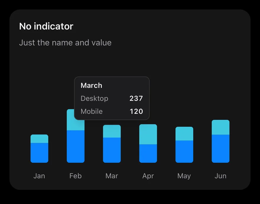
Tooltip with only names and values.
iOS
Chart (tooltip no indicator) on iOS in light modeChart (tooltip no indicator) on iOS in dark mode
import * as React from "react"
import { Card, CardContent, CardDescription, CardHeader, CardTitle } from "@/components/ui/card"
import { Bar, BarChart, type ChartConfig, ChartContainer, ChartTooltip, ChartTooltipContent, XAxis } from "@/components/ui/chart"

const monthData = [
  { month: "January", desktop: 186, mobile: 80 },
  { month: "February", desktop: 305, mobile: 200 },
  { month: "March", desktop: 237, mobile: 120 },
  { month: "April", desktop: 173, mobile: 190 },
  { month: "May", desktop: 209, mobile: 130 },
  { month: "June", desktop: 264, mobile: 140 },
]

const deviceConfig = {
  desktop: { label: "Desktop", color: "chart-1" },
  mobile: { label: "Mobile", color: "chart-2" },
import Charts
import EsuissUI
import SwiftUI

struct ChartTooltipNoIndicatorExample: View {
  var body: some View {
    ChartStackedTooltip(title: "No indicator", description: "Just the name and value", defaultIndex: 2) { payload in
      ChartTooltipContent(payload, hideIndicator: true)
    }
  }
}

let chartMonthData: [(month: String, desktop: Double, mobile: Double)] = [
  ("January", 186, 80),
  ("February", 305, 200),
  ("March", 237, 120),
import androidx.compose.foundation.layout.fillMaxWidth
import androidx.compose.foundation.layout.height
import androidx.compose.runtime.Composable
import androidx.compose.ui.Modifier
import androidx.compose.ui.unit.dp
import com.adamglin.phosphoricons.regular.Desktop
import com.esuiss.ui.components.BarChart
import com.esuiss.ui.components.Card
import com.esuiss.ui.components.CardContent
import com.esuiss.ui.components.CardHeader
import com.esuiss.ui.components.CardSize
import com.esuiss.ui.components.CardVariant
import com.esuiss.ui.components.ChartConfig
import com.esuiss.ui.components.ChartConfigItem
import com.esuiss.ui.components.ChartContainer
import com.esuiss.ui.components.ChartMargin

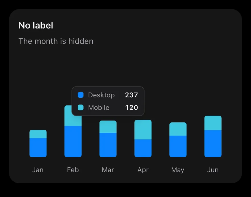
Tooltip no label

Tooltip with the category label hidden.
iOS
Chart (tooltip no label) on iOS in light modeChart (tooltip no label) on iOS in dark mode
import * as React from "react"
import { Card, CardContent, CardDescription, CardHeader, CardTitle } from "@/components/ui/card"
import { Bar, BarChart, type ChartConfig, ChartContainer, ChartTooltip, ChartTooltipContent, XAxis } from "@/components/ui/chart"

const monthData = [
  { month: "January", desktop: 186, mobile: 80 },
  { month: "February", desktop: 305, mobile: 200 },
  { month: "March", desktop: 237, mobile: 120 },
  { month: "April", desktop: 173, mobile: 190 },
  { month: "May", desktop: 209, mobile: 130 },
  { month: "June", desktop: 264, mobile: 140 },
]

const deviceConfig = {
  desktop: { label: "Desktop", color: "chart-1" },
  mobile: { label: "Mobile", color: "chart-2" },
import Charts
import EsuissUI
import SwiftUI

struct ChartTooltipNoLabelExample: View {
  var body: some View {
    ChartStackedTooltip(title: "No label", description: "The month is hidden", defaultIndex: 2) { payload in
      ChartTooltipContent(payload, hideLabel: true)
    }
  }
}

let chartMonthData: [(month: String, desktop: Double, mobile: Double)] = [
  ("January", 186, 80),
  ("February", 305, 200),
  ("March", 237, 120),
import androidx.compose.foundation.layout.fillMaxWidth
import androidx.compose.foundation.layout.height
import androidx.compose.runtime.Composable
import androidx.compose.ui.Modifier
import androidx.compose.ui.unit.dp
import com.adamglin.phosphoricons.regular.Desktop
import com.esuiss.ui.components.BarChart
import com.esuiss.ui.components.Card
import com.esuiss.ui.components.CardContent
import com.esuiss.ui.components.CardHeader
import com.esuiss.ui.components.CardSize
import com.esuiss.ui.components.CardVariant
import com.esuiss.ui.components.ChartConfig
import com.esuiss.ui.components.ChartConfigItem
import com.esuiss.ui.components.ChartContainer
import com.esuiss.ui.components.ChartMargin

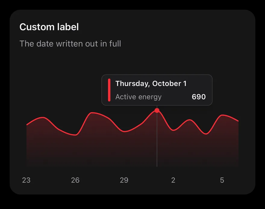
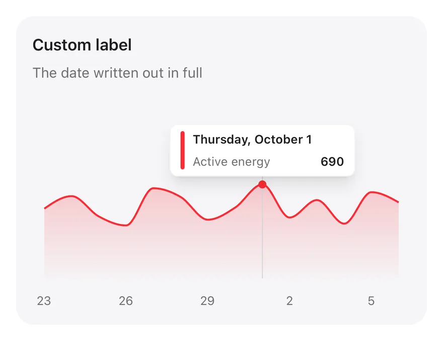
Tooltip label formatter

A formatted date as the tooltip label.
iOS
Chart (tooltip label formatter) on iOS in light modeChart (tooltip label formatter) on iOS in dark mode
import { Card, CardContent, CardDescription, CardHeader, CardTitle } from "@/components/ui/card"
import { Area, AreaChart, type ChartConfig, ChartContainer, ChartTooltip, ChartTooltipContent, XAxis } from "@/components/ui/chart"

const MONTHS = [
  "January",
  "February",
  "March",
  "April",
  "May",
  "June",
  "July",
  "August",
  "September",
  "October",
  "November",
  "December",
import Charts
import EsuissUI
import SwiftUI

let chartEnglish = Locale(identifier: "en_US")

let chartEnergyValues: [Double] = [512, 604, 455, 389, 662, 598, 431, 520, 690, 447, 575, 402, 633, 558]

let chartEnergyConfig: ChartConfig = [
  "energy": .init("Active energy", color: Palette.red500),
]

func chartDate(year: Int, month: Int, day: Int) -> Date {
  let calendar = Foundation.Calendar(identifier: .gregorian)
  let first = calendar.date(from: DateComponents(year: year, month: month, day: 1)) ?? .now
  return calendar.date(byAdding: .day, value: day - 1, to: first) ?? first
import androidx.compose.foundation.layout.fillMaxWidth
import androidx.compose.foundation.layout.height
import androidx.compose.runtime.Composable
import androidx.compose.runtime.remember
import androidx.compose.ui.Modifier
import androidx.compose.ui.text.font.FontWeight
import androidx.compose.ui.unit.dp
import com.esuiss.ui.components.AreaChart
import com.esuiss.ui.components.Card
import com.esuiss.ui.components.CardContent
import com.esuiss.ui.components.CardHeader
import com.esuiss.ui.components.CardSize
import com.esuiss.ui.components.CardVariant
import com.esuiss.ui.components.ChartConfig
import com.esuiss.ui.components.ChartConfigItem
import com.esuiss.ui.components.ChartContainer

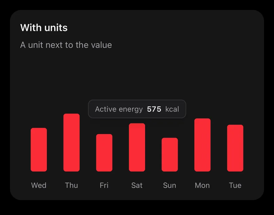
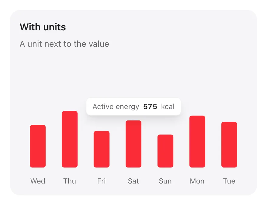
Tooltip formatter

Custom value formatting with formatter.
iOS
Chart (tooltip formatter) on iOS in light modeChart (tooltip formatter) on iOS in dark mode
import { View } from "react-native"
import { Card, CardContent, CardDescription, CardHeader, CardTitle } from "@/components/ui/card"
import { Bar, BarChart, type ChartConfig, ChartContainer, ChartTooltip, ChartTooltipContent, XAxis } from "@/components/ui/chart"
import { Text } from "@/components/ui/text"

const WEEKDAYS = [
  "Sunday",
  "Monday",
  "Tuesday",
  "Wednesday",
  "Thursday",
  "Friday",
  "Saturday",
]

function formatNumber(value: number, digits = 0) {
import Charts
import EsuissUI
import SwiftUI

let chartEnglish = Locale(identifier: "en_US")

let chartEnergyValues: [Double] = [512, 604, 455, 389, 662, 598, 431, 520, 690, 447, 575, 402, 633, 558]

let chartEnergyConfig: ChartConfig = [
  "energy": .init("Active energy", color: Palette.red500),
]

func chartDate(year: Int, month: Int, day: Int) -> Date {
  let calendar = Foundation.Calendar(identifier: .gregorian)
  let first = calendar.date(from: DateComponents(year: year, month: month, day: 1)) ?? .now
  return calendar.date(byAdding: .day, value: day - 1, to: first) ?? first
import androidx.compose.foundation.layout.Arrangement
import androidx.compose.foundation.layout.Row
import androidx.compose.foundation.layout.fillMaxWidth
import androidx.compose.foundation.layout.height
import androidx.compose.runtime.Composable
import androidx.compose.runtime.remember
import androidx.compose.ui.Modifier
import androidx.compose.ui.text.font.FontWeight
import androidx.compose.ui.unit.dp
import com.esuiss.ui.components.BarChart
import com.esuiss.ui.components.Card
import com.esuiss.ui.components.CardContent
import com.esuiss.ui.components.CardHeader
import com.esuiss.ui.components.CardSize
import com.esuiss.ui.components.CardVariant
import com.esuiss.ui.components.ChartConfig

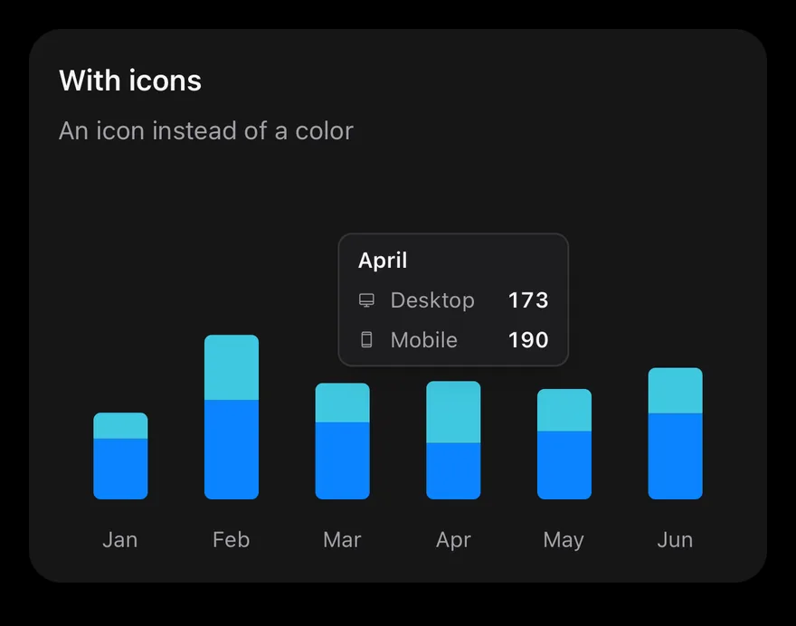
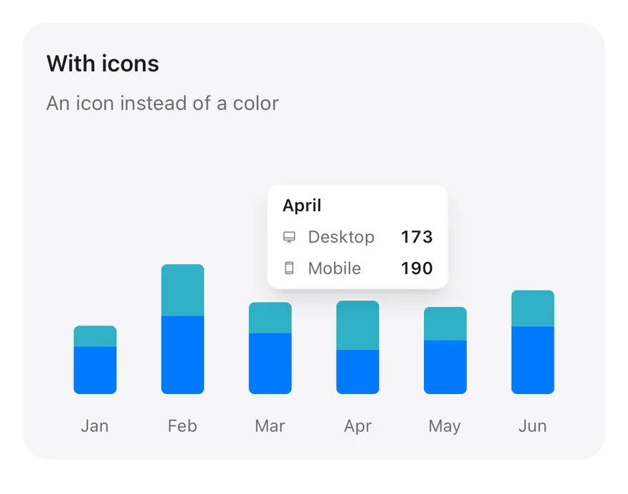
Tooltip icons

Config icons in place of color indicators.
iOS
Chart (tooltip icons) on iOS in light modeChart (tooltip icons) on iOS in dark mode
import { DesktopIcon, DeviceMobileIcon } from "phosphor-react-native"
import { Card, CardContent, CardDescription, CardHeader, CardTitle } from "@/components/ui/card"
import { Bar, BarChart, type ChartConfig, ChartContainer, ChartTooltip, ChartTooltipContent, XAxis } from "@/components/ui/chart"

const monthData = [
  { month: "January", desktop: 186, mobile: 80 },
  { month: "February", desktop: 305, mobile: 200 },
  { month: "March", desktop: 237, mobile: 120 },
  { month: "April", desktop: 173, mobile: 190 },
  { month: "May", desktop: 209, mobile: 130 },
  { month: "June", desktop: 264, mobile: 140 },
]

const iconConfig = {
  desktop: { label: "Desktop", color: "chart-1", icon: DesktopIcon },
  mobile: { label: "Mobile", color: "chart-2", icon: DeviceMobileIcon },
import Charts
import EsuissUI
import PhosphorSwift
import SwiftUI

struct ChartTooltipIconsExample: View {
  var body: some View {
    ChartStackedTooltip(
      title: "With icons",
      description: "An icon instead of a color",
      config: chartDeviceIcons,
      defaultIndex: 3
    ) { payload in
      ChartTooltipContent(payload)
    }
  }
import androidx.compose.foundation.layout.fillMaxWidth
import androidx.compose.foundation.layout.height
import androidx.compose.runtime.Composable
import androidx.compose.ui.Modifier
import androidx.compose.ui.unit.dp
import com.adamglin.PhosphorIcons
import com.adamglin.phosphoricons.Regular
import com.adamglin.phosphoricons.regular.Desktop
import com.adamglin.phosphoricons.regular.DeviceMobile
import com.esuiss.ui.components.BarChart
import com.esuiss.ui.components.Card
import com.esuiss.ui.components.CardContent
import com.esuiss.ui.components.CardHeader
import com.esuiss.ui.components.CardSize
import com.esuiss.ui.components.CardVariant
import com.esuiss.ui.components.ChartConfig

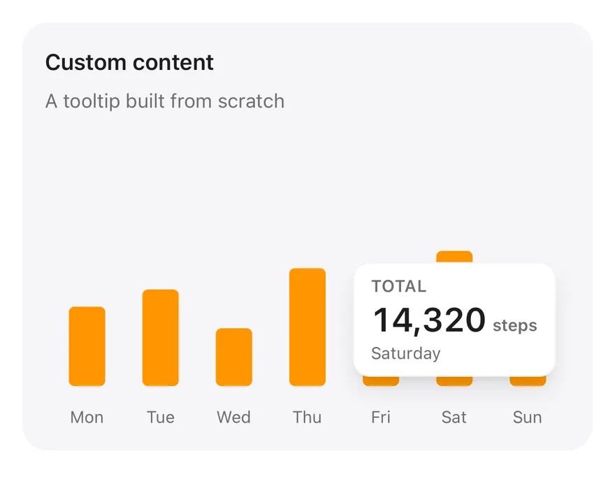
Tooltip custom

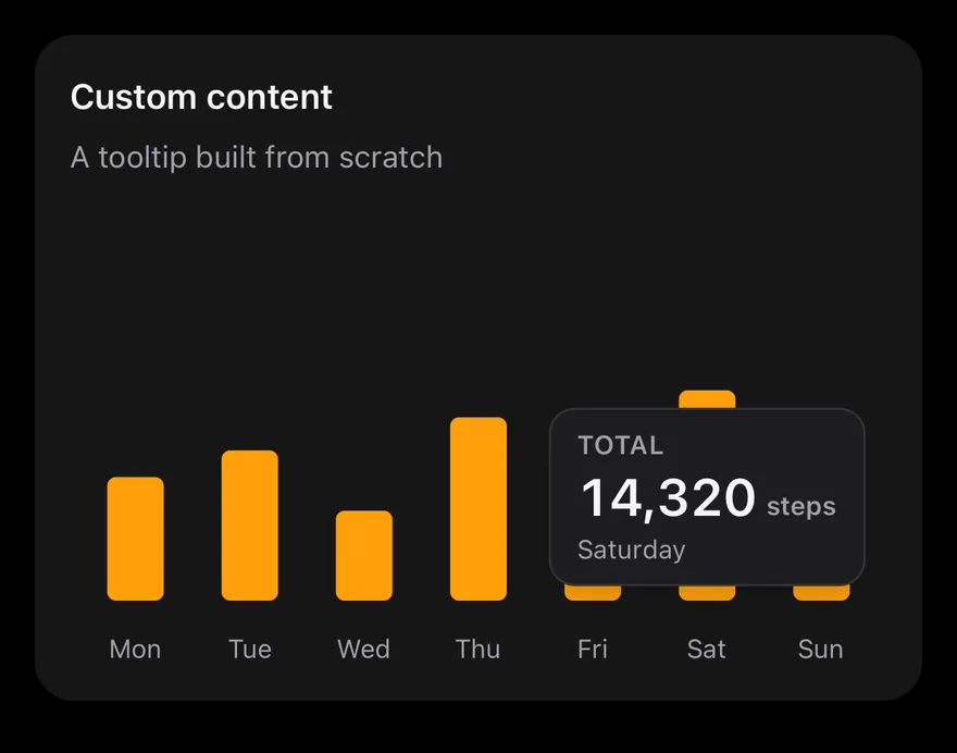
A fully custom tooltip rendered from a function.
iOS
Chart (tooltip custom) on iOS in light modeChart (tooltip custom) on iOS in dark mode
import { View } from "react-native"
import { Card, CardContent, CardDescription, CardHeader, CardTitle } from "@/components/ui/card"
import { Bar, BarChart, type ChartConfig, ChartContainer, ChartTooltip, XAxis } from "@/components/ui/chart"
import { Text } from "@/components/ui/text"

function formatNumber(value: number, digits = 0) {
  try {
    return new Intl.NumberFormat("en-US", {
      minimumFractionDigits: digits,
      maximumFractionDigits: digits,
    }).format(value)
  } catch {
    const [whole = "0", fraction] = value.toFixed(digits).split(".")
    const grouped = whole.replace(/\B(?=(\d{3})+(?!\d))/g, ",")
    return fraction ? `${grouped}.${fraction}` : grouped
  }
import Charts
import EsuissUI
import SwiftUI

let chartEnglish = Locale(identifier: "en_US")

struct ChartCustomDemo: View {
  let steps: [(day: String, steps: Double)] = [
    ("Monday", 8412),
    ("Tuesday", 10230),
    ("Wednesday", 6120),
    ("Thursday", 12480),
    ("Friday", 9050),
    ("Saturday", 14320),
    ("Sunday", 4870),
  ]
import androidx.compose.foundation.background
import androidx.compose.foundation.border
import androidx.compose.foundation.layout.Arrangement
import androidx.compose.foundation.layout.Column
import androidx.compose.foundation.layout.Row
import androidx.compose.foundation.layout.fillMaxWidth
import androidx.compose.foundation.layout.height
import androidx.compose.foundation.layout.padding
import androidx.compose.foundation.layout.widthIn
import androidx.compose.foundation.shape.RoundedCornerShape
import androidx.compose.runtime.Composable
import androidx.compose.ui.Modifier
import androidx.compose.ui.text.font.FontWeight
import androidx.compose.ui.unit.dp
import com.esuiss.ui.components.BarChart
import com.esuiss.ui.components.Card

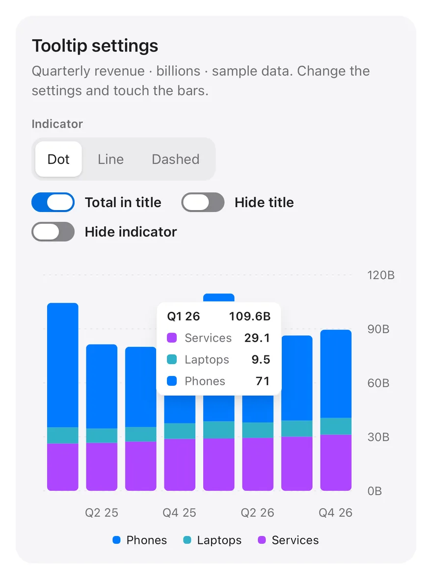
Tooltip interactive

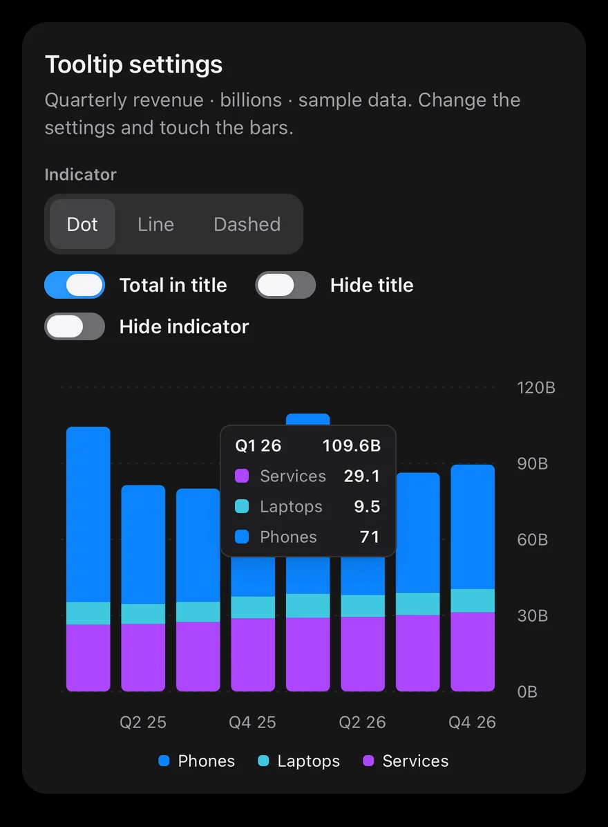
Settings that change the tooltip on a stacked bar chart with a legend.
iOS
Chart (tooltip interactive) on iOS in light modeChart (tooltip interactive) on iOS in dark mode
import * as React from "react"
import { View } from "react-native"
import { Card, CardContent, CardHeader } from "@/components/ui/card"
import { Bar, BarChart, CartesianGrid, type ChartConfig, ChartContainer, ChartLegend, ChartLegendContent, ChartTooltip, ChartTooltipContent, XAxis, YAxis } from "@/components/ui/chart"
import { Label } from "@/components/ui/label"
import { Switch } from "@/components/ui/switch"
import { Text } from "@/components/ui/text"
import { ToggleGroup, ToggleGroupItem } from "@/components/ui/toggle-group"

function formatTotal(value: number) {
  try {
    return new Intl.NumberFormat(undefined, {
      maximumFractionDigits: 1,
    }).format(value)
  } catch {
    return String(Math.round(value * 10) / 10)
import Charts
import EsuissUI
import SwiftUI

struct ChartInteractiveDemo: View {
  let quarters: [(quarter: String, phones: Double, laptops: Double, services: Double)] = [
    ("Q1 25", 69.1, 9, 26.3),
    ("Q2 25", 46.8, 8, 26.6),
    ("Q3 25", 44.6, 8, 27.4),
    ("Q4 25", 46.2, 8.7, 28.8),
    ("Q1 26", 71, 9.5, 29.1),
    ("Q2 26", 49.4, 8.6, 29.4),
    ("Q3 26", 47.3, 8.9, 30.1),
    ("Q4 26", 49, 9.3, 31.2),
  ]
  let config: ChartConfig = [
import androidx.compose.foundation.clickable
import androidx.compose.foundation.layout.Arrangement
import androidx.compose.foundation.layout.Column
import androidx.compose.foundation.layout.FlowRow
import androidx.compose.foundation.layout.Row
import androidx.compose.foundation.layout.fillMaxWidth
import androidx.compose.foundation.layout.height
import androidx.compose.foundation.layout.padding
import androidx.compose.runtime.Composable
import androidx.compose.runtime.getValue
import androidx.compose.runtime.mutableStateOf
import androidx.compose.runtime.saveable.rememberSaveable
import androidx.compose.runtime.setValue
import androidx.compose.ui.Alignment
import androidx.compose.ui.Modifier
import androidx.compose.ui.semantics.contentDescription

API Reference

01

ChartPalette

Resolves token colors to concrete values.

PropTypeDefaultDescription
colorsreadonly ChartColor[]RequiredToken colors to resolve.
children(palette: Partial<Record<ChartColor, string>>) => React.ReactNodeRequiredFunction that receives the resolved colors.
02

ChartContainer

Sizes the chart and provides the config.

PropTypeDefaultDescription
configChartConfigRequiredSeries labels, token colors and icons keyed by data key.

Also accepts the props of ChartPrimitive.ContainerProps.

03

LineChart

Cartesian chart for Line series.

Also accepts the props of CartesianChartProps.

04

AreaChart

Cartesian chart for Area series, with optional stacking.

Also accepts the props of CartesianChartProps, ChartPrimitive.RootProps.

05

BarChart

Cartesian chart for Bar series, vertical or horizontal.

Also accepts the props of CartesianChartProps, ChartPrimitive.RootProps.

06

ComposedChart

Cartesian chart that mixes lines, areas and bars.

Also accepts the props of CartesianChartProps.

07

PieChart

Pie and donut charts built from Pie.

Also accepts the props of ChartRootProps, ChartPrimitive.RootProps.

08

RadialBarChart

Circular bars built from RadialBar.

Also accepts the props of ChartRootProps, ChartPrimitive.RootProps.

09

RadarChart

Polar chart built from Radar and PolarGrid.

Also accepts the props of ChartRootProps, ChartPrimitive.RootProps.

10

ChartTooltipContent

Default tooltip card.

PropTypeDefaultDescription
classNamestring-Classes for the tooltip card.
indicator"line" | "dot" | "dashed""dot"dot, line or dashed. Defaults to dot.
hideLabelbooleanfalseHides the category label.
hideIndicatorbooleanfalseHides the color indicator.
nameKeystring-Data key used to look up series names in the config.
labelFormatter( label: React.ReactNode, payload: ChartPrimitive.TooltipItem[] ) => React.ReactNode-Formats the tooltip label.
formatter( value: ChartPrimitive.ChartValue, name: string, item: ChartPrimitive.TooltipItem, index: number, payload: ChartPrimitive.ChartDatum ) => React.ReactNode-Renders each row yourself.
11

ChartLegendContent

Default legend with swatches or icons.

PropTypeDefaultDescription
classNamestring-Classes for the legend row.
nameKeystring-Data key used to look up legend names in the config.

Accessibility

  • The chart is one accessible element labelled with its series names and data range; pass accessibilityLabel to ChartContainer to override the names.
  • With a tooltip it has the adjustable role: VoiceOver and TalkBack swipe actions step through data points, and the selected values are announced as the value text.
  • Without a tooltip it has the image role.
  • With Reduce Motion on, charts skip the enter and update animations and draw in their final state.

Notes

  • Series colors accept chart-1 to chart-5, theme colors such as primary, destructive and foreground, and palette colors such as green-500 and red-500; grid and cursor lines use border.
  • Value labels from LabelList and pie label appear once a series finishes animating.
  • Light and dark follow the system appearance.
NextCheckboxPreviousCarousel

On this page

  1. 01Installation
    • CLI
    • Manual
  2. 02Usage
  3. 03Examples
    • Multiple series
    • Stacked
    • Line series
    • Area series
    • Donut
  4. 04API Reference
    • ChartContainer
    • ChartTooltipContent
    • ChartLegendContent
  5. 05Accessibility
  6. 06Notes
  7. 07Installation
    • Manual
  8. 08Usage
  9. 09Examples
    • Tooltip line
    • Tooltip dashed
    • Tooltip no indicator
    • Tooltip no label
    • Tooltip label formatter
    • Tooltip formatter
    • Tooltip icons
    • Tooltip custom
    • Tooltip interactive
  10. 10API Reference
    • ChartPalette
    • ChartContainer
    • LineChart
    • AreaChart
    • BarChart
    • ComposedChart
    • PieChart
    • RadialBarChart
    • RadarChart
    • ChartTooltipContent
    • ChartLegendContent
  11. 11Accessibility
  12. 12Notes