suiss/ui · Component
Dropdown Menu
A menu of actions or options that opens from a button.
Dropdown Menu is an open-source component from suiss/ui for React, React Native, SwiftUI and Jetpack Compose. The @esuiss/ui CLI copies its source into your project, so you own the code.
Dropdown menu wraps the menu primitive of the chosen base. The DropdownMenu root manages the open state and DropdownMenuTrigger opens it. DropdownMenuContent renders the menu in a portal, positioned below the trigger. Inside it, use DropdownMenuItem for actions, DropdownMenuCheckboxItem for toggles, and DropdownMenuRadioGroup with DropdownMenuRadioItem for a single choice. Organize items with DropdownMenuGroup, DropdownMenuLabel and DropdownMenuSeparator, and nest a submenu with DropdownMenuSub, DropdownMenuSubTrigger and DropdownMenuSubContent. DropdownMenuShortcut displays a keyboard shortcut at the end of an item.
Use a dropdown menu for actions and settings behind a visible button. For actions on an object opened with a right-click, use a context menu; to choose a value for a form field, use a select.
Installation
CLI
Works in any project with a components.json. See Installation for the one-line registry setup. Or use the suiss/ui CLI:
Manual
- Install the dependencies and add the
cnhelper:
-
Add the pieces it builds on:
use-platform. -
Copy the source into
components/ui/dropdown-menu.tsx:
- Update the import paths to match your project.
Usage
The menu is uncontrolled by default; set defaultOpen to start open, or control it with open and onOpenChange. Render the trigger as another component, such as a Button, with the render prop.
The menu is uncontrolled by default; set defaultOpen to start open, or control it with open and onOpenChange. Set asChild on DropdownMenuTrigger to render your own Button as the trigger.
The menu is uncontrolled by default; set defaultOpen to start open, or control it with isOpen and onOpenChange. The Button placed first inside DropdownMenu opens it.
Selecting a regular item closes the menu.
Checkbox and radio items keep the menu open so several choices can be made in a row.
Checkbox items are uncontrolled with defaultChecked, or controlled with checked and onCheckedChange. Radio groups take defaultValue, or value and onValueChange, and each radio item needs a value.
Checkbox items are uncontrolled with defaultSelected, or controlled with isSelected and onChange. Radio groups take defaultValue, or value and onChange, and each radio item needs a value.
Set inset on items and labels without an icon to align their text with items that have one, and set variant="destructive" on items that delete or remove something.
Examples
Checkboxes
Controlled checkbox items that toggle interface elements, including a disabled item.
Radio group
A controlled radio group for choosing a single panel position.
Inset
A labelled group of inset items without icons, each with a keyboard shortcut.
API Reference
DropdownMenu
The root that manages the menu's open state.
Also accepts the props of the primitive part it wraps.
DropdownMenuPortal
Renders its children into a portal outside the current DOM hierarchy.
Also accepts the props of the primitive part it wraps.
DropdownMenuTrigger
The button that opens the menu.
Also accepts the props of the primitive part it wraps.
DropdownMenuContent
The menu panel, rendered in a portal and positioned relative to the trigger.
Also accepts the props of the primitive parts it wraps.
DropdownMenuGroup
Groups related items.
Also accepts the props of the primitive part it wraps.
DropdownMenuLabel
A heading for a group of items.
| Prop | Type | Default | Description |
|---|---|---|---|
inset | boolean | - | Adds leading padding so the label aligns with items that have an icon or indicator. |
Also accepts the props of the primitive part it wraps.
DropdownMenuItem
An action in the menu.
| Prop | Type | Default | Description |
|---|---|---|---|
inset | boolean | - | Adds leading padding so the item aligns with items that have an icon or indicator. |
variant | "default" | "destructive" | "default" | destructive colors the item and its icon with the destructive color. |
Also accepts the props of the primitive part it wraps.
DropdownMenuSub
The root of a nested submenu.
Also accepts the props of the primitive part it wraps.
DropdownMenuSubTrigger
The item that opens a submenu, shown with a trailing caret.
| Prop | Type | Default | Description |
|---|---|---|---|
inset | boolean | - | Adds leading padding so the trigger aligns with items that have an icon or indicator. |
Also accepts the props of the primitive part it wraps.
DropdownMenuSubContent
The panel of a submenu, opened beside its trigger.
Also accepts the props of React.ComponentProps<typeof DropdownMenuContent>.
DropdownMenuCheckboxItem
An item that toggles a setting on or off and shows a check mark when on.
| Prop | Type | Default | Description |
|---|---|---|---|
inset | boolean | - | Adds leading padding so the item aligns with other inset items. |
Also accepts the props of the primitive part it wraps.
DropdownMenuRadioGroup
Groups radio items so that only one can be selected.
Also accepts the props of the primitive part it wraps.
DropdownMenuRadioItem
An item in a radio group that shows a check mark when selected.
| Prop | Type | Default | Description |
|---|---|---|---|
inset | boolean | - | Adds leading padding so the item aligns with other inset items. |
Also accepts the props of the primitive part it wraps.
DropdownMenuSeparator
A divider between groups of items.
Also accepts the props of the primitive part it wraps.
DropdownMenuShortcut
Displays a keyboard shortcut at the end of an item.
| Prop | Type | Default | Description |
|---|---|---|---|
mod | boolean | - | Prefixes the shortcut with the platform modifier key, ⌘ on Apple platforms and Ctrl+ elsewhere. |
Also accepts the props of React.ComponentProps<"span">.
Accessibility
- The trigger sets
aria-expanded. The menu has themenurole; items have themenuitem,menuitemcheckboxormenuitemradiorole, and checkbox and radio items setaria-checked. - Groups have the
grouprole and take their name fromDropdownMenuLabel. - Opening the menu from the keyboard focuses the first item. Arrow keys move between items, and disabled items set
aria-disabled. - On a submenu trigger, the Right Arrow opens the submenu and moves focus into it, and the Left Arrow returns to the trigger. The arrow directions follow the reading direction.
- Escape closes the menu and returns focus to the trigger.
DropdownMenuShortcutonly displays a shortcut; it does not register one. It is hidden on small screens.
Notes
- Styling hooks:
data-slotvalues such asdropdown-menu-content,dropdown-menu-item,dropdown-menu-checkbox-item,dropdown-menu-checkbox-item-indicator,dropdown-menu-radio-item,dropdown-menu-radio-item-indicator,dropdown-menu-sub-trigger,dropdown-menu-label,dropdown-menu-separatoranddropdown-menu-shortcut. - Items set
data-insetanddata-variant; disabled items getdata-disabled, and an open submenu trigger getsdata-popup-open. - By default the menu opens below the trigger, aligned to
start, and matches the trigger's width with a minimum of12rem. Override the width withclassName. - Uses the
popover,accent,destructiveandbordercolors.
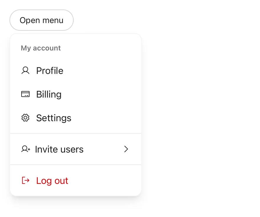
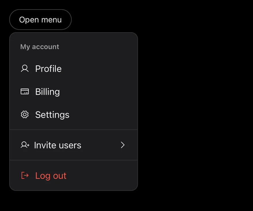
DropdownMenu opens DropdownMenuContent next to a DropdownMenuTrigger when it is pressed. The content renders through a portal (inside a full-window overlay on iOS) as a raised, rounded card positioned below the trigger by default.
Items can be plain actions, checkbox items, radio items in a group, or a submenu. DropdownMenuSubContent expands in place under its trigger, and the caret turns to point down while it is open. For a menu that opens on long press at the touch point, use Context Menu.
Installation
The CLI also adds what it builds on: Icon, Text. On React Native it also adds the animated view components/ui/animated-view.tsx.
Manual
- Install the dependencies:
-
Add the pieces it builds on: Icon, Text, and the primitives
components/primitives/menu.tsx,components/primitives/use-render.tsx, and the animated viewcomponents/ui/animated-view.tsxfrom the next step. -
Copy the animated view into
components/ui/animated-view.tsx:
- Copy the source into
components/ui/dropdown-menu.tsx:
- Update the import paths to match your project.
- Install the dependencies:
-
Add the pieces it builds on: Icon, Text, and the primitives
components/primitives/menu.tsx,components/primitives/use-render.tsx, and the animated viewcomponents/ui/animated-view.tsxfrom the next step. -
Copy the animated view into
components/ui/animated-view.tsx:
- Copy the source into
components/ui/dropdown-menu.tsx:
- Update the import paths to match your project.
- Install the dependencies:
-
Add the pieces it builds on: Icon, Text, and the primitives
components/primitives/menu.tsx,components/primitives/use-render.tsx, and the animated viewcomponents/ui/animated-view.tsxfrom the next step. -
Copy the animated view into
components/ui/animated-view.tsx:
- Copy the source into
components/ui/dropdown-menu.tsx:
- Update the import paths to match your project.
-
Target iOS 17 or later.
-
Add the Swift package to your app:
- Copy the theme files every view uses:
- Copy the source and every file it uses:
- Add the files to your app target.
- Set
minSdkto 24 or higher and add the dependencies:
- Copy the theme files every view uses:
- Copy the source and every file it uses:
- Update the
com.esuiss.uipackage names to match your project.
Usage
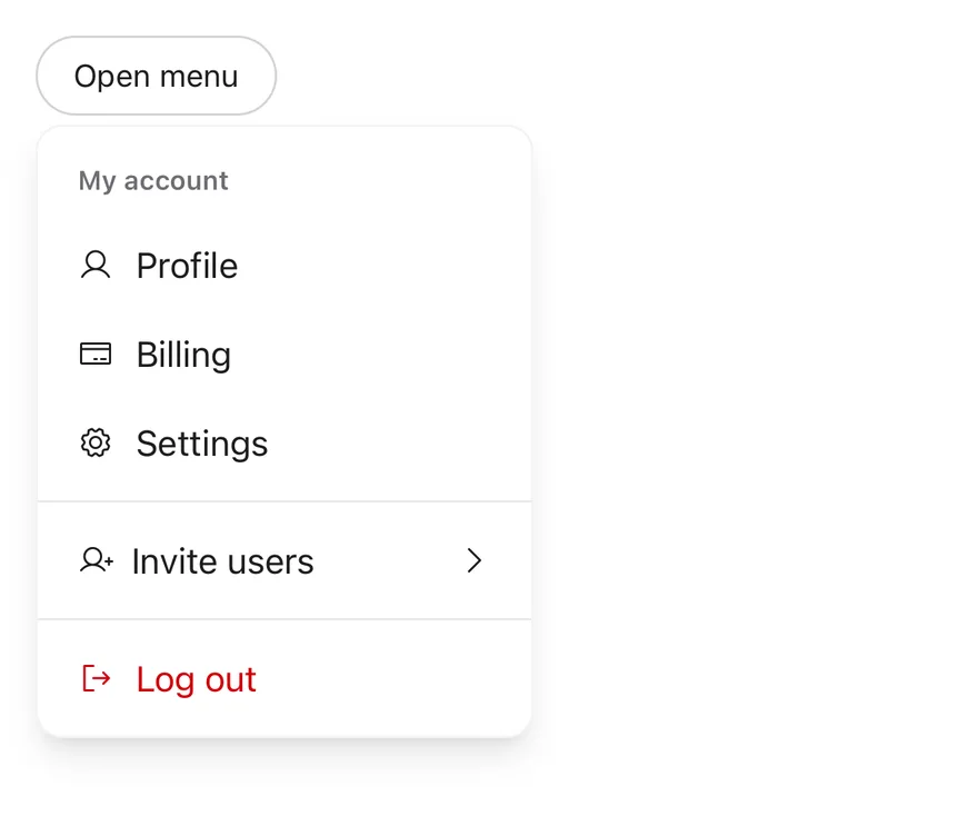
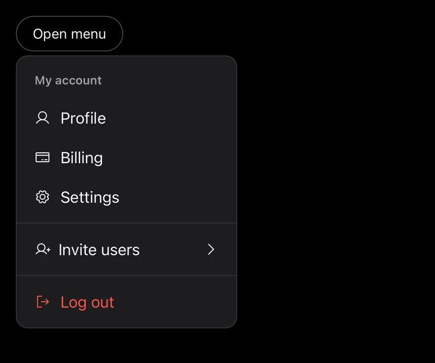
Use render on DropdownMenuTrigger to render it as a Button. Items close the menu when pressed unless closeOnPress={false}.
Use DropdownMenuCheckboxItem with checked and onCheckedChange, and DropdownMenuRadioItem inside a DropdownMenuRadioGroup with value and onValueChange. Group items with DropdownMenuGroup and DropdownMenuLabel, and divide sections with DropdownMenuSeparator.
Set variant="destructive" on an item that deletes or removes. Use inset on items without an icon to align them with items that have one. Position the content with side, align, sideOffset and alignOffset.
Examples
Default
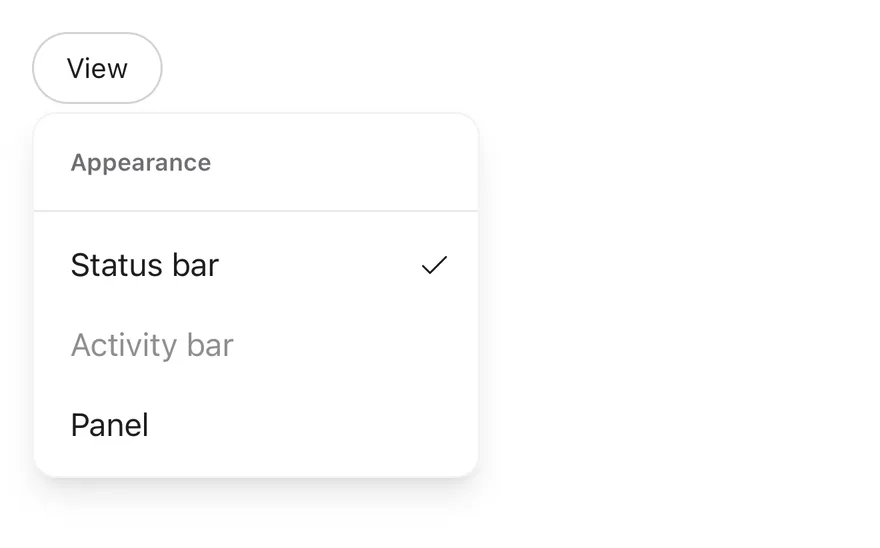
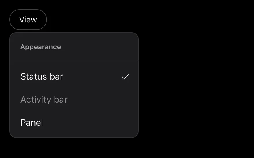
Checkboxes
Checkbox items that toggle panels on and off.
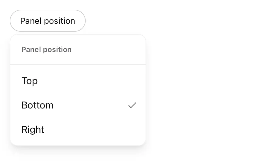
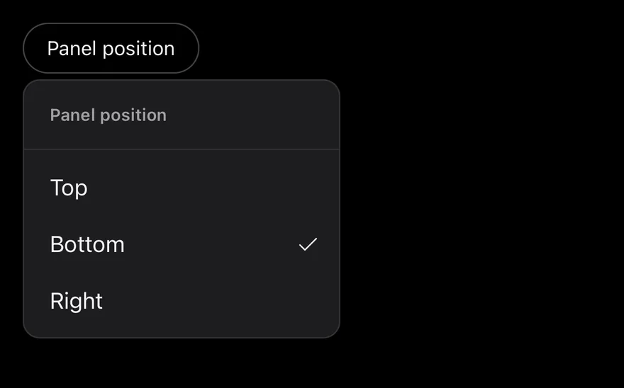
Radio group
Radio items that pick one value.
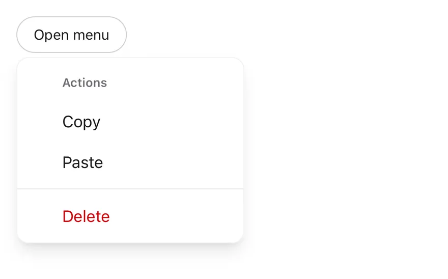
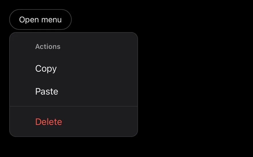
Inset
Items aligned with inset.
API Reference
DropdownMenu
The root that manages the open state.
| Prop | Type | Default | Description |
|---|---|---|---|
open | boolean | - | Whether the menu is open, for controlled use. |
defaultOpen | boolean | false | Whether the menu starts open when uncontrolled. |
onOpenChange | (open: boolean, details) => void | - | Called when the menu opens or closes. |
modal | boolean | true | Blocks interaction with the rest of the screen while open. |
disabled | boolean | false | Prevents the menu from opening. |
DropdownMenuContent
Floating menu card.
| Prop | Type | Default | Description |
|---|---|---|---|
portalHost | string | - | Name of the portal host to render into. |
Also accepts the props of React.ComponentProps<typeof MenuPrimitive.Popup>, PositionerProps.
DropdownMenuSubTrigger
Row that expands the submenu.
| Prop | Type | Default | Description |
|---|---|---|---|
children | React.ReactNode | - | |
iconClassName | string | - | Extra classes for the caret icon. |
inset | boolean | - | Adds start padding. |
Also accepts the props of React.ComponentProps<typeof MenuPrimitive.SubmenuTrigger>.
DropdownMenuSubContent
Items of the submenu.
Also accepts the props of React.ComponentProps<typeof MenuPrimitive.Popup>.
DropdownMenuItem
Action row.
| Prop | Type | Default | Description |
|---|---|---|---|
inset | boolean | - | Adds start padding to align with icon items. |
variant | "default" | "destructive" | "default" | default or destructive. |
Also accepts the props of React.ComponentProps<typeof MenuPrimitive.Item>.
DropdownMenuCheckboxItem
Row with a check mark that toggles.
| Prop | Type | Default | Description |
|---|---|---|---|
children | React.ReactNode | - | |
inset | boolean | - | Adds start padding. |
Also accepts the props of React.ComponentProps<typeof MenuPrimitive.CheckboxItem>.
DropdownMenuRadioItem
Row that selects one value in its group.
| Prop | Type | Default | Description |
|---|---|---|---|
children | React.ReactNode | - | |
inset | boolean | - | Adds start padding. |
Also accepts the props of React.ComponentProps<typeof MenuPrimitive.RadioItem>.
DropdownMenuLabel
Heading for a group.
| Prop | Type | Default | Description |
|---|---|---|---|
inset | boolean | - | Adds start padding. |
Also accepts the props of React.ComponentProps<typeof MenuPrimitive.GroupLabel>.
DropdownMenuSeparator
Line between sections.
Also accepts the props of React.ComponentProps<typeof MenuPrimitive.Separator>.
Accessibility
- The trigger has the
buttonrole. - The popup has the
menurole; items usemenuitem,checkboxandradioroles, and radio groups useradiogroup. - Groups are labelled by their
DropdownMenuLabel, and separators have theseparatorrole.
Notes
- Uses
bg-popover, andbg-accentfor an open submenu trigger; a highlighted item fades toopacity-80and a disabled one toopacity-50; light and dark follow the system appearance. - The fade-in respects the system Reduce Motion setting.