suiss/ui · Component
Item
A flexible row that pairs media, a title, a description and actions, for lists and settings.
Item is an open-source component from suiss/ui for React, React Native, SwiftUI and Jetpack Compose. The @esuiss/ui CLI copies its source into your project, so you own the code.
Item is a row container. Inside it, ItemMedia holds an icon, image or avatar, ItemContent stacks an ItemTitle and ItemDescription, and ItemActions holds buttons or indicators at the end. ItemHeader and ItemFooter span the full width of the item, above and below the main row. The whole item can also render as a link or button.
Use the render prop to turn the whole item into a link or button.
Set asChild and pass a link or button as the child to turn the whole item into it.
Pass a render function that returns a link or button with the props it receives to turn the whole item into it.
ItemGroup stacks items as a list, and its inset variant groups them into a rounded list on bg-muted, like iOS Settings. Place an ItemSeparator between items to divide them. Use items to display content; for form controls with labels and validation, use Field.
Installation
CLI
Works in any project with a components.json. See Installation for the one-line registry setup. Or use the suiss/ui CLI:
Manual
- Install the dependencies and add the
cnhelper:
- Copy the source into
components/ui/item.tsx:
- Update the import paths to match your project.
Usage
ItemGroup has the list role, so set role="listitem" on each Item inside it. Choose a variant for the item's border and background, and a size for its padding. Items inside a group with sm or xs items are spaced more tightly.
When ItemDescription is present, the media aligns to the top of the item instead of its center. The title is limited to one line and the description to two.
Examples
Variants
The default, outline and muted item variants.
Sizes
The default, sm and xs item sizes.
As link
An item rendered as a link, so the whole row is one focusable target.
With image
A list of people with image media, separators and an invite button on each row.
Inset
The same list in an inset item group, forming a rounded list with inset separators.
With avatar
An item with an Avatar as media and a Message button.
With header and footer
A plan summary with a price in the header and a renewal date and action in the footer.
API Reference
ItemGroup
Stacks items as a list, or groups them into an inset list.
| Prop | Type | Default | Description |
|---|---|---|---|
variant | "default" | "inset" | "default" | inset groups the items into a rounded list on bg-muted, with square item corners and separators inset from the start. |
Also accepts the props of React.ComponentProps<"div">.
ItemSeparator
A divider between items.
Also accepts the props of React.ComponentProps<"div">.
Item
The row container for media, content and actions.
| Prop | Type | Default | Description |
|---|---|---|---|
variant | "default" | "outline" | "muted" | "default" | default has no border or background, outline adds a border, and muted adds a subtle background. |
size | "default" | "sm" | "xs" | "default" | Sets the padding and gap: default is the roomiest, then sm, then xs. |
Also accepts the props of useRender.ComponentProps<"div">.
ItemMedia
Holds an icon, image or avatar at the start of the item.
| Prop | Type | Default | Description |
|---|---|---|---|
variant | "default" | "icon" | "image" | "default" | icon sizes an icon, image crops an image into a rounded square that scales with the item size, and default renders the media as is. |
Also accepts the props of React.ComponentProps<"div">.
ItemContent
Stacks the title and description.
Also accepts the props of React.ComponentProps<"div">.
ItemTitle
The item's title, limited to one line.
Also accepts the props of React.ComponentProps<"div">.
ItemDescription
Supporting text, limited to two lines.
Also accepts the props of React.ComponentProps<"p">.
ItemActions
Holds buttons or indicators at the end of the item.
Also accepts the props of React.ComponentProps<"div">.
ItemHeader
A full-width row above the item's content.
Also accepts the props of React.ComponentProps<"div">.
ItemFooter
A full-width row below the item's content.
Also accepts the props of React.ComponentProps<"div">.
Accessibility
ItemGrouphas thelistrole; give eachItemin it thelistitemrole.ItemSeparatorhas thenonerole, so it is ignored by assistive technology.- An item rendered as a link or button is a single focusable element and shows a focus ring.
- Give icon-only action buttons an accessible name with
aria-label.
Notes
- Styling hooks:
data-slotvaluesitem-group,item-separator,item,item-media,item-content,item-title,item-description,item-actions,item-headeranditem-footer. Itemsetsdata-variantanddata-size;ItemGroupandItemMediasetdata-variant.- An item rendered as an anchor gets the
accentbackground on hover. - Uses the
border,muted,accent,muted-foregroundandprimarycolors.
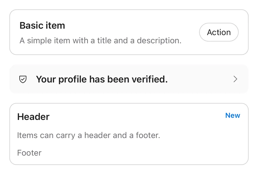
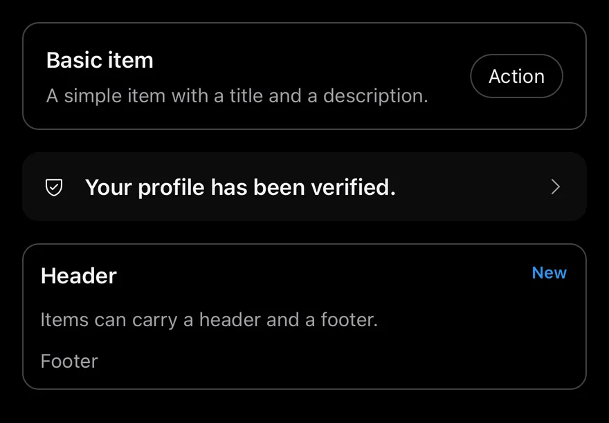
Item is a row that renders as a Pressable with the button role when it has onPress or onLongPress, and as a plain View with the listitem role otherwise. It has three variants (default, outline, muted) and three sizes (default, sm, xs).
ItemGroup stacks items as a list. Its inset variant joins them into one rounded card with square inner corners, which suits settings screens; add ItemSeparator between rows to draw an inset divider.
Installation
The CLI also adds what it builds on: Icon, Text.
Manual
-
Target iOS 17 or later.
-
Copy the theme files every view uses:
- Copy the source and every file it uses:
- Add the files to your app target.
- Set
minSdkto 24 or higher and add the dependencies:
- Copy the theme files every view uses:
- Copy the source and every file it uses:
- Update the
com.esuiss.uipackage names to match your project.
Usage
Compose a row from ItemMedia, ItemContent (holding ItemTitle and ItemDescription) and ItemActions. Use ItemHeader and ItemFooter for full-width rows above or below the main content.
ItemMedia with variant="icon" sizes icons to 16 points; variant="image" makes a square thumbnail that shrinks with the item size. ItemTitle truncates to one line and ItemDescription to two by default; override with numberOfLines. Text inside ItemActions picks up text-muted-foreground.
Pass render to render the row as another component while keeping the item styles.
Examples
Inset group
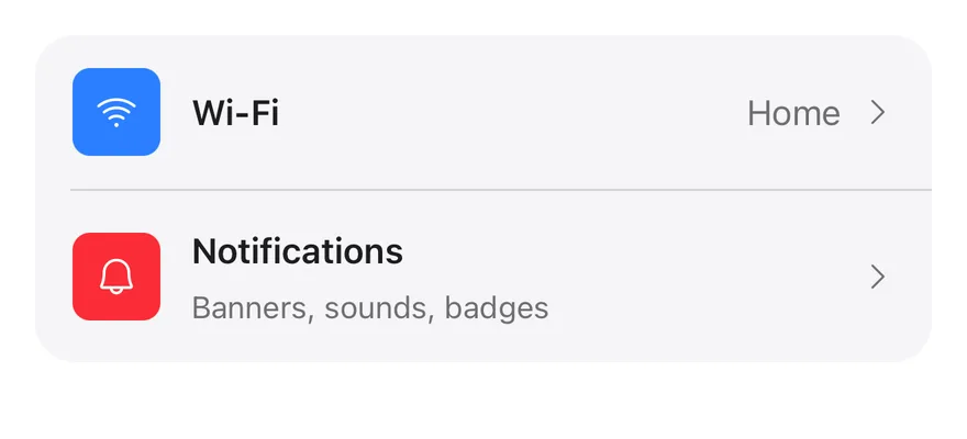
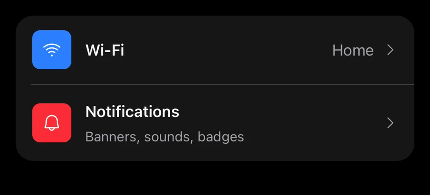
Pressable rows in an inset group, with colored icon tiles, separators and trailing chevrons.
API Reference
ItemGroup
List container for items.
| Prop | Type | Default | Description |
|---|---|---|---|
variant | "default" | "inset" | "default" | default stacks items with a gap; inset joins them into one rounded card. |
Also accepts the props of ViewProps.
ItemSeparator
Divider between items, inset inside an inset group.
Also accepts the props of ViewProps.
Item
The row itself, pressable when given a press handler.
| Prop | Type | Default | Description |
|---|---|---|---|
variant | "default" | "outline" | "muted" | "default" | Visual style. |
size | "default" | "sm" | "xs" | "default" | Padding and gap. |
render | RenderProp | - | Renders the item as another element, such as a Pressable. |
Also accepts the props of ItemProps.
ItemMedia
Leading icon, image or avatar.
| Prop | Type | Default | Description |
|---|---|---|---|
variant | "default" | "icon" | "image" | "default" | default, icon for 16-point icons, or image for a square thumbnail. |
Also accepts the props of ViewProps.
ItemContent
Flexible column for the title and description.
Also accepts the props of ViewProps.
ItemTitle
Single-line title.
Also accepts the props of React.ComponentProps<typeof Text>.
ItemDescription
Secondary text, up to two lines.
Also accepts the props of React.ComponentProps<typeof Text>.
ItemActions
Trailing row for values, buttons or chevrons.
Also accepts the props of ViewProps.
ItemHeader
Full-width row above the content.
Also accepts the props of ViewProps.
ItemFooter
Full-width row below the content.
Also accepts the props of ViewProps.
Accessibility
ItemGrouphas thelistrole.- A static
Itemhas thelistitemrole; an item withonPressoronLongPresshas thebuttonrole and fades to 80% opacity while pressed. disableddims the item and blocks presses.ItemSeparatoris hidden from VoiceOver and TalkBack.
Notes
- Uses
bg-mutedfor inset groups and themutedvariant,border-borderforoutline, andopacity-80for the pressed state. - Colors follow the system appearance.