suiss/ui · Component
Header
A navigation bar with a back button, a centered title, actions and an optional large title that collapses on scroll.
Header is an open-source component from suiss/ui for React Native, SwiftUI and Jetpack Compose. The @esuiss/ui CLI copies its source into your project, so you own the code.
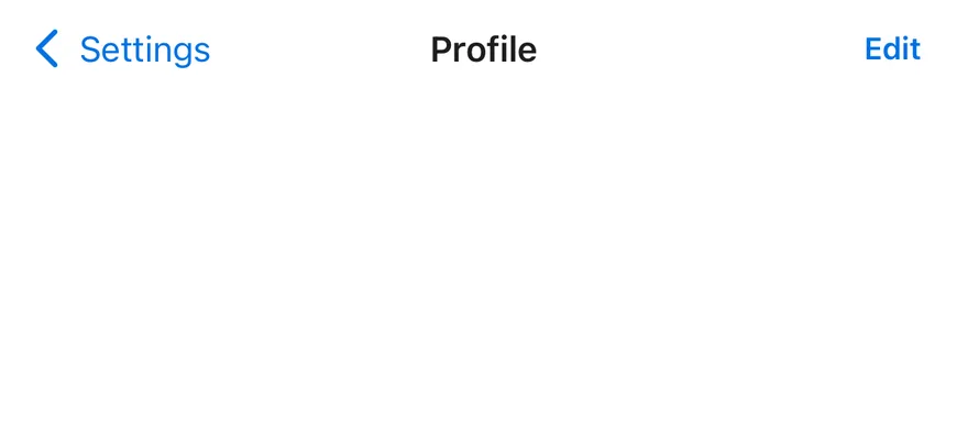
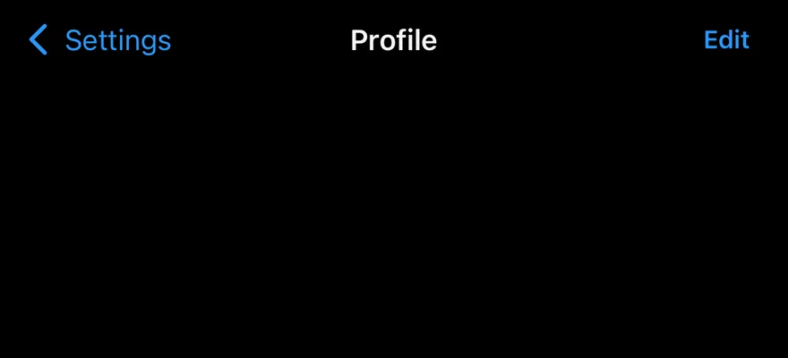
Header is a 44-point bar that sorts its children into three slots: HeaderBack and leading HeaderActions on the start side, HeaderTitle in the center, and everything else on the end side. The side slots share the remaining width equally, so the title stays centered.
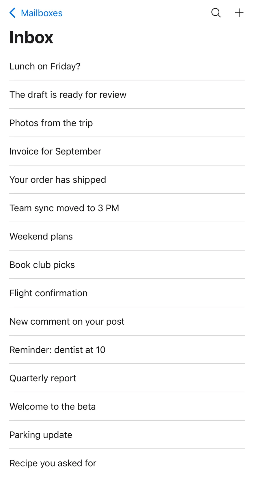
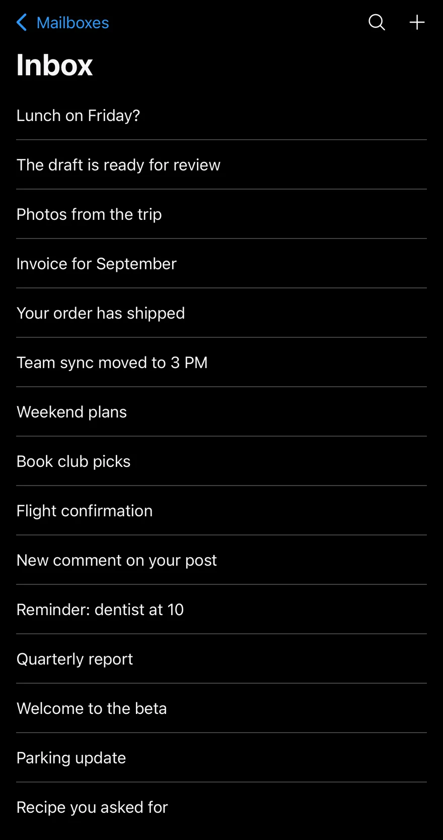
For a large title, create a scroll state with useHeaderScroll(), pass it to both Header and HeaderScrollView, and put a HeaderLargeTitle at the top of the scroll view. As the large title scrolls away, the small title fades in and a hairline appears under the bar. Pulling down stretches the large title slightly.
Installation
The CLI also adds what it builds on: Icon, Text. On React Native it also adds the animated view components/ui/animated-view.tsx.
Manual
- Install the dependencies:
-
Add the pieces it builds on: Icon, Text, and the animated view
components/ui/animated-view.tsxfrom the next step. -
Copy the animated view into
components/ui/animated-view.tsx:
- Copy the source into
components/ui/header.tsx:
- Update the import paths to match your project.
- Install the dependencies:
-
Add the pieces it builds on: Icon, Text, and the animated view
components/ui/animated-view.tsxfrom the next step. -
Copy the animated view into
components/ui/animated-view.tsx:
- Copy the source into
components/ui/header.tsx:
- Update the import paths to match your project.
- Install the dependencies:
-
Add the pieces it builds on: Icon, Text, and the animated view
components/ui/animated-view.tsxfrom the next step. -
Copy the animated view into
components/ui/animated-view.tsx:
- Copy the source into
components/ui/header.tsx:
- Update the import paths to match your project.
-
Target iOS 17 or later.
-
Add the Swift package to your app:
- Copy the theme files every view uses:
- Copy the source and every file it uses:
- Add the files to your app target.
- Set
minSdkto 24 or higher and add the dependencies:
- Copy the theme files every view uses:
- Copy the source and every file it uses:
- Update the
com.esuiss.uipackage names to match your project.
Usage
HeaderBack shows a caret and an optional text label such as the previous screen's name; wire onPress to your navigation. Group icon buttons in HeaderActions, and set side="leading" to place a group on the start side.
Both HeaderTitle and HeaderLargeTitle accept a subtitle. Plain strings are wrapped in Text and truncated to one line in the bar.
Without a large title, you can still pass the same scroll to Header and HeaderScrollView to show the hairline once content scrolls under the bar.
Examples
Large title
A large title that collapses into the bar on scroll.
Large title with subtitle
A large title with a subtitle.
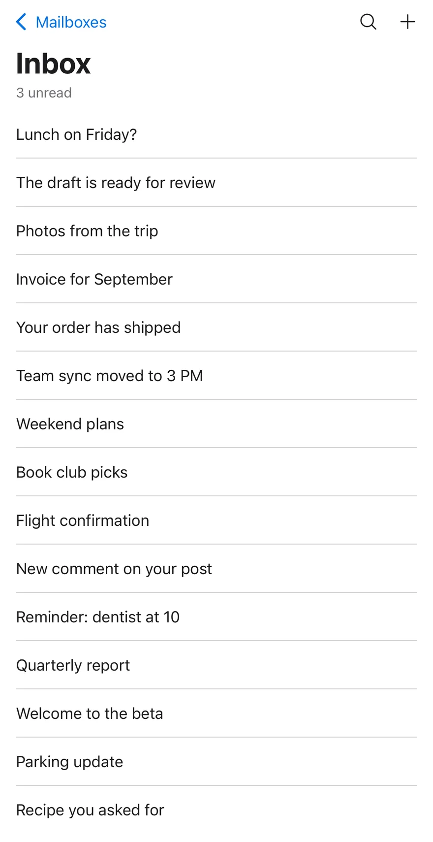
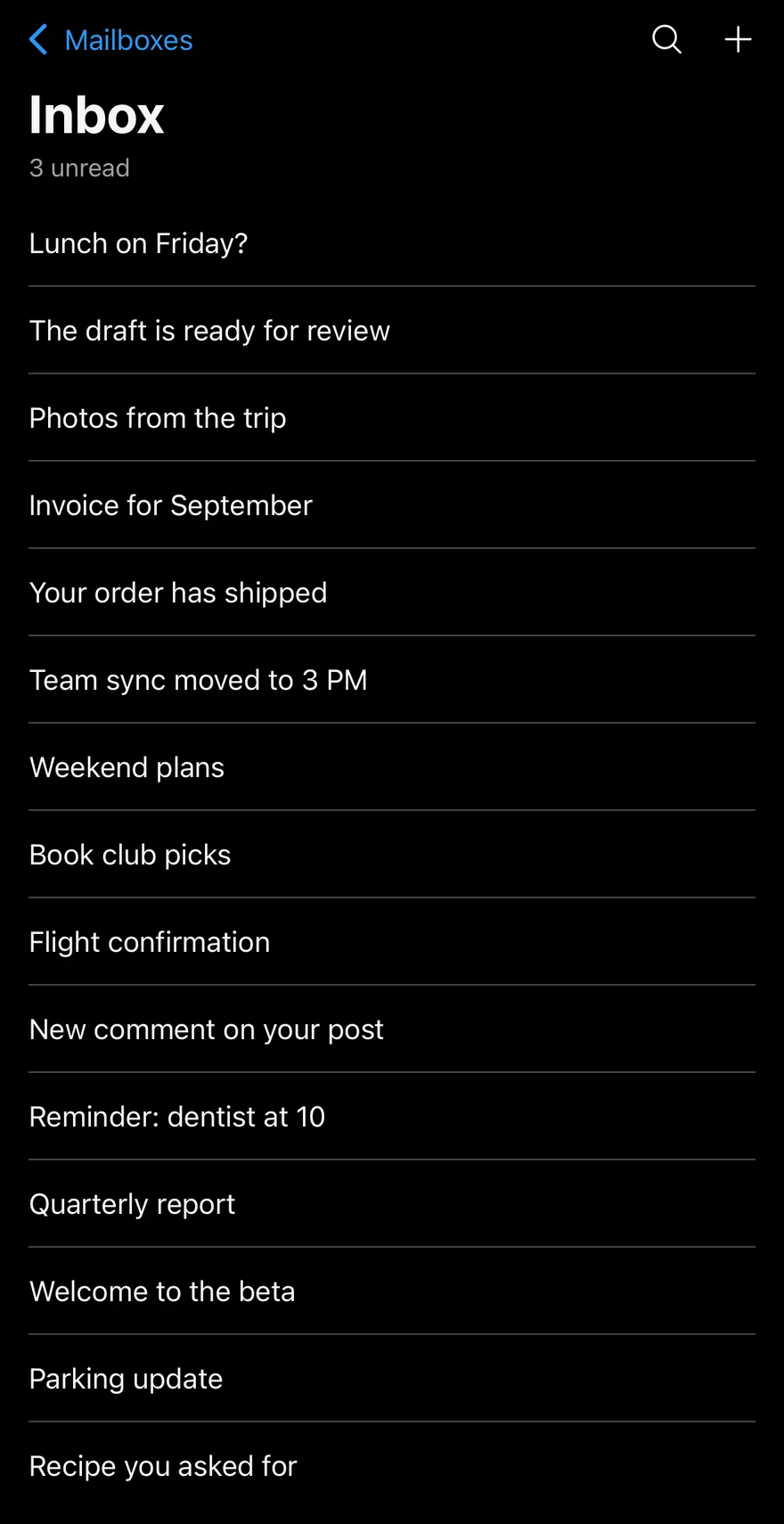
Compact with scroll
A compact title whose hairline appears on scroll.
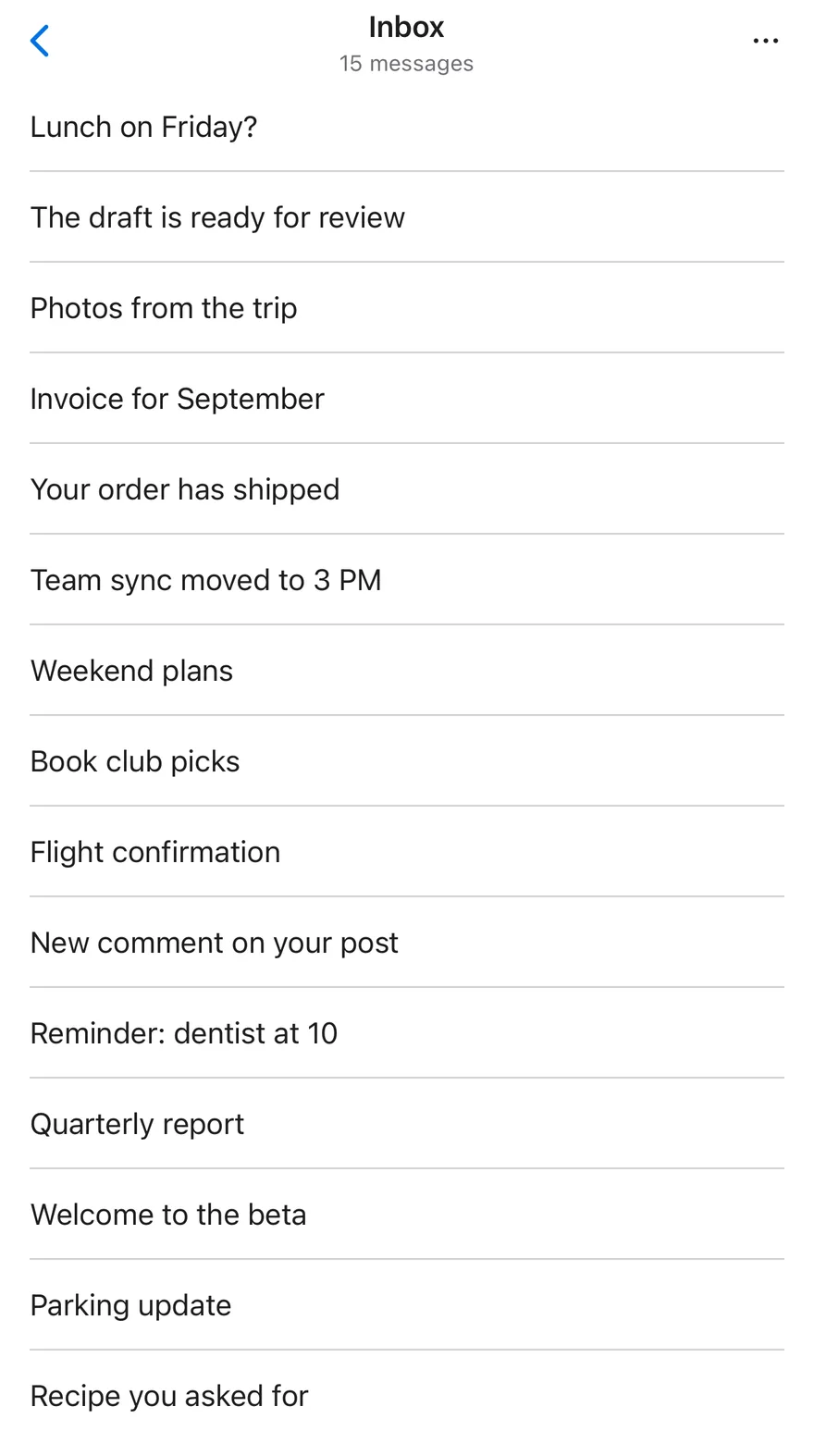
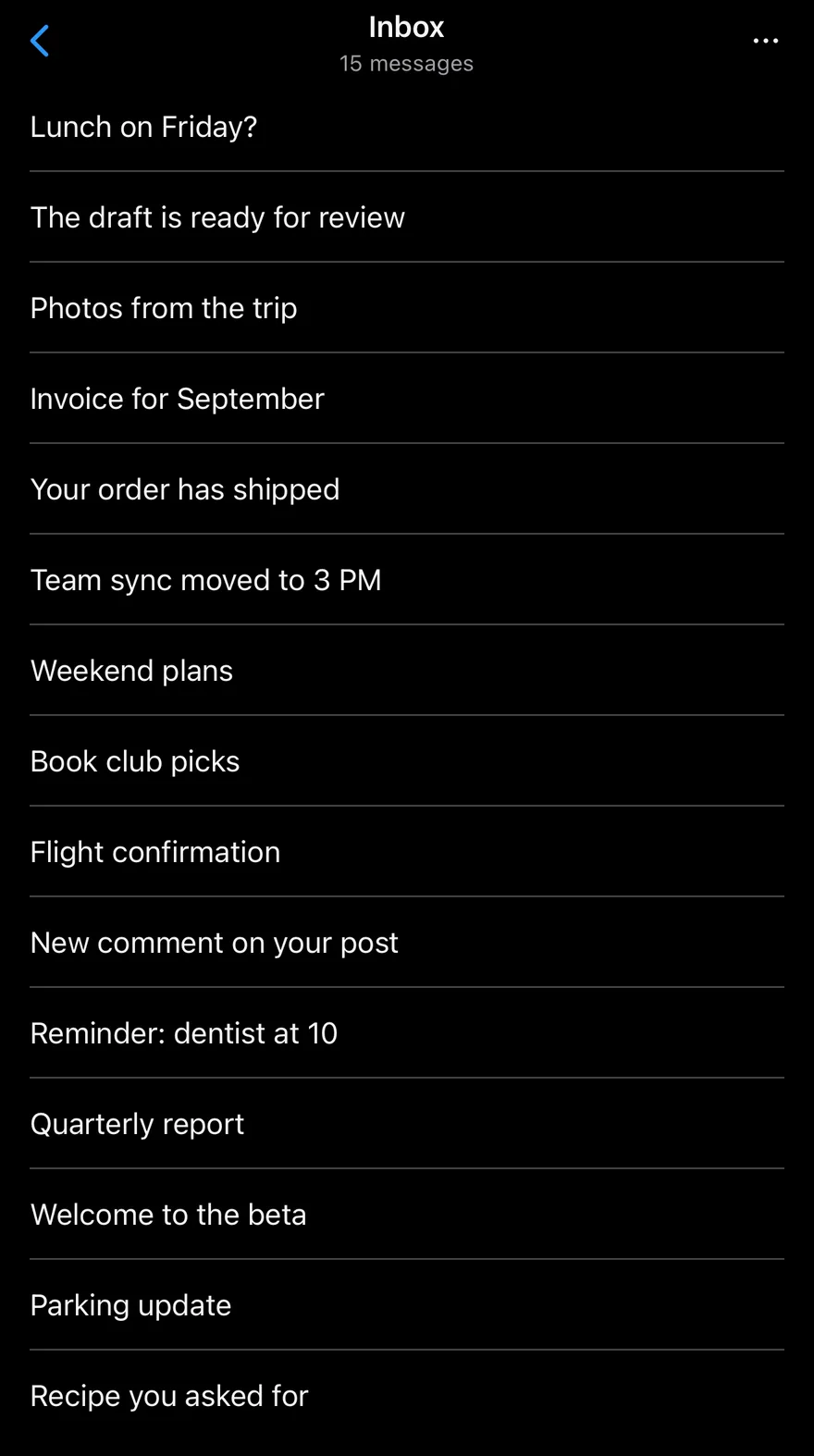
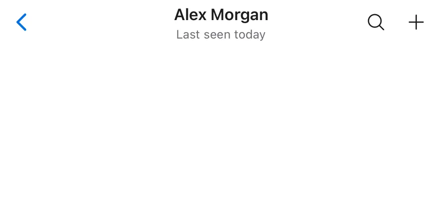
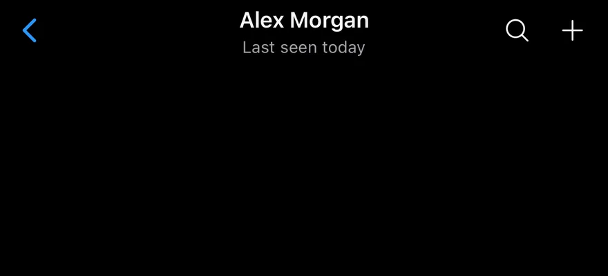
Subtitle
A two-line title with a subtitle.
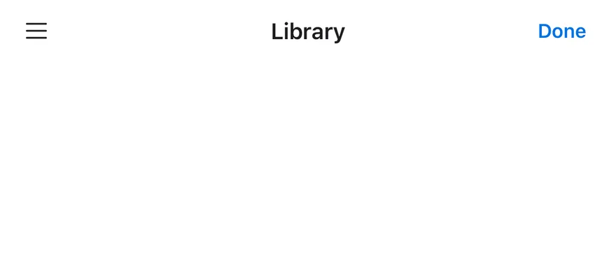
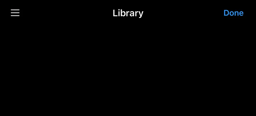
Leading actions
Actions on both sides of the title.
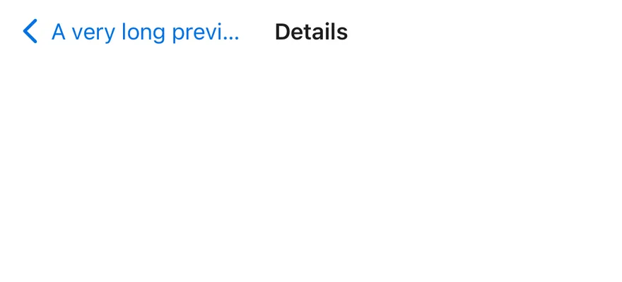
Back only
A long back label that truncates.

API Reference
Header
Bar that lays out the back button, title and actions.
| Prop | Type | Default | Description |
|---|---|---|---|
scroll | HeaderScroll | - | Scroll state from useHeaderScroll(). |
Also accepts the props of ViewProps.
HeaderTitle
Centered title with optional subtitle.
| Prop | Type | Default | Description |
|---|---|---|---|
subtitle | React.ReactNode | - | Second line under the title. |
Also accepts the props of ViewProps.
HeaderLargeTitle
Large title at the top of the scroll content.
| Prop | Type | Default | Description |
|---|---|---|---|
subtitle | React.ReactNode | - | Line under the large title. |
Also accepts the props of ViewProps.
HeaderBack
Back button with a caret and optional label.
| Prop | Type | Default | Description |
|---|---|---|---|
children | React.ReactNode | - |
Also accepts the props of React.ComponentProps<typeof Pressable>.
HeaderActions
Row of actions for either side.
| Prop | Type | Default | Description |
|---|---|---|---|
side | "leading" | "trailing" | "trailing" | leading or trailing. Defaults to trailing. |
Also accepts the props of ViewProps.
HeaderScrollView
Scroll view that drives the header animations.
| Prop | Type | Default | Description |
|---|---|---|---|
scroll | HeaderScroll | Required | Scroll state from useHeaderScroll(). |
Also accepts the props of ScrollViewProps.
Accessibility
HeaderTitleand a stringHeaderLargeTitlehave theheadingrole.HeaderBackhas thebuttonrole and is labelled with its text, or "Back" when it has none.- Give icon-only actions an
accessibilityLabel.
Notes
- The back caret rotates and the large title scales from the correct edge in right-to-left layouts.
- Uses
text-primaryandbg-bordertokens, withopacity-80while pressed; light and dark follow the system appearance.