suiss/ui · Component
Signature Pad
A drawing area that captures a handwritten signature as strokes and can export it as an SVG string.
Signature Pad is an open-source component from suiss/ui for React Native, SwiftUI and Jetpack Compose. The @esuiss/ui CLI copies its source into your project, so you own the code.
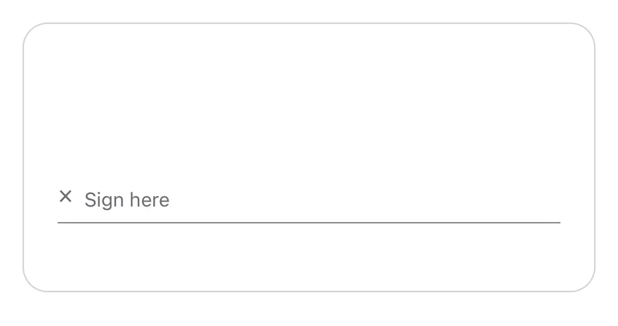
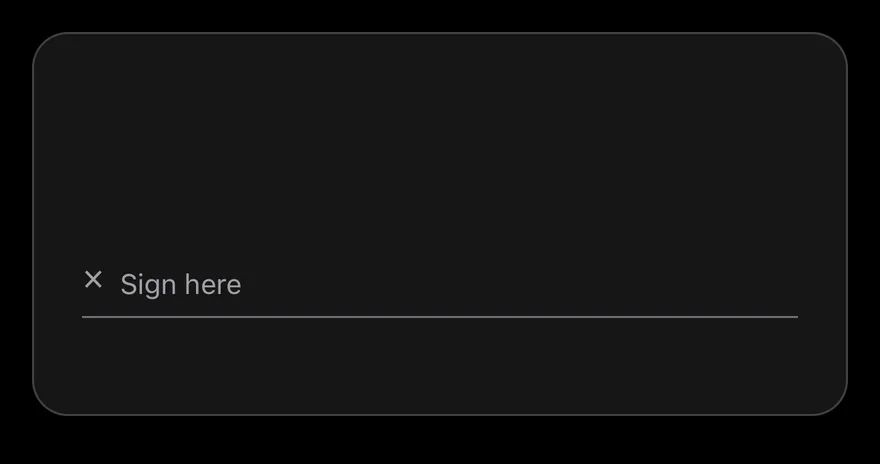
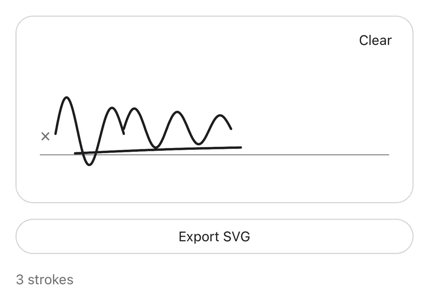
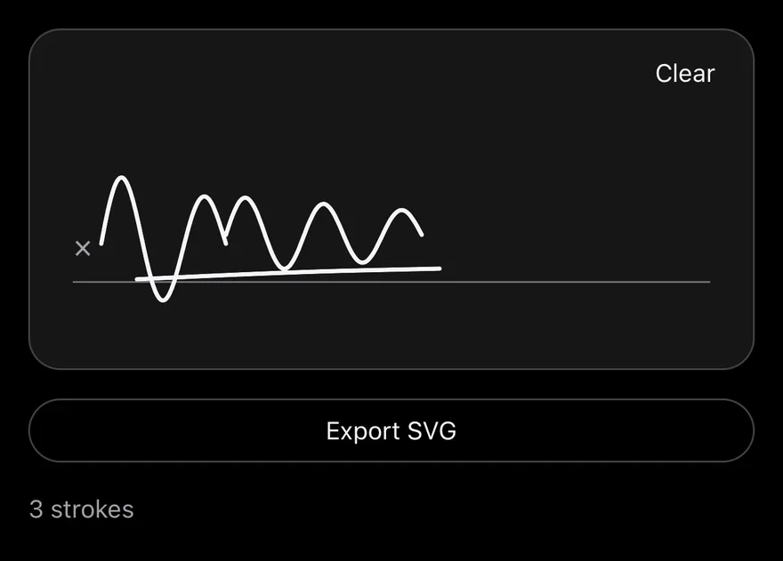
SignaturePad is a View with a single-finger pan gesture from react-native-gesture-handler. Each touch records a stroke of points, and the strokes are drawn as smoothed paths with react-native-svg. A signature line with an × mark and a placeholder sits near the bottom, and a ghost Clear button appears in the top corner once something is drawn.
Installation
The CLI also adds what it builds on: Button, Icon, Text.
Manual
-
Target iOS 17 or later.
-
Add the Swift package to your app:
- Copy the theme files every view uses:
- Copy the source and every file it uses:
- Add the files to your app target.
- Set
minSdkto 24 or higher and add the dependencies:
- Copy the theme files every view uses:
- Copy the source and every file it uses:
- Update the
com.esuiss.uipackage names to match your project.
Usage
Use it uncontrolled with defaultValue, or controlled with value and onChange. The value is an array of strokes, where each stroke is an array of { x, y } points.
Pass a ref to get a SignaturePadHandle with toSVG(), clear() and isEmpty(). toSVG returns an SVG string sized to the pad and accepts an optional color (defaults to currentColor).
The SignaturePadHandle, SignaturePadPoint and SignaturePadStroke types are also exported.
Examples
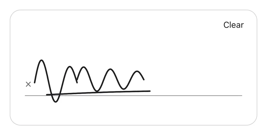
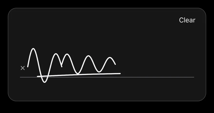
Signed
A pad that starts with a saved signature.
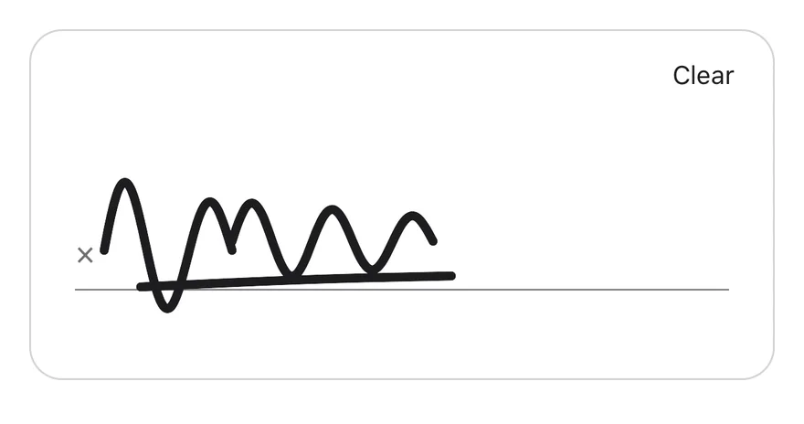
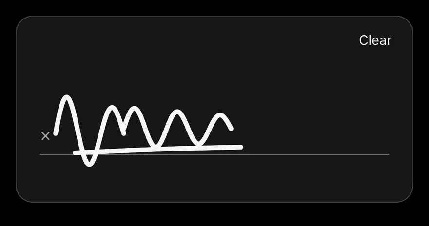
Thick stroke
A signature drawn with strokeWidth={5}.
Disabled
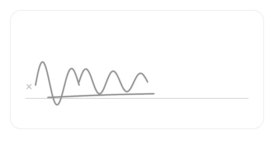
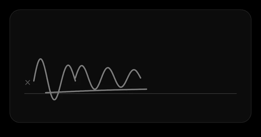
A disabled pad that ignores touches and hides the Clear button.
Controlled
A controlled pad that reads the signature through the ref and exports it with toSVG.
API Reference
SignaturePad
| Prop | Type | Default | Description |
|---|---|---|---|
value | SignaturePadStroke[] | - | Strokes for controlled use. |
defaultValue | SignaturePadStroke[] | - | Initial strokes for uncontrolled use. |
onChange | (value: SignaturePadStroke[]) => void | - | Called with the full list of strokes after each stroke ends or the pad is cleared. |
strokeWidth | number | 2.5 | Line width of the strokes. Defaults to 2.5. |
disabled | boolean | false | Turns off drawing, hides the Clear button and dims the pad. |
placeholder | React.ReactNode | "Sign here" | Content shown on the signature line while the pad is empty. Defaults to "Sign here". |
clearLabel | React.ReactNode | "Clear" | Label of the Clear button. Defaults to "Clear". |
ref | React.Ref<SignaturePadHandle> | - | Receives a SignaturePadHandle with toSVG, clear and isEmpty. |
Also accepts the props of React.ComponentProps<typeof View>.
Accessibility
- The pad is a single accessible element labeled by
accessibilityLabel. - Its value is announced as "Empty" or "Signed", and
disabledis reported in its state. - When it has a signature and is not disabled, it offers a
clearaccessibility action, so VoiceOver and TalkBack users can clear it without finding the button.
Notes
- Uses
bg-cardin light mode andbg-mutedin dark mode, withborder-borderandtext-foregroundfor the strokes. - Points closer than one point to the previous point are skipped while drawing.